"Is one Stop Shopping all we Dreamed it Would be? Usability and the Single Search Interface"
•Als PPT, PDF herunterladen•
0 gefällt mir•624 views

Presented at APLA, Fredericton 2006 & CLA, Ottawa 2006 with Louise McGillis.

Empfohlen
Weitere ähnliche Inhalte
Was ist angesagt?
Was ist angesagt? (20)
Ähnlich wie "Is one Stop Shopping all we Dreamed it Would be? Usability and the Single Search Interface"
Ähnlich wie "Is one Stop Shopping all we Dreamed it Would be? Usability and the Single Search Interface" (20)
Mehr von Gillian Byrne
Mehr von Gillian Byrne (6)
Kürzlich hochgeladen
Kürzlich hochgeladen (20)
"Is one Stop Shopping all we Dreamed it Would be? Usability and the Single Search Interface"
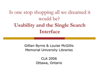
- 1. Is one stop shopping all we dreamed it would be? Usability and the Single Search Interface Gillian Byrne & Louise McGillis Memorial University Libraries CLA 2006 Ottawa, Ontario
- 2. Introduction What is SingleSearch? The methodology The results What’s next?
- 3. Federated Searching at Memorial SingleSearch (one interface…many resources) Resolver (links to our full-text & holdings) RELAIS (document delivery)
- 6. …leading to full text…
- 7. …or to a check of our holdings…
- 8. …Resolver links to online holdings…
- 9. …or to Relais (document delivery system)
- 10. Test Audience 12 participants from three MUN Libraries 5 males & 7 females 7 undergradutes, 3 graduate & 2 faculty Ages ranged from under 20 to 49
- 11. Survey Tasks Select categories & resources Find & check holdings for a book Find & check holdings for an article Navigate the Resolver
- 13. Test Materials & Analysis Test Materials Pre-test: demographic and library use data Survey: completed as participants completed the tasks Post-test: participant impressions of SingleSearch Analysis Quantitative data analyzed by SPSS Screen captures analyzed with a variety of tools (click path analysis)
- 14. Results! The expected... The unexpected... The bonus material
- 15. Difficulty understanding layout of search screen Participants had difficulty understanding the differentiation of resources and categories on the search screen Participant Comments: “I would also chose the library catalogue and GoogleScholar if it were here” “In the beginning when you have to choose groups and individual resources, there are so many categories that it is difficult to decide which topics to select.” Several did not even scan down to the resources section
- 16. Resource/Category Selection For the question, “Find information on the evolution of the human skeleton” participants selected an average of 2.5 categories and 3.25 resources. Equals approximately 25 databases being searched Categories Selected Resources Selected M 2.0 3.25 Mdn 2.0 1 σ 1.348 4.845
- 17. Lots of clicking... Participants were asked to select “Get It@Memorial” and navigate to Library holdings. Took participants an average of 9 clicks to reach an article/holdings or to give up. Participants who were successful took an average of 6 clicks.
- 18. ...And lots of hovering Participants were asked to choose an article citation and determine if it were available online or whether MUN owned it. Took participants an average of 5 min. & 10 sec. to complete
- 19. Basic search strategies None of the participants used sophisticated search techniques like Boolean and/or truncation. I.e., “Find information on pollution and asthma” pollution asthma (2) asthma pollution “Find information on elder abuse” information on elder abuse elder abuse (2)
- 20. Users identified format with ease 100% of participants were correctly able to identify whether there was a book and an article on their search results. Majority (75%, n=12) selected an article where document type was in the Single Search display
- 21. Route to holdings 2 options in each citation More Information: Links to native interface Get it@Memorial: Links to Resolver Majority select “more information” first Question asked: “Is the article available online (full text)? If not…does any MUN Library have this article?”
- 22. Expected Click Path Question: Is the article available online?
- 23. Actual Click Paths Question: Is the article available online? N = 8 (successful attempts) N =10 (unsuccessful attempts)
- 24. Bonus Material Fascinating insight into how people deal with error messages (which abounded) and other browsing behaviours. Example
- 25. Conclusions...thus far. 1. Need to simplify resource selection 2. Need to include format identifiers 3. Need to clean up display 4. Need to promote “most efficient” path through the SingleSearch to the article
- 26. What next? Use the data to develop mocks of different layouts for focus group this summer Re-do study when Rooms Portal is implemented?
- 27. Users get the last word… “It displayed a wide range of results with very little effort. Usually I would use google for research for an essay, but after seeing how easily and accurately this system finds and displays information I would rather use it.”