Route of the Eye Theory in Soap Opera Poster Design
•Als DOCX, PDF herunterladen•
0 gefällt mir•168 views

1) The document analyzes existing soap opera posters and identifies conventions around placement of key elements along an implied line of sight or "route of the eye". 2) It describes how the poster for a new soap opera sticks to conventions by placing main characters along this line, with the soap logo in the center to link the characters. 3) The poster breaks from conventions of including background images and uses color and character costumes to convey personalities and a fresh, welcoming atmosphere for the new soap.

Empfohlen
Weitere ähnliche Inhalte
Was ist angesagt?
Was ist angesagt? (17)
Andere mochten auch
Andere mochten auch (20)
Ähnlich wie Route of the Eye Theory in Soap Opera Poster Design
Ähnlich wie Route of the Eye Theory in Soap Opera Poster Design (10)
Mehr von Rachel Ashby
Kürzlich hochgeladen
Kürzlich hochgeladen (20)
Route of the Eye Theory in Soap Opera Poster Design
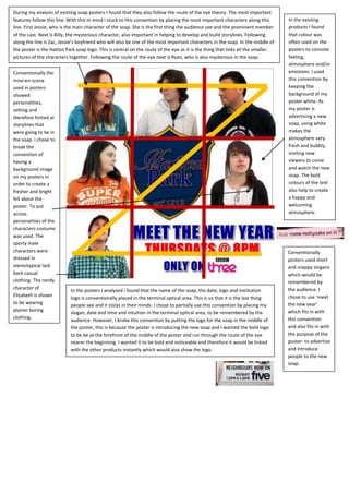
- 1. During my analysis of existing soap posters I found that they also follow the route of the eye theory. The most important features follow this line. With this in mind I stuck to this convention by placing the most important characters along this In the existing line. First Jessie, who is the main character of the soap. She is the first thing the audience see and the prominent member products I found of the cast. Next is Billy, the mysterious character, also important in helping to develop and build storylines. Following that colour was along the line is Zac, Jessie’s boyfriend who will also be one of the most important characters in the soap. In the middle of often used on the the poster is the Hatton Park soap logo. This is central on the route of the eye as it is the thing that links all the smaller posters to connote pictures of the characters together. Following the route of the eye next is Ryan, who is also mysterious in the soap. feeling, atmosphere and/or Conventionally the emotions. I used mise-en-scene this convention by used in posters keeping the showed background of my personalities, poster white. As setting and my poster is therefore hinted at advertising a new storylines that soap, using white were going to be in makes the the soap. I chose to atmosphere very break the fresh and bubbly, convention of inviting new having a viewers to come background image and watch the new on my posters in soap. The bold order to create a colours of the text fresher and bright also help to create fell about the a happy and poster. To put welcoming across atmosphere. personalities of the characters costume was used. The sporty male characters were Conventionally dressed in posters used short stereotypical laid and snappy slogans back casual which would be clothing. The nerdy remembered by character of the audience. I In the posters I analysed i found that the name of the soap, the date, logo and institution Elizabeth is shown chose to use ‘meet logo is conventionally placed in the terminal optical area. This is so that it is the last thing to be wearing the new year’ people see and it sticks in their minds. I chose to partially use this convention by placing my plainer boring which fits in with slogan, date and time and intuition in the terminal optical area, to be remembered by the clothing. this convention audience. However, I broke this convention by putting the logo for the soap in the middle of the poster, this is because the poster is introducing the new soap and I wanted the bold logo and also fits in with to be be at the forefront of the middle of the poster and run through the route of the eye the purpose of the nearer the beginning. I wanted it to be bold and noticeable and therefore it would be linked poster- to advertise with the other products instantly which would also show the logo. and introduce people to the new soap.