SlideShare ist ein Scribd-Unternehmen logo
1 von 15
 
Ranking 1: Mooncat, Bank Robbery Photo 1 Photo 2 Photo 3 Photo 4 Photo 5
Head judge: tinaateurface, 2 When it comes to photography, your team generally pulls out ahead.  Your framing and cropping is pretty good, and the lighting isn’t horrible considering what you have to go off of.  I’d still like to see you pull your photos together better by using photoshop in a way that increases how aesthetically pleasing your photos are (i.e. color, lighting, etc.).  Take a look at the favorites of deviantart and some photoshop tutorials.  Feel free to look at my favorites folders (my username is tinaateurface).  From the beginning of the competition, you have stood out as one of the better teams.  My only concern is that, when compared to the other teams, you have probably improved the least from beginning to end.  This probably has to do with the fact that you started much better, but you should still be improving, especially since there are still things to critique in your photos.  You guys have had a great run so far though, and I wish you luck. Photo 1: This is a great photo to begin with as it definitely creates the setting.  Before I understood your concept, I was put off by the toys in the hallway, however, now that I look at it with a clearer eye, I love the detail.  While the photo is good though, overall it doesn’t have a huge impact.  I think this is mostly due to the poor lighting, which I understand you don’t have huge control over since you’re inside.  Even so, the dull color takes away from the photo.  The contrast could also be increased here, to sharpen the photo. Photo 2: In terms of photography, this is a pretty great photo.  Although it bugs me that the spotlight is off center, I still like how you framed the model in light.  The hand gestures are great as is the model’s facial expression, however, my only problem (with the entire set pretty much) is that the model does not look very child-like.  The black outfit, although typical of cliche bank robbers, takes away from the childhood feel and kind of wrecks the setting.  In this photo in particular, the model looks a lot older.  That being said, it’s still a nice photo, and I especially appreciate the reflection in the piggy bank. Photo 3: This photo is by far my least favorite in the set, in fact, it pretty much cost you guys first place from me.  My rankings were based off of following the task more than anything, since the whole idea behind the task came with how well you execute a timeline.  This photo doesn’t really have a place in the timeline.  Sure, it shows after the model has picked up the bank, but is this really important to the story?  I think not.  When you have to depict an entire story in only five photos, it’s really important that you pick your snapshots in time carefully.  Not only did it fail to fulfill this requirement, but the quality of the photo is quite poor.  I also don’t understand the model’s facial expression whatsoever.  Simply put, this photo hurt your entire set. Photo 4: This photo is an example of when your model overacts.  You seem to rally between being too expressive and not expressive enough.  This maniacal look, while it definitely gets the point across, is too much.  It looks to comical and unreal.  Neither a bank robber or a young child acting as a thief would have this look on their face.  I feel like in your entire set you’re borderline cute silly kid and scary crazy evil thief.  I think you really should have committed either way.  Nice photography though, the lighting creates a nice feel. Photo 5: This is by far your greatest photo.  I love how you made the model appear smaller by standing the other person on a stool or something like that.  The expression on her face perfectly embodies a little kid who has done something wrong and doesn’t really understand the guilt that they should be feeling.  It’s a cute photo and a good conclusion to the story.  My only problem is that for some reason the quality of the photo is especially low around the model’s clothes.  The green pixelatedness is very strange.  Good lighting though.
Photography judge: Nick Sullivan, 2 What's with all the clutter? I liked the way your portrayed your theme, but the fact that there were random things in the photos definitely took away from their beauty. The final shot's angle is really interesting, and I like the reflections in the second and third shots, but I think that, overall, a bit more cohesiveness would have been a good idea. Also, the third photo seems kind of inserted, but other than those things, this was an okay set.  Photography judge: Kaitlyn, 2 I will not lie. I didn’t think this team could pull off what they were assigned for their storyboard and, frankly, I was worried. But boy did you guys prove me wrong! I was BLOWN AWAY by the amount of creativity and quick-thinking you used to make this storyboard. I love the story, I think its hysterical. Unfortunately, the photography falls a little short of the master-mind. It was difficult, really difficult to place you guys in second place, but based on these photos, I had to.  In the very first photo I had to squint at the sign. I have yet to be able to read it, and I’m still not quite sure its important. If it is, I hope its not integral to your story…because I have no idea what it says. Also, the photo is slightly out of focus and just generally not as clean as I’m used to from you. There’s a distracting…something. There in the hallway. I think it’s a vacuum.  The third photo is remarkable, but its out of focus! I’m not sure if this is due to resizing, or just had something to do with the camera, but its an unavoidable fact.  I know It seems like I’m picking the photos apart, but I really had to in order to make my ranking decisions.  I’m really amazed by the quality of the second and final photos. They are staged, lit, and shot very similar to what I’ve seen in magazines and are really excellent photos all on their own. The other three don’t stick as well in my memory, and in the end…that’s what knocked you guys down to second.  Photography judge: Sandy, 2 I enjoyed looking at your photos, and the story it told. For the first photo, I feel that you should have used a tighter frame or remove the little toys around the door, since it takes a bit of the focus away. The second one was amazing, great use of lighting and you had a nice, tight frame. The third one was a bit iffy for me. I felt that it was a bit grainy/unfocused but it had nice lighting and a tight frame. And for the last two pictures, they were a miss for me. I think the background/foreground in the fourth picture could be cleaned up a bit or perhaps fall out and the fifth picture should be a bit tighter  and I don't like your use of lighting.  Modeling judge: Cassandra, 1 This team did a great job once again and I found it very humorous (and cleaver) how they went about portraying the task. The first photo is a good prelude to the story and it’s easy to see that the model is getting ready to break in somewhere. There is one thing that does bug me however and that is that we can see that the sign says something but we can’t see what it says. I know it’s something small and doesn’t really matter but it’s distracting because it causes us to be curious with what it is but we aren’t being told. When taking photos you want to avoid things that may make the audience curious if they aren’t going to find out the answer later on as it’s a bit of a let-down. The pose overall is great although the model’s right arm seems a tad awkwardly placed and the angle makes it look disfigured. Make sure that the photographer lets the model know whenever something looks wrong so that the model can make the proper corrections. I can see some emotion in this photo but it does seem to be a touch too weak. The model has shown that she is excellent with expressing emotion so make sure that in every image you turn in you are doing the best you can.
The second photo is a great photo all around. The pose is almost perfect and you can really see the model excited about her prize. I know that some other judges have said to watch your “manic-ness” but I honestly thought is was perfect for this shot - but of course everyone has their own opinion. There was only one thing that I thought needed to be improved upon in this picture and it’s the right hand. The angle that we have of it makes it look like there is no point where her hand changes to her arm and it’s just weird. Additionally I would have liked to be able to see the model’s right thumb more than we are able to see it currently.  The third photo is perfect as far as the pose goes but I do feel as though the model can give us some more emotion in this shot. Additionally the photo just seemed to be lacking something in that it wasn’t as captivating as it could’ve been. Compared to the other photos in this set this picture just doesn’t really stand up. I know that some of the other judges have stated that this photo doesn’t help to progress the storyline and, while I disagree with this, I could think of another photo that could’ve replaced this one. Perhaps before your first shot you could have a scene where the model is getting ready to break in (getting dressed for example) which I can see you were playing with based on the photo that you have in your signature. That way you would be able to still complete the assignment with five photos while still continuing to tell us a story instead of lingering for too long on one part. Once again I thought that this photo really went but I think that my opinion may be outnumbered. Your fourth photo is great and is truly humorous. The posing is awesome and the manic cackling is very wonderfully portrayed. Unfortunately this photo has issues with lighting which did effect the overall modeling. With how dark the model’s clothes are and the color of the blanket behind her it makes the shadows seem to engulf the model’s body into the blanket. She looks almost as if her torso is protruding from a chest and her legs are disconnected from her body. It’s a shame that the shadowing effected the model’s pose so much as this would be a superb photo had that little issue not been there.  I found that this round their fifth photo was the practically perfect one. Her pose is great and really ties in with the expression on her face. You can honestly believe that she is a little girl being sent to The Corner for trying to steal from her mommy (or big sissy). The staging is just wonderful and really makes it look both cheery and grim (the dark chair and black-and-white backyard contrasting with the floral wall paper, cutesy tiles and trying-to-be-cheery picture) which helps to make the model’s ‘guiltily-innocent’ expression all the more convincing while assuring the audience that she is in no real harm. I just love this photo all together and it was a great ending to the story. All-in-all this team did a superb job this round and I was highly pleased with what they turned in. I love how they went with a totally twisted take on what they were handed showing that they are able to take risks to get the job done as well as surprising the judges with a totally different outlook on the task. The model is hanging in there as strongly as usual with great and convincing poses tied in with awesome expressions and emotion. Just keep making sure that all your photos are perfect and have the photographer help you when it comes to assuring that you look great in every photo (and that a blanket doesn’t suck you into oblivion) and that your expressions are spot-on. If you believe what you are doing is real then so will the judges. In the next round also try to make sure you follow the assignment so perfectly that we will be struggling to find anything wrong with what you’ve turned in. Like I said, I didn’t find anything wrong but we all have different opinions - try to study the judges and go through everything that they’ve said to try to see if you can figure out what it is that they want to see from you. You two are doing an excellent job - now just keep hanging in there and keep trying to better yourselves. This is the final round now so really ensure that all your photos are ‘Picture Perfect’ and try to blow us all away.  Modeling judge: Shawn Keeney, 2 Funny, funny, funny. The thing I really love about this team is that in all of the photo sets they've turned in, I see their sense of humor and personality and I really like that they're having fun doing the competition. I'm not sure if this was intentional or not--perhaps just a weird camera angle--but I'm wondering how she looks so little in all the pictures that show her full body. Well whether it was an accident or not, I loved it. Photo 5 cracks me up, just the innocence in the little scorned girl face is genius. I think this is a great comeback from last task; what a clever play on the assigned story. Great job again (but I would be careful about the face getting a little too manic, like in Photo 2)!!
Photography judge: Momo, 1 Hilarious! I simply adore the spin put into this task. You could have gone very straight forward with a bank robbery but instead you put a little twist on it and it was wonderful. I loved the humor in the photos, they actually made me get this really wide, dumb smile on my face! For what could have been a very serious story, you twisted into a fun tale of a little demon child.  First photo, there's not too much to say. I like the pose, the fingers apart from each other-- "grabby" you could say-- but there's something blending in with the right arm which contorts the figure a bit. I can't for the life of me figure out what it is. Something in the background? Hair? It's brownish looking. Other than that, it's nice. Wonderful outfit choice! Simple, yet it works, and easily looks like something a child could come up with. And are those pigtails? because that completely fits.  Second photo is perhaps my favorite. The shadows on her face are awesome. The look of evil joy is overwhelming. Once again, the "grabby hands" really help emphasize the 'burglar' aspect. The neck is partially obscured by the darkness, but in this shot, I don't mind-- the focus is first on the piggy, then on her face. It's OK to look like a floating head in this case.  In the third picture, I'm not 100% sure what facial expression she's making, but it's funny as heck. It looks like a literal "OMG" face. I like how one sleeve slid down a little bit-- it seems childish to me, unkempt, like how children might have one pant leg rolled up and one down.  In the fourth picture, lovelovelove the expression. It's completely exaggerated, comical, but it fits-- that's almost the theme of the whole thing. Exaggeration. My only complaint here would be the left side of her body is completely blending with the shadows of the...thing behind her.  I know I'm just judging modeling, but I must add the camera angle in the last photo is awesome. It really helps make the model seem like a small child--the size of the "mother" helps too. The crossed arms are great, and the comical expression is there, however the hands completely blend in at the elbows. I would have liked to see them standing out as it seems strange where they've disappeared.
Ranking 2: 1867, Blind Date
Head judge: tinaateurface, 1 While this was a solid set of photos, I really wish that they had been more crisp.  Usually your photo quality is next to perfect, but this week (perhaps due to the indoor lighting) the quality was actually poor.  What made me rank you first this week was your ability to follow the task and produce a timeline that showed a clear progression.  Every photo was clearly necessary to the set and each made sense in the order that they came in.  My only other comment is that I think you played it a little safe this week.  This task gave a great opportunity for creativity and acting, and I think you downplayed this aspect.  You chose to portray a typical blind date when you could have created some sort of drama.  While you have definitely improved the quality of your photos, your creativity has taken a slight drop this week.  Bring back that awesome and unique quality from the beginning of the competition and combined it with your improved compositional skills. Photo 1: I like the set-up to your story with the ad and phone call, however, this isn’t a very compelling photo.  It’s great that the model is smiling and her expression is very real, but the rest of the photo is pretty plain and boring.  The lighting is pretty poor and the model’s face is tinted red, two things which I believe you had control of this shoot.  As you can probably tell, I’m not a great fan of this photo.  Luckily, this is probably the worst one in your set.  In the future, while you shouldn’t turn in any weak photos, you should be especially careful that your first and last photos are exceptionally strong. Photo 2: This is probably my favorite photo of your set.  While you used a traditional mirror shot for flavor, it is well executed and quite crisp.  I love the model’s facial expression, and the colors in this photo are phenomenal.  The photographer did a great job of framing this photo although I would have cropped out the bottom right black corner of the door.  The perspective is nice though and the model’s expression is refreshing and crisp.  Nice job with this photograph. Photo 3: A great example of a classic photo.  The model’s expression is pure and I like the symbolism behind the roses on either side.  The colors are really cool, although they’re also a bit harsh on the secondary model’s face.  As strange as this sounds, the wall looks wonderful and soft, which reflects the mood of the model’s and the photo.  I also love how the glow of the light rests on the joining hands, also quite symbolic.  The photo does seem a bit out of focus though, which is something you should look out for. Photo 4: This photo has great symmetry, although it does bother me that the light isn’t centered within the frame and the chairs aren’t evenly cut off.  Next time, make sure to crop your photos evenly, it actually makes quite a big difference.  Again, the colors are really nice, but the lighting is still kind of weird.  I love how real the expressions of the model’s are though.  I guess that’s what I like the most about your set; they’re just so real.  Authenticity is written all over these photos and it’s really nice to look at even though the quality isn’t as clear as it should be. Photo 5: There are a lot of good and bad things about this photo.  The framing with the light and the wreath is great and the glow of the light over the model’s is symbolic of their successful date and blooming love.  The modeling is daring, which is much appreciated, however, it does have its faults.  The primary model’s shoulders are too hunched which makes her posture quite awkward.  The legs are also a bit too forced, specifically the straight and harsh angles.  However, I absolutely love how both models are holding the flowers now.  This is a great detail of time progression and a key way to bring out symbolism.  Taking something from earlier in the set, and transforming its meaning in the end, is quite wonderful.  Great job with this photo, although the composition could have probably been more clean.
Photography judge: Nick Sullivan, 1 Your storyboard was really coherent and effective. Each shot was different, and yet they all seemed to link together in more ways than just plot. Your use of framing was really good, especially in the final photo. You also really seemed to feel your emotions, rather than act them.  Photography judge: Kaitlyn, 3 I am not really pleased with these photos. They’re alright, but they’re not the most amazing work we’ve seen from this team, which it should have been, given this is the last task. That being said, really nice work on the storyboard here. I can see you were a bit pressed for location, but you made it work. I’m pleased with that aspect.  Unfortunately, it looks like the putzed out compositionally in the last three photos. They’re blurry, and lack the compositional and angular complexity of the first two. Aditionally, I think they could have been cleaned up at bit.  Photo three has an extra chair at the table that isn’t there in photo four. There’s the cluster of wires in the bottom right of photo four, as well as the tiny sliver of the over-head light. The elimination of these things could have really cleaned up your last three photos…made them more professional.  However! I think you really deserve some credit for seriously thinking through the challenge this week. You thought about what it was like to go on a blind date. I assume the news paper in the first photo means the character answered a personal add. She looks excited when she’s getting ready (And the photo is also brightly lit; excited!). Good good work with the storyboard…just not what I expected for the final task.  Photography judge: Sandy, 3 First of all, I think you guys did a great job with the theme that was given to you. However the composition was a bit iffy. The lighting in most of your photos is okay, except for the second, which is amazing. The last three photos don't really have a center of focus and is a bit blurry. The fourth photo looks like it should be cropped, and I'm struggling on whether that's true or not for the fifth picture, but I'm thinking it would be better if that light post(?) wasn't there. I feel that if you replaced those last two photos, I could given you a higher rank.  Modeling judge: Cassandra, 3 After the last round I wasn’t too impressed with this set of photos unfortunately. These photos were good all-in-all but last week’s set was just a lot better. The first photo was a very cleaver way to start the story and you can clearly see that the model is contacting someone in a newspaper ad. The model’s posing is fair although it isn’t as strong as it could be; first of all her right forearm is completely gone and it makes her hand protruding from the paper seem weird without an arm. Then second, with how loosely her legs are tucked in we should be able to see a bit of her feet (or slippers possibly) to let us know that her legs aren’t just disappearing into nowhere. The last bit of error is one of the most annoying things to fix and/or avoid; her eyes. It’s excruciatingly hard to get a photo where the model is closing her eyes and have it look good. I know that she isn’t closing her eyes but with the angle of the shot and how far down she is looking it appears that way and it just simply detracts from the photos. This could be fixed by having her possibly look above the newspaper (this is where the photographer’s input comes into play) so that we can see that she is looking at the ad instead of sleeping away while talking on the phone. I do really like the way that the model is holding the phone - we can clearly see the definition in her hand and it looks very strong and well posed. I can sense a good amount of emotion coming from the model in this picture although it isn’t as strong as it could be.
Unfortunately I didn’t find this photo to be too interesting to look at. I can’t really place why but it just isn’t all that intriguing. When you’re taking photos you want to make sure that every photo you submit will catch the viewers eye and just make them want to gaze at the photo; I’m sorry that I can’t really offer advice on this one as I don’t know exactly why it’s not captivating but I’m sure that the other judges might have some more input on how to make a very intriguing photo.  Out of this set I found that their second photo was the best one. The concept is great and really goes along with the storyline, the modeling is very nicely played out and this photo has a good feel coming from it. As far as her posing goes I can only find two issues in this shot; the first one is her left arm(her actual left arm, not the reflection’s) - the forearm and the upper arm seem to be morphed into one object due to the lighting and the tone of her skin and it’s hard to see that they are two different parts. Then the second little quip is the way her dress is bunched up behind her looks a bit awkward. You should try to avoid having your clothes turn on you when you’re taking photos so try to keep an eye on awkward clothe bunching. This photo has a really great feel coming from it; you can clearly see the adorable innocence and excitement coming from her as she gets ready for her date. It is very easy to see that she is getting ready to go out even if you have no idea of the storyline and that is an excellent factor. This team’s third photo I felt was the second best out of their set. The model’s pose is spot-on with my only issue being that I would have liked to be able to see some of her shoulder - not necessarily all of it since the photo is cropped like it is but it just seems weird to be able to see her forearm without seeing where it’s coming from. She is doing a great job at expressing emotion in this picture and you can really see that she’s both excited and nervous about going out with a guy she’s never met before. Perhaps the photo could be a little better had there been a hint of blush on her cheeks to make her look a bit more nervous but that may just be my opinion. This is a great third photo to the set introducing her date for the evening and helps to continue to tell the story.  As some of the other reviewers said, this team’s fourth photo does look like a ‘real-life moment’ although I don’t look at that as a plus in this case. This shot looks like it came from a movie - as if someone was watching it on their computer and took a screenshot. Perhaps this is due to how blurry and out of focus the shot is but I do find that to be a bit distracting. I do like that this image continues to tell the story so that is a plus for this team. The model is doing a decent job at posing although I do feel as though her left foot is a touch too high and almost seems like it’s disappearing into the table. Speaking of feet I have to question why the model isn’t wearing any shoes? I find that typically when you are going on a date you would wear shoes and it just seems awkward that there aren’t any in the photo. Along the lines of posing I do find that the model’s left hand seems a bit too tilted in this shot and it’s fairly distracting. Something like this could be fixed by her lowering her forearm some or drawing her elbow back a touch. I can see emotion coming from the model but it does seem to be lacking a little. I am speculating though that this comes from the blurriness of the shot - it’s hard to see emotion when her face is outlined by a bunch of pixels. I honestly didn’t care much for this team’s fifth photo and, just like the first one, the shot just wasn’t too interesting to look at. The posing is alright in itself but I feel it could be better. First, due to the lighting and the choice of wardrobe, the model looks like she doesn’t have an upper arm. This could be avoided by holding her arm back a little instead of letting it hang vertically with her body so that we could see that there is some definition. Second, the model’s left leg looks awkward the way it is lifted up - I can’t really think of a way to fix this though but something just looks off about it. The model’s right leg looks strangely short in this photo but I can’t place why either. Honestly I can’t really see any emotion coming from the model in this shot and it’s really missing that extra punch that emotion brings to a picture. This was a good ending to the story and helped to pull it to a close so, in that respect, good work.  Overall this team did a fairly decent job at telling us a story and it was well-communicated and flowed nicely. As I said earlier, I do believe that this round wasn’t up to par with the last round but they did decently none-the-less. The model just needs to make sure that her posing is superb in every photo (which she has shown she is capable of doing) and this is how the photographer can help. Make sure that as you are taking the photos of your model you are honest with her and let her know about things that should be changed, excluded or added. Additionally keep working on emotion. You want to wow us in every shot that you turn in and really try to captivate us. Believe the story that you’re telling us and really draw us in so that we don’t want to look away. Try to make sure that none of the photos you turn in are boring or uninteresting. Make us want to just gawk at the photos and wonder how you possibly managed to express so wonderfully in every photo (and for the photographer - make us wonder how you are so awesome with a camera). For the final round you two will need to really push it, push it, push it and make sure that all your photos are truly ‘Picture Perfect.’
Modeling judge: Shawn Keeney, 1 Phenomenal job!! I was amazingly impressed with every picture. Brilliant modeling; every emotion looked sincere and genuine and I believed it. My favorite photo is Photo 4 because it looks like a real moment, something that's truly occurring. None of the pictures look posed or fake. I love that it's really a story that flows and has a beginning middle and end. As far as technical modeling, also amazing. The only thing I noticed was that in Photo 5, the shoulders are raised up a little too high and it looks a bit awkward. Other than that, superb. I know it sounds like I'm repeating myself a lot, but there's really not much to say other than EXCELLENT!  Modeling judge: Momo, 2 You guys have come a long way and I really feel you deserve to be in the top two. Originally I figured you'd be kicked out early on, but you continued to grow and take our critiques and use them. What I've seen lately has been wonderful. This week's wasn't the greatest, in my opinion, but I feel you have shown your capacity to grow and I wish to see you do one final task. This round was a little bland for me. You followed a storyline excellently, but it was a little boring. There wasn't much pizazz in the story, and I know you guys are capable of adding neat little twists.  The first picture is a nice, casual picture. The pose is relaxed, she looks happy, but I'm not 100% sure what she's doing with the paper, though it is open to interpretation (personally I feel she's either searching for a blind date or was just working on the crossword puzzle when someone called her and said-- "Hey! I have a blind date for you!") My main complaint here would be that her chin is blending in a little bit to the shoulder. Perhaps a different light or little bit of burning in photoshop could have fixed that.  I like the angle in the second picture. You're drawn to her reflection, but you still see her out of your side view. Once again, there is blending-- the left arm blends in a bit with the shoulder and it's hard to tell where her arm is bending or what it is doing. The expression on the face is another nice, calm, content one. She's obviously happy to be going somewhere and wants to look nice! I like how her bangs are pulled back, as well-- that's a really natural thing to do, I do it all the time while applying makeup. It adds a nice realism to an already realistic picture.  The third photo was probably my favorite out of the set. I really liked the nice, warm colors of the decor and lighting contrasting with his cool-colored hair and her cool-colored dress and necklace. It's once again a very realistic picture-- it doesn't look posed at all. The models look wonderful, all dolled up and like they're on a real date. The framing of her hair on her jawline and face are perfect.  The fourth picture was cute, and once again, I really like the warmth of their surroundings. It feels like a very comforting, inviting photo. I like the holding hands sort of hidden-- it's not the focus of the picture, but it's there, and it's adorable to see. The models (once again) look very natural, if just a little underexposed(left) and overexposed (right). The only thing I noticed was that she was wearing no shoes! I thought I saw someone talking about it in the forums, and it's not a huge deal, but it certainly can be seen by someone judging the photo, but perhaps not by a passerby.  The fifth photo is OK, but I feel the focus isn't really on the models. The first thing I look at is the lamp, then the models. The leg up is a little dramatic, and considering how natural all the photos seem, a little obvious. Unless some people actually lift their leg like that, but personally, I've never seen it outside of movies. It's cute, though, and other than that, realistic. The kiss looks kind and sweet.
Ranking 3: Uh Oh Spaghetti-Os, School Day Photo 1 Photo 2 Photo 3 Photo 4 Photo 5
Head judge: tinaateurface, 3 Unfortunately, your set was the only one in which I saw no succinct timeline. Their first photo was an obvious beginning to the story, but the rest were merely snapshots from a school day that could have been put in any order. Since the real purpose of the task was to create a storyboard and the other teams did this, I automatically placed your team last.  While your biggest problem was your lack of a timeline, your second was the overexposure in most of your photos.  You’ve been cutting down on the photo-shopping which is good, but the lighting is still too bright and the contrast too high.  I’d still like to see you cut down on the shopping a bit.  Overall, I’m very happy with your improvement throughout the competition, and I think that you’ve come quite far.  Just keep on taking photos and keep analyzing yourself and you should come along nicely. Photo 1: The first photo got me really excited to see the rest of your set.  It’s an obvious beginning of a timeline and I like the idea behind it, especially since I’m one of those people who likes to finish up their make-up in the car.  I also like the glow of the model’s left eye and the pursing of her lips..  My problems with this photo have to do with the photography: the framing and the lighting.  The mirror is awkwardly cut off and doesn’t take advantage of the natural frame already there.  The lighting and contrast is a bit too harsh, making the white corner of the mirror and the model’s hair on that side look strange.  Otherwise, nice photo. Photo 2: This is a cute photo...unfortunately the photography makes the photo  looks like it was taken by a friend documenting the first day of school.  The model’s expression is cute, although her gaze leaves me wondering what she is looking at.  I like the slanted photo composition, but I really wish the photographer had taken advantage of the cool perspective of parallel lockers in a hallway.  Especially with those cute frog stickers; the setting is kind of asking for perspective play.  The elbow looks funny cut off, and I really wish that the photo was overexposed and the model’s face so washed out.  I don’t know if this is because the exposure settings on the camera are off, or if the photo is simply over-contrasted in photoshop, but the really bright washed out look is not a good one. Photo 3: Eh, what’s going on here?  I’m utterly and completely confused.  Why is the model licking a phone and what does this have to do with a school day?  If you were relying on the apple and outfit to tie the photo to school, that was a mistake, and even if you were doing this, I don’t understand why the model is licking it.  Is she supposed to be eating lunch?  I understand that we’re in a tech savy generation here, but that’s a bit much if that’s what you were going for.  Not only is the school reference lacking here, but the photo itself isn’t that great.  The slanted angle doesn’t work here, the model’s legs are awkwardly too close to the camera making them appear much larger, and the photo is way way overexposed.  It’s so overexposed you can’t see where her shirt ends on her arm or the students milling on the lawn in the background (which would have massively helped your school portrayal).  I also don’t see how this fits in a timeline.  Starting with this photo is where I start to see the storyboard drift off course from the task. Photo 4: I definitely like the comical aspect of the photo, and I wish my school had such comfy looking chairs.  While I think the idea is nice, I’m not crazy about the execution.  Sometimes extreme perspective looks cool, but in this case the arm and hand just look awkward.  Also, the horizon line is off and the photo is at a slight tilt, which makes the photo look less clean and professional.  I am also unsure of whether the background is enough to represent school or not.  Rows of desks give you a lot to work with when it comes to compositional lines in a photo, and I wish that you had taken advantage of this. Photo 5: While this photo is definitely cute, it doesn’t really add up with the rest of your theme.  I actually think it would have been cool if you had gone with an elementary school theme.  You could have made that really interesting, cute, and possibly editorial even, however, you did not.  Your model is dressed in an outfit (especially those heels) that makes it obvious that you set your age at high school and older.  I honestly don’t know of any high schools or colleges with playgrounds, which makes this photo very misleading.  Basically, the setting makes no sense with your theme.
Photography judge: Nick Sullivan, 3 I really expected more. You guys have definitely improved the most, but your photos are all overexposed and kind of random. The 'apple' in the third shot is hardly recognizable, and even once it is recognized, it leaves room for confusion. I think you could have done much better, but its not a horrible set.  Photography judge: Kaitlyn, 1 First of all, I’m really proud of this team. You’ve come so far and put in a lot of really hard work. Secondly, I love this set. It reminds me a lot of my middle school. I’m glad you chose a uniform, even though it does sort of beat the viewer over the head with the “school” theme: but a lot of storyboard photography and editorial photography is like that!  I also appreciate the progression that you chose: for example, putting the “Sleeping while studying” photo AFTER “lunch”…when students are more likely to be sleepy. But the thing I love most about these pictures is that they’re all great on their own. They all stand out as well composed, well staged and well thought-out photos…put them together? They tell a great story!  I have very little to critique on these photos, other than to shout about how much I love them. The lighting, the color palette… everything is just wonderful. Its made even better knowing where you all were when you started this competition.  Photography judge: Sandy, 1 I really enjoyed your submission this week. I felt that you used an expressive approach, letting the audience decipher your photos. I liked that you mixed it up a little and took a few risks. The first and second pictures could have had better lighting and it seems to me like the first was a bit out of focus. I liked the third because it's a bit intriguing. At first I thought you were just licking a phone at lunch, because that's the time when most people text like savages at my school and that's their lunchtime routine but then I thought maybe it was about anorexia, but your expression makes me think otherwise. The fourth made sense to me because of the lunch picture, and I do apologize if it isn't referring lunch, but anyways I pictured how I usually feel after lunch: sleepy. Then the fifth was probably my favorite, time to go home and the freedom it brings. The only thing I would suggest for that photo is having the background fall out because it draws a bit of focus away from the model.  Modeling judge: Cassandra, 2 Unavailable this week.
Modeling judge: Shawn Keeney, 3 *sigh* I'm afraid this is just not good enough work to be turning in this late in the game. I agree with PPC that their pictures really don't show any progression in time and you could literally put them in any order you wanted to. Okay, the first two photos are kind of in progression (girl gets to school and checks her make up before going inside, then she gets into her locker for the day) but after that, it's just kind of....just no. Why would anyone be licking their phone, even if there is an image of an apple on it? Nonsensical. When Photo 4 popped up on my screen, the first thing I thought was "Good Lord her hand looks huge!" followed shortly after the thought "Hey, some of the books in the library I work in have those blue stickers too." Then I wondered, if this is a high school, when does one have time to not only go to the library, but fall asleep in the library? Then Photo 5 just kind of throws the whole thing out of whack again, because I've never heard of a high school with recess before, or even a playground to have recess on. In any case, I just think this is not good enough to compare with the other teams' photos, and I don't think they've got enough past greatness to let me look past the low spots this task.  Modeling judge: Momo, 3 This time around, I was a little confused by the photos, and that there was a rudimentary timeline, but things could still be switched up a bit. You've shown sporadic progress, but not as evenly as I would have hoped. You definitely have deserved to make it this far but I think it's time to go.  In all honesty, the first photo was the one that made the most sense to me until I got to the other photos. In this one, we see a girl putting on her makeup in a car mirror. Ok, she's most likely a teenager. I really liked the cool colors of the car vs the warmth of her hair, eyes, and the shrubbery. However, going on to other pictures, I'm not quite sure what age group she's supposed to be in. If she's a teenager, why do her lockers have frogs on them? Why is she at a playground at the end? My highschool doesn't have a playground. If she's a child, why is she doing her makeup in a car mirror? Isn't makeup more of a teenager thing? I was aware kids were growing up fast, but I hope they're not doing their makeup in car mirrors nowadays.  The second photo was OK. Her pose is good, I feel she's a tad overexposed, though, and the shadows around her chin aren't too flattering. The makeup seems heavier here and I can't tell if her eyes are closed or not.  The third photo, once again, I feel the model is overexposed. She's practically glowing and blending in with her shirt. Also-- I don't understand this. I get the lunch time feeling, but licking an apple... on a phone? Couldn't she have had a regular apple and be holding it, eating it, doing something with it--other than licking it? It just seems strange and doesn't fit. The legs seem a bit strange, being cut off right under the knee makes them seem stubby.  The fourth photo is AMAZING. The exposure is perfect here. The softness on the model's face is very pretty. The makeup looks just right. The slight droop to her lips suggest she's actually sleeping! The slumped body, limp wrist, etc are all 'sleepy' without being unattractive/slouchy looking. I like how the hand is extended towards the camera, as well.  The fifth photo is OK. She doesn't have a neck! The hair covers it all up. That creates a strange effect that she has just a floating head. There's not much 'motion' in the picture-- it doesn't look like she slid down the slide, it looks like she's posing (mostly due to the crossed feet, and the unrealistic outstretched arms-- if you're going down a slide, I don't think you're reaching up.). It's cute, though

Weitere ähnliche Inhalte

Was ist angesagt?

Justification of images
Justification of imagesJustification of images
Justification of imageskirsty97
 
As component 1 py_14_sample 12
As component 1 py_14_sample 12As component 1 py_14_sample 12
As component 1 py_14_sample 12Melanie Powell
 
Fashion work research sheet
Fashion work research sheetFashion work research sheet
Fashion work research sheetSarahMurrayy
 
Photo For Front Cover
Photo For Front CoverPhoto For Front Cover
Photo For Front Coverguestb057af
 
Photoshoot analysis henry
Photoshoot analysis henryPhotoshoot analysis henry
Photoshoot analysis henryAubert Cavallo
 
Photography evaluation
Photography evaluationPhotography evaluation
Photography evaluationJamie Hyman
 
Victoria Siemer Work Sheet Analysis
Victoria Siemer Work Sheet Analysis Victoria Siemer Work Sheet Analysis
Victoria Siemer Work Sheet Analysis ryansharman
 
Task 1 work sheet 2 dimitris theocharis (done)
Task 1 work sheet 2 dimitris theocharis (done)Task 1 work sheet 2 dimitris theocharis (done)
Task 1 work sheet 2 dimitris theocharis (done)shaunaeleacy
 
Photography assignment 3
Photography assignment 3Photography assignment 3
Photography assignment 3kayleighhickeyx
 
Top 5 photographs
Top 5 photographsTop 5 photographs
Top 5 photographsaczachor4
 
American Psycho- inspiring
American Psycho- inspiringAmerican Psycho- inspiring
American Psycho- inspiringmillieoconnor12
 
Photoshoot analysis henry
Photoshoot analysis henryPhotoshoot analysis henry
Photoshoot analysis henryEMILYCORBET
 
Photoshoot (Media Studies AS Level)
Photoshoot (Media Studies AS Level)Photoshoot (Media Studies AS Level)
Photoshoot (Media Studies AS Level)Teddy Smith
 
Evaluation of photos
Evaluation of photos Evaluation of photos
Evaluation of photos Paige Ward
 
Task 1 work sheet 2 kristin sinclaire (done)
Task 1 work sheet 2 kristin sinclaire (done)Task 1 work sheet 2 kristin sinclaire (done)
Task 1 work sheet 2 kristin sinclaire (done)shaunaeleacy
 
FInal Sketchbook Presentation
FInal Sketchbook Presentation FInal Sketchbook Presentation
FInal Sketchbook Presentation JacobBudzak
 

Was ist angesagt? (18)

Justification of images
Justification of imagesJustification of images
Justification of images
 
Feedback
FeedbackFeedback
Feedback
 
As component 1 py_14_sample 12
As component 1 py_14_sample 12As component 1 py_14_sample 12
As component 1 py_14_sample 12
 
Fashion work research sheet
Fashion work research sheetFashion work research sheet
Fashion work research sheet
 
Photo For Front Cover
Photo For Front CoverPhoto For Front Cover
Photo For Front Cover
 
Photoshoot analysis henry
Photoshoot analysis henryPhotoshoot analysis henry
Photoshoot analysis henry
 
Photography evaluation
Photography evaluationPhotography evaluation
Photography evaluation
 
Victoria Siemer Work Sheet Analysis
Victoria Siemer Work Sheet Analysis Victoria Siemer Work Sheet Analysis
Victoria Siemer Work Sheet Analysis
 
Task 1 work sheet 2 dimitris theocharis (done)
Task 1 work sheet 2 dimitris theocharis (done)Task 1 work sheet 2 dimitris theocharis (done)
Task 1 work sheet 2 dimitris theocharis (done)
 
Photography assignment 3
Photography assignment 3Photography assignment 3
Photography assignment 3
 
Top 5 photographs
Top 5 photographsTop 5 photographs
Top 5 photographs
 
American Psycho- inspiring
American Psycho- inspiringAmerican Psycho- inspiring
American Psycho- inspiring
 
Photoshoot analysis henry
Photoshoot analysis henryPhotoshoot analysis henry
Photoshoot analysis henry
 
Photos
PhotosPhotos
Photos
 
Photoshoot (Media Studies AS Level)
Photoshoot (Media Studies AS Level)Photoshoot (Media Studies AS Level)
Photoshoot (Media Studies AS Level)
 
Evaluation of photos
Evaluation of photos Evaluation of photos
Evaluation of photos
 
Task 1 work sheet 2 kristin sinclaire (done)
Task 1 work sheet 2 kristin sinclaire (done)Task 1 work sheet 2 kristin sinclaire (done)
Task 1 work sheet 2 kristin sinclaire (done)
 
FInal Sketchbook Presentation
FInal Sketchbook Presentation FInal Sketchbook Presentation
FInal Sketchbook Presentation
 

Ähnlich wie Task 6 Critiques

Experiments evidence template
Experiments evidence templateExperiments evidence template
Experiments evidence templateHenry123456789
 
Task 4 Final Images Portrait Review Work Sheet
Task 4 Final Images Portrait Review Work SheetTask 4 Final Images Portrait Review Work Sheet
Task 4 Final Images Portrait Review Work Sheetryansharman
 
FMP: Updated Evaluation
FMP: Updated EvaluationFMP: Updated Evaluation
FMP: Updated EvaluationEwanWild
 
Photography experiments
Photography experiments Photography experiments
Photography experiments HannahMizen
 
FMP: Unfinished evaluation
FMP: Unfinished evaluationFMP: Unfinished evaluation
FMP: Unfinished evaluationEwanWild
 
Pet Sematary Photoshoot.pptx
Pet Sematary Photoshoot.pptxPet Sematary Photoshoot.pptx
Pet Sematary Photoshoot.pptxAmyKilbride2
 
Competitive photography principles
Competitive photography principlesCompetitive photography principles
Competitive photography principlesDave Shafer
 
Experiments evidence template
Experiments evidence templateExperiments evidence template
Experiments evidence templateMarieSie
 
CONTACT SHEET FOR IMAGE LOG actual.pptx
CONTACT SHEET FOR IMAGE LOG actual.pptxCONTACT SHEET FOR IMAGE LOG actual.pptx
CONTACT SHEET FOR IMAGE LOG actual.pptxScarlett974721
 
Experiments Evidence Template
Experiments Evidence TemplateExperiments Evidence Template
Experiments Evidence Templatehayleylou11
 
Development pro forma
Development pro formaDevelopment pro forma
Development pro formaTom-Brett
 

Ähnlich wie Task 6 Critiques (20)
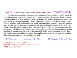
Experiments evidence template
Experiments evidence templateExperiments evidence template
Experiments evidence template
 
Model Planning 2
Model Planning 2Model Planning 2
Model Planning 2
 
Model Planning 2
Model Planning 2Model Planning 2
Model Planning 2
 
Task 2
Task 2Task 2
Task 2
 
Task 4 Final Images Portrait Review Work Sheet
Task 4 Final Images Portrait Review Work SheetTask 4 Final Images Portrait Review Work Sheet
Task 4 Final Images Portrait Review Work Sheet
 
FMP: Updated Evaluation
FMP: Updated EvaluationFMP: Updated Evaluation
FMP: Updated Evaluation
 
Photography experiments
Photography experiments Photography experiments
Photography experiments
 
Evaluation
EvaluationEvaluation
Evaluation
 
FMP: Unfinished evaluation
FMP: Unfinished evaluationFMP: Unfinished evaluation
FMP: Unfinished evaluation
 
Evaluation
EvaluationEvaluation
Evaluation
 
Evaluation
EvaluationEvaluation
Evaluation
 
Pet Sematary Photoshoot.pptx
Pet Sematary Photoshoot.pptxPet Sematary Photoshoot.pptx
Pet Sematary Photoshoot.pptx
 
Evaluation
EvaluationEvaluation
Evaluation
 
Competitive photography principles
Competitive photography principlesCompetitive photography principles
Competitive photography principles
 
Experiments evidence template
Experiments evidence templateExperiments evidence template
Experiments evidence template
 
Documentary photographers
Documentary photographersDocumentary photographers
Documentary photographers
 
CONTACT SHEET FOR IMAGE LOG actual.pptx
CONTACT SHEET FOR IMAGE LOG actual.pptxCONTACT SHEET FOR IMAGE LOG actual.pptx
CONTACT SHEET FOR IMAGE LOG actual.pptx
 
Task 2
Task 2Task 2
Task 2
 
Experiments Evidence Template
Experiments Evidence TemplateExperiments Evidence Template
Experiments Evidence Template
 
Development pro forma
Development pro formaDevelopment pro forma
Development pro forma
 

Task 6 Critiques

  • 1.  
  • 2. Ranking 1: Mooncat, Bank Robbery Photo 1 Photo 2 Photo 3 Photo 4 Photo 5
  • 3. Head judge: tinaateurface, 2 When it comes to photography, your team generally pulls out ahead. Your framing and cropping is pretty good, and the lighting isn’t horrible considering what you have to go off of. I’d still like to see you pull your photos together better by using photoshop in a way that increases how aesthetically pleasing your photos are (i.e. color, lighting, etc.). Take a look at the favorites of deviantart and some photoshop tutorials. Feel free to look at my favorites folders (my username is tinaateurface). From the beginning of the competition, you have stood out as one of the better teams. My only concern is that, when compared to the other teams, you have probably improved the least from beginning to end. This probably has to do with the fact that you started much better, but you should still be improving, especially since there are still things to critique in your photos. You guys have had a great run so far though, and I wish you luck. Photo 1: This is a great photo to begin with as it definitely creates the setting. Before I understood your concept, I was put off by the toys in the hallway, however, now that I look at it with a clearer eye, I love the detail. While the photo is good though, overall it doesn’t have a huge impact. I think this is mostly due to the poor lighting, which I understand you don’t have huge control over since you’re inside. Even so, the dull color takes away from the photo. The contrast could also be increased here, to sharpen the photo. Photo 2: In terms of photography, this is a pretty great photo. Although it bugs me that the spotlight is off center, I still like how you framed the model in light. The hand gestures are great as is the model’s facial expression, however, my only problem (with the entire set pretty much) is that the model does not look very child-like. The black outfit, although typical of cliche bank robbers, takes away from the childhood feel and kind of wrecks the setting. In this photo in particular, the model looks a lot older. That being said, it’s still a nice photo, and I especially appreciate the reflection in the piggy bank. Photo 3: This photo is by far my least favorite in the set, in fact, it pretty much cost you guys first place from me. My rankings were based off of following the task more than anything, since the whole idea behind the task came with how well you execute a timeline. This photo doesn’t really have a place in the timeline. Sure, it shows after the model has picked up the bank, but is this really important to the story? I think not. When you have to depict an entire story in only five photos, it’s really important that you pick your snapshots in time carefully. Not only did it fail to fulfill this requirement, but the quality of the photo is quite poor. I also don’t understand the model’s facial expression whatsoever. Simply put, this photo hurt your entire set. Photo 4: This photo is an example of when your model overacts. You seem to rally between being too expressive and not expressive enough. This maniacal look, while it definitely gets the point across, is too much. It looks to comical and unreal. Neither a bank robber or a young child acting as a thief would have this look on their face. I feel like in your entire set you’re borderline cute silly kid and scary crazy evil thief. I think you really should have committed either way. Nice photography though, the lighting creates a nice feel. Photo 5: This is by far your greatest photo. I love how you made the model appear smaller by standing the other person on a stool or something like that. The expression on her face perfectly embodies a little kid who has done something wrong and doesn’t really understand the guilt that they should be feeling. It’s a cute photo and a good conclusion to the story. My only problem is that for some reason the quality of the photo is especially low around the model’s clothes. The green pixelatedness is very strange. Good lighting though.
  • 4. Photography judge: Nick Sullivan, 2 What's with all the clutter? I liked the way your portrayed your theme, but the fact that there were random things in the photos definitely took away from their beauty. The final shot's angle is really interesting, and I like the reflections in the second and third shots, but I think that, overall, a bit more cohesiveness would have been a good idea. Also, the third photo seems kind of inserted, but other than those things, this was an okay set. Photography judge: Kaitlyn, 2 I will not lie. I didn’t think this team could pull off what they were assigned for their storyboard and, frankly, I was worried. But boy did you guys prove me wrong! I was BLOWN AWAY by the amount of creativity and quick-thinking you used to make this storyboard. I love the story, I think its hysterical. Unfortunately, the photography falls a little short of the master-mind. It was difficult, really difficult to place you guys in second place, but based on these photos, I had to. In the very first photo I had to squint at the sign. I have yet to be able to read it, and I’m still not quite sure its important. If it is, I hope its not integral to your story…because I have no idea what it says. Also, the photo is slightly out of focus and just generally not as clean as I’m used to from you. There’s a distracting…something. There in the hallway. I think it’s a vacuum. The third photo is remarkable, but its out of focus! I’m not sure if this is due to resizing, or just had something to do with the camera, but its an unavoidable fact. I know It seems like I’m picking the photos apart, but I really had to in order to make my ranking decisions. I’m really amazed by the quality of the second and final photos. They are staged, lit, and shot very similar to what I’ve seen in magazines and are really excellent photos all on their own. The other three don’t stick as well in my memory, and in the end…that’s what knocked you guys down to second. Photography judge: Sandy, 2 I enjoyed looking at your photos, and the story it told. For the first photo, I feel that you should have used a tighter frame or remove the little toys around the door, since it takes a bit of the focus away. The second one was amazing, great use of lighting and you had a nice, tight frame. The third one was a bit iffy for me. I felt that it was a bit grainy/unfocused but it had nice lighting and a tight frame. And for the last two pictures, they were a miss for me. I think the background/foreground in the fourth picture could be cleaned up a bit or perhaps fall out and the fifth picture should be a bit tighter and I don't like your use of lighting. Modeling judge: Cassandra, 1 This team did a great job once again and I found it very humorous (and cleaver) how they went about portraying the task. The first photo is a good prelude to the story and it’s easy to see that the model is getting ready to break in somewhere. There is one thing that does bug me however and that is that we can see that the sign says something but we can’t see what it says. I know it’s something small and doesn’t really matter but it’s distracting because it causes us to be curious with what it is but we aren’t being told. When taking photos you want to avoid things that may make the audience curious if they aren’t going to find out the answer later on as it’s a bit of a let-down. The pose overall is great although the model’s right arm seems a tad awkwardly placed and the angle makes it look disfigured. Make sure that the photographer lets the model know whenever something looks wrong so that the model can make the proper corrections. I can see some emotion in this photo but it does seem to be a touch too weak. The model has shown that she is excellent with expressing emotion so make sure that in every image you turn in you are doing the best you can.
  • 5. The second photo is a great photo all around. The pose is almost perfect and you can really see the model excited about her prize. I know that some other judges have said to watch your “manic-ness” but I honestly thought is was perfect for this shot - but of course everyone has their own opinion. There was only one thing that I thought needed to be improved upon in this picture and it’s the right hand. The angle that we have of it makes it look like there is no point where her hand changes to her arm and it’s just weird. Additionally I would have liked to be able to see the model’s right thumb more than we are able to see it currently. The third photo is perfect as far as the pose goes but I do feel as though the model can give us some more emotion in this shot. Additionally the photo just seemed to be lacking something in that it wasn’t as captivating as it could’ve been. Compared to the other photos in this set this picture just doesn’t really stand up. I know that some of the other judges have stated that this photo doesn’t help to progress the storyline and, while I disagree with this, I could think of another photo that could’ve replaced this one. Perhaps before your first shot you could have a scene where the model is getting ready to break in (getting dressed for example) which I can see you were playing with based on the photo that you have in your signature. That way you would be able to still complete the assignment with five photos while still continuing to tell us a story instead of lingering for too long on one part. Once again I thought that this photo really went but I think that my opinion may be outnumbered. Your fourth photo is great and is truly humorous. The posing is awesome and the manic cackling is very wonderfully portrayed. Unfortunately this photo has issues with lighting which did effect the overall modeling. With how dark the model’s clothes are and the color of the blanket behind her it makes the shadows seem to engulf the model’s body into the blanket. She looks almost as if her torso is protruding from a chest and her legs are disconnected from her body. It’s a shame that the shadowing effected the model’s pose so much as this would be a superb photo had that little issue not been there. I found that this round their fifth photo was the practically perfect one. Her pose is great and really ties in with the expression on her face. You can honestly believe that she is a little girl being sent to The Corner for trying to steal from her mommy (or big sissy). The staging is just wonderful and really makes it look both cheery and grim (the dark chair and black-and-white backyard contrasting with the floral wall paper, cutesy tiles and trying-to-be-cheery picture) which helps to make the model’s ‘guiltily-innocent’ expression all the more convincing while assuring the audience that she is in no real harm. I just love this photo all together and it was a great ending to the story. All-in-all this team did a superb job this round and I was highly pleased with what they turned in. I love how they went with a totally twisted take on what they were handed showing that they are able to take risks to get the job done as well as surprising the judges with a totally different outlook on the task. The model is hanging in there as strongly as usual with great and convincing poses tied in with awesome expressions and emotion. Just keep making sure that all your photos are perfect and have the photographer help you when it comes to assuring that you look great in every photo (and that a blanket doesn’t suck you into oblivion) and that your expressions are spot-on. If you believe what you are doing is real then so will the judges. In the next round also try to make sure you follow the assignment so perfectly that we will be struggling to find anything wrong with what you’ve turned in. Like I said, I didn’t find anything wrong but we all have different opinions - try to study the judges and go through everything that they’ve said to try to see if you can figure out what it is that they want to see from you. You two are doing an excellent job - now just keep hanging in there and keep trying to better yourselves. This is the final round now so really ensure that all your photos are ‘Picture Perfect’ and try to blow us all away. Modeling judge: Shawn Keeney, 2 Funny, funny, funny. The thing I really love about this team is that in all of the photo sets they've turned in, I see their sense of humor and personality and I really like that they're having fun doing the competition. I'm not sure if this was intentional or not--perhaps just a weird camera angle--but I'm wondering how she looks so little in all the pictures that show her full body. Well whether it was an accident or not, I loved it. Photo 5 cracks me up, just the innocence in the little scorned girl face is genius. I think this is a great comeback from last task; what a clever play on the assigned story. Great job again (but I would be careful about the face getting a little too manic, like in Photo 2)!!
  • 6. Photography judge: Momo, 1 Hilarious! I simply adore the spin put into this task. You could have gone very straight forward with a bank robbery but instead you put a little twist on it and it was wonderful. I loved the humor in the photos, they actually made me get this really wide, dumb smile on my face! For what could have been a very serious story, you twisted into a fun tale of a little demon child. First photo, there's not too much to say. I like the pose, the fingers apart from each other-- "grabby" you could say-- but there's something blending in with the right arm which contorts the figure a bit. I can't for the life of me figure out what it is. Something in the background? Hair? It's brownish looking. Other than that, it's nice. Wonderful outfit choice! Simple, yet it works, and easily looks like something a child could come up with. And are those pigtails? because that completely fits. Second photo is perhaps my favorite. The shadows on her face are awesome. The look of evil joy is overwhelming. Once again, the "grabby hands" really help emphasize the 'burglar' aspect. The neck is partially obscured by the darkness, but in this shot, I don't mind-- the focus is first on the piggy, then on her face. It's OK to look like a floating head in this case. In the third picture, I'm not 100% sure what facial expression she's making, but it's funny as heck. It looks like a literal "OMG" face. I like how one sleeve slid down a little bit-- it seems childish to me, unkempt, like how children might have one pant leg rolled up and one down. In the fourth picture, lovelovelove the expression. It's completely exaggerated, comical, but it fits-- that's almost the theme of the whole thing. Exaggeration. My only complaint here would be the left side of her body is completely blending with the shadows of the...thing behind her. I know I'm just judging modeling, but I must add the camera angle in the last photo is awesome. It really helps make the model seem like a small child--the size of the "mother" helps too. The crossed arms are great, and the comical expression is there, however the hands completely blend in at the elbows. I would have liked to see them standing out as it seems strange where they've disappeared.
  • 7. Ranking 2: 1867, Blind Date
  • 8. Head judge: tinaateurface, 1 While this was a solid set of photos, I really wish that they had been more crisp. Usually your photo quality is next to perfect, but this week (perhaps due to the indoor lighting) the quality was actually poor. What made me rank you first this week was your ability to follow the task and produce a timeline that showed a clear progression. Every photo was clearly necessary to the set and each made sense in the order that they came in. My only other comment is that I think you played it a little safe this week. This task gave a great opportunity for creativity and acting, and I think you downplayed this aspect. You chose to portray a typical blind date when you could have created some sort of drama. While you have definitely improved the quality of your photos, your creativity has taken a slight drop this week. Bring back that awesome and unique quality from the beginning of the competition and combined it with your improved compositional skills. Photo 1: I like the set-up to your story with the ad and phone call, however, this isn’t a very compelling photo. It’s great that the model is smiling and her expression is very real, but the rest of the photo is pretty plain and boring. The lighting is pretty poor and the model’s face is tinted red, two things which I believe you had control of this shoot. As you can probably tell, I’m not a great fan of this photo. Luckily, this is probably the worst one in your set. In the future, while you shouldn’t turn in any weak photos, you should be especially careful that your first and last photos are exceptionally strong. Photo 2: This is probably my favorite photo of your set. While you used a traditional mirror shot for flavor, it is well executed and quite crisp. I love the model’s facial expression, and the colors in this photo are phenomenal. The photographer did a great job of framing this photo although I would have cropped out the bottom right black corner of the door. The perspective is nice though and the model’s expression is refreshing and crisp. Nice job with this photograph. Photo 3: A great example of a classic photo. The model’s expression is pure and I like the symbolism behind the roses on either side. The colors are really cool, although they’re also a bit harsh on the secondary model’s face. As strange as this sounds, the wall looks wonderful and soft, which reflects the mood of the model’s and the photo. I also love how the glow of the light rests on the joining hands, also quite symbolic. The photo does seem a bit out of focus though, which is something you should look out for. Photo 4: This photo has great symmetry, although it does bother me that the light isn’t centered within the frame and the chairs aren’t evenly cut off. Next time, make sure to crop your photos evenly, it actually makes quite a big difference. Again, the colors are really nice, but the lighting is still kind of weird. I love how real the expressions of the model’s are though. I guess that’s what I like the most about your set; they’re just so real. Authenticity is written all over these photos and it’s really nice to look at even though the quality isn’t as clear as it should be. Photo 5: There are a lot of good and bad things about this photo. The framing with the light and the wreath is great and the glow of the light over the model’s is symbolic of their successful date and blooming love. The modeling is daring, which is much appreciated, however, it does have its faults. The primary model’s shoulders are too hunched which makes her posture quite awkward. The legs are also a bit too forced, specifically the straight and harsh angles. However, I absolutely love how both models are holding the flowers now. This is a great detail of time progression and a key way to bring out symbolism. Taking something from earlier in the set, and transforming its meaning in the end, is quite wonderful. Great job with this photo, although the composition could have probably been more clean.
  • 9. Photography judge: Nick Sullivan, 1 Your storyboard was really coherent and effective. Each shot was different, and yet they all seemed to link together in more ways than just plot. Your use of framing was really good, especially in the final photo. You also really seemed to feel your emotions, rather than act them. Photography judge: Kaitlyn, 3 I am not really pleased with these photos. They’re alright, but they’re not the most amazing work we’ve seen from this team, which it should have been, given this is the last task. That being said, really nice work on the storyboard here. I can see you were a bit pressed for location, but you made it work. I’m pleased with that aspect. Unfortunately, it looks like the putzed out compositionally in the last three photos. They’re blurry, and lack the compositional and angular complexity of the first two. Aditionally, I think they could have been cleaned up at bit. Photo three has an extra chair at the table that isn’t there in photo four. There’s the cluster of wires in the bottom right of photo four, as well as the tiny sliver of the over-head light. The elimination of these things could have really cleaned up your last three photos…made them more professional. However! I think you really deserve some credit for seriously thinking through the challenge this week. You thought about what it was like to go on a blind date. I assume the news paper in the first photo means the character answered a personal add. She looks excited when she’s getting ready (And the photo is also brightly lit; excited!). Good good work with the storyboard…just not what I expected for the final task. Photography judge: Sandy, 3 First of all, I think you guys did a great job with the theme that was given to you. However the composition was a bit iffy. The lighting in most of your photos is okay, except for the second, which is amazing. The last three photos don't really have a center of focus and is a bit blurry. The fourth photo looks like it should be cropped, and I'm struggling on whether that's true or not for the fifth picture, but I'm thinking it would be better if that light post(?) wasn't there. I feel that if you replaced those last two photos, I could given you a higher rank. Modeling judge: Cassandra, 3 After the last round I wasn’t too impressed with this set of photos unfortunately. These photos were good all-in-all but last week’s set was just a lot better. The first photo was a very cleaver way to start the story and you can clearly see that the model is contacting someone in a newspaper ad. The model’s posing is fair although it isn’t as strong as it could be; first of all her right forearm is completely gone and it makes her hand protruding from the paper seem weird without an arm. Then second, with how loosely her legs are tucked in we should be able to see a bit of her feet (or slippers possibly) to let us know that her legs aren’t just disappearing into nowhere. The last bit of error is one of the most annoying things to fix and/or avoid; her eyes. It’s excruciatingly hard to get a photo where the model is closing her eyes and have it look good. I know that she isn’t closing her eyes but with the angle of the shot and how far down she is looking it appears that way and it just simply detracts from the photos. This could be fixed by having her possibly look above the newspaper (this is where the photographer’s input comes into play) so that we can see that she is looking at the ad instead of sleeping away while talking on the phone. I do really like the way that the model is holding the phone - we can clearly see the definition in her hand and it looks very strong and well posed. I can sense a good amount of emotion coming from the model in this picture although it isn’t as strong as it could be.
  • 10. Unfortunately I didn’t find this photo to be too interesting to look at. I can’t really place why but it just isn’t all that intriguing. When you’re taking photos you want to make sure that every photo you submit will catch the viewers eye and just make them want to gaze at the photo; I’m sorry that I can’t really offer advice on this one as I don’t know exactly why it’s not captivating but I’m sure that the other judges might have some more input on how to make a very intriguing photo. Out of this set I found that their second photo was the best one. The concept is great and really goes along with the storyline, the modeling is very nicely played out and this photo has a good feel coming from it. As far as her posing goes I can only find two issues in this shot; the first one is her left arm(her actual left arm, not the reflection’s) - the forearm and the upper arm seem to be morphed into one object due to the lighting and the tone of her skin and it’s hard to see that they are two different parts. Then the second little quip is the way her dress is bunched up behind her looks a bit awkward. You should try to avoid having your clothes turn on you when you’re taking photos so try to keep an eye on awkward clothe bunching. This photo has a really great feel coming from it; you can clearly see the adorable innocence and excitement coming from her as she gets ready for her date. It is very easy to see that she is getting ready to go out even if you have no idea of the storyline and that is an excellent factor. This team’s third photo I felt was the second best out of their set. The model’s pose is spot-on with my only issue being that I would have liked to be able to see some of her shoulder - not necessarily all of it since the photo is cropped like it is but it just seems weird to be able to see her forearm without seeing where it’s coming from. She is doing a great job at expressing emotion in this picture and you can really see that she’s both excited and nervous about going out with a guy she’s never met before. Perhaps the photo could be a little better had there been a hint of blush on her cheeks to make her look a bit more nervous but that may just be my opinion. This is a great third photo to the set introducing her date for the evening and helps to continue to tell the story. As some of the other reviewers said, this team’s fourth photo does look like a ‘real-life moment’ although I don’t look at that as a plus in this case. This shot looks like it came from a movie - as if someone was watching it on their computer and took a screenshot. Perhaps this is due to how blurry and out of focus the shot is but I do find that to be a bit distracting. I do like that this image continues to tell the story so that is a plus for this team. The model is doing a decent job at posing although I do feel as though her left foot is a touch too high and almost seems like it’s disappearing into the table. Speaking of feet I have to question why the model isn’t wearing any shoes? I find that typically when you are going on a date you would wear shoes and it just seems awkward that there aren’t any in the photo. Along the lines of posing I do find that the model’s left hand seems a bit too tilted in this shot and it’s fairly distracting. Something like this could be fixed by her lowering her forearm some or drawing her elbow back a touch. I can see emotion coming from the model but it does seem to be lacking a little. I am speculating though that this comes from the blurriness of the shot - it’s hard to see emotion when her face is outlined by a bunch of pixels. I honestly didn’t care much for this team’s fifth photo and, just like the first one, the shot just wasn’t too interesting to look at. The posing is alright in itself but I feel it could be better. First, due to the lighting and the choice of wardrobe, the model looks like she doesn’t have an upper arm. This could be avoided by holding her arm back a little instead of letting it hang vertically with her body so that we could see that there is some definition. Second, the model’s left leg looks awkward the way it is lifted up - I can’t really think of a way to fix this though but something just looks off about it. The model’s right leg looks strangely short in this photo but I can’t place why either. Honestly I can’t really see any emotion coming from the model in this shot and it’s really missing that extra punch that emotion brings to a picture. This was a good ending to the story and helped to pull it to a close so, in that respect, good work. Overall this team did a fairly decent job at telling us a story and it was well-communicated and flowed nicely. As I said earlier, I do believe that this round wasn’t up to par with the last round but they did decently none-the-less. The model just needs to make sure that her posing is superb in every photo (which she has shown she is capable of doing) and this is how the photographer can help. Make sure that as you are taking the photos of your model you are honest with her and let her know about things that should be changed, excluded or added. Additionally keep working on emotion. You want to wow us in every shot that you turn in and really try to captivate us. Believe the story that you’re telling us and really draw us in so that we don’t want to look away. Try to make sure that none of the photos you turn in are boring or uninteresting. Make us want to just gawk at the photos and wonder how you possibly managed to express so wonderfully in every photo (and for the photographer - make us wonder how you are so awesome with a camera). For the final round you two will need to really push it, push it, push it and make sure that all your photos are truly ‘Picture Perfect.’
  • 11. Modeling judge: Shawn Keeney, 1 Phenomenal job!! I was amazingly impressed with every picture. Brilliant modeling; every emotion looked sincere and genuine and I believed it. My favorite photo is Photo 4 because it looks like a real moment, something that's truly occurring. None of the pictures look posed or fake. I love that it's really a story that flows and has a beginning middle and end. As far as technical modeling, also amazing. The only thing I noticed was that in Photo 5, the shoulders are raised up a little too high and it looks a bit awkward. Other than that, superb. I know it sounds like I'm repeating myself a lot, but there's really not much to say other than EXCELLENT! Modeling judge: Momo, 2 You guys have come a long way and I really feel you deserve to be in the top two. Originally I figured you'd be kicked out early on, but you continued to grow and take our critiques and use them. What I've seen lately has been wonderful. This week's wasn't the greatest, in my opinion, but I feel you have shown your capacity to grow and I wish to see you do one final task. This round was a little bland for me. You followed a storyline excellently, but it was a little boring. There wasn't much pizazz in the story, and I know you guys are capable of adding neat little twists. The first picture is a nice, casual picture. The pose is relaxed, she looks happy, but I'm not 100% sure what she's doing with the paper, though it is open to interpretation (personally I feel she's either searching for a blind date or was just working on the crossword puzzle when someone called her and said-- "Hey! I have a blind date for you!") My main complaint here would be that her chin is blending in a little bit to the shoulder. Perhaps a different light or little bit of burning in photoshop could have fixed that. I like the angle in the second picture. You're drawn to her reflection, but you still see her out of your side view. Once again, there is blending-- the left arm blends in a bit with the shoulder and it's hard to tell where her arm is bending or what it is doing. The expression on the face is another nice, calm, content one. She's obviously happy to be going somewhere and wants to look nice! I like how her bangs are pulled back, as well-- that's a really natural thing to do, I do it all the time while applying makeup. It adds a nice realism to an already realistic picture. The third photo was probably my favorite out of the set. I really liked the nice, warm colors of the decor and lighting contrasting with his cool-colored hair and her cool-colored dress and necklace. It's once again a very realistic picture-- it doesn't look posed at all. The models look wonderful, all dolled up and like they're on a real date. The framing of her hair on her jawline and face are perfect. The fourth picture was cute, and once again, I really like the warmth of their surroundings. It feels like a very comforting, inviting photo. I like the holding hands sort of hidden-- it's not the focus of the picture, but it's there, and it's adorable to see. The models (once again) look very natural, if just a little underexposed(left) and overexposed (right). The only thing I noticed was that she was wearing no shoes! I thought I saw someone talking about it in the forums, and it's not a huge deal, but it certainly can be seen by someone judging the photo, but perhaps not by a passerby. The fifth photo is OK, but I feel the focus isn't really on the models. The first thing I look at is the lamp, then the models. The leg up is a little dramatic, and considering how natural all the photos seem, a little obvious. Unless some people actually lift their leg like that, but personally, I've never seen it outside of movies. It's cute, though, and other than that, realistic. The kiss looks kind and sweet.
  • 12. Ranking 3: Uh Oh Spaghetti-Os, School Day Photo 1 Photo 2 Photo 3 Photo 4 Photo 5
  • 13. Head judge: tinaateurface, 3 Unfortunately, your set was the only one in which I saw no succinct timeline. Their first photo was an obvious beginning to the story, but the rest were merely snapshots from a school day that could have been put in any order. Since the real purpose of the task was to create a storyboard and the other teams did this, I automatically placed your team last. While your biggest problem was your lack of a timeline, your second was the overexposure in most of your photos. You’ve been cutting down on the photo-shopping which is good, but the lighting is still too bright and the contrast too high. I’d still like to see you cut down on the shopping a bit. Overall, I’m very happy with your improvement throughout the competition, and I think that you’ve come quite far. Just keep on taking photos and keep analyzing yourself and you should come along nicely. Photo 1: The first photo got me really excited to see the rest of your set. It’s an obvious beginning of a timeline and I like the idea behind it, especially since I’m one of those people who likes to finish up their make-up in the car. I also like the glow of the model’s left eye and the pursing of her lips.. My problems with this photo have to do with the photography: the framing and the lighting. The mirror is awkwardly cut off and doesn’t take advantage of the natural frame already there. The lighting and contrast is a bit too harsh, making the white corner of the mirror and the model’s hair on that side look strange. Otherwise, nice photo. Photo 2: This is a cute photo...unfortunately the photography makes the photo looks like it was taken by a friend documenting the first day of school. The model’s expression is cute, although her gaze leaves me wondering what she is looking at. I like the slanted photo composition, but I really wish the photographer had taken advantage of the cool perspective of parallel lockers in a hallway. Especially with those cute frog stickers; the setting is kind of asking for perspective play. The elbow looks funny cut off, and I really wish that the photo was overexposed and the model’s face so washed out. I don’t know if this is because the exposure settings on the camera are off, or if the photo is simply over-contrasted in photoshop, but the really bright washed out look is not a good one. Photo 3: Eh, what’s going on here? I’m utterly and completely confused. Why is the model licking a phone and what does this have to do with a school day? If you were relying on the apple and outfit to tie the photo to school, that was a mistake, and even if you were doing this, I don’t understand why the model is licking it. Is she supposed to be eating lunch? I understand that we’re in a tech savy generation here, but that’s a bit much if that’s what you were going for. Not only is the school reference lacking here, but the photo itself isn’t that great. The slanted angle doesn’t work here, the model’s legs are awkwardly too close to the camera making them appear much larger, and the photo is way way overexposed. It’s so overexposed you can’t see where her shirt ends on her arm or the students milling on the lawn in the background (which would have massively helped your school portrayal). I also don’t see how this fits in a timeline. Starting with this photo is where I start to see the storyboard drift off course from the task. Photo 4: I definitely like the comical aspect of the photo, and I wish my school had such comfy looking chairs. While I think the idea is nice, I’m not crazy about the execution. Sometimes extreme perspective looks cool, but in this case the arm and hand just look awkward. Also, the horizon line is off and the photo is at a slight tilt, which makes the photo look less clean and professional. I am also unsure of whether the background is enough to represent school or not. Rows of desks give you a lot to work with when it comes to compositional lines in a photo, and I wish that you had taken advantage of this. Photo 5: While this photo is definitely cute, it doesn’t really add up with the rest of your theme. I actually think it would have been cool if you had gone with an elementary school theme. You could have made that really interesting, cute, and possibly editorial even, however, you did not. Your model is dressed in an outfit (especially those heels) that makes it obvious that you set your age at high school and older. I honestly don’t know of any high schools or colleges with playgrounds, which makes this photo very misleading. Basically, the setting makes no sense with your theme.
  • 14. Photography judge: Nick Sullivan, 3 I really expected more. You guys have definitely improved the most, but your photos are all overexposed and kind of random. The 'apple' in the third shot is hardly recognizable, and even once it is recognized, it leaves room for confusion. I think you could have done much better, but its not a horrible set. Photography judge: Kaitlyn, 1 First of all, I’m really proud of this team. You’ve come so far and put in a lot of really hard work. Secondly, I love this set. It reminds me a lot of my middle school. I’m glad you chose a uniform, even though it does sort of beat the viewer over the head with the “school” theme: but a lot of storyboard photography and editorial photography is like that! I also appreciate the progression that you chose: for example, putting the “Sleeping while studying” photo AFTER “lunch”…when students are more likely to be sleepy. But the thing I love most about these pictures is that they’re all great on their own. They all stand out as well composed, well staged and well thought-out photos…put them together? They tell a great story! I have very little to critique on these photos, other than to shout about how much I love them. The lighting, the color palette… everything is just wonderful. Its made even better knowing where you all were when you started this competition. Photography judge: Sandy, 1 I really enjoyed your submission this week. I felt that you used an expressive approach, letting the audience decipher your photos. I liked that you mixed it up a little and took a few risks. The first and second pictures could have had better lighting and it seems to me like the first was a bit out of focus. I liked the third because it's a bit intriguing. At first I thought you were just licking a phone at lunch, because that's the time when most people text like savages at my school and that's their lunchtime routine but then I thought maybe it was about anorexia, but your expression makes me think otherwise. The fourth made sense to me because of the lunch picture, and I do apologize if it isn't referring lunch, but anyways I pictured how I usually feel after lunch: sleepy. Then the fifth was probably my favorite, time to go home and the freedom it brings. The only thing I would suggest for that photo is having the background fall out because it draws a bit of focus away from the model. Modeling judge: Cassandra, 2 Unavailable this week.
  • 15. Modeling judge: Shawn Keeney, 3 *sigh* I'm afraid this is just not good enough work to be turning in this late in the game. I agree with PPC that their pictures really don't show any progression in time and you could literally put them in any order you wanted to. Okay, the first two photos are kind of in progression (girl gets to school and checks her make up before going inside, then she gets into her locker for the day) but after that, it's just kind of....just no. Why would anyone be licking their phone, even if there is an image of an apple on it? Nonsensical. When Photo 4 popped up on my screen, the first thing I thought was "Good Lord her hand looks huge!" followed shortly after the thought "Hey, some of the books in the library I work in have those blue stickers too." Then I wondered, if this is a high school, when does one have time to not only go to the library, but fall asleep in the library? Then Photo 5 just kind of throws the whole thing out of whack again, because I've never heard of a high school with recess before, or even a playground to have recess on. In any case, I just think this is not good enough to compare with the other teams' photos, and I don't think they've got enough past greatness to let me look past the low spots this task. Modeling judge: Momo, 3 This time around, I was a little confused by the photos, and that there was a rudimentary timeline, but things could still be switched up a bit. You've shown sporadic progress, but not as evenly as I would have hoped. You definitely have deserved to make it this far but I think it's time to go. In all honesty, the first photo was the one that made the most sense to me until I got to the other photos. In this one, we see a girl putting on her makeup in a car mirror. Ok, she's most likely a teenager. I really liked the cool colors of the car vs the warmth of her hair, eyes, and the shrubbery. However, going on to other pictures, I'm not quite sure what age group she's supposed to be in. If she's a teenager, why do her lockers have frogs on them? Why is she at a playground at the end? My highschool doesn't have a playground. If she's a child, why is she doing her makeup in a car mirror? Isn't makeup more of a teenager thing? I was aware kids were growing up fast, but I hope they're not doing their makeup in car mirrors nowadays. The second photo was OK. Her pose is good, I feel she's a tad overexposed, though, and the shadows around her chin aren't too flattering. The makeup seems heavier here and I can't tell if her eyes are closed or not. The third photo, once again, I feel the model is overexposed. She's practically glowing and blending in with her shirt. Also-- I don't understand this. I get the lunch time feeling, but licking an apple... on a phone? Couldn't she have had a regular apple and be holding it, eating it, doing something with it--other than licking it? It just seems strange and doesn't fit. The legs seem a bit strange, being cut off right under the knee makes them seem stubby. The fourth photo is AMAZING. The exposure is perfect here. The softness on the model's face is very pretty. The makeup looks just right. The slight droop to her lips suggest she's actually sleeping! The slumped body, limp wrist, etc are all 'sleepy' without being unattractive/slouchy looking. I like how the hand is extended towards the camera, as well. The fifth photo is OK. She doesn't have a neck! The hair covers it all up. That creates a strange effect that she has just a floating head. There's not much 'motion' in the picture-- it doesn't look like she slid down the slide, it looks like she's posing (mostly due to the crossed feet, and the unrealistic outstretched arms-- if you're going down a slide, I don't think you're reaching up.). It's cute, though