Plan-B Studio SS10
•
1 gefällt mir•524 views

A small taster of some recent, and not so recent work including a new web site for The Shop at Bluebbird. A branding, identity and web site for Upping Your Elvis; a site to represent the motivational speaker Chris Baréz-Brown. An interrim web site for RedDot Clothing as well as many other juicy bits of work.

Empfohlen
Weitere ähnliche Inhalte
Was ist angesagt?
Was ist angesagt? (14)
Andere mochten auch
Ähnlich wie Plan-B Studio SS10
Ähnlich wie Plan-B Studio SS10 (20)
Mehr von Plan-B Studio
Mehr von Plan-B Studio (20)
Kürzlich hochgeladen
Kürzlich hochgeladen (20)
Plan-B Studio SS10
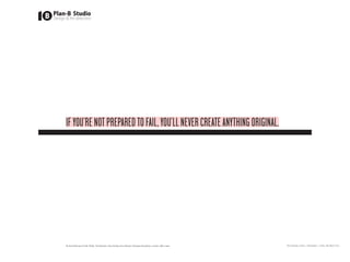
- 1. IF YOU’RE NOT PREPARED TO FAIL, YOU’LL NEVER CREATE ANYTHING ORIGINAL. Sir Ken Robinson (5 Feb 2009). The Element: How Finding Your Passion Changes Everything. London: Allen Lane. Plan-B Studio Limited | Presentation | Friday 19th March 2010
- 2. ANImIs OPIbUsqUE PARATI* Established in 2000 by Steve Price, Plan-B Studio is a with a blank page, a sharpened pencil and begins with plan-bstudio.com creative agency with global experience, consisting of a core a discussion. steve@plan-bstudio.com studio team (Steve) and an extended network of talent. I have spent the last ten years building not just a design +44 (0)7971 207 276 Steve believes his job is not to preach to clients about consultancy, but a network of passionate, creative and what his role is but to learn as much as possible about innovative peers across all media. The industry that we work you, your company and your business model. That way in has evolved and very rarely do you find one agency that the resulting creative work you pay me to do is based has all the relevant skills that is so often required for most on informed attributes rather than desires to make pretty projects. Those that say they do, are either lying, or not lying; shapes. mostly lying though. There is no need for mystery, barriers or illusions between Steve is a visiting lecturer at the Arts Academy Bergen, designer and client. A project starts with a discussion which, Hyper Island, Central Saint Martins, Cardiff University, LCC, in theory, should never end. Ultimately, for Steve, it is about Nottingham Trent University, Winchester Art School and KBU working with people who are equally passionate, driven and in Kuala Lumpur. As well as recently awarded an Associate- brilliant at what they do. Professorship from the Arts Academy in Bergen (KHiB). Steve once said that ‘Just as behind every man there is a Steve also used to be a chef and still relishes cooking an great woman, so too is a great idea behind every design.’ (he baking: lilchef.posterous.com wasn’t drunk). Every project is different and is approached * Prepared in spirit and resources Plan-B Studio Limited | Presentation | Friday 19th March Presentation | Friday 19th March 2010 Plan-B Studio Limited | 2010
- 3. ONLINE www.theshopatbluebird.com www.uppingyourelvis.com www.reddotclothing.com www.arisingartist.com www.jobsgopublic.com Plan-B Studio Limited | Presentation | Friday 19th March 2010
- 4. TsAb GOEs ON THE bLOG! The fashion industry is constantly changing; twice a year to Client: Shop at Bluebird (since 2009) be precise. The Shop at Bluebird is an amazing, high-end www.theshopatbluebird.com fashion labyrinth of all things desirable. Project: Web site/CMS/marketing What makes the store unique is not the informal, relaxed, Design & Art direction: Steve Price friendly staff and atmosphere, or the amazing array of Developed & Build: Nico Nuzzaci clothes, accessories or even the fact that everything you see in the store is for sale (chairs, lights, tables, even the till; probably). No, what makes TSAB so different is the layout. Adapted and changed weekly to suit their mood, or the season, or just because! So when I was tasked with the role of creating a new web site all of this fed in to the conceptual approach. Through my discussions with Paul Baptiste, operations manager, we concluded that the site needed to feel fresh, up-to-the- minute, and constantly changing; like the store itself. I brought Nico Nuzzaci on board to help realise the new sites potential and together we have created a content managed site using the free blog engine Wordpress, marking a new era of how customising free platforms can help stretch the possibilities, and budget. Paul Baptiste, Operations Manager for The Shop at Bluebird, said, “Prior to Steve [Plan-B Studio] working with The Shop at Bluebird (TSAB) we had what we thought was a very static website; clean and simple but not very effective or reflective of the changing moods of the store. The new site is much more flexible and therefore representative of the store as it is today. It is informative, light-hearted and visually more appealing, newspaper-style coverage our happenings daily weekly and monthly.” “What we love is that the new site provides us is a platform with which we can really show our personality both as a store and as the passionate individuals who work here.” I am currently working with TSAB on their off/online marketing and strategy, including HTML emails, printed literature and a new bi-annual ‘trendbook’ Plan-B Studio Limited | Presentation | Friday 19th March 2010
- 5. UP YOUR ELVIs, I DARE YOU! “Steve is the dogs bollocks!! I have used Client: Chris Baréz-Brown (since 2004) numerous designers and no one has come close www.uppingyourelvis.com to him in his ability to nail the brief and make the creative birthing process enjoyable. Project: Logo/Stationery/Web site He is pragmatic and yet creative, he knows what Design & Art direction: Steve Price works and is not shy in telling me, professional Built by: Steve Price yet bloody funny. I am looking forward to my next idea that needs his help!” Chris Baréz-Brown When Chris came to me he had already begun the of having his identity and web site for Upping Your Elvis (UYE) designed. He asked for my opinion. I told him what I thought and based on that advise, he binned what he had, tripled his spend and hired me. Chris is in the business of motivated people, and sometimes large numbers of people for sustained periods of time. He’s a character and brilliantly open to ideas and input. His identity, for me, needed to echo this personality, whilst also playing more on the phonetic emphasis of each word. So ‘Upping’ became the tallest and loudest. ‘Your’ the same but slightly smaller, and ‘Elvis’ bold, and punchy. I introduced an endless banner than seemingly and steadily moves upwards to the right. Growth, and hope. Or just a great orange banner that, with the black (or white) background, creates a great big slice across the screen, page, powerpoint, business card. The web site needed no complex functionality. I recommended that since this new venture is all about Chris, so rather than use lots of words, we should use him, literally. Recorded on his own HD Flip camera in various places around his house we posted a video for each section. This helps Chris deliver his message personally, whilst cross- fertilising other platforms with his content. This fed in to his email communications, his business cards and soon his blog and twitter page. Plan-B Studio Limited | Presentation | Friday 19th March 2010
- 6. REDDOT CLOTHING Client: RedDot Clothing (since 2005) www.reddotclothing.com Project: ‘Interim’ Web site Design & Art direction: Steve Price Front/backend build by: Matt Booth “We have found it very difficult to find people to work with on Red Dot. As a general rule they either don’t get it at all, get it but can’t take it forward, or get it, could maybe take it forward but can’t get it together. Our experiences with Steve have been that he got it, moved it forward and all without any drama ... I’m not sure what this says about him but it’s been very good for us.” This ‘interim’ web site is the third web site I have designed and produced for RedDot Clothing (RD). Sounds like a lot in five years? Well, the first was a ‘holding site’, the second the ‘actual’ site (still live, and this one represents an ‘interim’ site. As the name suggests this is a temporary web site that will be going live soon. RD are in the process of working with me on the scope for a new web site that will include a full e-commerce solution. In the meantime rather that update the current website, which we all feel needs to be replaced, I’ve come up with a better solution and thankfully RD agree. Matt Booth is a flash guru and knowing he has a ready- built engine which calls images from a Flickr account I enlisted him to tweak it for RD; who wanted a solution that (if possible) they could update. So all RD will have to do is upload new images to their Flickr account, adding a title, description and tag each image with a link to their shopify page and this will update their web site. Providing the user with a catalogue of images to look through and/or buy. Plan-B Studio Limited | Presentation | Friday 19th March 2010
- 7. ARIsING ARTIsT A project to re-design the web site for Arising Artist. Their Client: Arising Artist (since 2008) old site was a mish-mash of heavy colours, too much text an www.arisingartist.com tired repetitive layout and design. I stepped in a stripped the whole site back. I minimised Project: Web site re-design the use of colour, but made the colours much flatter and Design & Art direction: Steve Price brighter. Build by: In-house I encourage more space and less text. Simple and easy navigation. Concise and clear copy that was easier on the eye. Creating a clear, but strict grid enables a much easier level of consistency and usability, along with a restricted colour palette and easier to read copy. Plan-B Studio Limited | Presentation | Friday 19th March 2010
- 8. jObs GO PUbLIC “Our web site was in dire need of a refreshment Client: Arising Artist (since 2008) to bring us in to 2008 and beyond. www.jobsgopublic.com As part of a long-term strategy we brought Steve [Plan-B Studio] in to art direct and design the Project: Web site re-design look and feel for our new site; with an attention Design & Art direction: Steve Price to the UI experience. Build by: In-house This resulted in Steve presenting not one, but two directions that we loved. The designs were fresh, and gave a much more human feel; which being a public sector recruitment company, was brilliant. In September (one month after launch) our unique visitors soared to over 400,000, our biggest leap ever. “ Eben Halford Technical Director, JGP jobsgopublic (JGP) is a public sector recruitment web site who were in dire need of a refreshed user-interface design for their site. They wanted an emphasis on getting more people to register, but also to enhance the whole user experience. From their current site (scroll right to see the site before I worked on it) I worked with JGP to restructure the general layout, moving all advertising to the same place (right) and below the branding/navigation. I introduced a more impactful use of photography with ‘feature’ panels. Making the whole site much more attractive, whilst not being ‘too heavy’. Using a mixture of serif fonts for headings and navigation (set in lowercase) also helps to create a much less informal environment. Plan-B Studio Limited | Presentation | Friday 19th March 2010
- 9. IDENT/LOGOs Entity Partnerships MorMor Viking Ninja Cowboy PokerTrillion Hvitbryggen Nyksund LD Communications Various Plan-B Studio Limited | Presentation | Friday 19th March 2010
- 10. The project was introduced to me by Concept Guardian, an Client: Entity Partnerships architectural consultant with a difference - he’s actually very Project: Logo good at his job! Design & Art direction: Steve Price The brief was quite simple – to develop a new identity, and brand for Entity Partnerships, a regeneration development company with strong beliefs in sustainable regeneration through partnerships in the industry. The result was an identity that doesn’t SHOUT, or scream off the page. It doesn’t need to do this because the company has very strong foundations from the people who run it. It was designed to have a warmer, softer more human feel to it. But a brand is more than just this, and you can read more about how this design was developed by clicking here. “We were delighted with how Steve was able to successfully interpret our Initial brief and work patiently with us to refine it. The final logo design and brand is modern, timeless and sophisticated. It is consciously understated and achieves impact through innovative print technologies which create a tactile and memorable stationary set. More than a year later and I’m still delighted by the positive reaction I get when I hand out a business card. Recently someone commented on how expensive it felt – in reality it isn’t, just very cleverly designed and well produced.” Plan-B Studio Limited | Presentation | Friday 19th March 2010 Karl-Heinz Richter, Entity Partnerships
- 11. I’m a man that likes a challenge. I am also a former chef and I Client: - do like to cook and bake. Project: Logo MorMor, meaning Grandmother in Norwegian, is the start Design & Art direction: Steve Price of a new venture I am planning in Norway. I cannot say too much but needless to say that I hope the logo suggests what the beginnings of this venture might entail. Plan-B Studio Limited | Presentation | Friday 19th March 2010
- 12. v I’m not a comic fan. I don’t buy them. Haven’t done since Client: Andy Lieberman/DC Comics I was a child, but no man worth his masculine DNA make- Project: Logo ident up could have gone through his life without knowing of, Design & Art direction: Steve Price hearing about and buying at least one of the comics, books, merchandise produced by DC Comics. Probably one of, if not the biggest name in comic superheroes. I got a call from a guy who was pitching an idea for a new character called, you guessed it, Viking Ninja Cowboy. A lot of fun, and excitement making a logo ident for a new comic. Unfortunately I don’t know that DC Comic’s felt the same about the story, but I loved the identity I created. Plan-B Studio Limited | Presentation | Friday 19th March 2010
- 13. Poker Trillion had already had a website designed for them, Client: PokerTrillion but not to their liking. When I was invited to come in and Project: Logo/Web site ‘help’ I agreed with one request - that I redesign their brand Design & Art direction: Steve Price as well as the entire site. The want to target their brand/product at the more discerning, more sophisticated poker player. Without being too obvious I wanted something very bold, but not too masculine. Something that had a touch of detail, without screaming ‘CARDS!’, ‘POKER’ or ‘GAMBLING’. Almost every online poker games branding and livery is green - how very ‘new’ that idea is. This ident and the branding that is rolling out across the on/ offline launch campaign is about being strong, bold but with taste and subtly. Plan-B Studio Limited | Presentation | Friday 19th March 2010
- 14. This is a project that has been on-going for us for a while Client: (self) now, but I have decided to make it one of my Project10’s Project: Logo/Web site/Architectural because it deserves to be. It is a 3,000sq ft fishing wharf Design & Art direction: Steve Price building located on a beautiful, small, remote island in North of Norway; the Norwegian Arctic Circle no less. Our plan is simple. Convert it in to two beautiful apartments to rent creative space to creative minds, with a gallery/space on the ground floor plus a recording studio. We are currently working on organising this years Nyksund/Ti ‘Near and Far’ festival – a music, arts, and culture festival. Plan-B Studio Limited | Presentation | Friday 19th March 2010
- 15. Colour was a major part of the re-design with LD Comms. Client: LD Communications From their previous red and grey I wanted to inject a bit more Project: Logo/CMS Web site/Print life in to the treatment. Design & Art direction: Steve Price Site Built by: Unwrong The final shape itself came about from a design developed during the scoping phase. A more bulbous, rounded shape, which I’d originally designed to look like a guitar plectrum. The Business card have a clear foil applied to the logo to give it a bit more richness. The bottom-right-hand corner of the business cards, stickers and compliment slips all echoed the curve of the new LD logo. Plan-B Studio Limited | Presentation | Friday 19th March 2010
- 16. LOGO IDENTs / VARIOUs Wall of Sound Friends of the Earth DC Comics Vicon Property owl Universal Music Mercury Records Wall of Sound British Phonographic Industry Rockport Publishing Friends of the Earth Bunch Friends of the Earth TZ 23rd Union Records Plan-B Studio PPA Breast Friends Rotovision WhatIf Innovation Critical Sales Plan-B Studio Limited | Presentation | Friday 19th March 2010
- 17. PRINT Festival Annual Friend The Cooperative Bank Diesel-U-Music The Big Ask Project10 Plan-B Studio Limited | Presentation | Friday 19th March 2010
- 18. FEsTIVAL ANNUAL09 “The brief to Steve [Plan-B Studio] was to create something which wasn’t “over-designed” as we wanted the photos to be the real stars of each page. But at the same time it was really important for the book to have an identity of its own. Steve came up with a design that managed to take these two directions and find a happy place for them to meet. The concept for the whole project was bold, distinctive and fun, and the published book really has that feel - which, I guess, is the definition of good design.” Frank Lampen Independents United Independents United (IU) wanted to celebrate the summer Client: Independents United (since 2008) voyage, en-masse that attracts millions to venture off to wet, www.festivalannual.com boggy fields to get wet and/or sunburnt whilst listening to music outdoors or in a big sweaty tent. In funny outfits. Published by: Independents United Art direction: Steve Price They set about finding a publisher to produce and distribute Design: Nicolo Dante their Festivals Annual. But, as with other industries, the Publishing sector has it’s own way of doing things and deterred by their overly-lengthy development timings UI decided to take matters in to their own hands and design, publish and distribute the book themselves; which in itself is highly commendable. You only had to see the first few photographs to know that this was going to be a vibrant, exciting book; full of character - literally! This was a great project to work on. There were non of the typical publishing-company-chains-of- command, editors, or (more invitingly) months of corrections. We started the design in June and completed the whole book by mid-September. The key was being able to work closely with UI in setting up a rigid grid and typographical style that would make it easy for us to produce as we got nearer to the deadline - seven days after the final festival! Plan-B Studio Limited | Presentation | Friday 19th March 2010
- 19. FRIEND, “The reason why Friends of the Earth wanted to work with Steve, especially with our Big Ask campaign and our magazine Friend, is because Steve has an extremely sharp and contemporary design that is helping to communicate better to our targeted audiences. In the last two years Steve, has always been extremely helpful, delivering on sometimes pretty intense deadlines. He always brings his personality to projects, taking a very thoughtful approach to the briefs, with very sharp delivery.” Bastien Hibon (former Creative Director, Friends of the Earth - now Marketing Director, Mercedez GP F1 team) Friends of the Earth invited me to pitch to help them develop Client: Friends of the Earth (since 2005) their self-described ‘conservative’ image. Project: Friend, (quarterly magazine) Art direction+design: Steve Price The brief was to develop a new magazine targeting a cosmopolitan, urban audience aged 25-35 - slightly younger than Friends of the Earth’s [FoE] general supporter profile – and is specifically targeting new supporters. I began with an idea that starts with the FoE campaigners on the street. Rather than stand armed with clipboards ready to ask fifty questions to strangers I devised an idea to hand out cards. Each card simple aimed to start a dialogue, challenging the recipient to question whether they are a ‘Friend or foe’ of the earth - by highlighting specific issues that are relative to their everyday life. This became shortened to simply ‘Friend,’. I left the comma in on purpose because that way it felt like the start of a letter a personal note. Plan-B Studio Limited | Presentation | Friday 19th March 2010
- 20. THE COOPERATIVE bANk A 16pp report for both the Cooperative Bank and Friends Client: The Cooperative Bank / of the Earth on the Climate on how we can tackle the Friends of the Earth (since 2005) challenge/change. Project: Climate Report The objective was making the whole report feel and Art direction+design: Steve Price look very easy - easy to read, and easy to understand. The primary focus was on the ‘roadmap’ designed to look like just that on the opening spread the roadmap illustrates the path to combating climate change. Plan-B Studio Limited | Presentation | Friday 19th March 2010
- 21. DIEsEL/DIEsEL-U-mUsIC For two years running I was the art director and designer Client: Diesel for Diesel’s unsigned artist competition; Diesel-U-Music. Project: Diesel-U-Music This included the art direction for the whole nine month Art direction+design: Steve Price campaign, printed literature, adverts, marketing, planning, TV documentary titles, stage-set design, stage screen awards visuals and everything else you can think of. I did it. Plan-B Studio Limited | Presentation | Friday 19th March 2010
- 22. THE bIG Ask The Big Ask’ is the most successful campaign for Friends of Client: Friends of the Earth the Earth (FoE). It is about asking the biggest question that Project: The Big Ask any one of us can ask today; ‘what is my governement doing Art direction+design: Steve Price about climate change?’ The project began as a simple manifesto design, but I was then asked to produce the identity, promotional pieces including a six panelled concertina flyer, a DM insert and a calendar accompanied with stickers! All this work produced in three weeks. Plan-B Studio Limited | Presentation | Friday 19th March 2010
- 23. PROjECT10/NEwsPAPER To celebrate my tenth year of running Plan-B Studio I decided that is themed on the subject of collaboration and the promotion of Client: Friends of the Earth for the first ten months of 2010 I would work with/on ten projects projects, people and places that are in some way connected to that Project: The Big Ask with ten different NGO/NFP (Not For profit) projects, or projects theme. Art direction+design: Steve Price that I deemed as being fun. March’s issue see’s articles by Matthew Knight, Daljit Singh, To promote these projects and the people I come in to contact Shane RJ Walter, Simon White, and responses to my ‘5 x with I’ve decided to produce a monthly newspaper. I realised I Questions/4 x Pioneers’ from the likes of Nik Roope, Chantelle Fiddy. didn’t and couldn’t fill twelve pages with Project10 work. There just Not to mention kind donations of illustrations from Mr Bingo and Alec isn’t enough to talk about yet. Strang. So I approached friends, peers, people that inspire me, some I am going to be publishing this once a month. If you would like a of which I am lucky enough to be working on projects with for copy, and if there are some left (I am only printing one copy) you can Project10. email me, but these are for promotional use only so you will need to Project10 is not about me, it is about me + others. It is blog about it. Not trying to twist your arm, just being honest. about collaborating with like-minded people. So the newspaper Plan-B Studio Limited | Presentation | Friday 19th March 2010