Unipost -0 The final proposal
•
2 gefällt mir•805 views

UX Website to improve notice board posting at Otago University.

Empfohlen
Weitere ähnliche Inhalte
Was ist angesagt?
Andere mochten auch
Andere mochten auch (20)
Ähnlich wie Unipost -0 The final proposal
Ähnlich wie Unipost -0 The final proposal (20)
Kürzlich hochgeladen
Kürzlich hochgeladen (20)
Unipost -0 The final proposal
- 1. 1
- 2. UniPost Online Notice Board Proposal, 31 March 2007. DESI312, Design Studies, University of Otago. Emily Chilton, Jason Anson, Jeremy Star, Luke Pirie, Olivia Flamank. 2
- 3. Contents 4 Introduction 5 Scenario 7 Scope 8 Campus Research 9 Web-Site Research 14 Web-Site Research Summary 15 Content Research 16 Branding 17 Colour Schemes 18 Implementation 20 Web-Site Interface 22 User Interface 23 Project Timeline 24 References 3
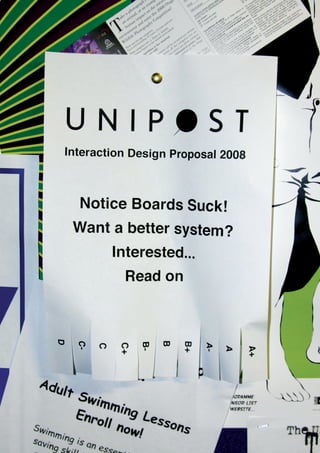
- 4. Introduction We are group of five third year design studies students at The University of Otago. For our Interaction Design project we are creating an online notice board which will contain the information currently displayed on campus notice boards. We hope to make the process of displaying and finding messages faster, more convenient and more reliable. The current system of displaying notices has a number of flaws and limitations which we hope our system will rectify. This proposal will outline the current scenario and discuss the scope of our proposed service. It will document our research and consider the content, design and implementation of our system. It will also include a projected timeline for our project. Emily Chilton, Jason Anson, Jeremy Star, Luke Pirie, Olivia Flamank. 4
- 5. Scenario There are a number of well established notice boards scattered around the University of Otago campus. The notice boards are well used but not very well organized and could be improved. Information Overload Looking at the university notice boards, many are overloaded with information. The amount of information makes it hard to find what you are looking for and difficult to effectively process the information. Obsolete Information The university notice boards contain an abundance of obsolete information such as out of date events or sold items. Due to a lack of effective administration many irrelevant notices remain on the notice boards while applicable notices are taken down in mass clear outs. This is not only irritating to both the people who post the notices and the viewer but also very wasteful. On an online notice board a 30 day limit could be imposed on each notice before they were automatically removed. Dated events could be set to disappear after the event and sold items could be easily removed by the seller. Equal Opportunity On a conventional notice board the biggest and brightest poster usually receives the most attention. Therefore, the message of a company that can afford to print large colour posters speaks louder than a handwritten notice of a student without a large printing budget. Waste of Paper Large amounts of paper are being used everyday for notice board posts. Although this paper may be recycled, reducing the amount used would be a more effective outcome. The process of recycling paper uses energy often created by burning fossil fuels. Paper can only be recycled up to six times until the fibres break down and becomes waste, so although recycling is a thoughtful option reduction is a more sustainable option.1 An online notice board would reduce this unnecessary use of paper. 5
- 6. Scenario Limitations Conventional notice boards are not very friendly for people with disabilities. The blind and sight impaired are unable to read the notices and people in wheelchairs are unable to easily read notices displayed high up. Maintenance Notices boards need to be cleared regularly because of the amount of information posted. Overlapping Because anyone is free to put notices up, notices can be covered up and obscured by others. This can mean that an event is missed or that someone’s notice is not seen. Handwritten or Typed Notice boards are simple to use - you can scribble your notice onto a piece of paper and pin it up. However, we have found that very few notices are handwritten. 24 of the 255 notices in St David were handwritten, two of the 108 in the Link were handwritten and only one of 79 in Commerce were handwritten. People are already on computers printing their notices so posting a notice online would simplify this process. Notice Board in the Link at the University of Otago. 6
- 7. Scope The notice boards that we have identified are all located at the University of Otago so we have made this the target area for our service. Limiting the scope of our audience to this group has a number of advantages. Being a reasonably small area, the transfer of goods such as furniture and textbooks should be possible person to person. Another advantage of limiting the service to students is that the notices will be relevant to the users wants and needs. Being so closely associated with the University should mean that there is no added cost for hosting and domain name registration. This means that it is possible to run our service without advertising which would clutter the web-site and compromise our equal opportunity policy for users. While our project is limited to students the principals we develop could be applied to a larger area. For example, such a system could work for Dunedin city, or the Otago region. Overview Map of the University of Otago, showing the scope of our project. 7
- 8. Campus Research Rearranging a Notice Board The first thing we did was physically rearrange a campus notice board to visually represent what our web-site would be doing. We found that: • The notice board were cluttered. • The notices were in no particular order. • There were duplicate posters and notices on a single board creating waste and unequal opportunity. • Many of the notices were out of date. Our online service will make the process of posting and reading messages more time efficient, provide equal opportunity to all students and reduce paper waste and information overload. The main types of notices we came across were for events, selling textbooks, furniture, cars and flat-mates wanted. Our first thoughts of clutter and outdated information were affirmed by this research. We recorded and photographed the experiment. Before After 8
- 9. Web-site Research Craigslist Craigslist, founded in 1995, was originally set up for San Francisco but has since spread throughout America. The site is for the publication of classifieds and discussion forums. They make money by charging for advertisements posted on the site.2 After choosing your region you are presented a list of categories. The categories range from community classifieds to resumes. There are many subcategories under each category such as artists, activities, childcare and ride share. The web-site uses a colour palette of grey and blue which reduces clutter and noise on the page. The Layout of the page consists of columns of lists. To the left is a navigation bar with search categories, in the middle there are categories and subcategories. To the right there a the list of states and cities in smaller text. Although it is clear where all of the information is, the page is extremely full. Perhaps the information could be split into bigger categories which would make the site easier to view. Users are presented with the states and cities before viewing the categories so a link could take you back to them rather than having them all displayed on the same page as the categories. A screen shot of the craigslist home page. 2 9
- 10. Web-site Research UStudents This student web-page contains online classifieds such as books, furniture, events and accommodation.3 This site identifies the same problems we have, cluttered and unclear notice boards. However, UStudents seems to have a need for gaining profit, and have resorted to advertising, which we wish to avoid. This should not be an unreasonable goal, as the project may get funding from the University of Otago. The main categories on the site are browse, books, accommodation, household and employment. Once clicking on these a sidebar with sub categories is displayed. The site is reasonably easy to use however it is cluttered with the two side bars showcasing flashing advertisements and many different colours used. While UStudents is a highly valuable research resource, due to its similarity to our service, we have found flaws in its design, and believe we can make UniPost a better service for its local users. A screen shot of the uStudents home page. 3 10
- 11. Web-site Research Trademe Ltd Trademe Ltd is a New Zealand web-site offering a service for people to buy and sell pre-owned and new goods within the country. There are many categories of goods presented to you on the sites home page. These include items such as jewelry, clothes, antiques, collectibles, books, electronics and DVD’s.4 The tabbed sections work well and are something that we could use. The search function is something that we could possibly add, since our list would be in a database. This is something that a notice board does not have. The site has a simple logo with a fairly simple colour scheme. The alternating row colours in the product list make each line easy to follow and this is something we could adopt in UniPost. Although it is much simpler than sites like Amazon, Trademe is a bit complicated. We need to ensure that our site is simple and uncluttered with only the essential features. A screen shot of the Trademe Ltd home page.4 11
- 12. Web-site Research Otago University Students Association The Otago University Students Association has a web-site where students and members of the public can keep up to date with events and news about the University. The web-site has a clean interface using two main colours. The main categories of information are displayed in a header. There are also tabs on both sides of the page. This creates clutter and disrupts the information hierarchy. Perhaps having one sub bar and having additional information displayed under the main categories would work better. Additionally, the pages do not flow well with layout elements moving as you view each page. Looking at this web-site was a crucial part of our research as it is a site for students. We will look at better ways to display public notices and provide a wider range of categories in a clear and student friendly way. A screen shot of the Otago University Students Association home page.5 12
- 13. Web-site Research University of Otago We wanted to look at the interface of this web-site and the way the information was organized. This gave us an idea of what is offered and how to make a site for students. The use of white space and a limited colour palette is effective. The three main navigation sections are placed in no particular order and an information hierarchy is not established. This creates confusion when trying to find relevant information. Under the section ‘Current Students’ we may be able to add a link for UniPost. This may mean it is initially difficult to find our site, due to the universities poor navigation bars. This could be remedied by rigorous advertising, or if the site becomes popular it is possible that ‘word of mouth’ would be sufficient. Regardless of this, working with the university would be a natural progression due to the sites focus on students as users. A screen shot of the University of Otago home page.6 13
- 14. Web-site Research Summary By looking at other web-sites we discovered a number of things to both avoid and adopt. We deliberately viewed web-sites that either had a similar target to ours or offered a similar service. We also looked at other web-sites as examples of interaction design which informed our research in different ways. Positive features of web-site layout that we could incorporate: • Limited colour palette (at least 2, no more than 5). • Limited navigation areas, for example have one main bar for navigation and one side bar or tabs for sub-categories. • Similar page layouts, avoiding shifting main elements. • Use of white space, avoiding the use of unnecessary advertisements, pictures, categories and colour. Features of web-site layout to avoid: • The use of too many bright colours. • The use of too many navigation bars. • The use of too many icons and tacky imagery. • Incorrect use of typography, such as text too small or a non- web friendly font. 14
- 15. Content Research After looking at current notices posted on University of Otago notice boards we found that ‘Text books for sale’ was the most common notice posted. Other common notices included Room/ flats for rent, Events, Tutors, Groups, and general items for sale. Possible categories for our web-site include: • For Sale • Text books • Furniture • Vehicles • Other • Rooms/Flats for Rent • Learn to/Tutors • Events • Public Lectures • General Events • Groups • Random These headings and sub-headings will assist in page navigation and help the user find more refined search outcomes. Notices from university notice boards can easily be posted within these simple and concise categories. Researching a notice board in the Commerce Building. 15
- 16. Branding Logo Developed in Adobe Illustrator, the logo concept was based on the idea of using the common pin often used when posting notices. The Nobel typeface was chosen for its simplicity. The letter ‘O’ in the typeface provided the symmetry required for the implementation of the pin. Branding The focus of our service should be on the notices and not the brand. Therefore, keeping the brand subtle and relatively small is important. The notices themselves are the advertising - people interested in the notice will come to associate the brand with the communication service. Related communications should reiterate the brand - for example 0800 UNIPOST, http://unipost.co.nz or http://unipost.ac.nz. Development The UniPost brand is still in the development stage. Fine tuning of proportions, colours and rules for the use of the logo are currently in progress. The logo should associate with the University of Otago, yet be recognized in its own right. Current concepts for the logo. 16
- 17. Colour Schemes #000000 #6C7690 #FFFFFF #F48623 #5F1D27 0, 0, 0 38, 50, 72 126, 138, 162 255, 255, 255 255, 152, 255 75, 68, 67, 90 87, 76, 47, 44 55, 41, 25, 1 0, 0, 0, 0 c, 48, 100, 0 #397DA1 #274252 #868732 #A2A344 #14264A 114, 43, 51 70, 143, 177 50, 84, 101 152, 149, 60 177, 174, 79 36, 87, 68, 40 73, 33, 19, 0 84, 58, 44, 25 43, 31, 96, 6 34, 22, 85, 1 #14264A #627F83 #DDESAD #FFFFFF #56071A 16, 51, 94 115, 143, 148 228, 230, 184 255, 255, 255 105, 17, 32 100, 85, 36, 27 58, 34, 37, 3 11, 3, 33, 0 0, 0, 0, 0 34, 97, 78, 49 In consideration of the proposed colour scheme we thought about how the colours reflected the tone of the web-site as a service, as well as how the colours could be used to make the interface more intuitive. Although colours like red and green have universal meaning, varying the saturation of colours can also indicate how the user should interact with the site. Alternatives to red and green are important because about 10 percent of the male population have some form of colour blindness, turning reds and greens into shades of grey. We have decided that monochromatic colour schemes for content are more pleasing to the eye than schemes like triad or complementary. However there is definitely a need for a colour out of this range that establishes clear emphasis. Reducing the number of colours in the swatch palette helps the user to concentrate, and reducing the saturation of selected swatches can produce a more recognizable hierarchy. 17
- 18. Implementation Web-site The UniPost web-site would be used for the posting and viewing of notices. All notices added would be stored in a database. Old notices could be automatically removed after 30 days. The web- site is discussed in more detail further on in this proposal. Integration Into The University of Otago Web-Site The ‘Current Students’ tab on the University of Otago home page would have a UniPost login option. Students use their login details and can create or edit the details of their notice. A stand alone web-site would be another option, with a database of student details which could be checked when their account is created. This option would be far more difficult to implement and maintain, but it would easily allow room for the growth of the service. Presentation Possibilities Since all of the notices are in one centralized database, there are a number of possibilities for the presentation and communication of the notices. These are discussed below. Displaying on Screen Savers The notices could be contained in a RSS feed which could be set up to display on the screen savers of University computers. Computers that are sitting idle could be broadcasting the latest notices to passers by. Projections A ‘real time’ digital projected notice board could be placed next to the current notice boards or on highly visible walls. Here it is in the public eye, in a place people go to look at notices without clutter, unequal opportunity and obsolete information. There is often a five to ten minute gap before lectures were students sit and wait watching a blank screen. The notices from the UniPost web-site could be screened in lecture theaters before and after class. There it will be shown to our target audience at a time when they would be doing nothing else and interested in seeing the notices. 18
- 19. Implementation Touch Screens Touch screen computers could be placed around campus and could be used to add notices. The user could login, select a category and then add the text for their notice. These computers could also have skype available which people looking at notices could use to call people selling items. Coffee Cups Notices could be printed weekly on local coffee cups. People often have coffee when on a break so are likely to look at the notices. This process does not create more waste as the coffee cups are being used anyway. Lunch tray inserts is another print option available or printed serviettes. Mobile Service A mobile service could be established as a way for users to post notices. They could text their notices to a certain number, say 027 UNIPOST. These could then be added on their behalf by an administrator. This would be easy for users but would mean someone would need to be employed to add the notices. A mock up of a UniPost coffee cup. Posting a notice by text. 19
- 20. Web-site Interface The centerpiece of UniPost will be a web-site were users can both post and view notices. The web-site also removes inequality and provides every user, no matter how good at design or how wealthy, an equal opportunity to have their message seen. The UniPost web-site will be university operated so to access the site a university login will need to be used. This will stop offensive notices (for example the advertisement for ‘cheap porn’ in the St David lecture theater) being posted. An administrator will be able to see who posted the message due to the login used and dismiss it. If the system is misused by a student they will be prohibited from using the site. Below is a wire frame and site map that illustrates a possible structure for our online service. We have incorporated one of our proposed colour schemes. This is only one of many possible outcomes for the final interface. Sign In/Out Post Home For Sale For Rent Tutors Events Groups Random Text Books Text Books MART307 Course book, in good condition $80 Furniture DESI312 Reader, used twice before $50 Vehicles Random A possible wire frame for the UniPost web-site. 20
- 21. Web-site Interface This is the initial site map for UniPost. Students would click the UniPost link in the ‘Current Students’ section of the University of Otago web-site and access UniPost using their login details as they do with other services like PIMS and Blackboard. The various headings and sub-headings will be prioritized based on the categories popularity. Further options could be added (or removed) depending on demand. With information probity in mind, reducing the number of clicks by the user is more important than having numerous pages to scroll through. University of Otago Home Page For Sale For Rent Tutors Events Groups Random Books Rooms Lectures Study Furniture Flats General Music Vehicles Random Random A Possible Site Map for UniPost. 21
- 22. User Interaction The diagram below is an example of how users can interact with the UniPost web-site. Considering this interaction aids our design decisions and the information flow of the web-site. Diagram Key Login User Action Decision No Unknown Correct? User System Action Yes Home Page Find Post/Find? Post Post Page Category Category For Sale Flats Tutoring Events Groups Random 22
- 23. Project Timeline This overview of the next few months will aid us in identifying the tasks required to complete our goals. Each of the five team members will work together on these tasks to complete these goals. Blue bars indicate project hand-ins. 31 March 7 April 14 April 21 April 28 April 5 May 12 May 19 May 26 May 2 June Project Proposal University Proposal Develop System Develop Interface Test Users Refine System Refine Interface Working Prototype Initiate Publicity Introduce Site Project Due Draft Report 23
- 24. References 1 Waste Online. (January 2006). Waste Online Homepage Retrieved 18 March, 2008, from http://www.wasteonline.org.uk/ 2 Craigslist. (n.d.) CraigsList New York. Retrieved March 18, 2008, from http://newyork.craigslist.org/ 3 uStudents. (n.d.) About uStudents. Retrieved 18 March, 2008, from http://www.ustudents.com.au/home.php 4 Trade Me Ltd. (2008). Trade Me: Where Kiwi’s Buy and Sell. Retrieved March 18, 2008, from http://www.trademe.co.nz/ 5 Otago University Students’ Association. (2008). Home. Retrieved March 18, 2008, from http://www.ousa.org.nz/ 6 University of Otago. (2007) University of Otago. Retrieved 18 March, 2008, from http://www.otago.ac.nz/ For the development of UniPost we set up a blog. This has aided the communication of the team and also provides a history of our project progression. Our Development Blog, http://uni-post.blogspot.com/. 24