
Empfohlen
Weitere ähnliche Inhalte
Was ist angesagt?
Was ist angesagt? (19)
Ähnlich wie Question 1 Media Coursework
Ähnlich wie Question 1 Media Coursework (20)
Kürzlich hochgeladen
Kürzlich hochgeladen (20)
Question 1 Media Coursework
- 1. Question 1. In what ways does your media product use, develop or challenge forms and conventions of real media products?
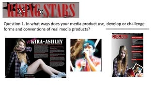
- 2. One way that my media product conforms to the conventions of music magazines if the title. The screenshot above shows the title of my magazine. The font is large and bold, it stretches across the top of the magazine. This is what most magazine do. The title also has the magazine logo (the four stars) behind it, most magazines have the logo of the magazine within the title or near it, so my magazine follows this convention. A final way in which my title conforms to other magazines is that it is in a colour which stands out against the background. However my title doesn’t conform to the convention of only having one word as the magazine name. I feel that this was a risky choice as it may not be as memorable as other magazine names such as Kerrang.
- 3. The mise en scene of the double page spread conforms to the conventions of real media products. Using a black background ensured that they image of my model and the text stood out. The costume that my model is wearing conforms to other magazines as many females wear a plaid shirt and either denim shorts or jeans during a photoshoot. I decided to keep to this convention as it placed my model into a genre of music. The use of a small font for the interview conforms to the conventions of music magazines have small fonts to ensure the text can fit on one page. Finally by keeping the colour scheme to a minimum of 3 colours for my text, I have also conformed to the convention of real media products as they generally keep to the same 3 or 4 colours, as shown in my research pages. However I challenged the conventions by using lipstick to write ‘Help!’.
- 4. My contents Page conforms to the convention of other media products as I used headings in boxes to make my contents page easier to understand. Also that the text within the boxes is bold and larger than the text below the headings. Another way in which my contents page conforms is that it has the issue number and date in the black box at the top of the page. Finally I developed the conventions of using multiple images of different artists which are featured within the magazine by overlapping them and using different styles to present them, such as the two polaroid's and the two images which have been cut from their background.
- 5. Another way that I conformed to the conventions is by using different people on my three pages. I also repetitively used my model who was my main feature.
- 6. Finally the layout of my double page spread uses the typical conventions of real media products is by using columns to organise the text. My media product uses the conventions of a front page as it has the main feature as the large image in the centre of the page and my model appears to be making eye contact with the audience. The layout is also conventional as it has the issue number and date on the cover at the top.