How to Look a Million Bucks: An entrepreneurs guide to creating a kick-ass brand identity.
•
4 gefällt mir•1,436 views

Learn what it takes to create a mega successful brand identity your customers will love and competitors will fear.

Empfohlen
Empfohlen
Weitere ähnliche Inhalte
Kürzlich hochgeladen
Kürzlich hochgeladen (20)
Empfohlen
Empfohlen (20)
How to Look a Million Bucks: An entrepreneurs guide to creating a kick-ass brand identity.
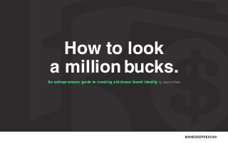
- 1. How to look a million bucks. An entrepreneurs guide to creating a kick-ass brand identity by Aaron Fifield
- 2. Hey, you’re awesome! Thanks for viewing our guide. I hope you find this valuable on your journey to world domination. I’ll bump into you again at the end. See you shortly. Follow @aaronfifield
- 3. Words you need to know. There are only three words you need to know to make the most of this guide. Here is a brief summary to bring you up to speed. Brand. Identity. Logo. Perceived emotional Visual aspects that form part Identifies a business in its company image as a whole. of the overall brand. simplest form via the use of a mark or icon. How To Look A Million Bucks 3
- 4. Contents Facing the tough questions pg08 Preparing to get creative pg16 Crafting the perfect logo design pg22 Creating an impact with the identity pg37 Bringing your identity to life pg55 Where to from here pg63
- 5. Look a million bucks – what for? Okay, not literally! But as the saying goes, when you ‘feel a million bucks’ you’re in excellent health and spirits. Well the same applies to your brand; when you’re identity is in tip top shape you give off the vibe of being an excellent company that can be trusted. How To Look A Million Bucks 5
- 6. Reality is perception. Another reason life’s better when you look a million bucks... Perceived as: Brilliant Brand Identity Bad Brand Identity Trustworthy Credible Established Recognisable Consistent How To Look A Million Bucks 6
- 7. Before we get started... It’s worth noting many ‘brand wizards’ like to overcomplicate and flood the topic of branding with unnecessary technical jargon. While we certainly understand it, our goal is not to knock your socks off with an extravagant vocabulary, but to be relatable and help you create an exceptional brand your customers will love. Lets go! How To Look A Million Bucks 7
- 8. First things first. Facing the tough QUESTIONS
- 9. Pinpoint who you are and why ears should prick up. What is the niche market you specialise in? How do you want to be perceived? It’s better to do one thing really well, than a dozen things poorly. Exclusive, friendly, creative, delicious, affordable etc. What are the most popular services or products Are there certain emotions you need to trigger? your company offers? Joy, desire, happiness, relief, surprise, excitement etc. What are your company values? What is the single most important problem your Efficient, reliable, integrity, excellence, teamwork etc. company solves? How To Look A Million Bucks 9
- 10. Small businesses can effectively compete with large companies by targeting a niche market.
- 11. Profile your perfect customer. If you could clone just one customer over and Does this person fit a certain stereotype? over again, who would that be? What’s their income bracket? Are they male or female? Where do they live? What’s the age of this person? Where do they hang out? What demographic do they fall into? What websites and blogs do they visit? How To Look A Million Bucks 11
- 12. Stick out like a sore thumb. Difference survives and excels in competitive What’s your point of difference? markets. Cheaper, faster, more experienced, track record of outstanding results, more of a variety, local experts etc. What can you offer customers that your competitors can’t? Steer clear of being another ‘me too’ business. Is there something that makes your company Avoid points your competitors could potentially truly unique? promote as well. How To Look A Million Bucks 12
- 13. To create a brand that stands out we need to find a design solution that hasn’t been used by any of your competitors.
- 14. Drill down and identify your closest competitors. Whether you like to admit it or not, they’re out Get the inside gossip from your suppliers – all there and they’re hungry for your customers. you have to do is ask. To get crystal clear on your competitors, you Who are the key players and influencers in must dig deeper than a Google search... your industry? Monitor social networks, attend trade shows, Make a note of your 3 closest local competitors visit conferences and go to networking events & top 3 inter/national competitors. to see whose really making waves and leading the way in your field. How To Look A Million Bucks 14
- 15. Sure, not all of these questions will be in-line with your company and the direction you are headed in and that’s okay. The important thing to remember is; the more you can narrow down on identifying who you are, how you’re unique, whose your ideal customer and who your closest competitors are – the easier things will be from here on in. How To Look A Million Bucks 15
- 16. The warm up. Preparing to get CREATIVE
- 17. Explore the endless possibilities. After answering the tough questions, the next point of call is to find that visual inspiration. Browse the websites responsible for inspiring some of the worlds most amazing brands. Save anything you like the look of, it will come in handy for the next step. behance.net brandingserved.com How To Look A Million Bucks dribbble.com awwwards.com designspiration.net 17
- 18. While the creative wheels are in motion... Create a mood board using.. Pintrest. A collection of textures, images and text related to your company helps to create a theme for your brand direction. THIS SOMETHING LIKE How To Look A Million Bucks
- 19. By this stage you’ve probably seen a few things that take your fancy. Right? Now is a great point to get a brand designer on board to work their magic and transform your ideas into a crystal clear identity.
- 20. Choosing the right designer for the job. Find a designer with a shmick website and a Where on earth would you like your brand that catches your attention. designer to be? A designer who doesn’t take pride in their own appearance sure With the internet the way it is, it’s possible for you to join forces isn’t going to take pride in yours, keep moving. with a designer anywhere in the world. Although in saying that, many prefer to stick with local designers who are familiar with How does their portfolio look, pretty crash hot? If they have a tight showcase of previous projects and you like their style, that’s one tick in your favour. the market you’re competing in. Prices can vary greatly from company to company, so it’s important to... Not all designers are the same, some specialise and others generalise. When it comes to branding you’re typically best to go with a Find a designer who can work within your budget. But, remember what the good man Sailor Jerry once taught us, ‘Good work ain’t cheap and cheap work ain’t good’. Use your judgement to find a happy medium. specialist seeing as they solely create identities all day, everyday. How To Look A Million Bucks 20
- 22. What’s involved. Crafting The Perfect LOGO DESIGN
- 23. What makes the perfect logo? Ah, great question! As you would already know this is an important step to get right, considering a logo is with you for the long haul. There are roughly 5 boxes every logo should tick, so lets make it count. How To Look A Million Bucks 23
- 24. Simple + Memorable Time and again, it is the simple logos that prove to be most memorable. Soundcloud is an all round perfect example of this. How To Look A Million Bucks 24
- 25. Clever + Appealing It’s safe to say MailChimp have hit the nail on the head when it comes to clever logo design. I mean c’mon, who could get mad at a face like that? How To Look A Million Bucks 25
- 26. Relevant + Convincing What better way to convince someone of your speedy express service than with a forward moving arrow. Don’t see it? Look at the negative space between the E and the X. How To Look A Million Bucks 26
- 27. Scalable + Versatile The recent overhaul of Telstra’s brand identity is nothing short of noteworthy for scalability and versatility. Notice how the logo is still incredibly effective even when scaled down to the size of a mini sim card. And the array of colours on their palette gets a whopping big tick for versatility. How To Look A Million Bucks 27
- 28. Full Colour + Mono The City of Melbourne logo is another beautifully versatile logo that showcases how an icon can appear in both full colour and mono while remaining loyal to the brand. How To Look A Million Bucks 28
- 29. Lets break it down even further. There are two more key factors that contribute to the success of a logo you should be aware of. Firstly there is fonts, this is a big one and equally important is a colour scheme. Creating the perfect logo is about getting the combination just right between all factors. How To Look A Million Bucks 29
- 30. Get your fonts in check. This is by no means a hard When experimenting What style of font is best and fast rule, but two fonts with logo fonts it is wise going to compliment your is generally the limit for to consider how they will brand? The three common creating a logo, anymore and impact headlines and body styles being; serif, sans serif it begins to look too busy. type across your website, and custom fonts. If using a single font – then stationary and marketing Examples on the next page. even better. material etc. For a real eye opener on how fonts alone can change the face of your company, visit: typographyserved.com How To Look A Million Bucks Browse thousands of typefaces on the worlds number one marketplace for fonts, visit: myfonts.com 30
- 31. Serif Sans Serif Custom Serifs are the small lines tailing from the Sans serif is a typeface that does not These fonts are in a league of their own, edges of letters and symbols. have the small projecting features at the coming in all sorts of weird, wacky and end of strokes. wonderful shapes. Times New Roman Helvetica American Typewriter Avant Grade Gothic Bellevue Klavika Basic Geometric Slabserif Proxima Nova Sentinel PhantOm How To Look A Million Bucks 31
- 33. Mixing the colour palette. With a spectrum of unlimited colours, shades and hues available, how do we know what select few are best for your brand? Unfortunately there is no right answer, however here is some food for thought... How To Look A Million Bucks 33
- 34. Triggering emotions with colour. Yellow The brightest and most energizing of warm colours, yellow is happy, warm, stimulating and Purple expansive. Orange Not as overwhelming as red, orange is a balanced colour that is vibrant and energetic Purple represents nobility, abundance and dignity, but can also stand for creativity and imagination. Blue Blue represents dependability, trustworthiness and security. It can also characterize calm and while being friendly and inviting. Red spirituality. The hottest and the most dynamic colour, red is The cool secondary colour is calming, activating, stimulating, passionate, exciting, and Green balancing and rejuvenating. Green represents powerful. Pink stability and inspires possibility. Pink is commonly perceived as a romantic and Black represents power, elegance and nurturing colour. Often associated with feminine products and services. How To Look A Million Bucks Black modernity, but can also characterise mysteriousness and appear exclusive. 34
- 35. G BOYS HOW THE BI UR USE COLO
- 36. The ultimate sin! When a designer creates a logo using Photoshop Illustrator are made up of paths (known as vector). they commit the ultimate sin. This is a massive This is important to know because pixels cannot no, no! Logos should only ever be created using be enlarged without losing quality, meaning you Adobe Illustrator. are very limited where you can use your logo. The Files created in Photoshop are made up of pixels (known as rasterised), whereas files created in How To Look A Million Bucks reason paths and logos go together like peanut butter and jelly is, paths are 100% scalable and much sharper. 36
- 37. Reinforcements. Creating an impact with THE IDENTITY How To Look A Million Bucks 37
- 38. Along come the reinforcements. With the logo taken care of it’s now time to set the overall theme for your brand. This is how we enforce memorability and create consistency. Without a theme there is mixed messages flying all over the place. Now let’s narrow in on how we pave the way for a lasting identity... How To Look A Million Bucks 38
- 39. Awesome supporting graphics. Common examples of supporting graphics are things like patterns, logo elements and sometimes even characters. These not only enhance your image, but are easily associated with your brand, as well as your logo when it is not present. How To Look A Million Bucks 39
- 40. Using patterns to support your identity. Cosmetic company, Uzuri effectively use patterns throughout their brand, including stationary and packaging. Taking inspiration from optical illusionary art, and the idea of makeup as a way of creating illusions. How To Look A Million Bucks 40
- 41. Using logo elements to support your identity. Using enlarged elements of their logo, DayDreamer achieve a powerful sense of brand and recognition. A versatile approach that works effectively across all media. How To Look A Million Bucks 41
- 42. Using characters and personalities to support your identity. Every chocolate-lovers favourite, M&M’s have done a brilliant job using characters to support and grow their brand. You could almost say the characters are now more popular and recognisable than the actual logo itself. Wouldn’t you agree? How To Look A Million Bucks 42
- 43. On point imagery. As we are aiming to have your brand look a million bucks, consistency is what will make it or break it. This means defining the style of everything, right down to the style of images. It’s important images remain consistent whether they appear online, in a brochure or even on a billboard. How To Look A Million Bucks 43
- 44. Say your thousand words the right way... It’s amazing how one photo can give off so many different vibes depending on how it is styled. Here we have three colour variations of one photo, each creating a very unique feel. It just goes to show how every factor of your identity can play a role in sending the right message. How To Look A Million Bucks 44
- 45. Inviting fonts and typography. Without trying to sound like a broken record, fonts and typography are another one of those ‘must-get-it-right’ points of brand design. But seeing as we already touched on fonts for logo design we will keep this brief. This is the stage where we decide on a collection of inviting fonts and styling options for headlines, sub-headlines, body text and captions. Here are a few tips to take on board... How To Look A Million Bucks 45
- 46. Great typography encourages people to read all the cool things about your company. Establish a hierarchy. Use uniform fonts or All fonts should be easy to read, but even styles for headlines, sub-headlines and body more so when it comes to the body font. When text. Don’t mix and match. fonts are hard to read they are uninviting and it creates resistance between you and a prospect. Font pairing. To avoid a crisis of too many fonts, it can be a good idea to use the Handwritten fonts often work well to create a secondary font from your logo for headlines personal touch, but don’t over-do it. Use in small and one font family for everything else. doses for things such as added confirmation for a call to action. Minimise clutter by ensuring everything is spaced out neatly, including line-heights and All CAPS is bad, very bad. Just don’t do it, paragraphs. Make it easy on the eyes. seriously... How To Look A Million Bucks 46
- 48. Consistent colour scheme. Again, colour is a topic we touched on during the logo design phase but it still requires a little extra attention here. Beyond the logo it’s important to keep the emotional triggers of colour flowing throughout your identity. Here’s a few pointers... How To Look A Million Bucks 48
- 49. Did you know, colour increases brand recognition by 80%? A tight colour scheme will have you on the When a logo uses just one colour and shades right track for a successful identity. aren’t the answer, by all means introduce another colour or two. But make sure those colours do not Utilise the colours from within your logo change, stay consistent at all costs. whenever possible. You need to have a pretty good reason to use additional colours. Large amounts of text should never be seen in super bright colours, it simply won’t be read. When a logo uses a limited amount of colours and more are required to create an Keep the colour scheme of your identity in-line awesome identity – shades are your friend. with the colours of your logo as much as possible. How To Look A Million Bucks 49
- 50. More than 90% of buying decisions are influenced by visual factors.
- 51. Style Guide: Protect your brand. A style guide is a set of standards to safeguard your identity from heading off the beaten track. It is essentially the guidelines spelling out what can and cannot be done with your logo, as well as supporting graphics, imagery, fonts and colours. Soundcloud have created a fine example of what should be displayed in a style guide. Here are a few pages to give you an idea... How To Look A Million Bucks 51
- 52. SoundCloud Logo For width smaller then ~80px use the side-by-side version instead of the stacked version. SoundCloud is orange! We prefer the gradient version or the white version on an orange gradient background In digital applications, don’t scale the logo; use only what you find here: https://soundcloud.com/press If you really can’t live without a special size, please ask Sarah: assets@soundcloud.com
- 53. SoundCloud Logo good use 100% min 125% A cloud needs air! At least 12.5% space in each direction around the logo. Apply on monochrome and quiet areas. If you prepare a background, use only circles or rectangles.
- 54. SoundCloud Logo bad use Don’t modify our wordmark or add any other term Use the gradient in the correct way Don’t use on fuzzy background SOUNDHOUND Don’t turn, distort or recolor the logo If you want to fail - scale Please don’t build your own SoundCloud logo
- 55. Post-groundwork. Bringing your IDENTITY TO LIFE How To Look A Million Bucks 55
- 56. Taking shape. With the groundwork now in place it’s time to bring your super-versatile identity to life, offline and online. We’re talking stationary, marketing material, signage, websites, social media and more. We thought what better way to carry us through this phase than to simply show you a few examples of appealing identities already in full swing. Check it out... How To Look A Million Bucks 56
- 57. Example 1 – Leichardt Group 3 1 Pencils 2 2 Letterhead 4 1 3 USB Sticks 4 CD Artwork 5 5 Business Cards 6 Website (Responsive) 6 How To Look A Million Bucks 6 56
- 58. Example 1 – (continued) 7 Report Cover 8 Vehicle Signage 7 8 9 With Compliment Slip 10 Advertising 9 10 How To Look A Million Bucks 58
- 59. Example 2 - Hydroforce 1 1 3 Coffee Mug 2 2 3 Business Card 4 Diary 5 4 Notepad Website (Responsive) 5 5 How To Look A Million Bucks
- 60. Joining the online world. When spreading your brand to the world wide web it is crucial to stay in-line with your identity, both offline and online. Not only with your company website, but also when branding your social media pages through display photos, cover photos and tabs etc. This is what often separates the companies who look a million bucks and the companies who don’t. It’s all about staying true to your brand and mastering the art of consistency. One company to master this extremely well is Baskin Robins. Flick through to see how they have created an almost seamless transition between their website, Twitter profile and Facebook page. How To Look A Million Bucks 60
- 61. Example 3 - Baskin Robins 1 Company Website How To Look A Million Bucks 2 Twitter Profile 3 Facebook Fanpage 61
- 62. 46% of people say a website’s design is the number one criterion discerning the credibility of a company.
- 63. Growth resources. Where to from FROM HERE How To Look A Million Bucks 63
- 64. Onwards and upwards. Once you’ve established a kick-ass identity it’s time to get out there and be found in front of your niche. How to do that exactly? Well that’s a story for another day, but in the meantime you might like to peep some of our own favourite growth resources to help you on your way. Some of these sites we visit on a daily basis and have taught us massive lessons about growing our own brand. Believe me, being on the front page of Google isn’t everything. If you want to get creative and unleash the entrepreneur spirit you will soon see there are plenty of other ways that are just as effective, if not better. So with that being said... Read. Listen. Watch. How To Look A Million Bucks 64
- 65. Read plenty of quality blogs. Quick Sprout Inc. Entrepreneur The blog of content marketing beast The largest entrepreneurial network Business ideas, trends, expert Neil Patel. Learn how to generate in the world. Plenty of advice, tools advice and growth strategies for BULK traffic! and services to help you grow. small businesses. How To Look A Million Bucks 65
- 66. Listen to inspiring podcasts. Entrepreneur On Fire Daily podcasts with entrepreneurs Australia’s no.#1 marketing show run from all parts of the world, at all by industry veteran Tim Reid as he stages in life. How To Look A Million Bucks Small Business, Big Marketing speaks with other success stories. 66
- 67. Watch incredible videos. Growth Hacker TV Awesome for online startups, but The home of incredible videos, often similar strategies can be presuming you’re searching the applied to service companies too. How To Look A Million Bucks You Tube right topics... No cats! 67
- 68. Thank you for reading.
- 69. Great to see you again! Well done making it all the way to the end. It shows you must really care about your brand and I’m impressed. I hope you now have a better understanding of not only how to look a million bucks, but also how the creative side of a brand identity comes together. If you would like to know more about anything we touched on, Follow @aaronfifield just shoot me an email at aaron@onedeepdesign.com.au. To your success, Aaron Fifield – One Deep Design How To Look A Million Bucks 69
- 70. Creating exceptional brands for entrepreneurs. Aaron Fifield 0403 566 743 aaron@onedeepdesign.com.au To learn more visit: onedeepdesign.com.au