
Empfohlen
Weitere ähnliche Inhalte
Was ist angesagt?
Was ist angesagt? (17)
Andere mochten auch
Andere mochten auch (18)
Ähnlich wie Country Music People Analysis
Ähnlich wie Country Music People Analysis (20)
Mehr von niresillum
Kürzlich hochgeladen
Kürzlich hochgeladen (20)
Country Music People Analysis
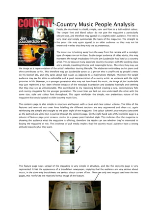
- 1. Country Music People Analysis Firstly, the masthead is a bold, simple, sans serif font in a dull reddish colour. The simple font and bland colour do not give the magazine a particularly vibrant look, and therefore may appeal to a slightly older audience. The title is very clear and simply summarises the basis of the magazine. The straight to the point title may again appeal to an older audience as they may not be interested in titles that they may see as pretentious. The cover star is looking away from the away from the camera with a nostalgic type of expression on his face. To the target audience of older adults, this may represent the tough troubadour lifestyle Jim Lauderdale has lived as a country artist. This is because many associate country musicians with the working class and a simple, travelling lifestyle and meaningful lyrics. Therefore they may see the image as a representation of the artist’s relentless touring lifestyle. The elaborate embroidery on his jeans and shirt contributes to this. This therefore may put Lauderdale across as a person who is unaffected by people’s views on his fashion etc, and only cares about real issues as opposed to a materialistic lifestyle. Therefore the target audience may see his attire as admirable and a good representation of a country artist, as someone with the right priorities in life. However, to a younger generation who may not have heard his music, the image of Jim Lauderdale may just represent a has-been lifestyle because of the nostalgic expression and outdated hairstyle and clothing that they may see as unfashionable. This contributed to my reasoning behind creating a new, contemporary folk and country magazine for the younger generation. The cover lines are laid out one underneath the other with the same size, style and colour font throughout. This again reinforces the simple, non pretentious nature of the magazine that would appeal to older country music fans. The contents page is also simple in structure and layout, with a clean and clear colour scheme. The titles of the features and reversed out cover lines labelling the different sections are very regimented and clean cut, again reinforcing the simple and straight to the point style of the magazine. The colour scheme also remains consistent as the dull red and white text is carried through the contents page. On the right hand side of the contents page is a column of feature page print screens, similar to a power point handout style. This indicates that the magazine is showing the audience what the magazine is offering, therefore the reader can see whether they’re interested in buying the magazine or not. This evidence of pull media implies that the country music audience have a strong attitude towards what they want. The feature page news spread of the magazine is very simple in structure, and like the contents page is very regimented. It has the appearance of a broadsheet newspaper, implying that the audience are very serious about music, in the same way broadsheets are serious about current affairs. There are only two images used over the two pages, this reinforces the relatively formal image of the feature.
- 2. Although the formal image of the magazine may appeal to an older target audience, for my magazine, I hope to create a more contemporary look that is more interesting and edgy to look at. However, one element that I will put forward to my focus group as a result of Country Music Magazine is the idea that country/folk/acoustic music doesn’t have to have a “wishy washy” appearance as it often does.