Get responsive in 30 minutes (WordCamp Sofia)
•
1 like•1,900 views

A presentation I made on WordCamp Sofia 2012. It's about how to make your WordPress theme responsive by Breaking and Fixing it.

Recommended
More Related Content
What's hot
What's hot (18)
Viewers also liked
Similar to Get responsive in 30 minutes (WordCamp Sofia)
Similar to Get responsive in 30 minutes (WordCamp Sofia) (20)
Recently uploaded
Recently uploaded (20)
Get responsive in 30 minutes (WordCamp Sofia)
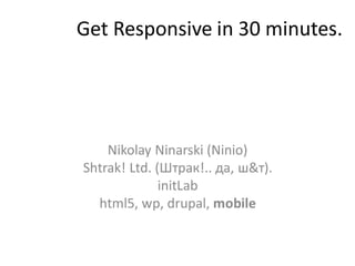
- 1. Get Responsive in 30 minutes. Nikolay Ninarski (Ninio) Shtrak! Ltd. (Штрак!.. да, ш&т). initLab html5, wp, drupal, mobile
- 2. Me? • Developer • WordPress fan • I like Drupal also • I and 2 friends founded a catering company that is doing WP and Drupal. • Long story. • Labber at initLab (hackerspaces FTW)
- 3. Why Mobile
- 4. Warning! Pie Chart ahead! Copyright kayakeverywhere, flickr.com
- 5. x2/year Desktop vs Mobile Desktop vs Mobile (09.2011) (09.2012) Desktop Mobile Desktop Mobile 7% 12% 93% 88% Data from StatCounter
- 6. How to go mobile?
- 7. Mobile Site Approaches • Separate mobile website • Responsive design • Hybrid
- 8. Separate mobile version • Detect the browser on server side • Redirect and serve simpler design + Less load on the device + Tailor-made website ‒ More work
- 9. Responsive design • Make CSS with media queries to show/hide stuff (*media query = a point from which the design will change.. Usually at specific width) • Use js if needed to make more complex changes + Quick (in simple cases) − Slower load/performance (desktop inheritance)
- 10. Responsive approaches • Mobile first – if we do it from scratch. – Start from the mobile version and enhance iteratively up to the desktop • Break/fix approach – In cases you have an existing non-responsive website. – Make the screen smaller and check when the design will break. Fix. Continue.
- 11. Check out our weapons
- 12. Break/fix approach Tools: • Chrome Web Dev Tools • Make something smaller • Make something bigger • Make something fluid • Hide something • Convert something (possibly with js)
- 13. Step 1 Break Something Copyright LinderRox, flickr.com
- 14. Step 1 Identify your break point (the point where it breaks)
- 15. Step 2 Find the problematic bastard Copyright COLECCION CAMARAS DE COLORES, flickr.com
- 16. Step 2 Find out what is breaking the page
- 17. Step 3 Fix it
- 18. Step 3 Fix it • Make the things fluid on it (%) • Change size • Hide/show • …
- 19. Step 4 Go To Step 1 (loop-loop)
- 20. Step Last Add <meta name="viewport" content="width=device-width, initial-scale=1.0"> to the head
- 21. Hacker’s tip Merge breakpoints so you don’t write that much
- 22. Break/fix comments • Good solution for existing websites • Not that much thinking involved • Kind of agile • Looks kind of natural
- 23. Want to go deeper • http://adaptive-images.com/ • http://wordpress.org/extend/plugins/mobble/ • http://wordpress.org/extend/plugins/wptouc h/ • http://caniuse.com/ • http://smashingmagazine.com • http://css-tricks.com/
- 24. Thanks! M: ninio@shtrak.eu Blog: http://shtrak.eu/ninio Twitter: @ninarski Shtrak!: http://shtrak.eu/it
Editor's Notes
- Find your First break point – make the screen smaller and see when the horizontal line appears. Hovering over the html element shows the width of our breakpoint
- Find your First break point – make the screen smaller and see when the horizontal line appears. Hovering over the html element shows the width of our breakpoint
- Find your First break point – make the screen smaller and see when the horizontal line appears. Hovering over the html element shows the width of our breakpoint
- Find your First break point – make the screen smaller and see when the horizontal line appears. Hovering over the html element shows the width of our breakpoint
- Find your First break point – make the screen smaller and see when the horizontal line appears. Hovering over the html element shows the width of our breakpoint
- Find your First break point – make the screen smaller and see when the horizontal line appears. Hovering over the html element shows the width of our breakpoint
- Find your First break point – make the screen smaller and see when the horizontal line appears. Hovering over the html element shows the width of our breakpoint
- Find your First break point – make the screen smaller and see when the horizontal line appears. Hovering over the html element shows the width of our breakpoint
- Find your First break point – make the screen smaller and see when the horizontal line appears. Hovering over the html element shows the width of our breakpoint