SlideShare ist ein Scribd-Unternehmen logo
1 von 3
Text- There is a large amount of text on
the double page, this could mean that
the target market is older people as
older people are more likely to read
large amounts in magazines. The text is
in one colour but there are bold
elements, this makes the pages look
dull and there could be more colour
added. The font of the text is all the
same apart from the title of the story,
this makes the page look consistent and
professional.

Language and Register- The language on
this double page spread will be a mixture
of formal and informal language as the
genre is R&B.


Layout- The layout of the double page
spread is very basic, there is a lot of text
rather than visual, this could suggest
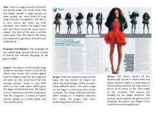
that the target market for the magazine        Image- There are several images on the   Colour- The colour scheme of this
are older as they read more than the           page, the top banner of images are       double page spread is mainly black and
younger people. There is very little           black and white images of the musician   white, however there is a small amount
white or non used space which gives            doing different poses. The main image    of blue within the text and logo, there is
the page a professional look. The layout       on the page is a full body shot of the   also a lot of colour on the main image
isn’t to crowded or full, this could show      musician. The image contrasts with the   of the musician. The colours are
that the magazine is aimed at higher           other images as is brightly coloured,    suitable for the target audience. The
income people as it looks better and           this makes the pages look more           colours could indicate the genre of the
more professional.                             interesting and professional.            musician, the colours are bright so the
                                                                                        musician could be pop/dance.
Text- There is a medium amount of text
 on the double page, this could mean
 that the target market is younger
 people as older people are more likely
 to read large amounts in magazines.
 The text is in two different colours, this
 makes the pages consistent and visually
 appealing. The font of the text is all the
 same apart from the title of the page,
 this makes the page look consistent and
 professional.


Language and Register- The language on
this double page spread is mainly informal
as it is a indie rock genre. Therefore the
language will be informal with swearing in
etc.


 Layout- The layout of the double page
                                              Image- The image is a medium close up      Colour- The colours on the double
 spread is very basic, the image of the
                                              of the band, the image is appropriate to   page spread are very neutral and
 band is dominating the page and there
                                              the text. The image is very neutral in     brown, there is a small amount of blue
 is a small amount of text. There is very
                                              colour, this could be a theme for the      that stands out on the whole of the
 little white or non used space which
                                              double page spread making it look          double page spread. The colours could
 gives the page a professional look. The
                                              professional and visually appealing to     represent the genre of the band, such
 layout isn’t to crowded or full, this
                                              the audience and target market. The        as dark colours could represent rock or
 could show that the magazine is aimed
                                              image is large and is dominating a large   heavy metal bands, the neutral/dark
 at higher income people as it looks
                                              percentage of the double page spread       colours could represent the indie/rock
 better and more professional.
                                              which could link into that the target      genre of the band.
                                              market are younger as there is more
                                              image and less text.
Text- There is a large amount of text on
the double page, this could mean that
the target market is older people as
older people are more likely to read
large amounts in magazines. The text is
in one colour but there are bold
lettering, this makes the pages look dull
and there could be more colour added.
The font of the text is all the same this
makes the page look dull and
uninteresting.

Language and Register- The language on
this double page spread is mainly formal.
The genre for this music magazine is pop
therefore the language will be formal and
good English as it is suitable for all ages.


Layout- The layout of the double page
spread is very basic, there is am equal
amount of text in comparison to visual,
this could suggest that the target                                                         Colour- The colour scheme of this
                                               Image- There is one image on the
market for the magazine are older as                                                       double page spread is mainly black and
                                               double page spread, the image is a full
they read more than the younger                                                            white, however there is a small amount
                                               page, medium close up of the musician.
people. There is very little white or non                                                  of red in the large letter ‘L’ this
                                               The image is black and white, this could
used space which gives the page a                                                          contrasts with the black and white
                                               be a consistent theme on the pages to
professional look. The layout isn’t to                                                     theme within the double page spread.
                                               give it a professional look. The image is
crowded or full, this could show that                                                      The colours used could possibly link in
                                               bold and it’s the first thing you are
the magazine is aimed at higher income                                                     with the personality of the musician as
                                               drawn to when looking at the double
people as it looks better and more                                                         red represents passion, love and
                                               page spread.
professional. The red ‘L’ stands for the                                                   danger.
name of the musician and this adds a
bit of colour into the pages but more
could be added.

Weitere ähnliche Inhalte

Andere mochten auch

Andere mochten auch (6)

Evaluation
EvaluationEvaluation
Evaluation
 
Draft 1
Draft 1Draft 1
Draft 1
 
Final cover editing
Final cover editingFinal cover editing
Final cover editing
 
Final cover changes [autosaved]
Final cover changes [autosaved]Final cover changes [autosaved]
Final cover changes [autosaved]
 
Magazine cover research
Magazine cover researchMagazine cover research
Magazine cover research
 
Problematika remaja -lds
Problematika remaja  -ldsProblematika remaja  -lds
Problematika remaja -lds
 

Mehr von nicolealice95 (20)

Magazine layout
Magazine layoutMagazine layout
Magazine layout
 
Drafts
DraftsDrafts
Drafts
 
Cp draft 1
Cp draft 1Cp draft 1
Cp draft 1
 
Image editing
Image editingImage editing
Image editing
 
Research results
Research resultsResearch results
Research results
 
Cp draft 1
Cp draft 1Cp draft 1
Cp draft 1
 
Draft 2
Draft  2Draft  2
Draft 2
 
Cp draft 1
Cp draft 1Cp draft 1
Cp draft 1
 
Cp draft 1
Cp draft 1Cp draft 1
Cp draft 1
 
New colour scheme
New colour schemeNew colour scheme
New colour scheme
 
Fonts
FontsFonts
Fonts
 
Names
NamesNames
Names
 
Names
NamesNames
Names
 
Audience
AudienceAudience
Audience
 
Genre
GenreGenre
Genre
 
Genre
GenreGenre
Genre
 
Magazine contents page research
Magazine contents page researchMagazine contents page research
Magazine contents page research
 
Contents page
Contents pageContents page
Contents page
 
Contents page
Contents pageContents page
Contents page
 
Final cover
Final coverFinal cover
Final cover
 

Magazine double page spread research

  • 1. Text- There is a large amount of text on the double page, this could mean that the target market is older people as older people are more likely to read large amounts in magazines. The text is in one colour but there are bold elements, this makes the pages look dull and there could be more colour added. The font of the text is all the same apart from the title of the story, this makes the page look consistent and professional. Language and Register- The language on this double page spread will be a mixture of formal and informal language as the genre is R&B. Layout- The layout of the double page spread is very basic, there is a lot of text rather than visual, this could suggest that the target market for the magazine Image- There are several images on the Colour- The colour scheme of this are older as they read more than the page, the top banner of images are double page spread is mainly black and younger people. There is very little black and white images of the musician white, however there is a small amount white or non used space which gives doing different poses. The main image of blue within the text and logo, there is the page a professional look. The layout on the page is a full body shot of the also a lot of colour on the main image isn’t to crowded or full, this could show musician. The image contrasts with the of the musician. The colours are that the magazine is aimed at higher other images as is brightly coloured, suitable for the target audience. The income people as it looks better and this makes the pages look more colours could indicate the genre of the more professional. interesting and professional. musician, the colours are bright so the musician could be pop/dance.
  • 2. Text- There is a medium amount of text on the double page, this could mean that the target market is younger people as older people are more likely to read large amounts in magazines. The text is in two different colours, this makes the pages consistent and visually appealing. The font of the text is all the same apart from the title of the page, this makes the page look consistent and professional. Language and Register- The language on this double page spread is mainly informal as it is a indie rock genre. Therefore the language will be informal with swearing in etc. Layout- The layout of the double page Image- The image is a medium close up Colour- The colours on the double spread is very basic, the image of the of the band, the image is appropriate to page spread are very neutral and band is dominating the page and there the text. The image is very neutral in brown, there is a small amount of blue is a small amount of text. There is very colour, this could be a theme for the that stands out on the whole of the little white or non used space which double page spread making it look double page spread. The colours could gives the page a professional look. The professional and visually appealing to represent the genre of the band, such layout isn’t to crowded or full, this the audience and target market. The as dark colours could represent rock or could show that the magazine is aimed image is large and is dominating a large heavy metal bands, the neutral/dark at higher income people as it looks percentage of the double page spread colours could represent the indie/rock better and more professional. which could link into that the target genre of the band. market are younger as there is more image and less text.
  • 3. Text- There is a large amount of text on the double page, this could mean that the target market is older people as older people are more likely to read large amounts in magazines. The text is in one colour but there are bold lettering, this makes the pages look dull and there could be more colour added. The font of the text is all the same this makes the page look dull and uninteresting. Language and Register- The language on this double page spread is mainly formal. The genre for this music magazine is pop therefore the language will be formal and good English as it is suitable for all ages. Layout- The layout of the double page spread is very basic, there is am equal amount of text in comparison to visual, this could suggest that the target Colour- The colour scheme of this Image- There is one image on the market for the magazine are older as double page spread is mainly black and double page spread, the image is a full they read more than the younger white, however there is a small amount page, medium close up of the musician. people. There is very little white or non of red in the large letter ‘L’ this The image is black and white, this could used space which gives the page a contrasts with the black and white be a consistent theme on the pages to professional look. The layout isn’t to theme within the double page spread. give it a professional look. The image is crowded or full, this could show that The colours used could possibly link in bold and it’s the first thing you are the magazine is aimed at higher income with the personality of the musician as drawn to when looking at the double people as it looks better and more red represents passion, love and page spread. professional. The red ‘L’ stands for the danger. name of the musician and this adds a bit of colour into the pages but more could be added.

Hinweis der Redaktion

  1. Text, layout, image, colour