NO1 Certified kala ilam Expert In Peshwar Kala Jadu Specialist In Peshwar Kal...
How the Main Product and Ancillary Texts Reflect Each Other
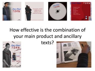
1. How effective is the combination of
your main product and ancillary
texts?
2. To ensure the link between all the ancillary texts were clear we made
sure simple stuff such as colour was seen as a link throughout.
Off white: Used as the background colour for all ancillary text except back
insert – here we see red, however, this still links in as the colour of
‘TORN’ is in a red colour on all other ancillary text and on the back insert
in the off white colour.
Blue: Used for name of the artist – Amy Piner. This allows the name to
stand out. This shows a link for all the ancillary texts.
Red: Used for the album name – TORN, except for the back insert where
the off white colour is used. Also used for the background colour for the
back insert. This shows a link for all the ancillary texts. It is also used for
the writing on the inlay and the copyright information on the CD.
Black: Used on the CD cover (company logo) and back insert (institutional
information, company logo, website address and facebook and twitter.
Dark reddish black: Used for the first layer of the background on the
advert and typography at the bottom and the CD base.
3. The two main ancillary texts are the CD cover and Magazine advert.
In production of the ancillary texts we ensured the fonts and
pictures used were able to show a connection.
Although the CD cover and Magazine advert show two different
pictures both are able to show a connection as the same clothes
and similar facial expressions are used. From my planning and
research conducted at the start of the coursework, I saw the
importance of having same/similar pictures as potential buyers are
able to identify with the product. For example, during the research
I found Ellie Goulding had the same picture on both her CD cover
and Magazine cover.
Two main fonts were used on all the ancillary texts. This again
would allow potential buyers to identify with the products and
would allow them to see what products connect. The two main
fonts are Monotype Corsiva which can be seen as a feminine font
and Trash which is a downloaded font and reinforces our album
name.
4. The main product and ancillary texts are able to reflect each other in many ways.
One way is through the use of clothing. As the song should echo sad emotion, the artist is seen
to be wearing woolly casual clothes throughout. This shows the female needs comfort and
shows her sad emotions as the colour of the clothes are warm.
Another way in which the product and texts reflect each other is the use of facial expressions.
Throughout the video the artist shows sad emotionless faces which reflect the mood of the
song. The one time the artist goes against this is in the first stop motion where the female is
smiling alongside the male actor.
In addition, the non-direct mode of address allows the audience to capture the sadness as the
singer isn't able to look at the camera and smile. By her looking down shows her emotion.
5. The main product and the two main ancillary texts are able to join as one with the use of
black and white colouring.
The black and white contrast is used in the music video to show a sad flashback and on the
ancillary texts to demonstrate the sad heartbreak. From the planning and research I
constructed on music videos, I found the black and white effect is a typical convention
used to show a sad emotion (Adele video).
6. In order to show variety from our
video to ancillary texts we ensured a
range of shots were used. We also
made sure there was a variety of
locations.
We have used to main shots in our ancillary texts – mid shot and close
up (silhouette) as well as using them in our music video.
The main reason for not having a location for any of the ancillary texts is
it the sad emotion may not be clear.
Point of view Stop motion Close up
Wide shot Close up spilt screen High angle