
Empfohlen
Weitere ähnliche Inhalte
Was ist angesagt?
Was ist angesagt? (20)
Ähnlich wie Horror poster analysis 3
Ähnlich wie Horror poster analysis 3 (20)
Horror poster analysis 3
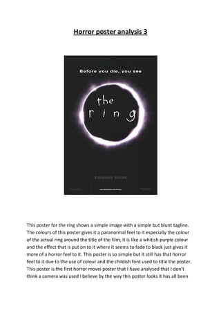
- 1. Horror poster analysis 3 This poster for the ring shows a simple image with a simple but blunt tagline. The colours of this poster gives it a paranormal feel to it especially the colour of the actual ring around the title of the film, it is like a whitish purple colour and the effect that is put on to it where it seems to fade to black just gives it more of a horror feel to it. This poster is so simple but it still has that horror feel to it due to the use of colour and the childish font used to title the poster. This poster is the first horror movei poster that I have analysed that I don’t think a camera was used I believe by the way this poster looks it has all been
- 2. created digitally, that could be a way for me and my group to create our horror movie poster.