
Empfohlen
Weitere ähnliche Inhalte
Andere mochten auch
Andere mochten auch (14)
Kürzlich hochgeladen
Kürzlich hochgeladen (20)
Production titles
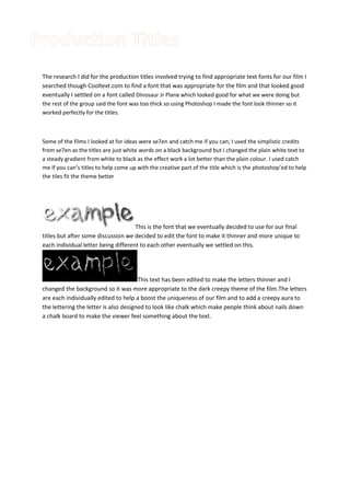
- 1. The research I did for the production titles involved trying to find appropriate text fonts for our film I searched though Cooltext.com to find a font that was appropriate for the film and that looked good eventually I settled on a font called DInosaur Jr Plane which looked good for what we were doing but the rest of the group said the font was too thick so using Photoshop I made the font look thinner so it worked perfectly for the titles. Some of the films I looked at for ideas were se7en and catch me if you can; I used the simplistic credits from se7en as the titles are just white words on a black background but I changed the plain white text to a steady gradient from white to black as the effect work a lot better than the plain colour. I used catch me if you can’s titles to help come up with the creative part of the title which is the photoshop’ed to help the tiles fit the theme better This is the font that we eventually decided to use for our final titles but after some discussion we decided to edit the font to make it thinner and more unique to each individual letter being different to each other eventually we settled on this. This text has been edited to make the letters thinner and I changed the background so it was more appropriate to the dark creepy theme of the film.The letters are each individually edited to help a boost the uniqueness of our film and to add a creepy aura to the lettering the letter is also designed to look like chalk which make people think about nails down a chalk board to make the viewer feel something about the text.