
Empfohlen
Weitere ähnliche Inhalte
Was ist angesagt?
Was ist angesagt? (19)
Andere mochten auch
Andere mochten auch (18)
Ähnlich wie Editing photos in Adobe Photoshop for an alternative music magazine
Ähnlich wie Editing photos in Adobe Photoshop for an alternative music magazine (20)
Kürzlich hochgeladen
Kürzlich hochgeladen (20)
Editing photos in Adobe Photoshop for an alternative music magazine
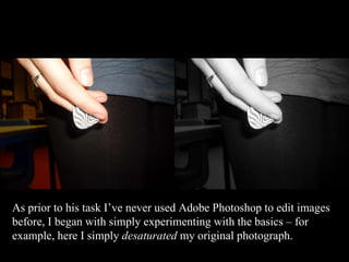
- 1. As prior to his task I’ve never used Adobe Photoshop to edit images before, I began with simply experimenting with the basics – for example, here I simply desaturated my original photograph.
- 2. I then did the same here, but utilized the history tool to return colour to particular features – in this case the red lipstick. I find it creates a very dynamic and intriguing look, without being overwhelmingly alternative.
- 3. I did the same again here, and found that by desaturating an image it can help it look more professional – in this case, a mint green carpet doesn’t exactly give the impression Ava’s on stage, yet once it is grey, it could pass as just about any surface.
- 8. I also edited this image on Adobe Photoshop to remove the background, I did so using the quick selection tool and a rubber for the detail. To smooth out the edges I used an over sized history brush to remove irregular edges left be jerky “rubbing out”. I furthered this by again again using the gaussion blur on the very edges of the image in order to prevent irregular and obviously photoshopped edges.
- 13. The final result was this image to the right. I will definitely be using it on the cover of my magazine as it is intriguing and abstract, yet fits comfortably within the genre of “alternative” by not appearing overly polished and therefore mainstream.
- 14. Another outcome of editing was this image created simply by overlaying a strong red hue to a black and white image of the photograph – which I find is exceedingly striking. Nevertheless I found that this overly pale figure with accentuated redness linked strongly vampirism and therefore the gothic music genre. Consequently I decided that this was the wrong route to go down, as I felt it would detract from my magazine’s standing as an Alternative Music magazine if it were used.
- 15. I wanted this figure to be alone with a transparent background, and so I used the quick selection tool, along with the occasional rubber use, to erase all the background so that Ezra was a lone figure. To smooth out the slightly jerky edges that were left, I used the lasso tool to draw around the very edges of the image and a bit of the now transparent background. I then applied the gaussion blur tool in order to give a smooth edge and professional finish.
- 16. Another of my original images has again got a coloured hue, only this time it is both red and green. The lone figure with his guitar gives the impression of a signer/songwriter, and the sultry lighting reflects the kind of alternative moody song they might be playing
- 17. In order to make sure there was a clear difference between my artists, I used Photoshop to replace the red lighting with a green hue . I also sharpened the image, as low lighting often leaves images looking of a poor quality. This photo will look very effective on my contents page, and could be used as an image representing a variety of articles.
- 18. This image, of my featured artist, I find is very effective as the light shining through and the silhouetted figure gives the impression that she is on stage. The dark lighting makes it look moody, but the bright light shining through prevents this image from becoming too gothic.
- 19. I again utilized the Gaussian Blur tool on Photoshop in order to blend the left hand side of this image into white. This way it can blend seamlessly into my double page spread. Furthermore, I feel it will create a more professional and convincing appearance.
- 20. I simply upped the contrast of this image once it was on publisher in order to give it a more striking look, and to strengthen the colours to make it look edgier and of a higher quality.
- 21. This image looks very convincing as an action shot of Ava performing on stage, however I felt it needed a certain polish! Furthermore, I wanted to manipulate it for effective use in my contents page, which involved a variety of editing skills!
- 22. I flipped the image horizontally so that Ava would be facing into the page (as this image is to be positioned to the right of the page) I used the quick selection tool, along with the rubber tool to smooth out the slightly jerky edges that were left, I then applied the gaussion blur tool in order to give a smooth edge and professional finish. I altered colour saturation of the iris’s in order to remove redness I then upped the contrast for a more striking, unique effect.