
Empfohlen
Weitere ähnliche Inhalte
Was ist angesagt?
Was ist angesagt? (19)
Ähnlich wie Music Magazines Analysis
Ähnlich wie Music Magazines Analysis (20)
Kürzlich hochgeladen
Kürzlich hochgeladen (20)
Music Magazines Analysis
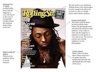
- 1. Masthead This is slightly covered which shows that the magazine is very well known as the cover is recognisable enough without the masthead being totally uncovered. Feature article photo This shows only the photo involved with the main feature, the photograph used will attract the attention of the audience. It also makes it clear who the magazine is targeted to as the picture is very clear to see. The cover is a poster style and the emphasis is on the photography. Indirect mode of address This gives the audience chance to see the character. The font used is very traditional ‘Rolling Stones’ font which makes it iconic enough to be able to be covered, it is also in a bright colour which attracts attention. Colour scheme Black, yellow & white these colours stand out a lot against the plain background and make the photograph the main topic of the cover.
- 2. -The house style is sophisticated throughout and has a newspaper-like appearance, this suggests that the readership is older and more intelligent as the stories have more substance. -The colour scheme is also the same throughout which makes it look more professional. -The photographs used are arranged on the page in a structured way, this adds to the sophisticated feeling of the magazine and makes the page look more organised. -The border on all of the pages ensure that all of the magazine pages look like they are from the same magazine which makes it look more professional.