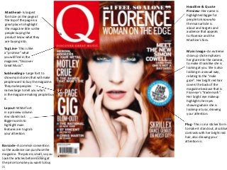
SlideShare ist ein Scribd-Unternehmen logo
1 von 9
Headline & Quote
 Masthead- Is largest                   Preview- Her name is
 font size on the page at               highlighted bigger for
 the top of the page is a               people to know who
 great place to highlight               the main article is
 the magazine title so the              about and targets and
 people buying the                      audience that appeals
 product know what they                 to Florence and the
 are buying into.                       Machine’s fans.

 Tag Line- This is like
 a “promise” what
                                        Main Image- An extreme
                                        close up shot emphases
 you will find in the
                                        her glare into the camera,
 magazine; “Discover
                                        to make it look like she is
 Great Music”.
                                        looking at you. She is also
 Subheadings- Large font to             looking in a sexual way,
 show main stories that will make       relating to the “male
 people want to buy the magazine.       gaze”. Her bright red hair
 They make peoples                      covers the back of the
 names large to tell you who’s          magazine because that is
 in the magazine making people buy      Florence’s “trade mark”.
 it.                                    Her bright eye makeup
                                        highlights her eyes
                                        showing where she is
 Layout- White font                     looking- at you, drawing
 in a preview column                    your attention.
 row stands out.
 Bigger words to
 highlight main                        Plug- This is in a sticker form
 features are to grab                  to make it stand out, also blue
 your attention.                       contrasts with her bright red
                                       hair, also drawing your
                                       attention in.
Barcode- A common convention
so the audience can purchase the
magazine. The price is small, so you
look the articles before looking at
the price to make you want to buy
it.
Subheading- This is to make sure
 the audiences know where to go if        Issue Number- This tells you
 they want to read about their            how long the magazine has been
 favourite band. It is an easier way to   publishing for and how successful
 structure and layout a contents page     it is.
 as the subheadings tell you what you
 need to know and where. Having
 the main subheading eg. Features, in
 a block and in a different colour
 makes it stand out and even the
 page numbers are in the same set         Splash Image & Caption- This is the
 red. The bands or articles are in a      largest image on the page showing a
 bold black font, just like the ones      main article to draw the audience in
 on the front page, this is so you can    and they can easily find it with this
 see and look out for what you want       large image and number marked in the
 and quickly get to it.                   corner.
                                          They look casual and laid back with
                                          their hands in their pockets shows
                                          they are not serious and making music
Kicker (Specials)- This contrasts with    because they want to. Being in the
the “Every Month” heading as it is        county side could tell you the genre of
something new in the magazine with        their music; indie/country. Or where
a famous band which a lot of people       they came from linking and inspiring to
know, framing to a larger audience        people in the country.
scale.


                                           “Review”- This tells people
                                           what is in the charts and what
                                           they should be listening to.
“Every Month”-Subheading                   Again the usual layout is used,
This is to tell you what you will          red to highlight page numbers
expect in every issue. So you feel         and bold black so you can quickly
comfortable with the magazine              find the review you want. As it is
layout inside and know what you            in its own box you can expect this
are expecting.                             to be in most issues and quite
                                           important to the magazine because
                                           the magazine statues it’s tagline;
                                           “Discover Great Music”.
Column-The                         Headline-The headline is bold although it is not large in comparison to the “Review New
column on the left                 Albums”, this suggests they would rather sell new albums than Florence and the Machine as
is advertising other               an artist herself. It could also show that because of the extremely large image on the opposite
artists like Florence              page Florence has been advertised largely through this image.
and the Machine.
This links to the
target audience as
Q’s audience buy
the magazine to
listen to the “good”
music. This column
will make it easier
for people who like
Florence's unique
voice and for
people to expand
their music in this
specific genre.
Pull-Quote-A
quote in the middle
of the page in a
sticker box bring it
out and is a
common
convention in
articles which gets
your attention by
highlighting a
interesting part of
the interview
making people want
to read the rest of
the article. It is in a   Main Image-The image takes up a whole page, this is effective as it shows who the article is about. Also
different colour to       the colours of the image are warm reds and oranges to link with her signature hair colour. Red= passion,
also highlight it and     love, fiery and warmth, this shows how Florence is in her personality. This links to intertextuality as her
make it stand out         website as the images rolling on her own website are alike, linking together both this article and her
from the page, the        website. Q readers treasure the Q photography with 97% saying it has the best interviews and award
box around it             winning photography, explaining why the image is so large.
complements this
too.
Price and date-                                              Subheadings- The sub-
The price relates to the                                     heading is close to the
status of classes and who can afford                         Masthead showing how
to buy the magazine. The date shows                          they relate and it is easier
how often the magazine is out.                               for the audience to see
Masthead- Is behind the image                                what to expect inside.
because it is such a well known                              The names of the bands
magazine just the shaping of the                             are highlighted in the same
masthead you know what magazine                              red as the Masthead and
you are reading and picking up. It also                      Headline, this is to show
suggests that the same audience buy                          the link and brining it out
the same magazine each issue. The                            from the black font is
colour red is to highlight new bands                         effective as it stands out and
or existing bands, and having the                            Is easy for the audience to
masthead(NME) in the same red shows                          See and notice.
that you will expect new and existing
bands in the NME magazine. The sub-
masthead underneath “New Music”                                 Headline- This is straight
even shows what you except in the                               across the middle of the
magazine.                                                       cover to grab attention
                                                                straight away. It is in a
Main Image- The band is set in a
                                                                bold red to stand out
traditional “band layout”- two in front,
                                                                from the cream and white
two behind. This is to show the will stick
                                                                colour scheme. Also the
together but also to show you who the
                                                                “of” is in a different font
band members are; drummer being at
                                                                to the rest of the fonts
the back, main guitarist/singer at
                                                                showing they are not
the front. The hand reaching out is
                                                                afraid to be different as
almost reaching out to you inviting you
                                                                their music is not like
to joining them; pulling you in. This is
                                                                many other bands but can
making you want to be with them and
                                                                still make it big being
Will make you buy the magazine so you
                                                                different; inspirational.
Can read about/with them.
Plug- This relates to the
audience in that would be interested                                Barcode- This is a
in V Festival as these people would                                 common convention
be interested in the bands in NME.                                  of magazines so
And it also has an article on the                                   people can buy the
Festival telling you about the bands that will be playing.          magazine.
Index- This column is in every       Heading- This is a large font
                                      to stand out but the thing
 issue on NME so it is easier to
                                      which stands out is the NME
 find your favourite bands and
                                      logo so people know and learn
 article on them. This is a good
                                      the logo instantly if they put it
 selling point to the music
                                      on most pages.
 audience wanting to find out
 more information on their
 favourite bands.
 Layout- Having the main               Subheadings- Again
 article in the middle of the          this is a feature to make
 page with a picture with it           it easy for the audience
 grabs your attention quickly          to what they want
 and the black, red and white          quickly. NME readers are
 colour scheme is to highlight         mostly male(74%) so the
 main information in the               easy subheadings are
 brighter colour(red) for              quick and easy because
 example band names or page            they do not want to
 numbers. Having headings and          search everywhere in
 an index is easier to find what       the magazine, also NME
 article you want to read.             readers trust the
                                       magazine and this layout
Main Article& Picture- The             is in every issue so they
 image is of the band playing          can trust to find the
 live which indicates to the           bands and articles they
 article will be about their tour.     want easily. The large
 The look like they are                picture and ads attract
 passionate in what they are           the male readers as
 doing. This links to the target       stereotypical males
 audience wanting to read the          prefer to look at images
 magazine, as they are having          rather than text.
 fun with what they are doing,
 which is what teenagers want.
Advert- This is advertise for their      Plug- drawing people
own magazine to subscribe and get        in with information
the issue every week at a                the “need” to know
discounted price.                        about No. 1 gigs in the
                                         UK.
Blobs-The odd rectangle and square shapes placed around, under test and
Layout-The layout of this double page spread is                                    over the image shows the band is quirky in their style of music and not afraid
simple with the colours and fonts standing out                                     to be different. Also NME is targeted for a student audience so they need to
from each other making it easy to read, also it                                    keep the audience interested by using a unique page design. Also the colours
looks like a simple page. The blue blobs stand out                                 of these blobs are bright and do not apply to the usual NME colour scheme,
making the                                                                         showing it is a special addition.
layout a bit more
interesting
and unique. The
text layout uses                                                                                                                                    Pull-Quotes-
a plain article                                                                                                                                     Pull quotes
layout but using                                                                                                                                    are a good
light blue to                                                                                                                                       way to attract
make some                                                                                                                                           the audience
information                                                                                                                                         by using an
stand out.                                                                                                                                          interesting
                                                                                                                                                    part of the
                                                                                                                                                    article and
                                                                                                                                                    highlighting it
                                                                                                                                                    making the
                                                                                                                                                    reader want
                                                                                                                                                    to read about
                                                                                                                                                    the subject
                                                                                                                                                    more. These
                                                                                                                                                    are used a lot
                                                                                                                                                    in interviews
                                                                                                                                                    so you can
                                                                                                                                                    quickly see
                                                                                                                                                    what the
                                                                                                                                                    band are
                                                                                                                                                    saying.

Main Image-Is large taking up a whole page and quarter of the next page. This gets straight to the point of who the band is. The way they are holding their
guitars near their crotch is a symbol of male power. This can relate to the male audience as they want to be powerful and will look up to them, but it can also
attract the female audience using phallic symbolism as women want a power, strong man. Again they are looking straight into the camera, wanting something
from you, the audience. Although, because only two members of the band are holding the guitars it may show they are the main members of the band. But
relating to the article it tells us that The Vaccines are the “biggest guitar band of 2011” so the object of guitars is shown in the image to strengthen this point.
The tone of this image is dirty and dull showing the genre may be garage and rock and reflecting to their gritty sound.
Date and Price- The price
Masthead- The masthead is behind                    is the smallest font on the
Taylor Swifts image, this shows the                 page so you look at it last,
audience of Rolling Stone are regular               after you have read the
buyers and know the recognisable logo,              headlines and decided to buy
even behind the image. The bright red               It.
stands out as it contrasts from the white
background making it easier to find in a            Plug- “HOT” stands out
magazine rack in your local shop.                   making it eye catching
                                                    and people will want to
                                                    read it as they want to
                                                    aspire to celebrities like
Subheadings- The subheadings are in a               Taylor Swift and will
preview and column, this is effective as            want to read how they
the reader knows straight away what is              do it and how they can
going to be in the magazine and if they             themselves.
like or relate to this. Shocker words
make you want to read the magazine                Headline- It is large and placed
more as it is gossip and gets your attention      centre, but to the right so it is
quickly.                                          not taking up the whole of the
                                                  image. This is because Taylor
                                                  Swift is a famous and talented
Main Image- Taylor Swift is known as a            artist so lots of people know
good, county girl but the provocative pose        who she is. Although it is in a
shows a different side to her. This links to      different colour to the other
the plug on the other side, “Hot Stuff”. It       fonts on the page, this is only to
relates to the theory, the Male Gaze as she       make the main article headline
is posing in a way she would not normally.        stand out so the audience know
The pose is sexy and the way she has her          it is about “the heart break kid”
hand between her legs is a provocative pose.      drawing people in with a direct
Her make up and hair looks messy and              Quote as the strapline.
although she is a good girl, this can portray
her in the opposite. The county girl looks
almost opposite to her county outback
                                                        Barcode- A common
songs and lifestyle are. This gets peoples
                                                        convention needed
attention because they want to know why
                                                        to sell the magazine,
she is looking like this. But it relates to the
                                                        placed at the bottom
Male Gaze theory that men would want to
                                                        not taking up much room
look at her because she is looking sexy and
women aspire to be her.
Layout-The layout is
Images-The images are              simple and is split into
presented in full blocks on the    separate sections so it is
left side of the page with         easy for the audience to
large page numbers in the          find what they are looking
corner so it doesn’t take up       for and also makes it look
the whole of the photography       smart, to link to the older
but know where to go               male audience. The bright
instantly. The images are all of   headings and page
inspirational people from the      numbers make it simple to
American president to Billie       find what you are looking
Armstrong from Green Day.          for but it doesn’t make it
This could show that the           look too outstanding.
audience for the Rolling Stone     A small box at the bottom
magazine is quite                  shows your what was on
sophisticated but also has a       the front cover and where
lively side to them with the       you can find the articles, I
rock bands. Rolling Stone is       think this is useful as
targeted for a medium age of       people mainly buy a
32 years old, one of the older     magazine because of
range of music magazines.          what’s on the cover.
The artists shown are older
artists which this target
audience will enjoy reading        Font-The font is used to
about such as Bruce                also represents an older
Springsteen. Although this         audience as it is quite
magazine is made in America,       sophisticated and not
represented by American            flashing out in front of
politics and American bands it     you. The way they
is sold in England and people      highlight main details
in the UK will still buy an        and information is by
American music magazine            using a bright red which
because the American artists       complements with the
shown are world wide known         white and black., making
so people in the UK still want     it stand out.
to read about their favourite
American bands.
Masthead-The masthead is large and in a the usual        Main Image-The main image takes up a page and quarter of the
Rolling Stone red to link with the magazine set          previous page, is because imagery of the band is important, also the main feature of this photograph
colours; red, black and white. It is large and at the    is the colours and how it links to their new album. The front cover of their album is the same tone as
top of the page to let the reader know what the          this photograph of the whole band linking to the intertextuality of the band advertising their album
interview is about; questionnaire interview.             through a photo-shoot with Rolling Stone. They look laid-back looking straight into the camera and
                                                                                                                                                maybe even
                                                                                                                                                looking
                                                                                                                                                desperate for
                                                                                                                                                you to buy their
Headline-A big
                                                                                                                                                new album
headline of the
                                                                                                                                                linking to the
bands name
                                                                                                                                                interview on the
gets straight to
                                                                                                                                                other side of the
the point and
                                                                                                                                                page.
tells you who
                                                                                                                                                Linking back to
the interview is
                                                                                                                                                the colours of
with. The Kings
                                                                                                                                                the album and
Of Leon font is
                                                                                                                                                this image and
the same font
                                                                                                                                                also link to their
of the side of
                                                                                                                                                tour, “Come
their albums
                                                                                                                                                Around
linking to other
                                                                                                                                                Sundown”,
media
                                                                                                                                                which is what
advertising and
                                                                                                                                                their album is
selling their
                                                                                                                                                called, with the
products with
                                                                                                                                                colours looking
the band name
                                                                                                                                                like a sunset
fitting with the
                                                                                                                                                linking to the
tone of the
                                                                                                                                                “sundown”.
image both
linking to their
upcoming
album.


Text and Fonts-The introduction is written in a bold red to make it stand out
from the main interview, this is so the readers know what the interview is         Layout-The text is spread into columns like a newspaper making it look
about and know when it is starting. A bold font is used to highlight the
                                                                                   official and so it is simple, but smart and easy to read. Having a large image
questions asked and answers from the band in a smaller font. A drop cap is
                                                                                   of the band promotes them quickly and with an male audience the
used at the start of the paragraph to show where the text and interview starts.
                                                                                   magazine wants to quickly get to the point so they don’t get bored.

Weitere ähnliche Inhalte

Andere mochten auch (7)

Deciduous forests
Deciduous forestsDeciduous forests
Deciduous forests
 
ดนตรีไทยสมัยรัตน
ดนตรีไทยสมัยรัตนดนตรีไทยสมัยรัตน
ดนตรีไทยสมัยรัตน
 
องค์ประกอบของดนตรี
องค์ประกอบของดนตรีองค์ประกอบของดนตรี
องค์ประกอบของดนตรี
 
ดนตรีไทยสมัยอยุธยาและธนบุรี
ดนตรีไทยสมัยอยุธยาและธนบุรีดนตรีไทยสมัยอยุธยาและธนบุรี
ดนตรีไทยสมัยอยุธยาและธนบุรี
 
Reli Languedoc
Reli LanguedocReli Languedoc
Reli Languedoc
 
Us.500.30
Us.500.30Us.500.30
Us.500.30
 
Emily
EmilyEmily
Emily
 

Cover, Contents and Double Page Spread Analysis

  • 1. Headline & Quote Masthead- Is largest Preview- Her name is font size on the page at highlighted bigger for the top of the page is a people to know who great place to highlight the main article is the magazine title so the about and targets and people buying the audience that appeals product know what they to Florence and the are buying into. Machine’s fans. Tag Line- This is like a “promise” what Main Image- An extreme close up shot emphases you will find in the her glare into the camera, magazine; “Discover to make it look like she is Great Music”. looking at you. She is also Subheadings- Large font to looking in a sexual way, show main stories that will make relating to the “male people want to buy the magazine. gaze”. Her bright red hair They make peoples covers the back of the names large to tell you who’s magazine because that is in the magazine making people buy Florence’s “trade mark”. it. Her bright eye makeup highlights her eyes showing where she is Layout- White font looking- at you, drawing in a preview column your attention. row stands out. Bigger words to highlight main Plug- This is in a sticker form features are to grab to make it stand out, also blue your attention. contrasts with her bright red hair, also drawing your attention in. Barcode- A common convention so the audience can purchase the magazine. The price is small, so you look the articles before looking at the price to make you want to buy it.
  • 2. Subheading- This is to make sure the audiences know where to go if Issue Number- This tells you they want to read about their how long the magazine has been favourite band. It is an easier way to publishing for and how successful structure and layout a contents page it is. as the subheadings tell you what you need to know and where. Having the main subheading eg. Features, in a block and in a different colour makes it stand out and even the page numbers are in the same set Splash Image & Caption- This is the red. The bands or articles are in a largest image on the page showing a bold black font, just like the ones main article to draw the audience in on the front page, this is so you can and they can easily find it with this see and look out for what you want large image and number marked in the and quickly get to it. corner. They look casual and laid back with their hands in their pockets shows they are not serious and making music Kicker (Specials)- This contrasts with because they want to. Being in the the “Every Month” heading as it is county side could tell you the genre of something new in the magazine with their music; indie/country. Or where a famous band which a lot of people they came from linking and inspiring to know, framing to a larger audience people in the country. scale. “Review”- This tells people what is in the charts and what they should be listening to. “Every Month”-Subheading Again the usual layout is used, This is to tell you what you will red to highlight page numbers expect in every issue. So you feel and bold black so you can quickly comfortable with the magazine find the review you want. As it is layout inside and know what you in its own box you can expect this are expecting. to be in most issues and quite important to the magazine because the magazine statues it’s tagline; “Discover Great Music”.
  • 3. Column-The Headline-The headline is bold although it is not large in comparison to the “Review New column on the left Albums”, this suggests they would rather sell new albums than Florence and the Machine as is advertising other an artist herself. It could also show that because of the extremely large image on the opposite artists like Florence page Florence has been advertised largely through this image. and the Machine. This links to the target audience as Q’s audience buy the magazine to listen to the “good” music. This column will make it easier for people who like Florence's unique voice and for people to expand their music in this specific genre. Pull-Quote-A quote in the middle of the page in a sticker box bring it out and is a common convention in articles which gets your attention by highlighting a interesting part of the interview making people want to read the rest of the article. It is in a Main Image-The image takes up a whole page, this is effective as it shows who the article is about. Also different colour to the colours of the image are warm reds and oranges to link with her signature hair colour. Red= passion, also highlight it and love, fiery and warmth, this shows how Florence is in her personality. This links to intertextuality as her make it stand out website as the images rolling on her own website are alike, linking together both this article and her from the page, the website. Q readers treasure the Q photography with 97% saying it has the best interviews and award box around it winning photography, explaining why the image is so large. complements this too.
  • 4. Price and date- Subheadings- The sub- The price relates to the heading is close to the status of classes and who can afford Masthead showing how to buy the magazine. The date shows they relate and it is easier how often the magazine is out. for the audience to see Masthead- Is behind the image what to expect inside. because it is such a well known The names of the bands magazine just the shaping of the are highlighted in the same masthead you know what magazine red as the Masthead and you are reading and picking up. It also Headline, this is to show suggests that the same audience buy the link and brining it out the same magazine each issue. The from the black font is colour red is to highlight new bands effective as it stands out and or existing bands, and having the Is easy for the audience to masthead(NME) in the same red shows See and notice. that you will expect new and existing bands in the NME magazine. The sub- masthead underneath “New Music” Headline- This is straight even shows what you except in the across the middle of the magazine. cover to grab attention straight away. It is in a Main Image- The band is set in a bold red to stand out traditional “band layout”- two in front, from the cream and white two behind. This is to show the will stick colour scheme. Also the together but also to show you who the “of” is in a different font band members are; drummer being at to the rest of the fonts the back, main guitarist/singer at showing they are not the front. The hand reaching out is afraid to be different as almost reaching out to you inviting you their music is not like to joining them; pulling you in. This is many other bands but can making you want to be with them and still make it big being Will make you buy the magazine so you different; inspirational. Can read about/with them. Plug- This relates to the audience in that would be interested Barcode- This is a in V Festival as these people would common convention be interested in the bands in NME. of magazines so And it also has an article on the people can buy the Festival telling you about the bands that will be playing. magazine.
  • 5. Index- This column is in every Heading- This is a large font to stand out but the thing issue on NME so it is easier to which stands out is the NME find your favourite bands and logo so people know and learn article on them. This is a good the logo instantly if they put it selling point to the music on most pages. audience wanting to find out more information on their favourite bands. Layout- Having the main Subheadings- Again article in the middle of the this is a feature to make page with a picture with it it easy for the audience grabs your attention quickly to what they want and the black, red and white quickly. NME readers are colour scheme is to highlight mostly male(74%) so the main information in the easy subheadings are brighter colour(red) for quick and easy because example band names or page they do not want to numbers. Having headings and search everywhere in an index is easier to find what the magazine, also NME article you want to read. readers trust the magazine and this layout Main Article& Picture- The is in every issue so they image is of the band playing can trust to find the live which indicates to the bands and articles they article will be about their tour. want easily. The large The look like they are picture and ads attract passionate in what they are the male readers as doing. This links to the target stereotypical males audience wanting to read the prefer to look at images magazine, as they are having rather than text. fun with what they are doing, which is what teenagers want. Advert- This is advertise for their Plug- drawing people own magazine to subscribe and get in with information the issue every week at a the “need” to know discounted price. about No. 1 gigs in the UK.
  • 6. Blobs-The odd rectangle and square shapes placed around, under test and Layout-The layout of this double page spread is over the image shows the band is quirky in their style of music and not afraid simple with the colours and fonts standing out to be different. Also NME is targeted for a student audience so they need to from each other making it easy to read, also it keep the audience interested by using a unique page design. Also the colours looks like a simple page. The blue blobs stand out of these blobs are bright and do not apply to the usual NME colour scheme, making the showing it is a special addition. layout a bit more interesting and unique. The text layout uses Pull-Quotes- a plain article Pull quotes layout but using are a good light blue to way to attract make some the audience information by using an stand out. interesting part of the article and highlighting it making the reader want to read about the subject more. These are used a lot in interviews so you can quickly see what the band are saying. Main Image-Is large taking up a whole page and quarter of the next page. This gets straight to the point of who the band is. The way they are holding their guitars near their crotch is a symbol of male power. This can relate to the male audience as they want to be powerful and will look up to them, but it can also attract the female audience using phallic symbolism as women want a power, strong man. Again they are looking straight into the camera, wanting something from you, the audience. Although, because only two members of the band are holding the guitars it may show they are the main members of the band. But relating to the article it tells us that The Vaccines are the “biggest guitar band of 2011” so the object of guitars is shown in the image to strengthen this point. The tone of this image is dirty and dull showing the genre may be garage and rock and reflecting to their gritty sound.
  • 7. Date and Price- The price Masthead- The masthead is behind is the smallest font on the Taylor Swifts image, this shows the page so you look at it last, audience of Rolling Stone are regular after you have read the buyers and know the recognisable logo, headlines and decided to buy even behind the image. The bright red It. stands out as it contrasts from the white background making it easier to find in a Plug- “HOT” stands out magazine rack in your local shop. making it eye catching and people will want to read it as they want to aspire to celebrities like Subheadings- The subheadings are in a Taylor Swift and will preview and column, this is effective as want to read how they the reader knows straight away what is do it and how they can going to be in the magazine and if they themselves. like or relate to this. Shocker words make you want to read the magazine Headline- It is large and placed more as it is gossip and gets your attention centre, but to the right so it is quickly. not taking up the whole of the image. This is because Taylor Swift is a famous and talented Main Image- Taylor Swift is known as a artist so lots of people know good, county girl but the provocative pose who she is. Although it is in a shows a different side to her. This links to different colour to the other the plug on the other side, “Hot Stuff”. It fonts on the page, this is only to relates to the theory, the Male Gaze as she make the main article headline is posing in a way she would not normally. stand out so the audience know The pose is sexy and the way she has her it is about “the heart break kid” hand between her legs is a provocative pose. drawing people in with a direct Her make up and hair looks messy and Quote as the strapline. although she is a good girl, this can portray her in the opposite. The county girl looks almost opposite to her county outback Barcode- A common songs and lifestyle are. This gets peoples convention needed attention because they want to know why to sell the magazine, she is looking like this. But it relates to the placed at the bottom Male Gaze theory that men would want to not taking up much room look at her because she is looking sexy and women aspire to be her.
  • 8. Layout-The layout is Images-The images are simple and is split into presented in full blocks on the separate sections so it is left side of the page with easy for the audience to large page numbers in the find what they are looking corner so it doesn’t take up for and also makes it look the whole of the photography smart, to link to the older but know where to go male audience. The bright instantly. The images are all of headings and page inspirational people from the numbers make it simple to American president to Billie find what you are looking Armstrong from Green Day. for but it doesn’t make it This could show that the look too outstanding. audience for the Rolling Stone A small box at the bottom magazine is quite shows your what was on sophisticated but also has a the front cover and where lively side to them with the you can find the articles, I rock bands. Rolling Stone is think this is useful as targeted for a medium age of people mainly buy a 32 years old, one of the older magazine because of range of music magazines. what’s on the cover. The artists shown are older artists which this target audience will enjoy reading Font-The font is used to about such as Bruce also represents an older Springsteen. Although this audience as it is quite magazine is made in America, sophisticated and not represented by American flashing out in front of politics and American bands it you. The way they is sold in England and people highlight main details in the UK will still buy an and information is by American music magazine using a bright red which because the American artists complements with the shown are world wide known white and black., making so people in the UK still want it stand out. to read about their favourite American bands.
  • 9. Masthead-The masthead is large and in a the usual Main Image-The main image takes up a page and quarter of the Rolling Stone red to link with the magazine set previous page, is because imagery of the band is important, also the main feature of this photograph colours; red, black and white. It is large and at the is the colours and how it links to their new album. The front cover of their album is the same tone as top of the page to let the reader know what the this photograph of the whole band linking to the intertextuality of the band advertising their album interview is about; questionnaire interview. through a photo-shoot with Rolling Stone. They look laid-back looking straight into the camera and maybe even looking desperate for you to buy their Headline-A big new album headline of the linking to the bands name interview on the gets straight to other side of the the point and page. tells you who Linking back to the interview is the colours of with. The Kings the album and Of Leon font is this image and the same font also link to their of the side of tour, “Come their albums Around linking to other Sundown”, media which is what advertising and their album is selling their called, with the products with colours looking the band name like a sunset fitting with the linking to the tone of the “sundown”. image both linking to their upcoming album. Text and Fonts-The introduction is written in a bold red to make it stand out from the main interview, this is so the readers know what the interview is Layout-The text is spread into columns like a newspaper making it look about and know when it is starting. A bold font is used to highlight the official and so it is simple, but smart and easy to read. Having a large image questions asked and answers from the band in a smaller font. A drop cap is of the band promotes them quickly and with an male audience the used at the start of the paragraph to show where the text and interview starts. magazine wants to quickly get to the point so they don’t get bored.