Elements & principles
•Download as PPT, PDF•
6 likes•1,847 views

Elements & Principles Basics Adrian Wegner 2002

Recommended
More Related Content
What's hot
What's hot (20)
Viewers also liked
Viewers also liked (20)
Similar to Elements & principles
Similar to Elements & principles (20)
Recently uploaded
Recently uploaded (20)
Elements & principles
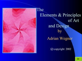
- 1. The Elements & Principles of Art and Design by Adrian Wegner 2002c copyright
- 2. Elements and Principles of Art INDEX: Introduction to ELEMENTS LINE SHAPE DIRECTION VALUE PROPORTION COLOR TEXTURE ELEMENTS Summary Introduction to PRINCIPLES REPETITION CONTRAST HARMONY GRADATION BALANCE UNITY PRINCIPLES Summary
- 3. Concepts of Art and Design are traditionally broken down into ELEMENTS and PRINCIPLES. ELEMENTS are “what” an artist uses to create a work of art. (ELEMENTS = what) PRINCIPLES describe “how” the artist uses the elements. (PRINCIPLES = how)
- 4. While different books and artists may use different words or labels to define the elements and principles, the basic concepts are the same. For this tutorial, we will utilize the following names for the seven (7) ELEMENTS. 1. Line 2. Direction 3. Shape 4. Value 5. Proportion 6. Color 7. Texture Back to INDEX
- 5. 1. The ELEMENT of LINE: A line is simply a point set in motion, the action of the motion giving the line its quality or characteristic. A line may be thick or thin, dark or light, curved or straight, crisp or fuzzy, and jagged or looping.
- 6. A HORIZONTAL LINE is peaceful or at rest. A VERTICAL LINE is alert, or has the potential to fall. A DIAGONAL LINE is dynamic and projects a feeling of movement or energy. Back to INDEX
- 7. 2. The ELEMENT of SHAPE: LINES may be used to enclose areas creating SHAPES. SHAPES may be GEOMETRICAL (having symmetry), or may be AMORPHOUS (being asymmetrical). Symmetrical shapes can be divided into two equal halves. Asymmetrical shapes cannot be divided equally. Back to INDEX
- 8. 3. The ELEMENT of DIRECTION: A line or row of shapes may align in a particular or general direction. A B C D A. HORIZONTAL B. LEFT OBLIQUE C. VERTICAL D. RIGHT OBLIQUE Back to INDEX
- 9. 4. The ELEMENT of VALUE: VALUE describes how dark or how light an element is. A LINE, SHAPE, or COLOR may have a VALUE ranging from very dark (BLACK or almost black) to very light (WHITE or almost white). Back to INDEX
- 10. 5. The ELEMENT of PROPORTION: How large or how small objects are in relation to one another is called PROPORTION. LINES, SHAPES, and general areas all have SIZE or WEIGHT. Back to INDEX
- 11. 6. The ELEMENT of COLOR: A LINE, SHAPE, or AREA may possess color. There are three (3) DIMENSIONS of COLOR: A. HUE B. CHROMA C. VALUE
- 12. HUE, or color, is important to the artist because of its psychological impact on the viewer. RED YELLOW BLUE RV BV RO YO YG BG G O V Warm colors and cool colors help create mood or attitude in a work.
- 13. CHROMA, or INTENSITY of HUE, is important because it allows the artist to create depth and emphasize contrasts through variations in intensity. Lower intensities of a color are achieved by adding a small amount of the color’s complement or black. Back to INDEX
- 14. VALUE, the lightness or darkness of a color, is also important for the artist in modeling and shaping form through the use of highlights and shadows. Back to INDEX
- 15. 7. The ELEMENT of TEXTURE: TEXTURE describes the characteristic of a surface. A LINE, SHAPE, or object may have the characteristic of being smooth or rough. The artist may try to suggest the illusion of a TEXTURE in two-dimensional work such as drawings and paintings, and may actually create textures in three- dimensional sculptures.
- 16. TEXTURE EXAMPLESBack to INDEX
- 17. ELEMENTS SUMMARY: The ELEMENTS of ART and DESIGN are LINE, DIRECTION, SHAPE, VALUE, PROPORTION, COLOR and TEXTURE. The ELEMENTS are WHAT an artist may use to create art. Next we will investigate the PRINCIPLES of ART and DESIGN. The PRINCIPLES describe HOW an artist USES the ELEMENTS. Back to INDEX
- 18. The PRINCIPLES are the various ways the seven ELEMENTS can be organized. These PRINCIPLES describe “how” an artist uses “elements” to create works of art. For this tutorial, we will utilize the following names for the six (6) PRINCIPLES. 1. Repetition 2. Contrast 3. Harmony 4. Gradation 5. Balance 6. Unity Back to INDEX
- 19. 1. The PRINCIPLE of REPETITION: The multiple use of the same element or group of elements is called REPETITION. Repeating the same ELEMENT creates a pattern or “REPETITIVE MOTIF.” Back to INDEX
- 20. 2. The PRINCIPLE of CONTRAST: Oftentimes designs that rely solely on REPETITION can be too monotonous or boring. For designs to be more interesting, add a CONTRASTING ELEMENT creating a point of interest or emphasis. The introduction of a UNIQUE ELEMENT becomes the PRINCIPLE of CONTRAST.
- 21. Designs in CONTRAST of SHAPE using a COMPLEMENTARY color scheme.
- 22. Designs in CONTRAST of PROPORTION using a TRIADIC color scheme.
- 23. Designs in CONTRAST of SHAPE using a TRIADIC color scheme. Back to INDEX
- 24. 3. The PRINCIPLE of HARMONY: HARMONY involves the use of elements that are “similar but not exactly the same.” HARMONIOUS ELEMENTS project a feeling of “family” or “belonging together.”
- 25. DESIGNS in HARMONY of LINE and SHAPE using an ANALOGOUS color scheme.
- 26. More designs in HARMONY of SHAPE and LINE using ANALOGOUS color schemes. Back to INDEX
- 27. 4. The PRINCIPLE of GRADATION: GRADATION involves change from one extreme to another in small sequential steps, i.e., BIG to small, DARK to light, STRAIGHT to bent, etc.
- 28. GRADATION DESIGNS based on GRADATION of DIRECTION and VALUE, using a MONOCHROMATIC COLOR SCHEME.
- 29. GRADATION DESIGNS based on GRADATION of COLOR INTENSITY using a COMPLEMENTARY-MIX color scheme.
- 30. GRADATION DESIGNS utilizing GRADATION of SHAPE and GRADATION of VALUE using SPLIT- COMPLEMENTARY color schemes.
- 31. DESIGN in GRADATION of SHAPE, DIRECTION and VALUE. DESIGN in GRADATION of SHAPE. Both of these designs utilize a SPLIT-COMPLEMENTARY color scheme. Back to INDEX
- 32. 5. The PRINCIPLE of BALANCE: BALANCE involves the sense of stability between weights and tensions within a design or composition. There are two types of BALANCE: A. SYMMETRICAL balance. B. ASYMMETRICAL balance.
- 33. Designs that are SYMMETRICAL are in a state of perfect balance, and project a feeling of being “static” or “unmoving.” SYMMETRICAL BALANCE:
- 34. ASYMMETRICAL BALANCE: Designs that are ASYMMETRICAL are slightly “unbalanced” and project a feeling of “dominance” by certain elements or areas. Usually ASYMMETRICAL designs are more dynamic and more interesting than SYMMETRICAL DESIGNS. Back to INDEX
- 35. 5. The PRINCIPLE of UNITY: UNITY is the result of using design ELEMENTS and PRINCIPLES in a manner that creates a pleasing and interesting design. In short, a “good design” has UNITY while a “poor design” appears disjointed and chaotic. Back to INDEX
- 36. PRINCIPLES SUMMARY: The PRINCIPLES of ART and DESIGN are REPETITION, CONTRAST, HARMONY, GRADATION, BALANCE and UNITY. The PRINCIPLES describe HOW an artist uses ELEMENTS to create art. Back to INDEX
- 37. While the terminology applying to art elements and principles varies somewhat from artist to artist and book to book, the basic concepts are the same. For example, “form” is a 3- dimensional variation of “shape”, “discord” is a form of “contrast”, and “rhythm” is achieved by repeating a pattern of elements.