Nampa Public Library Identity Guidebook
•
0 gefällt mir•280 views

Our logo is a very valuable asset. We must treat it nicely, and use it strategically to create a unifi ed look. It must appear prominently on the front cover, home page, or equivalent location of all print, video, and electronic publications.

Empfohlen
Empfohlen
Weitere ähnliche Inhalte
Ähnlich wie Nampa Public Library Identity Guidebook
Ähnlich wie Nampa Public Library Identity Guidebook (10)
Kürzlich hochgeladen
Kürzlich hochgeladen (20)
Nampa Public Library Identity Guidebook
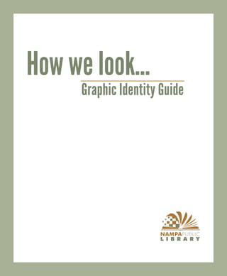
- 1. How we look... Graphic Identity Guide
- 2. Our logo is a very valuable asset. We must treat it nicely, and use it strategically to create a unified look. It must appear prominently on the front cover, home page, or equivalent location of all print, video, and electronic publications. V1 V2 Brand Attributes: Confident Progressive Friendly Comfortable Savvy Functional When you put together a publication, write the content and design the layout to communicate these key attributes.
- 3. Examples
- 4. Logo and Font Quick Reference Guide
- 5. Logo and Font Quick Reference Guide CYMK RGB 36 168 24 175 44 149 0 80 33 47 64 100 27 56 29 171 53 119 92 52 11 Serif Fonts - Best for large amounts of text Serif Fonts - Best for headlines Minion Pro Franklin Gothic Medium Times News Roman Arial Century Schoolbook News Gothic DM Bt Myriad
- 6. General Guidelines Before You Write Plan writing with your audience in mind Organize you ideas logically Avoid inadvertent racial, class age or gender stereotyping Always ask how to spell a name before you print it After You Write Have someone else read your copy for clarity Use your computer’s spell checker, but remember it will not catch many proper names or homonyms Proofread two or three times and have someone else proof the document as well. Social Media Guidelines Purpose of Using Social Media: Use Facebook (and other social media) as a tool to invite library users into the library and/ or to our website. Guidelines: Broadcast changes or important messages (hour changes/internet down/etc) Highlight library services and/or materials (new services, holiday books, etc) Invite library social media followers to library events Share news relevant to the library and its users. Share media (videos, photos, etc) relevant to the library and its users Other: Is your posting appropriate? When posting for the library, remember you are representing the library and the City of Nampa. Do not post personal beliefs, opinions, ideas, etc. Keep postings family friendly. Respect other departments’ updates. Do not immediately post on top of their posts, doing this pushes the posts down and making them less visible. If someone has posted . . . wait until the next day. Only designated administrators can post representing the library.
- 7. Some Do’s and Don’ts We don’t want to limit your creativity with a lot of rules and regulations, but there are some tricks that keep us looking good, and there some things that are ugly and need to be avoided Do Leave some space around the logo. Use white or neutral backgrounds. If you have to put the logo on a color use the reverse logo on green. Don’t Put the logo on yucky colors Put the logon on one of the colors in it’s own color palette Use a negative logo on backgrounds that are too light or cluttered Rotate the logo Skew the logo Don’t add embellishments, like drop shadows , embossing, etc.