
Empfohlen
Weitere ähnliche Inhalte
Was ist angesagt?
Was ist angesagt? (17)
Ähnlich wie Page Numbers in Images
Ähnlich wie Page Numbers in Images (20)
Mehr von lydiaplatts
Mehr von lydiaplatts (16)
Kürzlich hochgeladen
Kürzlich hochgeladen (12)
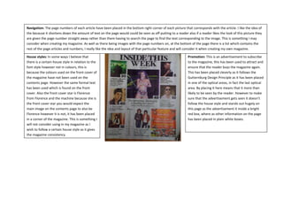
Page Numbers in Images
- 1. Navigation: The page numbers of each article have been placed in the bottom right corner of each picture that corresponds with the article. I like the idea of the because it shortens down the amount of text on the page would could be seen as off putting to a reader also if a reader likes the look of this picture they are given the page number straight away rather than them having to search the page to find the text corresponding to the image. This is something I may consider when creating my magazine. As well as there being images with the page numbers on, at the bottom of the page there is a list which contains the rest of the page articles and numbers, I really like the idea and layout of that particular feature and will consider it when creating my own magazine. House styles: In some ways I believe that Promotion: This is an advertisement to subscribe there is a certain house style in relation to the to the magazine, this has been used to attract and font style however not in colours, this is ensure that the reader buys the magazine again. because the colours used on the front cover of This has been placed cleverly as it follows the the magazine have not been used on the Gutternburg Design Principle as it has been placed contents page. However the same formal text in one of the optical areas, in fact the last optical has been used which is found on the front area. By placing it here means that it more than cover. Also the front cover star is Florence likely to be seen by the reader. However to make from Florence and the machine because she is sure that the advertisement gets seen it doesn’t the front cover star you would expect the follow the house style and stands out hugely on main image on the contents page to also be this page as the advertisement it inside a bright Florence however it is not, it has been placed red box, where as other information on the page in a corner of the magazine. This is something I has been placed in plain white boxes. will not consider using in my magazine as I wish to follow a certain house style as it gives the magazine consistency.
- 2. Text: The font styles used are quite formal, this is due to the target audience of this particular magazine as this magazine targets mainly ages 20-35 therefore it is appropriate to use formal text. When creating my own magazine I will take into consideration whether to use a formal or informal font type. The use of bold and italics have been used for the article titles, these font styles have been used to attract and grab the attention of the reader and encourage them to read this particular article. The article titles are either pull quotes from the full article, or the columnists view, these quotes could be said to be quite extreme as some of language used could be offensive to some people. However the use of the language does attract peoples attentions and therefore meeting the aim of its purpose. I will not personally use this language in my magazine as I do not see it as necessary however I will use pull quotes from the article to attract the reader attention. Navigation: Unlike the NME magazine, the MixMag magazine contents page only contains one image which has the page number in the bottom corner and then the rest of the magazines contents are listed down the right hand side of the page. By having only one image on the contents page it indicates that this is the main article in the magazine, whereas in the NME magazine it is not clear which is the main article. I like the layout of this page as it isn’t over crowded making it look contemporary and modern which is appropriate to my target audience as the younger generation are modern and like modern things. This navigation layout is really appealing to me and I will consider this layout when creating my own website. House Styles: The Mixmag magazine has Promotion: This is a promotion offering the reader of the followed the house styles from the front magazine a free CD, this advertisement has been used to cover unlike the NME magazine as the attract the reader and also to gain a rapport with the reader same colours of black, yellow and white so that they purchase the magazine again. In comparison that were on the front cover have been the NME magazine this promotion has been places in the used on the contents page. Similar to the bottom left corner and is the same colour and style of the NME, Mixmag have also used the same rest of text on the page. When following the Gutternburgh font style that is found on the front cover, Design Principle the bottom left corner is seen as a dead on the contents page, following the house corner meaning that the promotion may not be seen and styles of the magazine, this gives the also because the colours and fonts used for this promotion magazine consistency. As I want my are the same as everything else the promotion may not also magazine to have consistency I will too be seen. If I was to add this feature to my website I would like the Mixmag magazine will follow a follow the style used in the NME magazine and make sure it certain house style within my magazine. stands out and is in a place where it can be seen.
- 3. Text: The use of informal text has been used on the contents page, the reasons that informal text has been used is because of the magazines target audience, which is from ages 16-25, therefore using and informal text would be appropriate. As my target audience is similar to the target audience of Mixmag magazine using informal text would be appropriate for my magazine as well. Similar to the NME magazine the use of different font styles such as bold and italics have been used to make information stand out, and in relation to the use of font styles in this magazine, bold has been used to indicate each article. Underneath the initial article title the use of pull quotes have been used to attract and draw the reader in. As I have seen the use of bold and italics used in both magazines this is something I too will incorporate into my magazine, my reason being is that I believe they are successful in the job that they do. I will also incorporate pull quotes benefit the article title as these too have been used in both magazines and are successful.