Presentations That Suck
•Als PPTX, PDF herunterladen•
1 gefällt mir•450 views

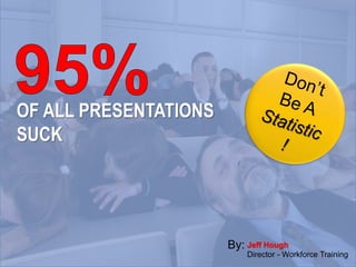
Stop being part of the 95% of public presentations that suck. Follow the principles outlined in this presentation to present like a pro!

Empfohlen
Empfohlen
Weitere ähnliche Inhalte
Andere mochten auch
Ähnlich wie Presentations That Suck
Ähnlich wie Presentations That Suck (20)
Mehr von Crazy Penguin Media
Mehr von Crazy Penguin Media (20)
Kürzlich hochgeladen
Kürzlich hochgeladen (20)
Presentations That Suck
- 1. OF ALL PRESENTATIONS SUCK Jeff Hough Director - Workforce Training By:
- 3. Big Idea:
- 7. Motivate
- 8. Entertain
- 9. Youdeliver the presentation The slides just help
- 10. The Trick…
- 11. “Recession fatigue is a form of chronic psychological stress caused or exacerbated by an individual’s economic circumstances, and severe and prolonged enough to degrade their personal effectiveness in work or non-work situations.” Recession Fatigue:
- 12. “Recession fatigue is a form of chronic psychological stress caused or exacerbated by an individual’s economic circumstances, and severe and prolonged enough to degrade their personal effectiveness in work or non-work situations.” Recession fatigue: The shotgun approach: blasting out information.
- 13. Recession fatigue: • Psychological stress • Economically exacerbated • Severe and prolonged • Degrade effectiveness • Work or non-work
- 14. Recession fatigue: • Psychological stress • Economically exacerbated • Severe and prolonged • Degrade effectiveness • Work or non-work The machine gun approach: more is better
- 16. Recession Fatigue The sniper approach: one shot, on point.
- 19. Recycle
- 25. Delive r
- 27. Audience
- 28. Time
- 29. Venue
- 30. So What?
- 32. Preparation
- 33. Preparation
- 34. Storyboard
- 40. cliché
- 41. cliché unique
- 42. cliché unique
- 47. #1 Rule for Fonts & Photos:
- 48. Fonts Serif
- 52. Fonts
- 53. Fonts
- 55. Quality Images
- 56. Images
- 63. Chocolate Cake
- 68. 5 Principles
- 76. Shape
- 80. Ali ent gnm
- 81. Ali entgnm
- 82. “Someone you can count on?”
- 83. “Someone you can count on?”
- 84. “Someone you can count on?”
- 87. Principles of Presentation Design: Think like a design pro By Art House Director of Crazy Penguin Grafix
- 88. Presentation Design Think like a design pro Principles of Art House Director - Crazy Penguin Grafix
- 89. Presentation Design Think like a design pro Principles of Art House Director - Crazy Penguin Grafix
- 93. 1st Qtr 2nd Qtr 3rd Qtr 4th Qtr Shows Percentages & Large Differences in Proportion
- 94. 1st Qtr 2nd Qtr 3rd Qtr 4th Qtr 0 1 2 3 4 5 6 7 8 9 Shows Precise Relationships & Data Over Time
- 95. 1st Qtr 2nd Qtr 3rd Qtr 4th Qtr 0 2 4 6 8 10 Best for Comparing Quantities
- 96. 1st Qtr 2nd Qtr 3rd Qtr 4th Qtr 0 1 2 3 4 5 6 7 8 9 Best for Showing Trends $8.2 Million
- 97. 0 1 2 3 4 5 Always Sometimes Seldom Never Survey Responses
- 98. 3.7 2.5 3.3 4.5 Always Sometimes Seldom Never Survey Responses
- 99. 0 20 40 60 80 100 Dog Cat Bird Fish Pet Preferences
- 100. 76% prefer dogs
- 105. John Jay
- 108. Helpful
- 109. Helpful Responsive
- 111. Delive r
- 112. “The use of the PowerPoint presentation has been a disaster… It should be ditched.” John Sweller University of NSW
- 118. Lead Your Audience
- 119. Tell Your Story
- 127. Delive r
- 128. Never give a presentation you would sleep through!
Hinweis der Redaktion
- To help you keep the word count down, keep your font size above 30 points. The words at the top of this slide are done in a font size of 32. Most of the slides that contain words in this presentation are in a font size around 60 pt.
- As you begin your preparation for your next presentation, there are a few questions that you need to be asked and answered before you begin your prepartions. The first question is who is your audience? What are their expectations? What background do they bring to the presentation that will influence how the presentation is interpreted and received?
- The next set of questions that you need to ask yourself deals with the amount of time that you will have for your presentation. How much time will you have? How much audience interaction will you have? Do you need to leave time for a question and answer period?
- Another great question to ask is, “what will my venue be like?” A venue like today requires a different approach than a presentation to a live audience. What will the room be like where you will be? Will you have room for props or to move around?
- This is the heart of any presentation. You may have a great topic or extraordinary information to share, but unless you deliver the information with an objective in mind you won’t have the impact that you desire. For example you may want your sales force to do a better job of tracking their sales calls. But unless your presentation provides a motivation for them to do that, they won’t take your message to heart and do what you want them to do. Most audience members are feeling some kind of pain, that is why they are in your audience. The are there seeking relief from whatever ails them. It is your job as the presenter to give them the prescription for their remedy. That is what the so what is, here is something that applies to you, and this is how it can make your/our world better.
- Every great presentation revolves around a central theme. I have a theme for today, and I will share with you later what it is, but my job as the story teller is to craft my tale in such a way as that everything points toward that main theme. Regardless of whether it is a sales presentation, a human resources issue or a company wide topic, the entire discussion must point towards that theme. Today you are here because you are feeling some type of presentation pain. You may feel like your powerpoint skills are lacking, or that your speaking skills aren’t where you would like them to be.
- As you go through your presentation you will support your central theme with multiple thoughts. These thoughts when connected together, like the strands of a web, will form a net that will encompass your thought and capture the minds of those in attendance and spur them towards action.
- When Kathy and I sat down to put this presentation together we spent about an hour on the process of brainstorming and mapping out our ideas. After we had completed our brainstorming we wrote each of the thoughts that we decided to keep on a post it note and began to assemble the thoughts under the appropriate sections. This gave us a great visual representation of the flow of the ideas from one topic to the next and allowed us to move thoughts around until we had them in an order that made sense and had a good flow and feel to it. The vertical lines represented the individual thoughts or slides, and the horizontal lines represented supporting thoughts or slides to the initial idea. Once we had the board arranged as we wanted it, our preparation phase was done and we were ready to move onto the design phase of the process. Are there any questions so far?
- To help you keep the word count down, keep your font size above 30 points. The words at the top of this slide are done in a font size of 32. Most of the slides that contain words in this presentation are in a font size around 60 pt.
- Lets take a moment to compare the original sign with the final version. Granted they are two different mediums, but let’s examine the emotional impact of the two signs. Does the wording on the first sign create any kind of impression on you? Regardless of whether or not you like fish, would this sign cause you to take even a peek at what’s inside? Now compare the second sign that has the image of the fish with the word fresh on it. What type of emotional impact does this one have?
- To help you keep the word count down, keep your font size above 30 points. The words at the top of this slide are done in a font size of 32. Most of the slides that contain words in this presentation are in a font size around 60 pt.
- To help you keep the word count down, keep your font size above 30 points. The words at the top of this slide are done in a font size of 32. Most of the slides that contain words in this presentation are in a font size around 60 pt.
- Another effective way to use contrast is in size. When using size, make sure that you put things in places that can accentuate the differences between the sizes. On this slide the “big” point is on the top left side of the slide, where your eye naturally goes when you first look at the slide. The “little” point is almost hidden because your eye has to work to find it, which is what you want with your contrast.
- Another effective way to use contrast is in size. When using size, make sure that you put things in places that can accentuate the differences between the sizes. On this slide the “big” point is on the top left side of the slide, where your eye naturally goes when you first look at the slide. The “little” point is almost hidden because your eye has to work to find it, which is what you want with your contrast.
- Another effective way to use contrast is in size. When using size, make sure that you put things in places that can accentuate the differences between the sizes. On this slide the “big” point is on the top left side of the slide, where your eye naturally goes when you first look at the slide. The “little” point is almost hidden because your eye has to work to find it, which is what you want with your contrast.
- Another effective way to use contrast is in size. When using size, make sure that you put things in places that can accentuate the differences between the sizes. On this slide the “big” point is on the top left side of the slide, where your eye naturally goes when you first look at the slide. The “little” point is almost hidden because your eye has to work to find it, which is what you want with your contrast.
- Another effective way to use contrast is in size. When using size, make sure that you put things in places that can accentuate the differences between the sizes. On this slide the “big” point is on the top left side of the slide, where your eye naturally goes when you first look at the slide. The “little” point is almost hidden because your eye has to work to find it, which is what you want with your contrast.
- To a certain extent I agree with this quote. Poorly designed powerpoints are a deterrent to the sharing of ideas and inspiring people. Conversely, a well designed powerpoint can enhance the sharing of your message and move people to action.
- This is a simple tool that can be somewhat difficult to use, because it requires some forethought to be able to use it effectively. You want your audience to want what you have bad enough that they will almost strain to hear your next word, or they will focus all of their attention on you so they won’t miss a word. For example, if I were wanting to share an important point on presentation delivery I might do something like this…. In preparation for this presentation I spent an hour on the phone with Roger Corvil who is a Nationally recognized speaker in the area of Webinars. His best selling book on Professional Presentations has sold over 1 millions copies world wide. While we were on the phone, Roger told me about a recent discover that he made that would revolutionize…. Now you have lead your audience to the edge of the water and it is time for them to drink. If you have set your story up correctly, they will drink deeply from your well.
- Tell the story of the auschwitz survivor and her brother.
- After you have done your preparation and decided upon a design, now it is time to work on the things that will help create an emotional connection with your audience. These connections are the building blocks for moving the audience. Pictures are great, but make sure they tie into what you are talking about. I couldn’t very well create a good emotional tie while talking about NASCAR and displaying this picture could I? Words, music, light sound….all can be used to create an emotional connection. Take time during your preparation & design phases to make sure you are using the appropriate medium to reach your desired audience.
- Deliver your presentation in blocks of time that are this size. Maximum concentration time for an adult is 15-20 minutes. Try to complete your topics within that timeframe.
- To help you keep the word count down, keep your font size above 30 points. The words at the top of this slide are done in a font size of 32. Most of the slides that contain words in this presentation are in a font size around 60 pt.