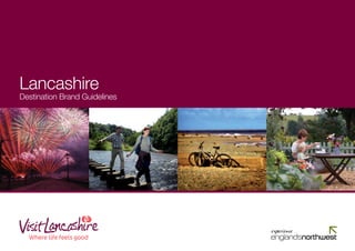
VisitLancashire Brand Guidelines
•
5 gefällt mir•1,555 views

Why are guidelines a good idea? By creating and reinforcing a consistent ‘look’, ‘feel’ and ‘tone of voice’ everything that is produced online or in print will be instantly identified. In this case it is a visitor destination brand for Lancashire that is being implemented. These guidelines have been designed to help Lancashire and Blackpool Tourist Board (LBTB) and its partners put the messages together by working within a clear set of rules. A consistent approach will strengthen the brand and help it become recognised and trusted by the people we want to reach - our visitors.

Empfohlen
Weitere ähnliche Inhalte
Andere mochten auch
Andere mochten auch (10)
Ähnlich wie VisitLancashire Brand Guidelines
Ähnlich wie VisitLancashire Brand Guidelines (20)
Mehr von Marketing Lancashire
Mehr von Marketing Lancashire (20)
Kürzlich hochgeladen
Kürzlich hochgeladen (20)
VisitLancashire Brand Guidelines
- 2. Welcome to the Contents Lancashire Brand Book 03 - 04 Defining our Brand Positioning Why are guidelines a good idea? By creating and reinforcing a consistent 05 Our Tone of Voice ‘look’, ‘feel’ and ‘tone of voice’ everything that is produced online or in 06 - 07 Our Brand Structure print will be instantly identified. In this case it is a visitor destination brand for 08 - 13 Our Brand Themes Lancashire that is being implemented. These guidelines have been designed 14 Our Goal to help Lancashire and Blackpool Tourist Board (LBTB) and its partners put 15 Our New Look Logo the messages together by working within a clear set of rules. A consistent 16 - 23 Design Guidelines approach will strengthen the brand and help it become recognised and trusted by the people we want to reach - our visitors. 02 Lancashire Destination Brand Guidelines
- 3. Defining our Brand Positioning Defining the brand position for Lancashire has been a thorough process. Research indicates that an emotional appeal that focuses on the visitor We spoke to many stakeholders and undertook focus groups with potential experience (rather than a rational presentation of our products) will differentiate visitors. We asked people what motivates them to take short breaks and what Lancashire from our competitors. Further, evidence shows that consumers they think about Lancashire. Some things were encouraging; they recognise respond more positively to emotional propositions rather than rational ones. the warmth and genuine big heartedness of Lancashire and its people. In the research groups, expressions and images that focused on how Lancashire Unfortunately, to many we are still an unknown quantity, or they have can make you feel drew many positive responses. outdated views. They are confused about our boundaries and what we stand for. The good news is that they are open to visit if we can With this research and looking at how our competitors often present themselves create the right impression. rationally, we arrived at our brand position: Lancashire benefits from countryside, cities and coast and these are important Through its compelling contrast of country, coastline and cities, its reasons to visit and identified as ‘drivers’ for visitors. But many other regions fabulous food, genuine warmth that makes you feel special and an of the UK can also make the same claim. If we try to persuade people that our abundance of fun things to do together, Lancashire is: features are somehow better than the rest then we are competing with these destinations with the same message, we have to shout louder but that’s not The home of the good things in life easy when we know other regions already have a higher profile. Our positioning is the foundation for all our communications regarding the brand, acting as a filter through which everything we produce should pass. What we have tried to do is find a way to differentiate Lancashire, to find a positioning that sets us apart from other destinations but still recognises our Our positioning is one part of our brand. With the associated brand values, unique products (positioning is the impression we want to create in the minds overleaf, our brand vision tells you about what you’ll find here and gives you an of potential visitors). idea of what we’re about. So from this positioning we’ve created a ‘consumer-facing’ line: Lancashire - where life feels good Lancashire Destination Brand Guidelines 03
- 4. Visitors aren’t just looking for a break, they’re looking for an experience While Lancashire has a superb mix of countryside, coastline and cities, fabulous food and fun things to do, it’s the feeling the area evokes that stays What’s so different about our values? with visitors. Lancashire’s warm, welcoming nature inspires us to indulge childhood emotions; the giddy excitement of running along a beach or Underpinning the brand positioning ‘the home of the good things in life’ are rolling down hills, or a walk across unspoilt moorland and the wonder Lancashire’s brand values: of a panoramic view. These moments are what visitors will remember - and are a greater incentive to return than any souvenir on a shelf. Big wows and little wows - we celebrate the little things that make a trip memorable and the big things that make it an unforgettable experience. Closeness - physically close and emotionally close; togetherness. Realness - real food, real fun, no falseness, unpretentious. Traditional quality - everything done properly. Genuine warmth - this is the real essence of Northerness. In other words, a break in Lancashire will give visitors all those ‘feel-good’ emotions that are sometimes missing from everyday life. And that’s what we aim to deliver, time after time. 04 Lancashire Destination Brand Guidelines
- 5. Our Tone of Voice Our tone of voice is a guideline for how the brand should speak to the APPROPRIATE COPY THAT IS ON MESSAGE visitor through its communications. Our positioning and five brand values give us a good guide. But specifically Lancashire – where life feels good to help us guide the way we do speak we have selected one of those values, It’s rare to discover an area that has the potential to appeal to everyone! ‘genuine warmth’, which should be uppermost in our mind when deciding the A place where you can relax and watch the world go by one day, and then language to use, or not use. embrace thrills and excitement the next. That’s Lancashire in a nutshell – So when you’re writing copy about Lancashire do it with genuine warmth and a place of contrasts! Loved for its spectacular landscape and rural idyll’s, massive enthusiasm. Because we want to motivate people to visit and love it as whilst equally admired for its great variety of coastal experiences. much as we do! Children will delight at so much to see and do. Adults watch out – you may find the glorious Blackpool sea air unleashes the child within. Entertainment beckons from dawn to dusk and with so many free and excellent value for money attractions you’ll be faced with a never-ending list Genuine Warmth of places to visit and sights to see. Using language to ‘set the scene’ emotionally is at the heart of our position INAPPROPRIATE COPY THAT IS OFF MESSAGE so we have included an example to help you write copy that is on message with the brand. Lancashire - great value short breaks Lancashire is second to none for a short break to remember. This historical county is a must for visitors seeking a wide variety of things to see and do at a great price. The scenery is spectacular, interspersed with traditional mills and market towns to explore. This kind of language is cold and uninspiring. It doesn’t welcome the visitor nor does it conjure up our unique spirit - you could even replace Lancashire with another location without changing the copy one bit. Lancashire Destination Brand Guidelines 05
- 6. Our Brand Structure When we talk about Lancashire in this destination branding context we are Earlier we referred to ‘assets’. These are the many and varied products that identifying Lancashire as the ‘parent brand’; that is the dominant brand that make Lancashire the place it is. For example, the Ribble Valley Food Trail needs to have a clear and attractive position in the mind of the consumer. is an asset. It offers a unique foodie experience to visitors and is promoted as We have already developed six winning themes which form an integral part part of the Taste Lancashire theme. of the branding strategy to promote the key strengths of Lancashire. These themes help us explain and present the diversity of our area. By packaging Blackpool together groups of similar attractions or experiences these ‘assets’ are This brand architecture (the way in which brands are structured in an appealing and motivating to potential visitors. organisation) recognises that Blackpool, whilst a separate brand, does however have its own identity and attracts an audience that is not always the Our branding themes are shown in the table below together with the theme same as Lancashire’s. The brands of Lancashire and Blackpool must support champions. Theme champions are key attractions or areas within the each other and that is why Blackpool sits within the core brand structure. destination which embody the particular theme and have the potential to appeal to large numbers of visitors. These champions are included as priority Blackpool is developing its own brand identity but it is one that aligns with partners in the relevant themes. Recent research by MORI has concluded that the Lancashire brand. It is an aspirational brand vision that is built on the people respond much better to themes than individual propositions. attractions of a city feel in a beach environment. Its success will help to build Lancashire as a destination ‘Where life feels good’ and a successful Lancashire brand will contribute to the all round attraction of Blackpool to Lancashire - Where life feels good its visitors. Theme Theme Champion Country Escapes Forest of Bowland and Pendle Hill Blackpool is recognised as a ‘development brand’ by the North West Regional Family Fun Blackpool Development Agency (NWDA), and is often included in regional campaigns Coastal Contrasts Lytham St Annes, Fleetwood and Morecambe as an attack brand alongside Manchester, Liverpool, Chester and the Lake What’s On Blackpool District. Attack Brands, offer the best opportunity to attract visitors from outside the region, and these take the form of our best known regional Heritage Revealed Lancaster, Pendle and Pennine Lancashire destinations. Given Blackpool’s status as the UK’s number one beach resort Taste Lancashire Not applicable as this is a cross-cutting theme, also promoting the Taste Lancashire Quality Marque it will of course receive a higher profile in certain publications and is a theme across the area. champion for two of the themes – Family Fun and What’s On. 06 Lancashire Destination Brand Guidelines
- 7. Incorporating The Brand In working with LBTB to promote a district, a place of historic interest or a fun The essence of this approach is to identify and highlight the emotional visitor experience, our recommendation is that you align your marketing to connection. Imagine you’re a visitor; think what you’d feel, what you’d the new brand position and the thematic approach. We recognise the value of expect and what you’d remember. This will help you understand the partnership and therefore, by using these guidelines, we hope you are assisted emotional positioning and what makes it more compelling than a purely in ensuring that everything we all produce about Lancashire is ‘on brand’ and rational or product based description. promoted in a consistent way. United in our destination’s offering we can use this brand positioning to everyone’s advantage. Overall our aim is to make All we ask is that you take the time to read these guidelines and should marketing more effective and adopt a more co-ordinated approach. you need any assistance or would like permission to use the logo or any images please email brand@visitlancashire.com. If you are using the logo on any marketing material, you will be required to send an artwork proof to LBTB for sign off prior to print or on-line submission. A sample copy of the completed product is required for LBTB’s approved artwork files. Most of all, we are here to offer practical guidance to partners in developing the new positioning and branding. Please don’t hesitate to ask! Lancashire Destination Brand Guidelines 07
- 8. Our Brand Themes The descriptive lines for each theme that follow serve as examples of the emotional appeal we wish to portray in our marketing material. These can be amended as required and new descriptors developed to suit your own particular circumstances. For example, changing the name of the destination or substituting words can create a subtle change to suit your needs. Country Escapes • Lose yourself in the unspoilt beauty of the Forest of Bowland. • We’ve got the perfect place to get over that mountain of paperwork. • Wander the lanes of Lancashire, where a rucksack is the only weight on your shoulders. 08 Lancashire Destination Brand Guidelines
- 9. Family Fun • Where fun loving families enjoy time together. • Let Lancashire bring out the kid in you. • Wide open spaces to stretch little legs. • Enjoy time with old friends and experience meeting new ones. Lancashire Destination Brand Guidelines 09
- 10. Our Brand Themes Coastal Contrasts • Breathe in the fresh sea air and invigorate your senses. • Stroll along Lancashire’s promenades and sandy beaches and let your worries leave with the tide. • Discover pretty harbours and sweeping bays as you journey along Lancashire’s coastline. 10 Lancashire Destination Brand Guidelines
- 11. What’s On • Hop, skip and jump into Lancashire’s action packed playground. • Relax, sit back and enjoy the entertainment, experience and memories. • Be entranced by the Illuminations, they light up more than just the sky. Lancashire Destination Brand Guidelines 11
- 12. Our Brand Themes Heritage Revealed • Feel the pulse as it beats at the heart of the Industrial Revolution. • Listen to the landscape as it whispers the secrets of the Pendle Witches. • Walk in the footsteps of royalty and revolutionaries as you unlock the legends of Lancashire. 12 Lancashire Destination Brand Guidelines
- 13. Taste Lancashire • Sample the unique taste of Lancashire on your culinary journey. • Lancashire’s warm welcome will make you feel like you are dining amongst friends. • Savour the flavours and aromas of Lancashire’s own hotpot. Lancashire Destination Brand Guidelines 13
- 14. Our Goal This is just the start of our journey. As we all work together to deliver a consistent image and message across everything that we do we are creating greater impact and awareness. Think of some of the world’s most famous logos. You don’t even have to see a message to know whose brand it is and where it’s from. We too want to create a recognisable brand that evokes a response. The response we want is a warm, feel-good emotion. One that makes people smile when they think of Lancashire and what it has to offer. By capturing hearts and minds we’ll be able to compete with other destinations and attract more people to Lancashire. 14 Lancashire Destination Brand Guidelines
- 15. Our New Look Logo Our logo is the signature of our brand. The hand-script is a personal, A grayscale logo is available when printing in black and white. warm touch. It give us an identity that’s easily recognised and sends Please note: The rose should always be 50% black when reversed out. a message that’s welcoming and inviting. We’ve taken the familiar Red Rose, an iconic part of our heritage and given it a twist to symbolise a contemporary Lancashire. Exclusion Zone We’ve defined an exclusion zone that stops other graphic elements getting too close to the Lancashire logo. This value (X) is taken from the height of the ‘V’ in the logo Minimum Usage To remain legible the Lancashire logo X should never appear too small. 25mm is the minimum size. X 25mm X Lancashire Destination Brand Guidelines 15
- 16. Colours Logo on brand colours We’ve developed an exciting palette of colours that have been specially Example of logos in colour (recommended background colours) chosen to reflect the varied experiences that can be enjoyed in Lancashire. Unlike other palettes that can be restricting, you can choose any colour that you think best reflects the mood or content of the message to be conveyed, or complements the selected theme or image. Pantone 130 Pantone 144 Pantone 240 Pantone 185 Pantone 229 Pantone 520 Pantone 285 Example of logos reversed out (recommended background colours) C0 M11 Y73 K0 C0 M58 Y100 K0 C21 M89 Y0 K0 C0 M94 Y78 K0 C26 M100 Y17 K63 C68 M90 Y4 K16 C90 M48 Y0 K0 The reversed out logo can be placed over the Lancashire R240 G171 B0 R233 G131 B0 R191 G34 B150 R224 G0 B52 R102 G32 B70 R105 G58 B119 R0 G115 B207 brand colours. Please note: the rose device and ‘Where life feels good’ strapline should always remain in red. 50% 50% 50% 50% 50% 50% 50% Pantone 382 Pantone 356 Pantone 385 Warm Gray 3 Pantone Pantone 4625 Black Pantone 280 C100 M85 Y5 K22 C34 M0 Y100 K0 C93 M4 Y100 K26 C24 M13 Y93 K60 C9 M12 Y12 K20 C30 M72 Y74 K85 C0 M0 Y0 K100 R0 G39 B118 R190 G214 B0 R0 G121 B52 R114 G110 B32 R199 G194 B186 R81 G43 B27 R30 G30 B30 50% 50% 50% 50% 50% 50% 50% With a logo incorporating a red rose, it will be difficult to use on a red background. If this is absolutely necessary, please contact LBTB to seek advice on a workable solution. 16 Lancashire Destination Brand Guidelines
- 17. Logo don’ts Fonts DO NOT STRETCH OR SQUEEZE The Helvetica family is the preferred Lancashire font on all communications. Helvetica Bold ABCDEFGHIJKLMNOPQRSTUVWXYZ abcdefghijklmnopqrstuvwxyz Helvetica Medium ABCDEFGHIJKLMNOPQRSTUVWXYZ abcdefghijklmnopqrstuvwxyz DO NOT CHANGE THE COLOURS Helvetica Roman ABCDEFGHIJKLMNOPQRSTUVWXYZ abcdefghijklmnopqrstuvwxyz DO NOT REMOVE THE STRAPLINE Helvetica Light ABCDEFGHIJKLMNOPQRSTUVWXYZ abcdefghijklmnopqrstuvwxyz Lancashire Destination Brand Guidelines 17
- 18. Visit Lancashire Website The visitlancashire.com website logo e.g. visitlancashire.com/countryescapes. (below) has been developed as part of Always check with LBTB that the prefix is the visitlancashire brand. This should valid to use. The official website of the Lancashire and Blackpool Tourist Board feature online where you have a link to visitlancashire.com and also in print The website logo artwork is available on when referring to the website. request from brand@visitlancashire.com Within publications it should be used Minimum Usage at the bottom right of pages wherever To remain legible the visitlancashire.com possible, defaulting to the centre where logo should never appear too small. not possible. 35mm is the minimum size. Welcome Walking in The Forest of Bowland on a beautiful autumn day. Where it is not appropriate to use this Where it is not appropriate to use this to Lancashire logo, the website should be referred to logo, the web address should be set in Dolut alit num ad dolore dunt lutatuer am, quisit vulla facilisim ip exer as visitlancashire.com, where the word illaore tionulput wissenit lumsan voluptat velisis aut digna feuis adio exero type as shown below. ea feugait nonullu ptatinim ilit. lancashire is always bold. Dolut alit num ad dolore dunt lutatuer am, Velisis aut digna feuis adio exero ea feugait visitlancashire.com quisit vulla facilisim ip exer illaore tionulput wissenit lumsan voluptat velisis aut digna nonullu ptatinim ilit, vel ipsum et lummy nullam, consequat autat, quat, commy nisl Please do not prefix the logo or the feuis adio exero ea feugait nonullu ptatinim ipisl ullaorer sit adit aut lut volore delisim ilit, vel ipsum et lummy nullam, consequat vent wisim dolor iliquis nulputpat. visitlancashire.com/countryescapes autat, quat, commy nisl ipisl ullaorer sit adit aut lut volore delisim vent wisim dolor Endiat volorem iustrud tatum dion velit written reference with www. iliquis nulputpat. ullam dolobore dolutat dolenis aute feu faci eui blamcor si bla consectem non visitlancashire.com Endiat, volorem iustrud tatum dion velit veriustrud er si elisisl il inci tis nonulla alit ullam dolobore dolutat dolenis aute feu ad molutem irit ad. faci eui blamcor si bla consectem non veriustrud er si elisisl il inci tis nonulla Dolore modigna feuisl utate vel ute minim alit ad molutem irit ad dolore modigna zzriuscidui euguero odionsendit lut am incip feuisl utate vel ute minim zzriuscidui el dui bla faccums andion ulputate consed euguero odionsendit lut am incip el dui eliquat. n ulputate consed eliquat. bla faccums. The web address should be set in the 35mm corporate typeface, never smaller than 7pt and lancashire should always appear Prefixes should not be added to the logo in bold. 1 visitlancashire.com version above. If a prefix is required it should be used in the written form only 18 Lancashire Destination Brand Guidelines
- 19. Hidden views at Hoghton Tower Photography Selecting the right images to use in your your subject colours will be more clearly marketing products will ensure that you defined and the addition of shadows helps make a good impression and attract to add a little depth to the image. visitors to your area. Also think about the time of day, the light Choose pictures that contribute to your on a building varies throughout the day, marketing message. You want to use so choose the time which gives the most pictures that describe the products better interesting or dramatic effects. than words can, that include emotion, feelings and experience, we want people Depth to want to visit the area and experience Adding a little depth will stop your pictures the enjoyment that they see represented from looking flat. This can be achieved by in the images. using focal points to compare features of your photo. If you are taking a picture of People a panoramic view then try and include a Use the familiar shapes of people person nearby to create a sense of scale. to complement or contrast with the This can help to make your picture more architecture or location. Including people striking and leap out more. If there are no in a view helps to humanise and give people about then look for something else context to the location by showing who like a tree or fence. uses the space. Time their position in the frame so that they complement the Dont Forget! composition without obstructing Add captions to your pictures*. Statistics important architectural features. have found that the most read part of any brochure is the pictures and the captions Lighting that go with them. Try to use interesting When taking pictures outdoors try to captions that capture the essence of position the sun behind you and a little to the image. the left or right. With the light pouring onto *see example opposite Lancashire Destination Brand Guidelines 19
- 20. Design Examples Family Fun The following pages show examples of the Lancashire brand in use. Brochure front cover Double page advert Full page advert A single brand colour can be applied to a front cover. Try and pick a brand colour which works well with the photography. 20 Lancashire Destination Brand Guidelines
- 21. We’ve got the perfect place to get over that mountain of paperwork Forest of Bowland Country Escapes poster Let nature’s beauty blow away your worries Burnley’s ‘Singing Ringing Tree’ Country Escapes advert Family Fun exhibition panel Lancashire Destination Brand Guidelines 21
- 22. Design Examples Country Escapes Example of how the branding can be applied to a thematic Direct Mail campaign across direct mail, advertorial and advertisements. taste... If you’re seeking tradition, a stay in a coaching inn or converted farm is the perfect choice. If luxury is a must, one of our five star self catering cottages or award winning hotels will be just the ticket. For a more intimate feel, guests staying at Lancashire’s B&Bs and boutique hotels can be assured of a warm welcome and a cosy stay. Feel, Experience, Embrace Visitors keen to ‘get up close and personal’ with the region’s natural habitat and wildlife will be thrilled to discover chill out and re-charge in the magnificent lancashire countryside accommodation that offers wildlife walks and opportunities to learn. Finally, we want you to make the most of the great outdoors during your stay so why not pack your boots and outdoor clothing - making sure you look out for the ‘Walkers & Cyclists Charter Mark’ Awaken your taste buds with a visit to Lancashire. when choosing your accommodation! Sample renowned local specialities from Morecambe Bay shrimps Relax, unwind and re-charge in comfort and style. to Goosnargh chicken to creamy Lancashire Cheese then wash it all down with scrumptious local ales like Pendle Witches Brew and Lancaster Bomber. What could be better? Food and drink enthusiasts will delight at the year round festivals, events and farmers markets including the Pennine Lancashire Festival of Food and Culture in September. The Ribble Valley Food Trail showcases the finest producers and places to eat in the Ribble Valley, from fine dining to teashops - all utilising the best of locally sourced produce. Is your mouth watering yet? For a list of local restaurants and eateries see visitlancashire.com To find accommodation and book online see visitlancashire.com Double Page Spread Half Page Advert 22 Lancashire Destination Brand Guidelines
- 23. A Brand for our Region We pride ourselves on being part of and investing in England’s Northwest. Anyone who is promoting Lancashire or in receipt of funding from the Northwest Regional Development Agency should use the England’s Northwest Regional Tourism marque, as shown opposite. In fact, we believe the brand should be embraced by our stakeholders as it immediately displays the support that the Northwest Regional Development Agency has given to this marketing initiative. Full guidelines and copies available on request from the NWDA: venw@nwda.com The Northwest Regional Development Agency PO Box 37 Renaissance House Centre Park Warrington WA1 1XB Tel: +44 (0) 1925 400 100 Fax: +44 (0) 1925 400 400 Lancashire Destination Brand Guidelines 23
- 24. How to obtain the Lancashire Logo Different versions of the logo are available as explained in the guidelines (see page 15) and these can be obtained from LBTB by emailing brand@visitlancashire.com These guidelines are also available to view on LBTB’s corporate website lancashireandblackpool.com Please don’t hesitate to ask if you have any queries E: brand@visitlancashire.com T: 01257 226 615 F: 01257 469 016 Lancashire and Blackpool Tourist Board St George’s House | St George’s Street Chorley PR7 2AA