1. Salford City College
Eccles Centre
AS Media Studies
Foundation Portfolio
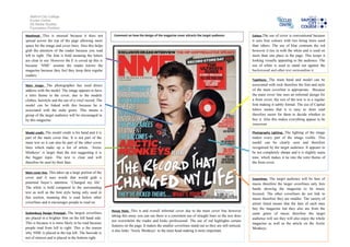
Masthead- This is unusual because it does not Comment on how the design of the magazine cover attracts the target audience: Colour-The use of cover is conventional because
spread across the top of the page allowing more it uses four colours with two being more used
space for the image and cover lines. Also this helps than others. The use of blue contrasts the red
grab the attention of the reader because you read however it ties in with the white and is used on
left to right. The font is bold meaning the letters more than one place in the page. This keeps it
are clear to see. However the E is coved up this is looking visually appealing to the audience. The
because ‘NME’ assume the reader knows the use of white is used to stand out against the
magazine because they feel they keep their regular background and other text surrounding it.
readers.
Typefaces- The main band and model can be
Main image- The photographer has used direct associated with rock therefore the font and style
address with the model. The image appears to have of the main coverline is appropriate. Because
a retro theme to the cover, due to the models the main cover line uses an informal design for
clothes, hairstyle and the use of a vinyl record. The a front cover, the rest of the text is in a regular
model can be linked with this because he is font making it subtly formal. The use of Capital
associated with the indie genre. This means a letters means that it is easy to skim read
group of the target audience will be encouraged to therefore easier for them to decide whether to
by this magazine. buy it. Also this makes everything appear to be
important.
Model credit- The model credit is his band and it is Photography Lighting- The lighting of the image
part of the main cover line. It is not part of the makes every part of the image visible. This
main text so it can also be part of the other cover model can be clearly seen and therefore
lines which make up a list of artists. ‘Arctic recognised by the target audience. It appears to
Monkeys’ is larger than the rest suggesting it is be not completely sharpe and it is slightly sepia
the bigger topic. The text is clear and will tone, which makes it tie into the retro theme of
therefore be seen by their fans. the front cover.
Main cover line- This takes up a large portion of the
cover and it uses words that would grab a Coverlines- The target audience will be fans of
potential buyer’s attention. ‘Changed my life’. music therefore the larger coverlines only lists
The white is bold compared to the surrounding bands showing the magazine to be music
text as well as the font style being only used in focused. The other coverlines do not link to
this section, meaning this is read before other music therefore they are smaller. The variety of
coverlines and it encourages people to read on. artists listed means that the fans of each may
buy the magazine but they also are from the
House Style- This is and overall informal cover due to the main cover line however
Guttenburg Design Principal- The largest coverlines same genre of music therefore the target
taking this away you can see there is a consistent use of straight lines so the text does
are placed in a brighter font on the left hand side. audience will see they will also enjoy the whole
not overwhelm the reader and looks professional. The use of red highlights certain
This is because it is more likely to be read because magazine as well as the article on the Arctic
features on the page. It makes the smaller coverlines stand out so they are still noticed,
people read from left to right. This is the reason Monkeys.
it also links ‘Arctic Monkeys’ to the mast head making it more important.
why NME is placed in the top left. The barcode is
not of interest and is placed in the bottom right.
2. Salford City College
Eccles Centre
AS Media Studies
Foundation Portfolio
Masthead- This is unusual because it does not Comment on how the design of the magazine cover attracts the target audience: Colour-The use of cover is conventional because
spread across the top of the page allowing more it uses four colours with two being more used
space for the image and cover lines. Also this helps than others. The use of blue contrasts the red
grab the attention of the reader because you read however it ties in with the white and is used on
left to right. The font is bold meaning the letters more than one place in the page. This keeps it
are clear to see. However the E is coved up this is looking visually appealing to the audience. The
because ‘NME’ assume the reader knows the use of white is used to stand out against the
magazine because they feel they keep their regular background and other text surrounding it.
readers.
Typefaces- The main band and model can be
Main image- The photographer has used direct associated with rock therefore the font and style
address with the model. The image appears to have of the main coverline is appropriate. Because
a retro theme to the cover, due to the models the main cover line uses an informal design for
clothes, hairstyle and the use of a vinyl record. The a front cover, the rest of the text is in a regular
model can be linked with this because he is font making it subtly formal. The use of Capital
associated with the indie genre. This means a letters means that it is easy to skim read
group of the target audience will be encouraged to therefore easier for them to decide whether to
by this magazine. buy it. Also this makes everything appear to be
important.
Model credit- The model credit is his band and it is Photography Lighting- The lighting of the image
part of the main cover line. It is not part of the makes every part of the image visible. This
main text so it can also be part of the other cover model can be clearly seen and therefore
lines which make up a list of artists. ‘Arctic recognised by the target audience. It appears to
Monkeys’ is larger than the rest suggesting it is be not completely sharpe and it is slightly sepia
the bigger topic. The text is clear and will tone, which makes it tie into the retro theme of
therefore be seen by their fans. the front cover.
Main cover line- This takes up a large portion of the
cover and it uses words that would grab a Coverlines- The target audience will be fans of
potential buyer’s attention. ‘Changed my life’. music therefore the larger coverlines only lists
The white is bold compared to the surrounding bands showing the magazine to be music
text as well as the font style being only used in focused. The other coverlines do not link to
this section, meaning this is read before other music therefore they are smaller. The variety of
coverlines and it encourages people to read on. artists listed means that the fans of each may
buy the magazine but they also are from the
House Style- This is and overall informal cover due to the main cover line however
Guttenburg Design Principal- The largest coverlines same genre of music therefore the target
taking this away you can see there is a consistent use of straight lines so the text does
are placed in a brighter font on the left hand side. audience will see they will also enjoy the whole
not overwhelm the reader and looks professional. The use of red highlights certain
This is because it is more likely to be read because magazine as well as the article on the Arctic
features on the page. It makes the smaller coverlines stand out so they are still noticed,
people read from left to right. This is the reason Monkeys.
it also links ‘Arctic Monkeys’ to the mast head making it more important.
why NME is placed in the top left. The barcode is
not of interest and is placed in the bottom right.
3. Salford City College
Eccles Centre
AS Media Studies
Foundation Portfolio
Masthead- This is unusual because it does not Comment on how the design of the magazine cover attracts the target audience: Colour-The use of cover is conventional because
spread across the top of the page allowing more it uses four colours with two being more used
space for the image and cover lines. Also this helps than others. The use of blue contrasts the red
grab the attention of the reader because you read however it ties in with the white and is used on
left to right. The font is bold meaning the letters more than one place in the page. This keeps it
are clear to see. However the E is coved up this is looking visually appealing to the audience. The
because ‘NME’ assume the reader knows the use of white is used to stand out against the
magazine because they feel they keep their regular background and other text surrounding it.
readers.
Typefaces- The main band and model can be
Main image- The photographer has used direct associated with rock therefore the font and style
address with the model. The image appears to have of the main coverline is appropriate. Because
a retro theme to the cover, due to the models the main cover line uses an informal design for
clothes, hairstyle and the use of a vinyl record. The a front cover, the rest of the text is in a regular
model can be linked with this because he is font making it subtly formal. The use of Capital
associated with the indie genre. This means a letters means that it is easy to skim read
group of the target audience will be encouraged to therefore easier for them to decide whether to
by this magazine. buy it. Also this makes everything appear to be
important.
Model credit- The model credit is his band and it is Photography Lighting- The lighting of the image
part of the main cover line. It is not part of the makes every part of the image visible. This
main text so it can also be part of the other cover model can be clearly seen and therefore
lines which make up a list of artists. ‘Arctic recognised by the target audience. It appears to
Monkeys’ is larger than the rest suggesting it is be not completely sharpe and it is slightly sepia
the bigger topic. The text is clear and will tone, which makes it tie into the retro theme of
therefore be seen by their fans. the front cover.
Main cover line- This takes up a large portion of the
cover and it uses words that would grab a Coverlines- The target audience will be fans of
potential buyer’s attention. ‘Changed my life’. music therefore the larger coverlines only lists
The white is bold compared to the surrounding bands showing the magazine to be music
text as well as the font style being only used in focused. The other coverlines do not link to
this section, meaning this is read before other music therefore they are smaller. The variety of
coverlines and it encourages people to read on. artists listed means that the fans of each may
buy the magazine but they also are from the
House Style- This is and overall informal cover due to the main cover line however
Guttenburg Design Principal- The largest coverlines same genre of music therefore the target
taking this away you can see there is a consistent use of straight lines so the text does
are placed in a brighter font on the left hand side. audience will see they will also enjoy the whole
not overwhelm the reader and looks professional. The use of red highlights certain
This is because it is more likely to be read because magazine as well as the article on the Arctic
features on the page. It makes the smaller coverlines stand out so they are still noticed,
people read from left to right. This is the reason Monkeys.
it also links ‘Arctic Monkeys’ to the mast head making it more important.
why NME is placed in the top left. The barcode is
not of interest and is placed in the bottom right.
4. Salford City College
Eccles Centre
AS Media Studies
Foundation Portfolio
Masthead- This is unusual because it does not Comment on how the design of the magazine cover attracts the target audience: Colour-The use of cover is conventional because
spread across the top of the page allowing more it uses four colours with two being more used
space for the image and cover lines. Also this helps than others. The use of blue contrasts the red
grab the attention of the reader because you read however it ties in with the white and is used on
left to right. The font is bold meaning the letters more than one place in the page. This keeps it
are clear to see. However the E is coved up this is looking visually appealing to the audience. The
because ‘NME’ assume the reader knows the use of white is used to stand out against the
magazine because they feel they keep their regular background and other text surrounding it.
readers.
Typefaces- The main band and model can be
Main image- The photographer has used direct associated with rock therefore the font and style
address with the model. The image appears to have of the main coverline is appropriate. Because
a retro theme to the cover, due to the models the main cover line uses an informal design for
clothes, hairstyle and the use of a vinyl record. The a front cover, the rest of the text is in a regular
model can be linked with this because he is font making it subtly formal. The use of Capital
associated with the indie genre. This means a letters means that it is easy to skim read
group of the target audience will be encouraged to therefore easier for them to decide whether to
by this magazine. buy it. Also this makes everything appear to be
important.
Model credit- The model credit is his band and it is Photography Lighting- The lighting of the image
part of the main cover line. It is not part of the makes every part of the image visible. This
main text so it can also be part of the other cover model can be clearly seen and therefore
lines which make up a list of artists. ‘Arctic recognised by the target audience. It appears to
Monkeys’ is larger than the rest suggesting it is be not completely sharpe and it is slightly sepia
the bigger topic. The text is clear and will tone, which makes it tie into the retro theme of
therefore be seen by their fans. the front cover.
Main cover line- This takes up a large portion of the
cover and it uses words that would grab a Coverlines- The target audience will be fans of
potential buyer’s attention. ‘Changed my life’. music therefore the larger coverlines only lists
The white is bold compared to the surrounding bands showing the magazine to be music
text as well as the font style being only used in focused. The other coverlines do not link to
this section, meaning this is read before other music therefore they are smaller. The variety of
coverlines and it encourages people to read on. artists listed means that the fans of each may
buy the magazine but they also are from the
House Style- This is and overall informal cover due to the main cover line however
Guttenburg Design Principal- The largest coverlines same genre of music therefore the target
taking this away you can see there is a consistent use of straight lines so the text does
are placed in a brighter font on the left hand side. audience will see they will also enjoy the whole
not overwhelm the reader and looks professional. The use of red highlights certain
This is because it is more likely to be read because magazine as well as the article on the Arctic
features on the page. It makes the smaller coverlines stand out so they are still noticed,
people read from left to right. This is the reason Monkeys.
it also links ‘Arctic Monkeys’ to the mast head making it more important.
why NME is placed in the top left. The barcode is
not of interest and is placed in the bottom right.