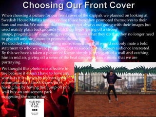
1. When choosing a picture for our front cover of the digipak we planned on looking at
Swedish House Mafia’s images online to see how they promoted themselves to their
fans and media. We noticed that they were not always out going with their images but
used mainly plain backgrounds with their logos giving off a strong
image, pragmatically suggesting everyone knows what they do that they no longer need
to give off anything more to promote themselves.
We decided we needed something more, something that would not only mate a bold
statement to who we were promoting but to also keep our chosen audience interested.
By this we have a taken a picture of Kieran simply jumping off of a wall and catching
him in mid air, giving off a sense of the beat dropping dance music that we are
portraying.
We thought this photo was affective to
use because it doesn’t have to have any
words as it is shown by his non verbal
communication, also it shows he’s
having fun by having him jump off of a
wall buy an amusement park
suggesting the song is fun.
2. This is our chosen second photo on our digipak, We thought this was a good photo
because it was laid out in the rule of thirds with Kieran placed directly in the middle.
The fountain has been used in our music video and was good because we were able to
reverse and add effects to the clip in aid on making it look more festively relating to the
genre of house music. As you can see in the distance this photo has been taken in
Southend right next to the Southend amusement park and the pier, We thought these
were good locations to capture the gloomy depression look we tried to achieve in some
parts of our music video.
3. This is what our third chosen photo looks like, we took this photo whilst we were
filming Kieran walking past different colourful walls. We used these walls to make
out that he was walking for ages through different places, everything was changing
but he still stayed the same, wearing the same clothes and not ageing.
This location was in London, Brick lane. We thought this would be a good photo to
use because it was colourful and eye capturing in contrast to his boring coloured
clothes technically given off his personality for the character.
4. This is the forth chosen photo, We thought this was another good photo for the
digipak because it was dark and mysterious. It makes us ask ourselves a lot of
questions like who this character is and where is he going? I might not be able to do a
lot of editing to this photo because there’s not much too it but all the editing I can do
to it may highlight its main features such as the character walking into the darkness.
5. For our final photo it is of the girl character walking with fade ins of Southend pier
and cars travelling past in the background. This was a good photo as it was different
from the male character being used showing we have used more than one person in
acting in the music video. Although the photo is faded I can make it more defined
when editing the photo and highlight the main features with bright, bold colours.
6. I edited the chosen five photos on a software found I wasn’t familiar
with called Colour Splash, I learnt how to change the effects of the
image and add on special effects to make it more realistic that it was
coming from a music video. When choosing a colour scheme I kept to
the bright colours as it related more to the genre of dance and house
music which meant I was keeping to the original plan. When editing
the photos I had no idea of what I wanted to come from it but when I
finally finished editing them all I was happy with the outcome which
just left me to finalise the pictures with text. If I were to edit images
again for promotional uses I would use colour splash again or to look
on more apps on my phone as I am not limited to the resources found
on the web or across apps.