
Empfohlen
Weitere ähnliche Inhalte
Kürzlich hochgeladen
Kürzlich hochgeladen (20)
Empfohlen
Empfohlen (20)
Analysing magazine covers
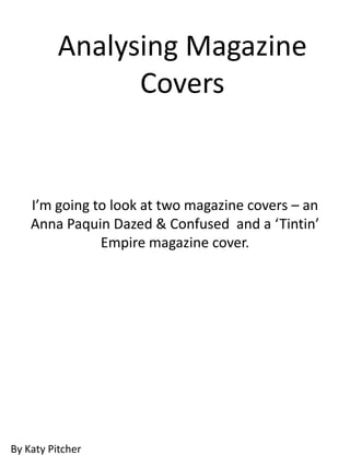
- 1. Analysing Magazine Covers I’m going to look at two magazine covers – an Anna Paquin Dazed & Confused and a ‘Tintin’ Empire magazine cover. By Katy Pitcher
- 3. The title ‘Dazed & Confused’ is emblazoned across the top of the magazine, and very much reflects the tone of the magazine: self- obsession, emoti on, power and a completely unashamed voyeurism. The large font and the plain white Anna Paquin wears bright typography show red lipstick in this image, a this off, so that colour typically related to even though the passion, hate or love. The picture is colour colour is bright enough to and layered in draw attention to her The connotations of the front, itred being colour draws the face, but not so bright to love and passion is also related to the eye. obscure her other features. reason behind Paquin being on the This has been used to magazine. During the release of this ensure Paquin being the edition of ‘Dazed & Confused’ was the first thing seen when the release of ‘The Romantics’, a film in which magazine is picked up. Paquin plays a woman whose fiance is in love with her best friend, and maid of honour. The colour red brings this film to mind for the audience, so advertises both.
- 4. The image of Anna Paquin Unlike the conventions of her role, Anna that the magazine has Paquin looks confident and feminine. She used reflects aspects of is still fashionable, as whilst being a the actress’ character. modern mix of arts and culture - Dazed She, like the magazine, is & Confused can still be considered a unashamed of showing fashion magazine - wearing a camel her emotion. Unlike the jacket and a leopard bra. These clothing archetypal magazine not only show her body, but her model, she is literally personality and character. This is used to grinning from ear to ear. advertise the magazine in that it implies The conventions of a that the article inside will give an insight magazine model is a into the actress’ life. It also has the skinny, pouting girl who implications that it is possible to be completely lacks beautiful and confident, and you can find emotion, in order to out how within the pages of the advertise whatever it is magazine. that she sells. All of this is reflected back upon the magazine. The colour scheme of this issue of Dazed and Confused is quite muted pastels. This really puts emphasis on Anna Paquin, and the words emblazoned across
- 5. The fact that Paquin wears a bra covered only by an open jacket could be interpreted through Mulvey’s male gaze. However whilst the image can be said to be shown from a perspective that makes her more attractive, the magazine has subverted this by making the text only on Paquin and by making the screen around her blank. This subverts Mulvey’s male gaze because it makes the actress the most important aspect of the magazine, and removes the idea that Paquin is owned by the magazine, and stops the actress being seen as an object or commodity, but instead as the selling point of the magazine.
- 6. The rest of the writing on the magazine cover is not related to Anna Paquin, so uses smaller text, that is white like the title. Like the title, the white makes the text obvious, but not overpowering. The majority of ‘Dazed & Confused’ centres on music, film and fashion, and the titles down the bottom reflect this. Raf Simons is a men's fashion designer, Lykke Li is a singer, and James Franco a famous actor. This shows the audience that whilst they can expect the subject matter to change, they know that the themes within the magazine will be the same.
- 8. By using two recognisable directors, a niche market is opened. This directly targets fans of both Spielberg and Jackson films - a very wide audience that would be happy to look at a new film. Price, date and issue - essential In the colour issues of Stark black background is reminiscent Tintin, he always used to of the Tintin special - ‘Ils Ont Marché wear either red or blue, and Sur la Lune’ (They walked on the his cheeks would be this moon). This shows that whilst the film shade of red too. Not only is will be new, it will still possess the this colour attention characteristics of what made Tintin grabbing, it is reminiscent of the comic great. the comic.
- 9. The word ‘present’ is written using the same font as the comic The bubble of films that are also originally used. This included in the magazine are again implies that the attention grabbing in that they use film will be a throwback a bright blue outline to be seen. to the Belgian classic. However by not using a bigger circle, or a large scrawling font, the main image of Tintin is drawn away from. Tintin is again represented in his original clothing By using a clearly defined shadow here, the magazine implies that the film will be a cartoon, or use some form of animated technology.
- 10. Again the magazine uses a typically comic strip Like Spielberg and writing, the red outline on white text was used Jackson, Tintin and his dog in Tintin to give audience extra information have become icons in the such as, ‘meanwhile’ or ‘2 hours later’. This comic world, and this implies to a Tintin fan, that this will be an therefore transpires into the important piece of information, which it is as it film genre, and gives the film gives the directors names. a certain sense of excitement - if they were this famous as a graphic novel, a cartoon and a comic strip, imagine how good they would be in film. The words adventures and of are in a Tells the reader that whilst there is smaller font to add emphasis to the still a typical representation of word Tintin./ If you didn’t recognise Tintin, there are new the character’s image, then you will characters, things have changed, and know his name, and allows the whilst still recognisable, Tintin is going magazine to target even those not to be new and improved. brought up on his comics.
- 11. I’m now going to replicate the Dazed & Confused magazine cover. The cover will have information generated from the internet – however the main image will feature an actress from a trailer I created.