
Empfohlen
Weitere ähnliche Inhalte
Was ist angesagt?
Was ist angesagt? (19)
Ähnlich wie Album covers
Ähnlich wie Album covers (20)
Mehr von kaieshash
Kürzlich hochgeladen
Kürzlich hochgeladen (20)
Album covers
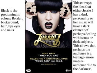
- 1. Black is the predominant colour: Border, background, hair, lips eyes and nails. This conveys the idea that either Jessie J has a dark personality or her music will have a dark element of perhaps dealing with issues or dark subjects. This shows that perhaps the audience is a teenage- more mature audience due to the darkness.
- 2. The font of Jessie J’s name and song title is fancy with her name in gold. This shows that she feels important to the music industry. The rest of the writing is in a simple font in gold and white. This makes it stand out against the black background and shows it is the important information.
- 3. The image is a close up of her face. This adds emphasis to her facial expression and as it was her first album and she wasn’t well known before, we feel like we are properly introduced to her.
- 4. We have the name and title of album first as it is a shot of the album cover. The next information adds to what we should expect from the album. Next we have Jessie J’s website which is in a smaller font and shows it isn’t the most important thing on the page. Finally there are logos at the bottom which establishes the advert as official.
- 5. Rihanna’s album cover has a close up shot of her face where we can only see one of her eyes. The dark make up adds to the dark clothing and the dark background of the writing. This all makes Rihanna look like she has a dark personality – perhaps a bad side and that this will be reflected in this album. The advert uses very spaced out fonts with very close together fonts. The spaced out font on her name which we see first means it would be able to be read easily from a distance and catch attention as she is a popular artist. The red colour of the more close together font adds to the dark element as red and black are dark, dangerous colours.
- 6. The overall darkness of the advert shows that we should expect Rihanna’s music to either include a lot of swearing or deal with more adult issues. This all shows that the target audience for this advert would be a more mature audience.
- 7. This advert features a close up of Marina’s face while she is led down. The photo looks seductive but sultry. The overall colour scheme of the advert creates a vintage feel which perhaps shows the type of music to expect from this album.
- 8. We firstly have the title of the band in a large font. This is eye catching and means it would be able to be seen from afar and catch attention. Next we have a picture which could be appealing to the male audience as it is seductive. The advert then features the actual album cover which shows the audience what it looks like for when they go to buy it.
- 9. The rest of the font is small which shows that the group want the album to be the most important thing and that the additional information isn’t as important as with the fact that the album is now on iTunes. This shows that the group are using ‘sex to sell’ as the photo is the main attraction.