
Empfohlen
Weitere ähnliche Inhalte
Andere mochten auch
Ähnlich wie 2 page spread
Ähnlich wie 2 page spread (13)
Mehr von jphibbert
Mehr von jphibbert (20)
Kürzlich hochgeladen
Kürzlich hochgeladen (20)
2 page spread
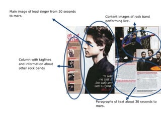
- 1. Main image of lead singer from 30 seconds to mars. Content images of rock band performing live. Column with taglines and information about other rock bands Paragraphs of text about 30 seconds to mars.
- 2. Typography Most of the text is paragraphs of information about 30 seconds to mars and other rock bands. There is a pull-out-quote on top of the main image from what the lead singer of 30 STM said. It is in a different font from the paragraphs of text and is in a bigger font. This helps it stand out and it is one of the first things we see after looking at the images. The fonts used aren’t too in your face or loud but they aren’t posh or girly either, so it could be for a neutral audience (male and female) but still of the rock genre because of the bands in the magazine (30 seconds to mars, Muse, Enter Shikari, etc.) Layout/Images The main image (on the verso page) is of the lead singer from 30 seconds to mars and the two smaller content images on the recto page are of them performing live and striking a pose. On the far left of the verso page is a column with brief paragraphs about other rock bands such as Muse and Rise Against. Next to the paragraphs, there are small content images of the bands the paragraphs are talking about. Colours White is the dominant colour of the magazine giving a neutral effect and there are darker colours used here and there on the magazine to contrast with the white or help something stick out. None of the colours used solely represent a gender so it is a neutral magazine. From the colours used, it seems this particular 2 page spread is talking about soft rock. Mise-en-scene Props used such as a guitar help represent the rock genre. In the image where he is performing live with a guitar he is wearing a blue jacket with sticks out and is loud. In other images they are all wearing black again even though there is a lot of white on the page.