SlideShare ist ein Scribd-Unternehmen logo
1 von 92
Downloaden Sie, um offline zu lesen
PREMIER

GIMP

USERS

M AG A Z I N E

.

ISSUE

#5

.

DECEMBER

2013

ISSN: 1 929-6894
DIGITAL VERSION

PAT DAVID
PHOTOGRAPHER
MEET THE GIMP

CHALLENGE

RAW/GIMP
RETOUCHING

WA N T T O C O N T R I BU T E ?

MORE GIMP
TUTORIALS

Master Class by
Christopher Mark Perez

V I S I T O U R W E B S I T E H T T P : / / G I M P M AG A Z I N E . O RG
NEW DESKTOP PUBLISHING COURSE NOW
AVAILABLE AS A DIGITAL DOWNLOAD. LEARN
DESKTOP PUBLISHING USING FREE AND OPEN
SOURCE SCRIBUS FROM THE MANAGING EDITOR OF
GIMP MAGAZINE, STEVE CZAJKA.
COMPLETE YOUR DIGITAL ARTS EXPERIENCE BY
LEARNING GIMP AND INKSCAPE. VIEW STEVE'S
PORTFOLIO AT: HTTP://FLICKR.COM/STEVECZAJKA.
BOTH COURSES ARE AVAILABLE AT
HTTP://GIMPMAGAZINE.ORG/COURSES
M AG A Z I N E

12

AN INTERVIEW WITH PAT DAVID

FEATURE

76

gimpmagazine.org

7

4

CONTENTS

Pat David is a dabbler prone to flights of fancy and
has a tendency to take strange tangents, depending
on his mood, to explore different techniques for
manipulating images. He is the administrator of the
GIMP Users Community on Google+.

GUM OVER PALLADIUM MASTER
CLASS

An active and enthusiastic supporter of open source
software for many years, Christopher Mark Perez is
a master photographer who enjoys using GIMP to
put the finishing touches on his beautiful
photographs. Currently, his favorite image themes
include dark romanticism and ghost-filled gothic
cemeteries.

LETTER FROM THE EDITOR
32
54
60
74
84

RAW/GIMP PORTRAIT RETOUCHING
WORKFLOW
Learn how to use RAW and GIMP together.

LOOK DOWN! – RESULTS OF THE MEET THE GIMP PHOTOGRAPHY CHALLENGE
Have a look at the results of the official Meet the GIMP Photography Challenge.

DESIGN GALLERY

IS GIMP BECOMING THE WORLD'S MOST DOMINANT IMAGE
MANIPULATION SOFTWARE?
SOFTWARE REVIEW: TUX PAINT – OPEN SOURCE DRAWING
SOFTWARE FOR CHILDREN

gimpmagazine.org

24

GIMP PHOTOGRAPHY GALLERY

5
gimpmagazine.org

6
Enjoy!

Cheers
Steve

http://twitter.com/steveczajka
http://flickr.com/steveczajka

gimpmagazine.org

E D I T O R
T H E
F RO M
L E T T E R

I can't believe we have reached Issue #5 already. Feels like yesterday since we started this
magazine. Upon completion of each issue of this magazine I wonder how we can better the previous
issues, and this issue is no exception. We have so many great articles and images to share with you.
We have a feature article with Pat David describing some innovative photography techniques. Pat
David also describes a tutorial about using RAW
photography and GIMP together.
And the
master, Christopher Mark Perez, is also back in
Issue #5 by sharing another master class with us.
We also have a special feature in this issue which
is a crossover with the ever-popular "Meet the
GIMP" website — this is an article revealing the
results of Rolf's photography challenge. We have
full photography and design galleries with some
pretty amazing works. To top it all up we have
Debi Dalio providing a special review of Tux Paint
for little ones who may eventually graduate to
become new users of GIMP.
Recently we have listened to our readers and
we have a plan to implement your suggestions to
make our magazine better. Thank you so much
for contributing to our survey. We will slowly work
towards implementing this next plan. You can
read about this plan on our website.
We have already started working on Issue #6
planned for a March 2014 release. We have also
completed an outline for a special edition of GIMP
Magazine on the very anticipated release of GIMP
2.10. Version 2.10 will be a very significant release
as it supports high bit depths which have been
viewed by some as a serious limitation of current
versions of GIMP. There are so many other key features that we have agreed to collaborate with the
core GIMP development team to bring this special issue to you. Version 2.10 will fundamentally
change the playing field in the image management software space. We specially thank the folks at
GIMP.org for helping to promote us on their website.
This is an exciting time for both GIMP and GIMP Magazine. You are welcome to join us if you have
strong skills as an illustrator, or graphic designer. Or maybe you could help us by submitting an
article, or perhaps just photography. And if you can't do any of that, then perhaps you could help us
by making a donation to GIMP Magazine on our website. These donations help us to cover to the
costs of running a free and completely voluntary magazine. So many people spend countless hours
putting this magazine together.
The team at GIMP Magazine proudly presents Issue #5. If you are not already doing so, please
follow us on Twitter, Google+, Issue, or by email subscription. Also, tell a friend about GIMP and
GIMP Magazine and kindly tweet or blog about us to help spread the word.

7
WEBSITE
HTTP://GIMPMAGAZINE.ORG

EMAIL NEWSLETTER
FOLLOW US VIA EMAIL SUBSCRIPTION
HTTP://GIMPMAGAZINE.ORG (CLICK SUBSCRIBE)
ISSUU
HTTP://WWW
.ISSUU.COM/GIMPMAGAZINE
FREELY VIEW THE PDF ONLINE
TWITTER
HTTP://WWW
.TWITTER.COM/GIMPMAGAZINE

GOOGLE+
FOLLOW +GIMP MAGAZINE

BIT TORRENT
PLEASE SHARE THIS PDF ON BIT TORRENT!

YOUTUBE
HTTP://WWW
.YOUTUBE.COM/STEVECZAJKA

gimpmagazine.org

FLICKR GROUP
HTTP://WWW
.FLICKR.COM/GROUPS/2173220@N23/

8
A SPECIAL THANKS TO...

HTTP://GIMP.ORG
HTTP://GOOGLE+ GIMP

ISSUE #5 . DECEMBER 2013

HTTP://OPENSOURCE.COM
HTTP://OPENSOURCE.ABOUT.COM
HTTP://ISSUU.COM
HTTP://TODOGIMP.COM
HTTP://GIMPUSERS.DE
HTTP://LAMIRADADELREPLICANTE.COM
HTTP://LINUXGRAPHIC.ORG
HTTP://LINUXUNDICH.DE
HTTP://GIMPUSERS.COM
HTTP://LINUXZASVE.COM
HTTP://ILOVEUBUNTU.NET
HTTP://ABCLINUXU.CZ
HTTP://GIMPMAGAZINE.MAGCLOUD.COM
HTTP://LINUXNEWSHERE.COM.AU
HTTP://FOTOSIDAN.SE
HTTP://UBUNTU-TW.ORG
HTTP://GIMPFR.ORG
HTTP://TUXMACHINES.ORG
HTTP://GIMPOLOGY
.COM
HTTP://IHEARTUBUNTU.COM
HTTP://LIBRESAVOUS.COM
HTTP://R.DUCKDUCKGO.COM
HTTP://ARTISTSGUIDETOGIMP.COM
HTTP://LINUXG.NET
HTTP://CHIP.DE
HTTP://UBUNTRONICS.COM
HTTP://NETVIBES.COM
HTTP://PHOTOGRAPHY-ON-THE.NET
HTTP://SCRAPAVECGIMP.CANALBLOG.COM

LEGAL:
GIMP Magazine does not take any responsibility, express
or implied, for the material and its nature or accuracy of the
information which is published in this magazine. All the
materials presented in this magazine have been produced
with the express permission of their respective
authors/owners.
GIMP Magazine and the contributors disclaim all
warranties, express or implied, including but not limited to
implied warranties of merchantability or fitness for a
particular purpose. All images and materials presented in
this document are printed/reprinted with express
permission from the authors and/or writers. The content
responsibility lies completely with the contributing writer or
the author of the article, and may not be representative of
the views of the publisher.
This PDF magazine is free and available from the GIMP
Magazine website. GIMP Magazine is made available under
Creative Commons "Attribution-Share Alike 2.5" license.
GIMP Magazine trademark logo is copyright by the owner
Steve Czajka. All advertisements are copyright by the
respective owners.
ADVERTISING:
Please visit our website to view our advertising rate card
and policies at http://gimpmagazine.org/about .
HOW TO CONTACT GIMP MAGAZINE:
Email: GIMPMagazine at hotmail dot ca
Website: http://gimpmagazine.org
Twitter: www.twitter.com/GIMPMagazine
Google+: +GIMP Magazine
Publication Origin: Mississauga, Ontario, Canada

PRODUCTION NOTES:
GIMP Magazine was created using Scribus 1.4.1, GIMP
2.6/2.8, Inkscape 0.47. Biondi was used for headlines,
Open Sans and Open Sans Condensed for house
typography. And we can't forget "the coolest mascot" ever,
Wilber, adorning the front cover and various locations! ISSN
1929-6894 (online), ISSN 1929-8498 (print).

gimpmagazine.org

HTTP://BLOG.MEETTHEGIMP.ORG

EDITORIAL TEAM:
Steve Czajka, Managing Editor
Design & Desktop Publishing
Dave Lepek, Contributing Writer / Editing Assistance
Oma Dial, All things Product Reviews
Rolf Steinort, All things Web
Sandra Livingston, All things Proof / Editing
Debi Dalio, Contributing Writer / Editing / Submissions
Ian Muttoo, Contributing Writer / Photography

9
GIMP Magazine
is now
available in
high quality
print format.
H TTP ://GIM PM AGAZINE .M AGCL OUD .COM
AN INTERVIEW WITH PAT DAVID
By Debi Dalio

gimpmagazine.org

Pat David is a dabbler prone to flights of fancy and has a tendency to take strange tangents, depending on his
mood, to explore different techniques for manipulating images. He is the administrator of the GIMP Users
Community on Google+.

13
gimpmagazine.org

15
SO, PAT, HOW DO YOU GET THE IDEAS FOR YOUR
WORK?

I usually start in one of two ways. One is working from a
general mood, idea, or feeling that I’d like to try capturing. The
other is getting a general idea of a technique or process, then
finding something to use it on. Sometimes it’s a combination
of the two, usually as a result of mentally toying with the tools
I have available to me. My ideas almost always start out as a
thought “Wouldn’t it be cool if...”.

I’m currently using an Olympus OM-D E-M5, and mostly my
17 mm prime lens. I’ll also pop on the 12-50 mm lens if I need
it. My portraits are usually shot on the long end of the 12-50
mm.
Lately I’ve been having fun with off-camera speedlights as
well. I’m using a few Yongnuo 560 II flashes with Cactus v5
wireless triggers and a few different modifiers—mostly do-ityourself stuff. I’ve built or used a 24” softbox, a ring flash, and
other things as the ideas come to me. I also really like slow
light painting for static subjects.

For software these days I’m usually going from
RawTherapee into GIMP. Occasionally I’ll jump into Hugin if I
want to bend some pixels
and play with correcting
distortions or creating
THE FASTER SOMEONE
panoramas. I’ll also use the
GETS THE KNOWLEDGE OF
command line version of
THE TOOLS OUT OF THE
ImageMagick, if needed, or,
WAY, THE SOONER HE OR
lately, G’MIC.

WHO OR WHAT ARE THE BIGGEST INFLUENCES
FOR YOU?

Chiaroscuro has a huge
influence on the way I see
the world. I find quite a lot
to love about the interplay
of light and shadow. Edward
Steichen is a favorite of
mine from back in my film
days, and I’m a huge sucker
for street photography in all
of its forms.

In GIMP I almost always
use the Curves tool in some
fashion. G’MIC filters figure
heavily in my workflow, as
does the incredible Wavelet
Decompose plugin. The GEGL command “c2g” is fantastic as
an additional visualization for a black and white workflow as
well.

SHE CAN START CREATING
NEW AND INTERESTING
IMAGES.

HAVE YOU EVER TAKEN FORMAL LESSONS OR
ARE YOU SELF-TAUGHT?

The extent of my education was a photography class in high
school, and that was purely film-oriented. (I’m dating myself a
bit, as digital had yet to mature.) Everything else was selftaught. In fact, it was this self-teaching that led me to want to
do my best to produce tutorials and information in as high a
quality as I could for anyone else that has to follow steps
similar to what I took.
The faster I can help someone get the knowledge of the
tools out of the way, the sooner he or she can start creating
new and interesting images using those tools. If I’m lucky, I’ll
learn something new from others as well!

DO YOU EVER USE GREEN SCREENS OR
TEXTURED BACKGROUNDS?

Not usually, no. I have seen others shooting against a
middle grey background, then overlaying textures and
masking to good effect, but it’s not something I’m currently
toying with (outside of video work).

DO YOU SHOOT IN RAW MODE? IF SO, WHICH
SOFTWARE DO YOU USE TO PROCESS RAW FILES?

WHAT IS YOUR PROCESS FOR CREATING AN

gimpmagazine.org

IMAGE?

16

If I have a general idea I want to try, I’ll start tinkering and
thinking about it right away. Sometimes I’ll mock up ideas in
3D modeling/rendering software like Blender; other times I’ll
mock things up physically and go from there.

WHAT ARE THE TOOLS IN YOUR WORKFLOW?

I almost exclusively shoot in RAW. There’s no good reason I
can see to throw away perfectly good image data! I had
previously used UFRaw into GIMP for processing, but these
days I prefer using RawTherapee. This is mostly because my
operating system environments are in flux, plus I like to have a
consistent set of tools that I can use anywhere on any
platform. I’ve heard great things about Darktable as well.
WHY DID YOU CHOOSE TO USE GIMP AND WHICH
FEATURES DO YOU USE THE MOST?

I have been a Linux user for a long, long time, mostly due to
philosophical differences with proprietary software. As such, GIMP was
a natural editor for me to gravitate towards.
Probably the single most indispensable part of my daily GIMP usage
is the G’MIC plugin. It’s just amazing how much you can do with it. Also,
no image leaves my GIMP session without some sort of adjustment in
color curves. I’ve built up quite a few different curve presets to cover

most of my tastes, and you’d be surprised at the flexibility that is
opened up just by mastering this one tool in GIMP.
For portraits or other images of people I’ve found the Wavelet
Decompose plugin to be indispensable, and I’m still amazed at the
power it brings to the editing process. As far as I know, even
Photoshop doesn’t have an equivalent capability. Being able to edit an
image based on frequency scales opens up an entirely new world of
processing and manipulation.

WHICH FEATURES WOULD YOU MOST LIKE TO SEE IN

As I understand it, high-bit-depth editing is coming down the road
for GIMP as GEGL integration is worked on. This would be nice, as it
COLOR CURVES TUTORIALS IN GIMP:
HTTP://BLOG.PATDAVID.NET/2012/06/GETTING-AROUND-IN-GIMP-COLOR-CURVES.HTML
HTTP://BLOG.PATDAVID.NET/2012/07/GETTING-AROUND-IN-GIMP-MORE-COLOR.HTML

gimpmagazine.org

UPCOMING VERSIONS OF GIMP?

17
gimpmagazine.org

19
would allow me to shift some of the violent things I do to an image to a
little later in my workflow without sacrificing as much quality.
Adjustment layers similar to what Photoshop has would be fantastic
as well. My GIMP sessions tend to have over 30 layers as I iterate
through editing and try different things out. It would be nice to be able
to modify only an effect in a stack.

TELL US A LITTLE ABOUT THE GIMP USERS COMMUNITY
ON GOOGLE+ THAT YOU ADMINISTER.

I was on Google+ pretty early, and saw its potential use for
photographers in general. I wanted to make sure there was a
community available to GIMP users that would be maintained and
could be used to show off new and interesting GIMP-related content as
much as possible. It’s amazing to me to see all the different
approaches and uses people have for GIMP beyond what I like to do.
The digital art stuff is just incredible to see, and I’m in awe at the talent
of some of the users there.

IF YOU COULD GO BACK IN TIME, WHAT ADVICE WOULD
YOU GIVE YOURSELF?

Buy Apple stock at $15 in 2004? Probably to learn more about color
theory, and pick up a nicer camera sooner to have fun with. Always be
shooting, creating, or learning.

WHAT ARE YOUR FUTURE PLANS?

I’m hoping to get many more tutorials published over on my website,
and I was toying with the idea of doing more video tutorials as well. I
even considered compiling a book of the tutorials I already have, but
haven’t really decided if that’s for me yet.

PAT DAVID’S WORK CAN BE FOUND AT THESE SITES:

gimpmagazine.org

Personal website portal for works and tutorials:
http://www.patdavid.net/
Flickr: http://www.flickr.com/photos/patdavid
Getting Around in GIMP blog: http://blog.patdavid.net/p/gettingaround-in-gimp.html ■

21
FOLLOW DAVE LEPEK ON TWITTER @ACCORDING2DAVE
gimpmagazine.org

GIMP

24

PHOTOGRAPHY

G A L L E RY
IF YOU’D LIKE TO HAVE YOUR WORK CONSIDERED FOR THE NEXT ISSUE OF GIMP MAGAZINE, SEND YOUR
SUBMISSIONS TO HTTP://GIMPMAGAZINE.ORG/SUBMISSIONS
Calligraphy: Steve Czajka

gimpmagazine.org

A Gallery of Works from our GIMP
User Community

25
gimpmagazine.org

26
gimpmagazine.org

ALEJANDRO RUETE
Title: Umbrella
Description: I'm an amateur photographer who enjoys the freedom and flexibility of "the GIMP". To maintain my
family and my hobby I have a second hobby (I'm a researcher), but the latter is paid. I live in Uppsala, Sweden,
and the picture was taken on a rainy summer afternoon on my terrace.
Color "pop-up" is very easily done in GIMP. Before that, I only tweaked contrast with the Curves tool and cropped
it a bit, as usual.
Portfolio: http://www.flickr.com/photos/aleruete/

27
gimpmagazine.org

28
gimpmagazine.org

DEBI DALIO
Title: Snack Time
Description: This photo was taken with a Canon EOS 5D Mark III and a 70-200mm telephoto lens. The settings
were f/5.6, 1/1250 sec, ISO 800, 135mm. I then used GIMP for cropping and to brighten the image using a curveadjusted duplicated layer in Value mode.
Flickr: http://www.flickr.com/photos/debidalio/

29
gimpmagazine.org

30
FLORIAN HENNIG
Title: Nature 2.0
Description: Here are the main pictures (after and before). I chose the theme "Nature 2.0" because at the time the nuclear
disaster of Fukushima happened.
About: I'm studying computer science with focus on media at the University of Applied Science in Dresden, Germany. In the
first year we had a module called "Digital Picture Editing". For this we needed to create/edit a picture and write
documentation about our steps. I think it is important to tell all students that there are possibilities to use free software and
get good results and grades too.

PLACE YOUR AD HERE!
FIND OUT HOW AT
HTTP: //G IM PMAGA ZINE.ORG/A BOUT
gimpmagazine.org

32
RAW/GIMP PORTRAIT RETOUCHING
WORKFLOW
by Pat David, Edited by Debi Dalio

One of the reasons I love using free and open source software (F/OSS) is the general availability of the software
across the operating systems that I use. There are many powerful F/OSS tools that can be used for professional
level photo retouching, GIMP being one of them. GIMP is more than capable of handling tasks that high level
retouching requires. It even includes some capabilities that don’t exist in commercial software.

This tutorial focuses on portrait retouching using a combination of RawTherapee, GIMP, and an incredibly useful
plugin — Wavelet Decompose.

There are a few F/OSS options for RAW image processing,
RawTherapee being the one I like and have incorporated into my
workflow. In this section I'll describe how to make various adjustments
to a RAW image, including exposure, black point, white balance, and
noise reduction.
RAW IMAGE PROCESSING

After starting up RawTherapee, you'll be in the File Browser interface.
You can navigate to your folder of images through the file browser on
the left side of the window. It may take a while for RawTherapee to
generate thumbnails of all the images in your directory.
Once you've located your image, double-click it in the main window
to open it for editing. If you're using default installation options, then
you'll probably find that a Default profile has been applied to your
image with Auto Levels turned on. Chances are that Auto Levels will
not look very good. That's OK, because we are going to fix this in the
next few steps.
STEP 1 — OPEN THE IMAGE IN RAWTHERAPEE

I like to control the exposure and processing of my RAW images.
Auto Levels may work for some, but once you get used to some basic
corrections and how to use them it’s relatively quick and painless to
adjust your images to something you like.
For a good starting point I usually remove all adjustments to an
image and reset everything back to zero. This is easy to do as my
Default profile has nothing in it other than Auto Levels.
A quick and easy way to reset the Exposure values on the Exposure
panel is to use the Neutral button (outlined in green).
(See left image)
You can also hit the small undo arrows next to each slider to set that
slider back to zero. For some reason the Neutral button doesn’t reset
the Saturation slider to zero, so I do that manually.
At this point the image exposure is set to a baseline. For reference,

gimpmagazine.org

STEP 2 — RESET THE EXPOSURE

33
here is my sample image after zeroing out all of the exposure sliders
and the saturation:
(See Image 1)

The first thing I adjust is the Exposure Compensation. It's necessary
to pay careful attention to the histogram for the image to know what
your adjustments to Exposure Compensation are doing and to keep
from blowing out any colors.
I push the Exposure Compensation until one of the RGB channels
just begins butting up against the right side of the histogram. Here is
what the histogram looks like for the neutral exposure:
(See Image 2)
After adjusting Exposure Compensation for my image, I had the Red
channel snug up against the right side of the histogram.
(See Image 2a)
If you go a little too far, you’ll notice one of the channels will spike
against the side, and if you go really too far, you’ll get a small colored
box in the upper right corner indicating that a channel has gone out of
range (is blown out).
Here is what my image looks like with only the Exposure
Compensation adjusted to a better value (2.40):
(See Image 2b)
If the highlights in your image begin to get slightly out of range, you
may need to make adjustments to the Highlight recovery amount or
threshold, but in my case the image was slightly underexposed, so I
kept these settings at zero.
There is also a great visual method of seeing where your exposures
are for each channel and whether or not highlights and shadows are
being clipped. Along the top of your main image window, to the right,
there are some icons that look like this:
(See Image 2d)
The Channel previews let you toggle each of the Red, Green, Blue,
and Luminosity previews individually for the image. You can use these
with the Highlight and Shadow clipping indicators to see which
channels are clipping and where.
The Highlight and Shadow clipping indicators will show you on your
image where the values go beyond the threshold for each. For
highlights, it’s any value that is greater than 253; for shadows, it’s any
value that is less than 8.
To illustrate, here is what my image looks like with the Exposure
Compensation set to 2.40:
(See Image 2e)
I don’t mind the shadows clipping in the dark regions of the image,
though I can make adjustments to the Black Point to modify that. The
highlight clipping on her face is of more concern to me. I certainly don’t
want that!
I decided to back down my Exposure Compensation for the
highlights slightly. As I eased off, I could see the dark patch for Highlight
Clipping growing smaller. I usually stop when it’s either all gone or
nearly all gone.
I wasn’t too far off in my initial adjustment. I had to back the
Exposure Compensation off to only 2.30 to remove most of the
highlight clipping.
STEP 3 — ADJUST THE EXPOSURE COMPENSATION

Image 1

Image 2

gimpmagazine.org

Image 2a

34
Image2b

Image2e

gimpmagazine.org

Image2d

35
Zooming in to a shadowed area of an image that includes dark or
black tones lets you see if the Black Point needs adjustment. The
blacks in my image felt a little flat to me, so I decided to increase the
black level just a bit to darken them.
You want to be zoomed in so you can determine at which point the
Black Point adjustments you make wipe out any details that you want
to keep visible. You want your blacks to be as dark as possible while
keeping as many details in the shadows as you can. It's really subjective
where this point is, but I tend to stay on the conservative side since I'm
going to process colors a little bit in GIMP later.
Starting with a Black Point of zero:
(See Image 3)
I increased the Black Point while keeping an eye on the shadow
details, increasing it until I liked how the blacks looked and seeing that I
hadn’t destroyed detail in the dark tones. I finally settled on a Black
value of 150 as seen here:
(See Image 3a)
It's necessary to watch out for Shadow Recovery when you first start
adjusting the Black Point. Its default might be a different value than
zero (mine is at 50), and the Neutral button won’t set it to zero (it
resets it to its default value of 50). You may want to push it manually to
zero, and if you feel you want to bump shadow details a bit, then start
pushing it up.
STEP 4 — SET THE BLACK POINT

Image 3

For this image I didn’t feel the need to modify these values, but this is
purely subjective (again). If you do modify these values, keep an eye on
the histogram to make sure colors don't go out of range.
STEP 5 — SET BRIGHTNESS, CONTRAST, & SATURATION

Image 3a

HTTP : //YO UTUBE .COM /STEVECZAJ KA
If you had the correct White Balance setting in your camera during
your shoot, then you can skip this step. If not, then you can adjust it
now.
I had my in-camera White Balance set to Flash, so the embedded
White Balance settings in my RAW file metadata are pretty close. In my
image, however, you’ll notice that there is a bit of a white window
visible in the left of the frame. I happen to know that the window is
quite white, and should be rendered as such in my image.
As a side note, what I really should have done was to get myself a
good reference for setting the white balance, and to shoot it as part of
my setup. Something like the X-Rite MSCCC ColorChecker Classic, or
even a WhiBal G7 Certified Neutral White Balance Card. These are a
little pricey, but any good 18 per cent grey card will do, really. I just
happen to know that my window borders are a pure white, so I’m
cheating a bit here.
Here is my image after the previous adjustments:
(See Image 5)
White Balance can be adjusted from the Color panel.
(See Image 5a)
You can try out some of the presets in the Method drop-down—it
contains the typical settings for Sunny, Shade, Flashes, etc. I chose to
use the Spot WB option. Clicking that button let me pick a section of
my image that should be color neutral.
STEP 6 — SET THE WHITE BALANCE

Image 5

Image 5a
I know that the window border in my image should be white (and color
neutral), so I picked from that area on my image. This shifted my White
Balance and produced this result:
(See Image 5b)
I also know that the grey-colored walls in the background are close
to neutral, but with the slightest hint of blue in them. If I used the grey
wall instead of the white window, I would introduce the slightest warm
cast to the image. I tried it (choosing a section of the grey wall on the
right side of the background), and actually prefer the slightly warmer
color.
(See Image 5c)

Chances are the RAW image is going to look pretty noisy when you're
zoomed in. This isn’t unusual since we are dealing with RAW data.
There are two noise reduction options in RawTherapee and you'll want
to use both of them.
STEP 7 — PERFORM NOISE REDUCTION

Image 5b

gimpmagazine.org

Image 5c

38
Impulse Noise Reduction removes pixels that have a high impulse
deviation from surrounding pixels. Basically, this takes care of the “salt
and pepper” noise you may notice in your images where individual
pixels are oddly brighter or darker than the surrounding pixels.
If I zoom into a portion of my image (not far from where I was looking
at shadows for setting the Black Point), I see this:
(See Image 6)
I normally play a bit with Impulse Noise Reduction to remove specks
while still retaining details. As with most noise reduction methods,
going a bit too far will obliterate some details with the noise. The trick
is to find a happy medium between the two. In my case, I settled on a
value of 55 (the default is 50):
(See Image 6a)
I could have gone a bit further (and have in other images), and
pushed it up to the 60–70 range, but it’s a matter of taste and weighing
the trade-offs.
IMPULSE NOISE REDUCTION

Image 6

Luminance and Chrominance Noise Reduction suppress noise in the
luminance channel (brightness) and the blue/red chrominances.
I use a light hand with these noise reduction methods. The defaults
are 5 for each, and it should make a noticeable difference with just the
default values. If you push the Luminance Noise Reduction too far,
you’ll smear fine details right off your image. If you push the
Chrominance Noise Reduction too far, you’ll suck the life out of the
colors in your image.
Not surprisingly, it’s another trade-off. In my image, I pushed the
Luminance/Chrominance Noise Reduction just a tiny bit past the
default to 6 each.
You can see the effect of Chrominance Noise Reduction by looking at
the flat-colored grey wall in the background. Just don’t forget to check
other areas of your image with the settings you choose. For me it was a
close look at her iris, where pushing the Chrominance Noise Reduction
too far lost some of the beautiful colors in her eye.
Here's the previous image with Luminance/Chrominance Noise
Reduction applied:
(See Image 6b)
If you’ve read my series of articles on Black & White Conversion,
you’ll know that I don’t mind a little noise or grain in my images, so this
level doesn’t bother me in the least. I could chase the noise even
further if I really wanted to, but always remember that doing so is going
to be at the expense of detail or color in the final result. As with most
things in life, moderation is key!

Image 6a

Image 6b

gimpmagazine.org

LUMINANCE/CHROMINANCE NOISE REDUCTION

39
If you are going to sharpen your image, this might be time to do so.
Usually sharpening is the last bit of post-processing you should do to
your image, due to its destructive nature. Lately, I’ve grown
accustomed to sharpening by using an extra wavelet scale during my
skin retouching in GIMP, so I avoid sharpening at this stage. If I were
going to sharpen my image now, it would be just very, very lightly. Also,
if you do decide to do any sharpening in RawTherapee, make sure that
you do it after any noise reduction (you don’t want to sharpen noise).
STEP 8 — SHARPEN THE IMAGE

That's all the RAW adjustment I want to do on this image. I try to
keep adjustments minimal where possible, though I could have gone
further and adjusted color tones and made LAB adjustments here as
well. In fact, with the exception of Wavelet Decompose for skin
retouching, and some other masking and painting operations, I could
do most of what I wanted to do with this portrait entirely in
RawTherapee.
I know this process seems really long, but the truth is that once you
become accustomed to the workflow, these steps takes less than five
minutes from start to finish. All we really worked with was exposure,
black point, white balance, and noise reduction.
Here is the final version after doing all of these RAW edits, as we get
ready to bring the image into GIMP for further processing:
(See Image 8)
RAW SUMMARY

Image 8

Armed with our final results from RawTherapee, we’re now ready to
do a little retouching to the image.
The overall workflow in GIMP and the order in which I approach the
steps are dependent on my mood. Most times I enjoy doing skin
retouching, so I’ll often jump right in with Wavelet Decompose and play
around. Really, though, I should shift Wavelet Decompose to a later
part of my workflow, and fix other things first — like removing objects
from the background and fixing flyaway hairs. This way, I can directly
reuse wavelet scales for a slight wavelet sharpening while I have them.
Looking at the current state of my image, I can spot a few broad
things that I want to correct, and I’m going to address them in this
order:
1. Touch up flyaway hairs.
2. Crop and remove distracting background elements.
3. Touch up skin with Wavelet Decompose.
4. Contour paint highlights.
5. Apply some color curves.
6. Sharpen the image.

gimpmagazine.org

GIMP IMAGE RETOUCHING

40

Image 9
If you can have the model bring a hairbrush with them to a shoot,
DO IT. Seriously. Your eyes and carpal tunnel will thank me later.
Even with a brush, or hairstylist or make-up artist, the occasional hair
will decide to rebel and do its own thing. This will require you to edit
the image and fix those errant hairs.
Luckily for me, Mairi’s hair mostly cooperated with us during the
shoot (and where it didn’t I kind of liked it). To illustrate this step,
though, I’m going to clean up some of the stray hairs on the left side of
the image (the right side of her face).
Fortunately, the background is a consistent color and texture. This
means cloning out these hairs shouldn’t be too much of a problem, but
there are still some things you should keep in mind while doing this.
Here is the area that I’d like to clean up a little bit:
(See Image 9)
I usually use a hard-edged brush because a soft edge will smear
details on its edges, which can often be spotted pretty easily. This
works well with my image because the background is relatively
consistent in grain and color.
I take a sample from an area near the hair I want to remove and set
the brush to "Aligned". I keep the brush size as small as I can while still
being able to remove the hair.
(See Image 9a)
What is necessary to keep in mind is how the hair is actually flowing
and follow that. I often follow outlying strands of hair back to where
they start from the head and begin cloning them out from there.
I also try not to get too ambitious (some stray hairs are sometimes
fine). Removing too many at once can lead to unrealistic results, so I try
to be conservative, and to constantly zoom out and check my work
from a normal viewpoint.
If possible, try not to leave hairs prematurely cut off in space; it tends
to look a bit distracting. If you want to remove a hair that crosses over
another strand that you may want to keep, make sure to adjust the
source of the clone brush so you can remove it without leaving a gap in
the leftover strand.
Here is a quick five-minute touch-up of some of the stray hairs:
(See Image 9b)
Occasionally, you’ll need to fix hairs that are crossing over other hair
(sort of like a virtual brushing of the hair). In these cases, you really
have to pay careful attention to how the hair flows and to use that as a
guide when choosing a sample point with either the clone or heal
brush.
If this sounds like a lot of work, it is. Thankfully, once you’ve become
accustomed to doing it, and doing it well, you’ll find yourself picking up
a lot of speed. It’s one of those things that’s worth learning to do
properly. Practice will speed it up for you.
I actually like the cascading hair around her face opening up to a
pretty color, so that’s as far as I’m going to go with stray hairs on this
image.

Image 9a

Image 9b

gimpmagazine.org

STEP 9 — TOUCH UP FLYAWAY HAIRS

41
With the limited space I had to shoot this portrait, it’s no surprise
that I got some undesirable background elements, like the window
edges. There are a couple of ways I could fix these problems: I could fix
the background in place, or I could crop out the elements I don’t want.
In my final version of the image I wanted to crop tighter, so it worked
out well for me to remove the window on the left. To illustrate how to
remove the window without cropping, I’ll leave the aspect ratio as it is,
and walk through removing the distracting background elements.
Because most of the background is already a (relatively) solid color,
this isn’t too hard. My approach was to make a duplicate of my current
layer and move the duplicate into place such that the background
would cover up the parts of the window I wanted to remove. Then I
masked the duplicate layer to hide the window.
I started by choosing an area of the background that’s similar in
color and tone (marked in green):
(See Image 10)
Then I moved the duplicate layer so that the green area covered up
the window to the left (marked in purple):
(See Image 10a)
Here is what this looks like in GIMP, with the duplicate layer set to 90
per cent opacity over the base layer so you can see where the window
edge is:
(See Image 10b)
Next I added a black (fully transparent) layer mask over the duplicate
layer, and painted white with a soft-edged brush on the mask to cover
up the window edge.
(See Image 10c)
You can see that the background area from the duplicate is a bit
darker than the base layer background and the seam is visible around
the mask. To fix this, I adjusted the lightness of the duplicate layer until
I got a good match.
I used Hue-Saturation to adjust the lightness because I wasn’t sure if
I would need to adjust the hue slightly as well. (It turns out I didn’t.) I
found that increasing the Lightness value to 3 got me reasonably close.
(See Image 10d)
To further fix the lower part of the window, I just repeated all the
steps above with another duplicate of the base layer, shifting it to cover
the lower part of the window. I had to mask along her sweater.
(See Image 10e)
This background adjustment is OK, but it could be just a little bit
better. Visually, the falloff of light on the background doesn’t match
what’s happening on her body, so I added a small gradient to the lower
left corner to give it a more natural looking light falloff.
(See Image 10f)
Fixing the slight window and shadow on the right is easily done with
a Clone/Heal tool combination. Here is the final result of quickly
cleaning up the background:
(See Image 10g)
STEP 10 — FIX THE BACKGROUND

gimpmagazine.org

Image 10

42

Image 10a
Image 10c

Image 10d

Image 110e

gimpmagazine.org

Image 10b

43
I could have spent a little more time on cleanup, but I’m happy with the
results for the purpose of this article. If your cloning efforts leave
obvious transitions between tones, the Heal tool can be helpful for
alleviating them, especially when used with large brush radii. Just be
prepared for it to take a while.
With the background squared away, we can move on to one of my
favorite things to play with—skin retouching!

gimpmagazine.org

Image 10f

44

Image 10g
In my skin retouching article, Getting Around in GIMP – Skin
Retouching (Wavelet Decompose), I said that using a light touch is
really best. Keep that in mind as we move forward. Don’t make
mannequins.
With a layer that contains all of the changes we’ve made so far, we
can now decompose the image to wavelet scales. I almost always use
the default of 5 scales unless there’s a good reason to increase or
decrease that number.
For anyone new to this method, the basic idea of Wavelet
Decompose is that it will break down your image into multiple layers,
each containing a specific set of details based on their relative size,
plus a residual layer with color and tonal information. For instance,
Wavelet scale 1 will contain only the finest details in your image, while
each successive scale will contain larger and larger details.
The benefit of breaking up an image in this manner is that
differently-sized details are isolated each on their own layer, so it's
possible to modify details on one layer without affecting details on
other layers; or to adjust the colors or tones on the residual layer
without modifying the details.
After running Wavelet Decompose, we have six new layers: a
Residual layer plus five Wavelet scales. Here is an example:
(See Image 11)
I generally work on skin retouching in sections. Usually I’ll consider
the forehead, nose, cheeks to smile lines, chin, and upper lip all as
separate sections, trying to follow normal facial contours.
(See Image 11a)
Let's start with the forehead. I work with detail scales first, and follow
up with touch-ups on the residual scale, if necessary, to even out color
tones. To see only Wavelet scale 5, you can hold down the Shift key
and click on its layer visibility icon. Here is what Wavelet scale 5 looks
like isolated:
(See Image 11b)
It may not seem obvious, especially if you don’t use wavelet scales
much, but there’s a lot of large-scale tonal imperfections here. Here is
the same image, but with the levels normalized:
(See Image 11c)
Normalizing the wavelet scale lets you see the tones that you'll want
to smooth out.
My usual workflow is to have all of the wavelet scales and residual
layer visible (each of the wavelet scales will already have their Layer
Blend Modes set to Grain Merge). This makes it possible to see the
overall image results in real time. Then I select each wavelet scale layer
as I work on it.
I normally use the Free Select tool to select the forehead, with the
Feather Edges option turned on with a large radius (maybe 1 per cent
of the smallest image dimensions roughly, so about 35 pixels for this
image).
With my forehead area selected, and the layer on which I want to
work selected, I often run a Gaussian Blur (IIR) over the skin to smooth
out the imperfections. The radius to use depends on how strongly you
want to smooth the tones out. Too much, and you’ll obliterate the
details on that scale, so start small.
Here's the selection I worked on, with Wavelet scale 5 as my active
layer:

Image 11

Image 11a

Image 11b

gimpmagazine.org

STEP 11 — TOUCH UP THE SKIN

45
Image 11c

Image 11d

Image 11e

gimpmagazine.org

Image 11f

46

Image 11g

(See Image 11d)
At this point I experimented with different Gaussian Blur radii to get
a feel for how they would affect my entire image. I settled on a
somewhat high radius of 35 pixels, which gave me this result:
(See Image 11e)
Just with this small change to a single wavelet scale, we can already
see a remarkable improvement to the underlying skin tones, and we
haven’t hurt any of the fine details in the skin!
In some cases, this may be all that is required for a particular area of
skin. I could push things just a tiny bit further if I wanted to by working
globally again on a finer wavelet scale, but I’ve learned the hard way to
back off early if possible.
Instead, I look at specific areas of the skin that I may want to touch
up; for instance, the two frown lines in the center of the forehead. I
may not want to remove them completely, but I may want to downplay
how visible they are. Wavelet scales are perfect for this.
(See Image 11f)
Because each of the Wavelet scales is set to a layer blend mode of
Grain Merge, any area that has a completely grey color will not affect
the final image. This means that you can paint with medium grey RGB
(128,128,128) to completely remove a detail from a layer.
You can also use the Blur/Sharpen brush to selectively blur an area
of the image as well. (I’ve found that the Blur tool works best at smaller
wavelet scales. It doesn’t appear to make a big difference on larger
scales).
So, if we look at Wavelet scale 5 where the frown lines are, we can
see there’s not much there; it was already smoothed earlier. However,
if we look at Wavelet scale 4, we can see they're prominent.
I used the Heal Tool to sample from the same wavelet scale in a
different location, and painted over just the frown lines on Wavelet
scale 4. If it had been necessary, I could also have worked on Wavelet
scale 3 and repeated the same procedure.
A couple of quick passes just over the frown lines, and the result
looks like this:
(See Image 11g)
I could have continued over any other blemishes I wanted to correct,
but small individual blemishes can usually be fixed with a little spot
healing quickly (using the Heal Tool on the merged image after working
with Wavelet Scales).
Moving on to the nose, the tones have different requirements. Overall,
the tones on Wavelet scale 5 are similar to the forehead. In this case, a
similar amount of blurring as the forehead on scale 5 will nicely
smooth out the tones. Here's the nose after a slight blurring:
(See Image 11h)
There is a bit of color in the nose that is slightly uneven. This is
relatively easy to fix with wavelet scales, because I can modify the
underlying color tones of the nose without destroying the details on
the other scale layers.
In this case, I worked on the Wavelet residual layer. I used the Heal
tool with a large, soft brush. I sampled from about the middle of the
nose and cleaned up the slightly redder skin by healing new tones into
that area. I followed the contours of the nose and the way that the light
was hitting it in order to match the underlying tones to what was
already there.
(See Image 11i)

Image 11h

DID YOU KNOW?

GIMP 2.8.8 IS NOW AVAILABLE!

Image 11i

gimpmagazine.org

THIS IS THE LATEST VERSION OF GIMP. READ ABOUT IT AND
DOWNLOAD IT FROM HTTP://GIMP.ORG

47
gimpmagazine.org

Image 11j

48

Image 11k

Next I looked at the eyes and cheek on the brighter side of her face.
(See Image 11j)
The tones here are not bad, particularly on scale 5. After making my
selection, I applied a blur of 25 pixels just to smooth things a bit.
(See Image 11k)
The dark tones under and around the eyes are a bit different to deal
with. As before, I worked on the Wavelet residual layer to brighten up
the color tones under the eyes. I used the Heal tool to sample from a
brighter area of skin near the eye. Then I carefully painted into the dark
tones to brighten them up and to even the colors out with the
surrounding skin.
(See Image 11L)
Wavelets are amazing for this type of adjustment, because it's
possible to brighten up and change the skin tones under the eyes
without affecting the fine skin details like small wrinkles and pores. The
textural character remains unchanged, but the underlying skin tones
can be modified easily.
The same process can be used for the slightly red tones on the
cheek and at the edge of the jaw.
I decided not to modify the fine wrinkles under the eyes. These small
imperfections will often bring great character to a face, and unless they
are very distracting or bad, I find it best to leave them be.
A good tip is that even though small imperfections may seem large
when you’re down at the pixel level, you should get into the habit of
zooming out to a sane zoom level and evaluating the image often.
Sometimes you’ll find you’ve gone too far and things begin to creep
into mannequin territory.
I repeat: don’t make mannequins!
Those are the basics of the skin retouching process. Just repeat the
steps above on the areas that remain (right cheek, chin, and upper lip).
To summarize, here are the tools and steps I use with Wavelet
Decompose to retouch skin:
•
Select an area and use Gaussian Blur to even out overall
tones at a particular scale.
•
Paint with grey and/or use the Clone or Heal tools on wavelet
scale layers to modify specific details.
•
Use the Clone and Heal tools on the residual scale layer to
modify underlying skin tones and colors while leaving details intact.
Here's the final result after all the changes I made using the Wavelet
Decompose process:
(See Image 12)
SKIN RETOUCHING SUMMARY

There are a few things that still need a little spot touch-up that I
didn’t bother to mess with in Wavelet scales. I finished the touching up
process by cloning or healing out some small hairs along the jaw line,
and touching up some small spots of skin individually. This is really just
a light cleaning, and I usually do this at the pixel level (zoomed in very
far and using small brush sizes).
I also use a method for checking the skin for areas that I may want to
touch up, but that might not be immediately visible or noticeable. This
method makes use of the fact that the blue channel of an image can
show you just how scary skin can look. (Seriously, color decompose any
image of skin and look at the blue channel.)
See my article, Getting Around in GIMP - Blue Channel Check Layer
(Retouching), for details.

Image 11L

Image 12

gimpmagazine.org

STEP 12 — FINISH SPOT TOUCH-UPS

49
One of the downsides of using Wavelet scales for modifying skin is
that if you’re blurring on some of the scales, you’ll sometimes decrease
the local contrast in your image. This isn’t so bad, but you may want to
bring back some of the contrast in areas you’ve touched up.
I use a method I refer to as Contour Painting. What I do is basically
add some transparent layers over my image and set their layer blend
modes to Overlay. Then I paint white over any contours I want to
enhance and adjust the opacity of the layer to taste. (This is highly
subjective, so I’m going to give just a quick idea of how I might
approach it. You can go as crazy with this as you like.) This is a very
common technique utilized by experienced retouchers to enhance the
lighting on an image.
Here I’ve added a new transparent layer on top of my image and set
the Layer Blend Mode to Overlay. Then I painted white onto the
contours that I wanted to highlight:
(See Image 14)
It looks strange, but, after adding a large radius Gaussian Blur of 111
pixels, the tones are smoothed out.
(See Image 14a)
Finally, I adjusted the opacity of the Overlay layer to suit my taste. I
usually dial this way, way down so that it’s not so obvious. Here, I’ve set
the opacity to about 20 per cent:
(See Image 14b)
I sometimes add a few more of these layers to enhance other parts
of the image as well. I use it (really, really, really lightly!) to enhance the
eyes a bit, and, in this case, I used an even larger layer to add some
volume and highlights to her hair as well.
Here is the result after adding some eye and hair highlight layers:
(See Image 14c)
STEP 13 — CONTOUR PAINT HIGHLIGHTS

gimpmagazine.org

Image 14

50

Image 14a
Image 15

Image 14c

Image 16

gimpmagazine.org

Image 14b

51
After making all the adjustments above, I like to apply some color
curves that I have around and use often. I’ve been heavily favoring a
Portra emulation curve from Petteri Sulonen that he calls Portraesque, especially for skin. It has a very pretty rolloff in the highlights
that renders very pleasing colors.
If I feel it’s too much, I can always apply it to a duplicate of my image
and adjust the opacity to suit. Here is the same image with only the
Portra-esque curve applied:
(See Image 15)
You can read a much more in-depth look at color curves for skin in
my article Getting Around in GIMP - More Color Curves (Skin). You can
also download some curve presets from that page.
STEP 15 — SHARPEN THE IMAGE
Finally. The last step to finish the image!
For sharpening, I actually like to use one of the Wavelet scales that I
generated earlier. I simply duplicate a low scale, like 2 or 3, and drag it
to the top of my layer stack to sharpen the details from that scale.
For this image, I like the details from Wavelet scale 2, so I duplicated
that layer and dragged it to the top of my layer stack. The blend mode
was already set to Grain Merge, so I didn’t have to do anything else.
(See Image 16)
STEP 14 — APPLY COLOR CURVES

Image 17

Before:
(See Image 17)
After:
(See Image 17a)
Not too bad for a little bit of fiddling, I think! I know that this tutorial
seems very long, but I promise that once you understand the
processes being used, it’s actually very quick in practice.
I hope that this has been helpful to you in some way. If you happen
to use anything from this tutorial please share it. I’d love to see what
others do with these techniques.
CONCLUSION

Patrick David is a hobbyist photographer, digital tinkerer, and open
source software advocate. He blogs (semi) regularly about using GIMP
and F/OSS tools for high quality photographic retouching on his
website under “Getting Around in GIMP”. You can find him at these
online sites:
Blog: http://blog.patdavid.net/
Google+: https://plus.google.com/105956747281909080618/posts
Flickr: http://flickr.com/photos/patdavid

gimpmagazine.org

ABOUT PATRICK DAVID

52

Image 17a

He is also the administrator of the GIMP Users Community on
Google+:
https://plus.google.com/u/0/communities/112556998953300949378 ■
Meet The GIMP!
A Videopodcast
about
Free and Open Source Graphics
Software

http://meetthegimp.org
LOOK DOWN! – RESULTS OF THE MEET
THE GIMP PHOTOGRAPHY CHALLENGE
By Rolf Steinort

I produce the video podcast “Meet the GIMP!” about GIMP and other free and libre graphics software. Due to a
move and a new job this summer I had no time to take care of that project. So I decided to set up a challenge.

gimpmagazine.org

“Present the place where you live to us – but look down on
the sidewalk for that!”

54

The Rules
1. Make a mosaic of at least 3×3 images.
2. All images have to be shot straight down
3. All images are in the same scale, use the same distance
to the ground and the same focal length.
4. All images have to be linked to each other in their theme
by being from one city, one journey …..
5. Publish your image online and post a link to it before
September 1st in the comments to this blog post.
6. License your image as CC-BY or better and allow this site
and the GIMP Magazine to publish your image under CCBY (here) or CC-BY-SA (GIMP Magazine).
7. Rules 1 to 4 may be broken, 5, 6 and 7 have to be
followed exactly.

This challenge is a perfect ripoff of a challenge by Andrés
(Twitter) (Website), an illustrator from Buenos Aires, in the
now closed forum of Tips from the Top Floor.
There was not much promotion by me for the challenge,
but the results are great.
In episode 192 (http://blog.meetthegimp.org/192/) I explain
how to make such a mosaic with the help of layer groups and
layer modes.
gimpmagazine.org

TINKER
This image proves that you can get a lot of clues by looking at the ground.
"tinker" lives on a former “LPG”, a collective farm from GDR times in
eastern Germany. It's obviously in use but has fallen on hard times.

55
gimpmagazine.org

KEVIN PAYNE
From Devon, UK, Kevin is a long time contributor to the forum of Meet the GIMP and helped a lot
with writing TOCs for the videos. To be fair – he wrote most of them. Kevin shares his photos on
23hq (http://www.23hq.com/paynekj), Flickr (http://www.flickr.com/people/paynekj/) and
Panoramio (http://www.panoramio.com/photo/40873240).

56
gimpmagazine.org

57
gimpmagazine.org

58

PAUL SAUVÉ
Paul broke two of the breakable rules that were set for the challenge – and he was right
about it.
Here is his slightly edited defense: “I visited San Jose, Costa Rica and David, Panama twice,
once in 2006 and again in 2008. I noticed that it is the individual owners that generally build
sidewalks in front of their businesses and this makes for very interesting sidewalks in the city
centers. I found this so intriguing that I took quite a few photos. Since I didn’t know that I
would use these for your Sidewalk Challange, your rules 1 to 3 were not followed.”
You can see Paul's photos on Flickr (http://www.flickr.com/photos/paulsaute).
gimpmagazine.org

UWE VAN OLFEN
Uwe gave us this impression of the intertidal zone of a Dutch island. The North Sea has quite
some tides and the coast is sandy – so this zone is wide and full of life.
The longer I look at this image, the more details and connections between the tiles I notice. And
softening the strict grid with the horizontal wavy lines adds the final touch to this image.

59
gimpmagazine.org

GIMP

60

DESIGN

G A L L E RY
IF YOU’D LIKE TO HAVE YOUR WORK CONSIDERED FOR THE NEXT ISSUE OF GIMP MAGAZINE, SEND YOUR
SUBMISSIONS TO HTTP://GIMPMAGAZINE.ORG/SUBMISSIONS

gimpmagazine.org

A Gallery of Works from our GIMP
User Community

61

Calligraphy: Steve Czajka
gimpmagazine.org

62

STEVE CZAJKA
Title: Seasons Greetings
Description: These pieces were created with authentic calligraphy
using a Pilot Parallel Calligraphy Pen and Pelikan Ink. Layout was
completed in Inkscape. Colourization was completed using GIMP.
Portfolio: http://flickr.com/photos/steveczajka
gimpmagazine.org

63
gimpmagazine.org

NAVJINDER KAINTHRAI
Title: *Eat
Description: I am a web developer/designer from Toronto. I have a passion for art and I
am a traditional artist, but when I discovered open source image programs my life
changed. GIMP, Inkscape, and Blender are my tools for designing.
In this image, the child is tricked (by the food giants) into eating anything but food. The
design was hand-drawn, then processed in Inkscape to vectorized the work. Then it was
post-processed in GIMP.
Contact: navjinder.tumblr.com

64
gimpmagazine.org

65
gimpmagazine.org

66

SEBASTIÁN VALENCIA
Title: Warrior
Description: I am a graphic designer, illustrator, and web developer. I command a digital agency called JUGO (juice in
English), in Chile. I love design and illustration. For this reason I am always looking for new ways to do my job. Now
I'm exploring the world of open source successfully, especially with GIMP and Inkscape, and Blender sometimes.
This warrior image was made with GIMP 2.8.4.
deviantART: http://papayeah.deviantart.com
Twitter: @Papa_Yeah
Facebook: facebook.com/seba.valencia
gimpmagazine.org

ALISTAIR MCGARRIE
Title: Remedy
Description: I’m an aspiring artist who just newly discovered GIMP. I still have not chosen which field I’d like
to go into yet, but I believe no matter which field you’re in, you should still be able to perform many art types
well, so at the moment I’m still learning.
I coloured this image with GIMP. I mainly used the Blur tool, and a very little bit of airbrush to get some of
the nice effects. I’m still new to GIMP; this is the first image I have produced using it. I’m hoping to learn a lot
more about GIMP.
Portfolio: http://zzecho.deviantart.com/

67
gimpmagazine.org

HARRY THOMAS
Title: Smoke Photography
Description: I'm a 16 year old photographer. I live in Southampton, UK, and have been
very interested in photography for about three years now. I started taking photos with
my phone, soon upgrading to a Sony HX100V bridge camera. I then hit the limits of this
camera and am now using a Canon EOS 550D. I started smoke photography after seeing
a YouTube how-to video and loved the editing, for which I use RawTherapee and GIMP.
I took this photo using a single strobe to the photo's right, and created the smoke with
an incense stick. I then edited the RAW file in RawTherapee, saved it as a TIF, and
finished editing in GIMP. I'm really looking for any hints, tips, and help as I am forever
wanting to expand my knowledge!
Portfolio: http://www.flickr.com/photos/waffles10/

68
gimpmagazine.org

69
gimpmagazine.org

70

ALDRIN ROCKY SAMPELILING
Title: Political Science Student
Description: I'm a student at Universitas Indonesia. I used GIMP 2.8. This picture was composed mostly using a mosaic filter, video 3x3 filter, and small tiles.
Portfolio: http://aldrinrs.deviantart.com/
gimpmagazine.org

HAZAN PEREZ
Title: Godspeed
Description: I'm 24, live in Colombia, and am a soon-to-be graduate from college (studied
Informatics Engineering). I'm also a Free Software enthusiast and varied artist.
I made this bookmark with GIMP 2.6 some time back now. The texture on the planet was
made with a few of my own photographs. All the rest was generated in GIMP. Most of it was
made with different filters. The planet itself was made with a script taken from
mygimptutorial.com.
deviantART: http://hapk.deviantart.com/
Google+: HaPK_PerCar
Twitter: @HaPK_PerCar

71
gimpmagazine.org

72
gimpmagazine.org

RAFAEL GARCÍA MORENO
Titles:
Dinosaur Creature
Owl Creature
Description: I am a computer engineer, a free software supporter, and a hobbyist artist. For my art I use a free software pipeline: GIMP +
Inkscape + Blender. (GIMP user since 1998.)
These images were created with the same technique. They are based on photos taken with my Nikon D90 camera and manipulated with
GIMP using animal textures to create the creatures.
Blog: http://bladecoder.blogspot.com
deviantART: http://bladecoder.deviantart.com/

73
IS GIMP BECOMING THE WORLD'S MOST
DOMINANT IMAGE MANIPULATION
SOFTWARE?
By Steve Czajka, Edited by Debi Dalio

gimpmagazine.org

So, what does all this have to do with the question, "Is GIMP
Recently, a very large producer of image-editing software
fundamentally changed the way they charge for their products. becoming the world's most dominant image manipulation
package?" Adoption rates.
This company went from a traditional pay for packaged
The aforementioned company recently announced that in
product model to a pay for subscription service model. While
roughly a three month time frame they had received one
this was a very bold move for this highly respected
million new subscription clients. In the grand scheme of things
organization, they were not the first, and they will not be the
this is actually a pretty large revenue, assuming that all clients
last, company to introduce this type of subscription service.
will remain loyal clients indefinitely. However, in that same
In the long run, subscription-based services benefit the
approximate time frame, GIMP absolutely crushed those
company because the company can rely on a regular and
numbers, with reports of 3.5 million downloads of the latest
dependable source of revenue. And this revenue can pay for
version (from the
new software
CNET source alone,
upgrades, support,
and the like. This is
GIMP ABSOLUTELY CRUSHED THOSE not including other
sources). The
fundamentally
NUMBERS, WITH REPORTS OF 3.5
difference here is
different from selling
MILLION DOWNLOADS OF THE
that this is a free
packaged software,
product versus a
which is based on
LATEST VERSION
paid product
how good or bad a
subscription. Could it be that GIMP is becoming the world's
particular version is. So, in other words, subscription-based
most dominant image manipulation software? Could it be that
models reduce the amount of risk for each major product
release. Companies also claim that this will reduce or eliminate many users are fleeing from the shackles of subscription-based
software where you pay a significant monthly fee? Could it be
software piracy. While I am against software piracy, I am
that users want to own the software license perpetually as
skeptical that this change in service will be able to reduce
piracy. Software pirates always seem to find a way. All of this is, before? While three months is a very small period in which to
measure the performance of sales versus downloads, it will be
of course, dependent on the major assumption (and the big
very interesting to see how these numbers change over the
elephant in the room) that the company making this transition
next three years, and especially how they change after the
will actually survive the transition itself. There is enormous risk
in this transition as clients may simply balk at the idea of having highly anticipated release of GIMP 2.10, which will unleash
processing of high bit-depth images, plus a number of other
to pay a monthly fee for software service. And the way this
significant features, into the hands of both amateur and
could unfold is that many clients could simply choose to stay
professional photographers and artists around the world.
with the current version of software until a better alternative
What will the impact on the world be when (or if) free and
comes along, and that could result in a very long tail. So
open source, as opposed to commercially available, software
adoption rates are critical to monitor.
becomes the industry standard? What kind of impact will this
For the clients who use the products, this shift is an
have on the commercial world, on developers, and on
enormous one. Purchasing a package of image manipulation
innovation? What kind of impact will this have on “creatives”
software gives you the right to use that software for as long as
who create amazing content using this software? Free and
you wish, and you can resell that boxed software to others in
open source software and other types of open source fields,
most cases. As long as your hardware environment doesn't
like open source science and open source architecture, are
radically change, the software will continue to run, and that is
radically changing the world by providing incredible things for
the beauty of code. You don't get the benefits of software
free, and perhaps becoming the next-generation form of
upgrades with that purchase, but you get to use it perpetually.
With subscription-based services, your software simply doesn't economy. Keep in mind that it wasn't that long ago when the
world's economy was based on trading beaver pelts. Maybe it
work after your subscription expires. And this is the ultimate
is time for another change. Chime in with your views by posting
trade-off that you are forced to make. It is an enormous
comments on our website, or on Google+ or Twitter. Just
decision for a large company or a hobbyist to make as it
remember to mention us so we can include your thoughts in
changes your operations. This has now become a very big
an upcoming issue of GIMP Magazine. We would love to hear
decision for students starting out in a creative field. “Which
from you. ■
software should I plan to learn that will get me a job when I
74 graduate?" Where should I invest my learning time?
C LA S S WIT H
AFTER

77

gimpmagazine.org

BEFORE
gimpmagazine.org

79
GUM OVER PALLADIUM
by Christopher Mark Perez
Edited by Debi Dalio

An active and enthusiastic supporter of open source software for many years, Christopher Mark Perez is a master
photographer who enjoys using GIMP to put the finishing touches on his beautiful photographs. Currently, his
favorite image themes include dark romanticism and ghost-filled gothic cemeteries.

This intermediate-level class is an exploration of photographic history and a high-level guide to digitally recreating
the effect of timeless hand-coated gum bichromate over palladium prints.
PREREQUISITES
• SCENE WITH STRONG,
PREDOMINANTLY DARK TONES

HARDWARE
• CAMERA
• PORTABLE STROBE WITH ZOOM
HEAD
• RF TRIGGERS TO REMOTELY
CONTROL THE PORTABLE STROBE
• COMPUTER
(FOR POST-PROCESSING)

gimpmagazine.org

SOFTWARE
• RAW TO JPG/TIFF/PNG CONVERTER
(OFTEN SUPPLIED WITH THE
CAMERA)
• GIMP (ANY STABLE 2.X VERSION)
• SAMPLE COLORIZED COLOR SAMPLE
OF AN ORIGINAL GUM OVER
PALLADIUM IMAGE

80

INTRODUCTION

For the gum over palladium effect, there are three early photographic
technologies that are of interest. The first is film; the second is
palladium printing; and the third is the application of gum over the
palladium image to add additional color.
Of primary importance is the film type. Early film started, not as dry
plate film as we might remember it, but rather as sheets of clear glass
hand-coated with a light-sensitive chemical suspended in a gelatin of
egg white—more properly known as wet plates. Wet plates were not
sensitive to the entire spectrum of human-visible light; they were
sensitive to blue light only. This is why, in early photographs, skies in a
scene tend to be nearly always white. It was only with the advent of
panchromatic film—light-sensitive materials which recorded a broader
range of light colors—that clouds and details were seen in
photographs.
Of next importance is the platinotype monochrome print process. It
was first patented in England by William Willis in 1873, and is currently
used to create very long-lasting images (over 500 years without
degradation). The platinotype process gives beautiful, deep, rich tones
in a very large tonal range. Platinum was the salted metal used early
on. Palladium was used later when the price of platinum skyrocketed in
the early 1900s. Both metals produce photographic prints in warm
colors. The dark tones tend toward chocolate and the highlights can
feather into subtle cream colors.
Finally, for adding color to an image, the gum bichromate process, as
first described by Alphonse Poitevin in 1855, was often used. This
process involves selectively masked color layers to make a final print.
As with the platinotype process, gum bichromate can give beautiful,
subtle, textured, and rich images. For this tutorial, we will limit our
considerations to a single layer of gum bichromate and how it can
further add warmth to an underlying platinotype print.
STEP ONE – PHOTOGRAPH A DARK SCENE

I enjoy wandering and spending time in aimless thought while musing
on the meanings of life and liberty in dark and creepy places. In the city
where I currently live (Paris, France), it’s all too easy to become
overwhelmed by the Sturm und Drang of sounds and movements of
people going about their daily lives. Even the cathedrals here tend to
be loud and heavily populated places. As long as I stay away from Jim
Morrison’s gravesite, peace and quiet is only a cemetery away.
It turns out that dark subjects lend themselves rather nicely to
recreating the look and feel of mid to late 1800s-style images. Photos
filled with dark tones reveal the rich and subtle light of which the early
photographic processes were capable.
I like to use a strobe to selectively light cemetery monuments. I set the
camera on manual and find the balance between the strength of the
strobe output and under-exposing the overall scene so that it shows
only a hint of detail. This approach can be tricky, but once
accomplished, you will have a good foundation for taking the next
steps. While you can simulate the dark and light effects using GIMP
layers and blend modes, it’s easier and quicker to get it “in camera”
from the start.

STEP TWO – RECREATE A WET PLATE

After returning from the field with your photographs, you need to
recreate the early blue light-sensitive emulsions. It’s a surprisingly
simple process, which involves using a blue filter with just a hint of
green.
First, go through your normal photo processing steps, which may
involve exposure adjustments, sharpening, and so forth. Remember
that, historically, the edges of a photograph are vignetted (made darker
than the center) so as to draw the eye to the main subject. [See GIMP
Magazine Issue #4 for a tutorial on vignetting.]

gimpmagazine.org

Once you’re happy with your image, duplicate it to a new layer so that
you can always return to the original and start again if your image ends
up in a place that you don’t like. Then, open the Channel Mixer tool
(Colors > Components > Channel Mixer), tick the boxes next to
Monochrome and Preserve luminosity, and set the Red channel to 0,
the Green channel to 30, and the Blue channel to 100. Press the OK
button to apply the changes to the duplicate image layer.

81
STEP THREE – RECREATE AN EARLY PRINT

In early photographic print techniques it was very difficult to get a pure
black, and seldom did the prints ever reach pure white. The black
tones were limited, or some might say enhanced, by the technologies
in that metals used in the platinotype process reflected a fair amount
of light back to the viewer, making shadows and dark parts of a scene a
deep grey. The white tones were limited by the color of the paper, and
in the case of albumin prints, the color of the egg whites used to coat
the paper.
These print qualities lend themselves to showing detail in the deepest
shadows as well as in the highest highlights. In this step we emulate
the tone curve of these early prints.
Duplicate your wet plate layer to a new layer. With the new layer active,
open the Curves tool (Colors > Curves). Drag the “toe” (bottom end) of
the luminosity scale just up off of pure black. Drag the “tail” (top end) of
the luminosity scale just down off of pure white. Press the OK button to
apply the changes to the layer.

STEP FOUR – TINT THE PRINT

Now it’s time to add the tones and colors of the classic gum over
palladium print. First, find a gum over palladium print online that you
can use to create a color sample with the Sample Colorize tool. [See
GIMP Magazine Issue #4 for a tutorial on using Sample Colorize.]
Here is an example:
http://www.getdpi.com/forum/attachments/analogprocessing/24661d1257830416-doing-platinum-print-digitalenvironment-flywheel_gum_lg.jpg
It’s an image posted by a Colorado-based engineer on 9 Nov 2009 in
the GetDPI Photography > Analog Camera Forum > Analog Processing
Forum discussion group, which can be found at:

gimpmagazine.org

http://www.getdpi.com/forum/analog-processing/7937-doing-platinumprint-digital-environment.html

82

Once you have your gum over palladium color sample, open the
Sample Colorize tool (Colors > Map > Sample Colorize), choose your
image layer from the previous step as the Destination, choose your
gum over palladium color sample as the Sample, press the Get Sample
Colors button to apply the colors to the thumbnail image, then press
the Apply button to apply the colors to the image layer. Press the Close
button to close the Sample Colorize tool.
CONCLUSION

With this tutorial, we have walked the paths of the great 1800s image
makers, such as William Henry Fox Talbot and Edward S. Curtis. We
have taken a trip back through photographic history and looked at
early wet plate emulsion and its sensitivity to a limited portion of the
visible spectrum of light. We borrowed the colors and tones from early
photographic print tones. By applying this knowledge, we have been
able to faithfully recreate and re-experience the beauty of early
photographic art using digital image processing techniques.
Christopher Perez’s Gum over Palladium portfolio can be found at
http://www.flickr.com/photos/christophersoddsandsods/sets/7215763
4150705323/ ■

READ GIMP MAGAZINE ON
YOUR APPLE IPAD
H TTP ://GIM PM AGAZINE .M AGCL OUD .COM

AND HELP TO SUPPORT
GIMP MAGAZINE
PRODUCT REVIEWS

SOFTWARE REVIEW: TUX PAINT – OPEN
SOURCE DRAWING SOFTWARE FOR
CHILDREN
by Debi Dalio

Tux Paint is a free, open source, award-winning drawing program
designed for children ages 3 to 12, but easily usable by anyone of any
age. It has a simple, intuitive interface, fun sound effects, and an
encouraging cartoon mascot who acts as a guide. Parts of the program
have been translated into a multitude of languages. It even allows entry
of text in several languages. Parental and teacher controls can be used
to enable or disable various aspects of Tux Paint. In addition, savvy
users can add their own content by creating stamps, brushes, and
backgrounds (also known as starters) in various open formats such as
PNG or SVG.

gimpmagazine.org

INTRODUCTION

84
Tux Paint works on a large number of operating systems and a wide
variety of devices. Installation is easy. Simply visit the Download page at
www.tuxpaint.org and choose your platform. The Tux Paint program
and its configuration tool are combined in one installer and the
optional rubber stamps are provided in a separate installer. Special
fonts (for example, simplified Chinese) and alternative icons can also
be downloaded.
INSTALLATION

HTTP://WWW.TUXPAINT.ORG/DOWNLOAD/
TUX PAINT IS AVAILABLE PREBUILT FOR
THESE PLATFORMS:

MICROSOFT WINDOWS 95, 98, ME, 2000, XP,
VISTA, 7
APPLE MAC OS X V10.3.9 OR LATER, IPAD
IOS 4.3 OR LATER
BLACKBERRY PLAYBOOK
LINUX DEBIAN, UBUNTU, RPM, SLACKWARE,
OLPC XO-1 ACTIVITY
BSD FREEBSD, NETBSD
SHARP ZAURUS PDAS
NOKIA 770 AND N800 TABLETS, N900
SMARTPHONE
BEOS
OS/2

I chose to install Tux Paint on Windows 7 as a folder instead of using
the executable installer. I downloaded the program zip file (version
0.9.21c) and unpacked it into a folder on one of my disks. I also
downloaded the stamps zip file (version 2009.06.28) and unpacked it
into the same folder. Then I created a shortcut on my desktop that
points to tuxpaint.exe. The program came up and ran perfectly the first
time I invoked it.

FOR OTHER LINUX AND UNIX PLATFORMS,
YOU CAN DOWNLOAD THE SOURCE CODE
AND BUILD IT YOURSELF.

Tux Paint comes with a separate configuration tool (tuxpaintconfig.exe) that allows you to adjust various settings in the following
categories: Video / Sound, Mouse / Keyboard, Simplification,
Languages, Printing, Saving, and Data. Settings can be made for the
current user or for all users.
CONFIGURATION

gimpmagazine.org

I set the window size to 1024 x 768 pixels, made sure keyboard
shortcuts (like CTRL+S to save) were enabled, set a specific save
directory, told it to start with a blank canvas, and turned off the sound
effects. This last control is very important because every action you
perform in Tux Paint has a sound associated with it. I suspect that
anyone over the age of 8 will probably want sound effects turned off.

85
Tux Paint’s interface consists of a drawing canvas surrounded by
various categories of easy-to-understand icons in fun, colorful shapes.
On the left is a column of tools and commands. On the right is a
column that changes depending on which tool is currently selected.
Across the bottom are colors. Below the colors is an icon of the Tux
Paint penguin and a text area where comments are displayed.
USER INTERFACE

The drawing canvas is a fixed size that can be configured to be as small
as 640 x 480 pixels or as large as full-screen, and can be set to either
portrait or landscape mode. The default size is 800 x 600 pixels. You
can configure Tux Paint either to display the last drawing that was
created and saved or to always start with a blank canvas.

The Tools column is where you select the action you want to take. It
contains the tools Paint, Stamp, Lines, Shapes, Text, and Magic; and the
commands Undo, Redo, Eraser, New, Open, Save, Print, and Quit. For
each tool or command, informative comments or helpful instructions
are shown at the bottom of the window.
TOOLS AND COMMANDS

The Paint tool gives you access to 51 brushes in the right-hand column,
including circles, squares, triangles, stars, and various other styles. The
sizes of the brushes are not adjustable. The up and down arrows let
you scroll the Brushes column, or you can use the scroll wheel on your
mouse. There are 17 predefined colors from which to choose. The icon
at the right end of the Colors row opens a dialog that lets you choose
any color from a color chart. Some brushes smear, others reproduce a
particular shape. Some of the shape brushes spray a sequence of
changing shapes when dragged, the changes in the shapes depending
on the direction of the drag. I found the squirrel and cat brushes to be
quite amusing.

gimpmagazine.org

With the Stamp package installed, the Stamp tool gives you access to a
lot of different types of images that can be stamped onto the canvas.
Stamps are organized into categories in the right-hand column. The up
and down arrows or the mouse wheel scroll within a category. The left
and right arrows change the category. Stamps can be mirror-reflected
left to right or up and down, and each stamp’s size can be adjusted
from small to large. Most stamps are specific images, so when they’re
selected, the Colors row is turned off. Some stamps, such as the
balloon, T-shirt, and butterfly stamps, can be stamped in any color.

86

The Lines tool is a variation on the Paint tool. It uses the same brushes
and turns on the Colors row. When you left-click and hold, the tool
marks a starting point. As you move the mouse around, a line based at
the starting point follows the cursor. When you let up on the left
mouse button, the selected brush is painted in the selected color from
the starting point to the ending point in a straight line. Very handy!
The Shapes tool lets you draw squares, rectangles, circles, ellipses,
triangles, pentagons, rhombuses, and octagons of any size and
orientation quickly and easily. You can choose an empty or a filled
shape in any color.
The Text tool lets you create text in any of several typefaces and in any
color. With this tool, the right-hand column shows a selection of letters
in various styles. Text can be in regular, bold, or italics, and the size can
be adjusted from tiny to fairly large. To enter text, you left-click on the
canvas and start typing. If you left-click in a different location, the text
moves there. The currently active text has either a colored background
or a box around it. When you’re happy with the arrangement of the
current text, you can hit the Enter key or the Tab key to make the text
stick to the canvas. It then becomes uneditable. If you use the Enter
key, a new text pointer appears on the next line. If you use the Tab key,
a new text pointer appears to the right of the previous text.
The Magic tool gives you access to a large number of special effects,
such as blurring existing parts of a drawing, adding bricks, darkening or
distorting, embossing or filling, and even adding adjustable flowers and
grass and other objects. Some of the effects can be drawn anywhere,
some affect the entire drawing at once, and some can be used either
way. Also, some effects allow you to select a color and some don’t. I
could see someone easily spending hours playing around with the
Magic effects.
The Undo and Redo commands let you remove the previous drawing
change or re-add a previous undo respectively. Several changes in a
row can be undone or redone, though there is a limit. CTRL+Z can be
used instead of the Undo button and CTRL+R can be used instead of
the Redo button.
The Eraser tool gives you either a square or circular cursor, each of
which can be one of six sizes, that you can swipe over the canvas to
erase parts of your drawing.
The New command lets you create a new canvas in any color or you
can choose from among many background designs, like jigsaw puzzles,
checkerboard patterns, photos, frames, and various line drawings.
Double-clicking on a background to choose it works the same as
single-clicking on a background, then clicking on the Open button.

The Save command (or CTRL+S) saves the current picture to a file in
either the default folder or the folder specified via the configuration
tool.
The Print command prints the current drawing.
The Quit command exits Tux Paint.

gimpmagazine.org

The Open command shows a palette of previously saved images from
which you can choose a drawing to load or to erase. If you click on the
Slides button, it switches into slide mode. You can then either click on
the saved images in any order to create a sequence or simply let the
tool show them in order. The playback speed is adjustable.

87
I found that Tux Paint is very easy to use. You simply invoke the
program and start drawing. The icons are generally intuitive,
and anything that isn’t completely obvious can be learned
quickly with a little experimentation. As a heavy GIMP user, I
had to adjust to the fact that there are no layers, and that once
an image is placed on the canvas, it can’t be moved. All you can
do is undo the action or erase the image, keeping in mind that
anything “behind” the image will be erased along with it. Also,
the window is not resizable on the fly, but the size can be
changed with the separate configuration tool. And there are no
tool-tip pop-ups, which shouldn’t be a problem since
everything is pretty obvious and the message area at the
bottom of the window gives a good indication of what you can
do with your currently selected tool.
USABILITY

The one thing that I found very confusing was using the Text
tool. Once I had clicked on the canvas and typed some text, I
couldn’t figure out how to anchor the text to the canvas so I
could create another line of text. I eventually figured out that
clicking on another tool, then clicking on the Text tool again
worked. After reading the online documentation, I learned that
using the Enter/Return key will anchor the text and start a new
line, and using the Tab key will anchor the text and start a new
text field to the right of the previous one.

According to the online Changes documentation, Tux Paint
hasn’t been updated since June 2009. There is a Known Issues
list that also dates from June 2009. The last press release was
issued in June 2012. Based on this, I’d say that Tux Paint is
considered to be in a stable form and is not actively being
maintained or updated. However, the source code is available,
so you’re welcome to make your own changes. Plus you can
join any of several mailing lists at http://www.tuxpaint.org/lists/
to keep up to date on any ongoing conversations about Tux
Paint.
SUPPORT

Tux Paint is eminently suited for use by children, or by anyone
who may feel intimidated by software like GIMP or Photoshop,
or who is interested in using a quick and easy drawing program
that does not have a lot of complicated tools and commands.
Because of its price (free!) and its easy accessibility, it’s used by
many schools and other organizations. Parents and
grandparents give it glowing reviews. If you have children in
your life, introduce them to Tux Paint and you will give them a
chance to express themselves in a new fun and creative way.
CONCLUSION

Tux Paint is (c) 2002-2010 Bill Kendrick et al.
Tux Paint website: http://www.tuxpaint.org/

Not only can you load photographs or other images you’ve
created into Tux Paint by placing PNG versions of them in Tux
Paint’s save folder, but you can also create your own brushes,
stamps, fonts, and backgrounds that can be loaded into Tux
Paint. Instructions for extending Tux Paint can be found in the
online documentation at http://www.tuxpaint.org/docs/.
EXTENSIBILITY

Tux Paint on Facebook: https://www.facebook.com/TuxPaint
Interview with Bill Kendrick:
http://opensource.com/education/13/6/tux-paintunderfunded-schools ■

HTT P:/ /F L I CKR .COM /ST EV ECZAJK A
FOLLOW DEBI DALIO AT
HTTP://CLOWNFISHCAFE.BLOGSPOT.CA/
WANT TO MAKE THE COVER OF GIMP
MAGAZINE?
We need your help to contribute to this magazine!

Promote your amazing works with GIMP or related open source graphics software to the world.

• YOUR BEST PHOTOGRAPHY
POST PROCESSED IN GIMP /
UFRAW ETC.
• YOUR MOST AWESOME GRAPHIC
ART DESIGN CREATED IN GIMP
• YOUR GIMP TUTORIALS
• YOUR TIPS & TRICKS
• YOUR LIST OF FAVOURITE GIMP
RESOURCES (WEBSITE URLS)

SUBMIT AN IMAGE FOR OUR DESIGN /
PHOTOGRAPHY GALLERY

gimpmagazine.org

Visit http://gimpmagazine.org/submissions and fill out the
form at the bottom of the page. All we need is a little
information about you, a few words about the submission
(e.g., I used GIMP 2.8 with the colorize filter to create this
image), and the submission itself. The submission needs to
be a high resolution image – 4″ wide @ 300 dpi (minimum
size). We prefer as large as you can make it.

90

OR SUBMIT A FEATURE ARTICLE (E.G., COVER STORY,
TUTORIAL, MASTER CLASS, ARTIST FEATURE, ETC.)

These are a little more complicated in terms of
requirements. Here is what we need from you:
• Send the story text clearly written in English (we will help
with minor editing).
• Send one or more feature images of high-quality – 8.5″

• YOUR NEW COOLEST SCRIPTS
AND PLUGIN DESCRIPTIONS
• YOUR OTHER OPEN SOURCE
SOFTWARE REVIEWS
• YOUR FAVOURITE HARDWARE
REVIEWS
• AND YOUR MOST REQUESTED
FUTURE GIMP UPGRADES /
FEATURE REQUESTS

wide @ 300 dpi (minimum size, 17″ wide @ 300 dpi is the
preferred size). Make sure that all images are properly
cropped and void of copyright marks.
• If you are doing a tutorial-style article, provide the stepby-step images properly cropped (each 2.5″ wide @ 300
dpi minimum) with files named step1.png, step2.png etc.
• Optional - Send a high quality head shot, 2″ wide @ 300
dpi (minimum).
Fill out the form at http://gimpmagazine.org/submissions.
Who knows, maybe you will be featured on the cover of GIMP
Magazine?

SUBMIT A SUGGESTION

Email us at GIMPMagazine at hotmail dot ca with the
details. You can also follow us on Twitter at
www.twitter.com/GIMPMagazine or on Google+ name GIMP
Magazine.
WANT TO JOIN THE GIMP MAGAZINE TEAM?

We are currently seeking contributing story writers,
people with a strong knowledge of GIMP and related
software. We are also looking for digital artists and Scribus
publishers to help with the layout.
Have you researched stories, interviewed people, and
written articles? Do you have skills in desktop publishing
(Scribus)? Are you a digital artist or photographer? Do you
have a passion for GIMP or related open source software?
Let us know by sending us an email with your credentials
and interest to GIMPMagazine at hotmail dot ca.

STORIES WE ARE WORKING ON FOR
UPCOMING ISSUES:
• FEATURE ON PHOTOGRAPHER AARON TYREE
• FEATURE ON ILLUSTRATIONS BY TURI
SCANDURRA
• FEATURE STORY ABOUT GIMP 2.10
• AND MUCH MORE . . .

INTERESTED IN ADVERTISING WITH US?

gimpmagazine.org

We are considering publishing corporate advertising in
upcoming issues. We are looking for organizations from the
following areas who are interested in reaching potentially
millions of interested GIMP users:
• Specialty computer hardware, printers, monitors, pen
tablets, etc.
• Specialty cameras, lenses, filters, lighting, accessories,
etc.
• Specialty print and imaging services
• Stock photography, textures, font collections, etc.
• Artists, photographers, models, creatives, etc.
• Software / photography / graphic design courses,
conferences, etc.
• Specialty software filters, plugins, apps etc.
• Instructional books, DVDs, videos, etc.
Our Advertising Rate Card can be found at
http://gimpmagazine.org/about

91
Gimp magazine 5

Weitere ähnliche Inhalte

Ähnlich wie Gimp magazine 5

Gimp magazine número 6.
Gimp magazine número 6.Gimp magazine número 6.
Gimp magazine número 6.Huehue 1
 
Gimp magazine 9
Gimp magazine 9Gimp magazine 9
Gimp magazine 9Huehue 1
 
Gimp magazine número 10
Gimp magazine número 10Gimp magazine número 10
Gimp magazine número 10Huehue 1
 
[PDF] GIMP for Absolute Beginners
[PDF] GIMP for Absolute Beginners[PDF] GIMP for Absolute Beginners
[PDF] GIMP for Absolute Beginnerskuteryhe45
 
Five Tips to Make Your Visual Content Pop
Five Tips to Make Your Visual Content PopFive Tips to Make Your Visual Content Pop
Five Tips to Make Your Visual Content PopFandom Marketing
 
Technology Study Guide
Technology Study GuideTechnology Study Guide
Technology Study GuideMike Snoderly
 
Q6. What have you learnt about technologies from the process of constructing ...
Q6. What have you learnt about technologies from the process of constructing ...Q6. What have you learnt about technologies from the process of constructing ...
Q6. What have you learnt about technologies from the process of constructing ...JenniferEse
 
What have you learnt about technologies from the process of constructing this...
What have you learnt about technologies from the process of constructing this...What have you learnt about technologies from the process of constructing this...
What have you learnt about technologies from the process of constructing this...benmaccers
 
GIMP - A Free Software Graphic Application
GIMP - A Free Software Graphic ApplicationGIMP - A Free Software Graphic Application
GIMP - A Free Software Graphic ApplicationAndrew Abogado
 
Nine free photo editing tools to help you create stunning graphics for your o...
Nine free photo editing tools to help you create stunning graphics for your o...Nine free photo editing tools to help you create stunning graphics for your o...
Nine free photo editing tools to help you create stunning graphics for your o...Andreea Ayers
 
Digital magazine -_make_useof.com
Digital magazine -_make_useof.comDigital magazine -_make_useof.com
Digital magazine -_make_useof.comIHSAN EP
 
As media evaluation g321 finished
As media evaluation g321 finishedAs media evaluation g321 finished
As media evaluation g321 finishedlukebarnacle96
 
How to get more instagram followers in 5 steps
How to get more instagram followers in 5 stepsHow to get more instagram followers in 5 steps
How to get more instagram followers in 5 stepsKyaraL
 
Designing micro content: Sophisticated design tips and tricks for creative bu...
Designing micro content: Sophisticated design tips and tricks for creative bu...Designing micro content: Sophisticated design tips and tricks for creative bu...
Designing micro content: Sophisticated design tips and tricks for creative bu...Danielle Oteri
 
Content Development TIPS
Content Development TIPSContent Development TIPS
Content Development TIPSlubaF
 
As media evaluation G321
As media evaluation G321As media evaluation G321
As media evaluation G321jaeplummer1
 

Ähnlich wie Gimp magazine 5 (20)

Gimp magazine número 6.
Gimp magazine número 6.Gimp magazine número 6.
Gimp magazine número 6.
 
Gimp magazine 9
Gimp magazine 9Gimp magazine 9
Gimp magazine 9
 
Gimp magazine número 10
Gimp magazine número 10Gimp magazine número 10
Gimp magazine número 10
 
[PDF] GIMP for Absolute Beginners
[PDF] GIMP for Absolute Beginners[PDF] GIMP for Absolute Beginners
[PDF] GIMP for Absolute Beginners
 
Five Tips to Make Your Visual Content Pop
Five Tips to Make Your Visual Content PopFive Tips to Make Your Visual Content Pop
Five Tips to Make Your Visual Content Pop
 
Evaluation
Evaluation Evaluation
Evaluation
 
Technology Study Guide
Technology Study GuideTechnology Study Guide
Technology Study Guide
 
Q6. What have you learnt about technologies from the process of constructing ...
Q6. What have you learnt about technologies from the process of constructing ...Q6. What have you learnt about technologies from the process of constructing ...
Q6. What have you learnt about technologies from the process of constructing ...
 
Q6. What have you learnt about technologies from the process of constructing ...
Q6. What have you learnt about technologies from the process of constructing ...Q6. What have you learnt about technologies from the process of constructing ...
Q6. What have you learnt about technologies from the process of constructing ...
 
What have you learnt about technologies from the process of constructing this...
What have you learnt about technologies from the process of constructing this...What have you learnt about technologies from the process of constructing this...
What have you learnt about technologies from the process of constructing this...
 
GIMP - A Free Software Graphic Application
GIMP - A Free Software Graphic ApplicationGIMP - A Free Software Graphic Application
GIMP - A Free Software Graphic Application
 
Nine free photo editing tools to help you create stunning graphics for your o...
Nine free photo editing tools to help you create stunning graphics for your o...Nine free photo editing tools to help you create stunning graphics for your o...
Nine free photo editing tools to help you create stunning graphics for your o...
 
Digital magazine -_make_useof.com
Digital magazine -_make_useof.comDigital magazine -_make_useof.com
Digital magazine -_make_useof.com
 
As media evaluation g321 finished
As media evaluation g321 finishedAs media evaluation g321 finished
As media evaluation g321 finished
 
How to get more instagram followers in 5 steps
How to get more instagram followers in 5 stepsHow to get more instagram followers in 5 steps
How to get more instagram followers in 5 steps
 
Mediaq
MediaqMediaq
Mediaq
 
Q7
Q7Q7
Q7
 
Designing micro content: Sophisticated design tips and tricks for creative bu...
Designing micro content: Sophisticated design tips and tricks for creative bu...Designing micro content: Sophisticated design tips and tricks for creative bu...
Designing micro content: Sophisticated design tips and tricks for creative bu...
 
Content Development TIPS
Content Development TIPSContent Development TIPS
Content Development TIPS
 
As media evaluation G321
As media evaluation G321As media evaluation G321
As media evaluation G321
 

Mehr von Jorge Brunal

The original hacker Nro 1
The original hacker Nro 1The original hacker Nro 1
The original hacker Nro 1Jorge Brunal
 
Configuracion servidores linux-20130503-mayo
Configuracion servidores linux-20130503-mayoConfiguracion servidores linux-20130503-mayo
Configuracion servidores linux-20130503-mayoJorge Brunal
 
Ubuntu server12 04_guide
Ubuntu server12 04_guideUbuntu server12 04_guide
Ubuntu server12 04_guideJorge Brunal
 
Revista hdmagazine
Revista hdmagazineRevista hdmagazine
Revista hdmagazineJorge Brunal
 

Mehr von Jorge Brunal (9)

The original hacker Nro 1
The original hacker Nro 1The original hacker Nro 1
The original hacker Nro 1
 
Configuracion servidores linux-20130503-mayo
Configuracion servidores linux-20130503-mayoConfiguracion servidores linux-20130503-mayo
Configuracion servidores linux-20130503-mayo
 
Ubuntu server12 04_guide
Ubuntu server12 04_guideUbuntu server12 04_guide
Ubuntu server12 04_guide
 
Hd magazine No 3
Hd magazine No 3Hd magazine No 3
Hd magazine No 3
 
Hd magazine nro2
Hd magazine nro2Hd magazine nro2
Hd magazine nro2
 
Hd magazine nro1
Hd magazine nro1Hd magazine nro1
Hd magazine nro1
 
Revista hdmagazine
Revista hdmagazineRevista hdmagazine
Revista hdmagazine
 
Pseint tutorial
Pseint tutorialPseint tutorial
Pseint tutorial
 
Git magic spanish
Git magic spanishGit magic spanish
Git magic spanish
 

Kürzlich hochgeladen

4.11.24 Mass Incarceration and the New Jim Crow.pptx
4.11.24 Mass Incarceration and the New Jim Crow.pptx4.11.24 Mass Incarceration and the New Jim Crow.pptx
4.11.24 Mass Incarceration and the New Jim Crow.pptxmary850239
 
ICS 2208 Lecture Slide Notes for Topic 6
ICS 2208 Lecture Slide Notes for Topic 6ICS 2208 Lecture Slide Notes for Topic 6
ICS 2208 Lecture Slide Notes for Topic 6Vanessa Camilleri
 
Congestive Cardiac Failure..presentation
Congestive Cardiac Failure..presentationCongestive Cardiac Failure..presentation
Congestive Cardiac Failure..presentationdeepaannamalai16
 
Mythology Quiz-4th April 2024, Quiz Club NITW
Mythology Quiz-4th April 2024, Quiz Club NITWMythology Quiz-4th April 2024, Quiz Club NITW
Mythology Quiz-4th April 2024, Quiz Club NITWQuiz Club NITW
 
Team Lead Succeed – Helping you and your team achieve high-performance teamwo...
Team Lead Succeed – Helping you and your team achieve high-performance teamwo...Team Lead Succeed – Helping you and your team achieve high-performance teamwo...
Team Lead Succeed – Helping you and your team achieve high-performance teamwo...Association for Project Management
 
Oppenheimer Film Discussion for Philosophy and Film
Oppenheimer Film Discussion for Philosophy and FilmOppenheimer Film Discussion for Philosophy and Film
Oppenheimer Film Discussion for Philosophy and FilmStan Meyer
 
Grade 9 Quarter 4 Dll Grade 9 Quarter 4 DLL.pdf
Grade 9 Quarter 4 Dll Grade 9 Quarter 4 DLL.pdfGrade 9 Quarter 4 Dll Grade 9 Quarter 4 DLL.pdf
Grade 9 Quarter 4 Dll Grade 9 Quarter 4 DLL.pdfJemuel Francisco
 
4.16.24 Poverty and Precarity--Desmond.pptx
4.16.24 Poverty and Precarity--Desmond.pptx4.16.24 Poverty and Precarity--Desmond.pptx
4.16.24 Poverty and Precarity--Desmond.pptxmary850239
 
MS4 level being good citizen -imperative- (1) (1).pdf
MS4 level   being good citizen -imperative- (1) (1).pdfMS4 level   being good citizen -imperative- (1) (1).pdf
MS4 level being good citizen -imperative- (1) (1).pdfMr Bounab Samir
 
Daily Lesson Plan in Mathematics Quarter 4
Daily Lesson Plan in Mathematics Quarter 4Daily Lesson Plan in Mathematics Quarter 4
Daily Lesson Plan in Mathematics Quarter 4JOYLYNSAMANIEGO
 
Q-Factor HISPOL Quiz-6th April 2024, Quiz Club NITW
Q-Factor HISPOL Quiz-6th April 2024, Quiz Club NITWQ-Factor HISPOL Quiz-6th April 2024, Quiz Club NITW
Q-Factor HISPOL Quiz-6th April 2024, Quiz Club NITWQuiz Club NITW
 
Indexing Structures in Database Management system.pdf
Indexing Structures in Database Management system.pdfIndexing Structures in Database Management system.pdf
Indexing Structures in Database Management system.pdfChristalin Nelson
 
Reading and Writing Skills 11 quarter 4 melc 1
Reading and Writing Skills 11 quarter 4 melc 1Reading and Writing Skills 11 quarter 4 melc 1
Reading and Writing Skills 11 quarter 4 melc 1GloryAnnCastre1
 
Active Learning Strategies (in short ALS).pdf
Active Learning Strategies (in short ALS).pdfActive Learning Strategies (in short ALS).pdf
Active Learning Strategies (in short ALS).pdfPatidar M
 
Q-Factor General Quiz-7th April 2024, Quiz Club NITW
Q-Factor General Quiz-7th April 2024, Quiz Club NITWQ-Factor General Quiz-7th April 2024, Quiz Club NITW
Q-Factor General Quiz-7th April 2024, Quiz Club NITWQuiz Club NITW
 
Using Grammatical Signals Suitable to Patterns of Idea Development
Using Grammatical Signals Suitable to Patterns of Idea DevelopmentUsing Grammatical Signals Suitable to Patterns of Idea Development
Using Grammatical Signals Suitable to Patterns of Idea Developmentchesterberbo7
 
Decoding the Tweet _ Practical Criticism in the Age of Hashtag.pptx
Decoding the Tweet _ Practical Criticism in the Age of Hashtag.pptxDecoding the Tweet _ Practical Criticism in the Age of Hashtag.pptx
Decoding the Tweet _ Practical Criticism in the Age of Hashtag.pptxDhatriParmar
 
CLASSIFICATION OF ANTI - CANCER DRUGS.pptx
CLASSIFICATION OF ANTI - CANCER DRUGS.pptxCLASSIFICATION OF ANTI - CANCER DRUGS.pptx
CLASSIFICATION OF ANTI - CANCER DRUGS.pptxAnupam32727
 

Kürzlich hochgeladen (20)

4.11.24 Mass Incarceration and the New Jim Crow.pptx
4.11.24 Mass Incarceration and the New Jim Crow.pptx4.11.24 Mass Incarceration and the New Jim Crow.pptx
4.11.24 Mass Incarceration and the New Jim Crow.pptx
 
ICS 2208 Lecture Slide Notes for Topic 6
ICS 2208 Lecture Slide Notes for Topic 6ICS 2208 Lecture Slide Notes for Topic 6
ICS 2208 Lecture Slide Notes for Topic 6
 
Congestive Cardiac Failure..presentation
Congestive Cardiac Failure..presentationCongestive Cardiac Failure..presentation
Congestive Cardiac Failure..presentation
 
Mythology Quiz-4th April 2024, Quiz Club NITW
Mythology Quiz-4th April 2024, Quiz Club NITWMythology Quiz-4th April 2024, Quiz Club NITW
Mythology Quiz-4th April 2024, Quiz Club NITW
 
Team Lead Succeed – Helping you and your team achieve high-performance teamwo...
Team Lead Succeed – Helping you and your team achieve high-performance teamwo...Team Lead Succeed – Helping you and your team achieve high-performance teamwo...
Team Lead Succeed – Helping you and your team achieve high-performance teamwo...
 
Oppenheimer Film Discussion for Philosophy and Film
Oppenheimer Film Discussion for Philosophy and FilmOppenheimer Film Discussion for Philosophy and Film
Oppenheimer Film Discussion for Philosophy and Film
 
Grade 9 Quarter 4 Dll Grade 9 Quarter 4 DLL.pdf
Grade 9 Quarter 4 Dll Grade 9 Quarter 4 DLL.pdfGrade 9 Quarter 4 Dll Grade 9 Quarter 4 DLL.pdf
Grade 9 Quarter 4 Dll Grade 9 Quarter 4 DLL.pdf
 
4.16.24 Poverty and Precarity--Desmond.pptx
4.16.24 Poverty and Precarity--Desmond.pptx4.16.24 Poverty and Precarity--Desmond.pptx
4.16.24 Poverty and Precarity--Desmond.pptx
 
MS4 level being good citizen -imperative- (1) (1).pdf
MS4 level   being good citizen -imperative- (1) (1).pdfMS4 level   being good citizen -imperative- (1) (1).pdf
MS4 level being good citizen -imperative- (1) (1).pdf
 
Daily Lesson Plan in Mathematics Quarter 4
Daily Lesson Plan in Mathematics Quarter 4Daily Lesson Plan in Mathematics Quarter 4
Daily Lesson Plan in Mathematics Quarter 4
 
Q-Factor HISPOL Quiz-6th April 2024, Quiz Club NITW
Q-Factor HISPOL Quiz-6th April 2024, Quiz Club NITWQ-Factor HISPOL Quiz-6th April 2024, Quiz Club NITW
Q-Factor HISPOL Quiz-6th April 2024, Quiz Club NITW
 
Indexing Structures in Database Management system.pdf
Indexing Structures in Database Management system.pdfIndexing Structures in Database Management system.pdf
Indexing Structures in Database Management system.pdf
 
Reading and Writing Skills 11 quarter 4 melc 1
Reading and Writing Skills 11 quarter 4 melc 1Reading and Writing Skills 11 quarter 4 melc 1
Reading and Writing Skills 11 quarter 4 melc 1
 
Active Learning Strategies (in short ALS).pdf
Active Learning Strategies (in short ALS).pdfActive Learning Strategies (in short ALS).pdf
Active Learning Strategies (in short ALS).pdf
 
Q-Factor General Quiz-7th April 2024, Quiz Club NITW
Q-Factor General Quiz-7th April 2024, Quiz Club NITWQ-Factor General Quiz-7th April 2024, Quiz Club NITW
Q-Factor General Quiz-7th April 2024, Quiz Club NITW
 
Using Grammatical Signals Suitable to Patterns of Idea Development
Using Grammatical Signals Suitable to Patterns of Idea DevelopmentUsing Grammatical Signals Suitable to Patterns of Idea Development
Using Grammatical Signals Suitable to Patterns of Idea Development
 
INCLUSIVE EDUCATION PRACTICES FOR TEACHERS AND TRAINERS.pptx
INCLUSIVE EDUCATION PRACTICES FOR TEACHERS AND TRAINERS.pptxINCLUSIVE EDUCATION PRACTICES FOR TEACHERS AND TRAINERS.pptx
INCLUSIVE EDUCATION PRACTICES FOR TEACHERS AND TRAINERS.pptx
 
Decoding the Tweet _ Practical Criticism in the Age of Hashtag.pptx
Decoding the Tweet _ Practical Criticism in the Age of Hashtag.pptxDecoding the Tweet _ Practical Criticism in the Age of Hashtag.pptx
Decoding the Tweet _ Practical Criticism in the Age of Hashtag.pptx
 
prashanth updated resume 2024 for Teaching Profession
prashanth updated resume 2024 for Teaching Professionprashanth updated resume 2024 for Teaching Profession
prashanth updated resume 2024 for Teaching Profession
 
CLASSIFICATION OF ANTI - CANCER DRUGS.pptx
CLASSIFICATION OF ANTI - CANCER DRUGS.pptxCLASSIFICATION OF ANTI - CANCER DRUGS.pptx
CLASSIFICATION OF ANTI - CANCER DRUGS.pptx
 

Gimp magazine 5

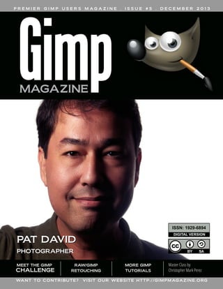
  • 1. PREMIER GIMP USERS M AG A Z I N E . ISSUE #5 . DECEMBER 2013 ISSN: 1 929-6894 DIGITAL VERSION PAT DAVID PHOTOGRAPHER MEET THE GIMP CHALLENGE RAW/GIMP RETOUCHING WA N T T O C O N T R I BU T E ? MORE GIMP TUTORIALS Master Class by Christopher Mark Perez V I S I T O U R W E B S I T E H T T P : / / G I M P M AG A Z I N E . O RG
  • 2. NEW DESKTOP PUBLISHING COURSE NOW AVAILABLE AS A DIGITAL DOWNLOAD. LEARN DESKTOP PUBLISHING USING FREE AND OPEN SOURCE SCRIBUS FROM THE MANAGING EDITOR OF GIMP MAGAZINE, STEVE CZAJKA.
  • 3. COMPLETE YOUR DIGITAL ARTS EXPERIENCE BY LEARNING GIMP AND INKSCAPE. VIEW STEVE'S PORTFOLIO AT: HTTP://FLICKR.COM/STEVECZAJKA. BOTH COURSES ARE AVAILABLE AT HTTP://GIMPMAGAZINE.ORG/COURSES
  • 4. M AG A Z I N E 12 AN INTERVIEW WITH PAT DAVID FEATURE 76 gimpmagazine.org 7 4 CONTENTS Pat David is a dabbler prone to flights of fancy and has a tendency to take strange tangents, depending on his mood, to explore different techniques for manipulating images. He is the administrator of the GIMP Users Community on Google+. GUM OVER PALLADIUM MASTER CLASS An active and enthusiastic supporter of open source software for many years, Christopher Mark Perez is a master photographer who enjoys using GIMP to put the finishing touches on his beautiful photographs. Currently, his favorite image themes include dark romanticism and ghost-filled gothic cemeteries. LETTER FROM THE EDITOR
  • 5. 32 54 60 74 84 RAW/GIMP PORTRAIT RETOUCHING WORKFLOW Learn how to use RAW and GIMP together. LOOK DOWN! – RESULTS OF THE MEET THE GIMP PHOTOGRAPHY CHALLENGE Have a look at the results of the official Meet the GIMP Photography Challenge. DESIGN GALLERY IS GIMP BECOMING THE WORLD'S MOST DOMINANT IMAGE MANIPULATION SOFTWARE? SOFTWARE REVIEW: TUX PAINT – OPEN SOURCE DRAWING SOFTWARE FOR CHILDREN gimpmagazine.org 24 GIMP PHOTOGRAPHY GALLERY 5
  • 7. Enjoy! Cheers Steve http://twitter.com/steveczajka http://flickr.com/steveczajka gimpmagazine.org E D I T O R T H E F RO M L E T T E R I can't believe we have reached Issue #5 already. Feels like yesterday since we started this magazine. Upon completion of each issue of this magazine I wonder how we can better the previous issues, and this issue is no exception. We have so many great articles and images to share with you. We have a feature article with Pat David describing some innovative photography techniques. Pat David also describes a tutorial about using RAW photography and GIMP together. And the master, Christopher Mark Perez, is also back in Issue #5 by sharing another master class with us. We also have a special feature in this issue which is a crossover with the ever-popular "Meet the GIMP" website — this is an article revealing the results of Rolf's photography challenge. We have full photography and design galleries with some pretty amazing works. To top it all up we have Debi Dalio providing a special review of Tux Paint for little ones who may eventually graduate to become new users of GIMP. Recently we have listened to our readers and we have a plan to implement your suggestions to make our magazine better. Thank you so much for contributing to our survey. We will slowly work towards implementing this next plan. You can read about this plan on our website. We have already started working on Issue #6 planned for a March 2014 release. We have also completed an outline for a special edition of GIMP Magazine on the very anticipated release of GIMP 2.10. Version 2.10 will be a very significant release as it supports high bit depths which have been viewed by some as a serious limitation of current versions of GIMP. There are so many other key features that we have agreed to collaborate with the core GIMP development team to bring this special issue to you. Version 2.10 will fundamentally change the playing field in the image management software space. We specially thank the folks at GIMP.org for helping to promote us on their website. This is an exciting time for both GIMP and GIMP Magazine. You are welcome to join us if you have strong skills as an illustrator, or graphic designer. Or maybe you could help us by submitting an article, or perhaps just photography. And if you can't do any of that, then perhaps you could help us by making a donation to GIMP Magazine on our website. These donations help us to cover to the costs of running a free and completely voluntary magazine. So many people spend countless hours putting this magazine together. The team at GIMP Magazine proudly presents Issue #5. If you are not already doing so, please follow us on Twitter, Google+, Issue, or by email subscription. Also, tell a friend about GIMP and GIMP Magazine and kindly tweet or blog about us to help spread the word. 7
  • 8. WEBSITE HTTP://GIMPMAGAZINE.ORG EMAIL NEWSLETTER FOLLOW US VIA EMAIL SUBSCRIPTION HTTP://GIMPMAGAZINE.ORG (CLICK SUBSCRIBE) ISSUU HTTP://WWW .ISSUU.COM/GIMPMAGAZINE FREELY VIEW THE PDF ONLINE TWITTER HTTP://WWW .TWITTER.COM/GIMPMAGAZINE GOOGLE+ FOLLOW +GIMP MAGAZINE BIT TORRENT PLEASE SHARE THIS PDF ON BIT TORRENT! YOUTUBE HTTP://WWW .YOUTUBE.COM/STEVECZAJKA gimpmagazine.org FLICKR GROUP HTTP://WWW .FLICKR.COM/GROUPS/2173220@N23/ 8
  • 9. A SPECIAL THANKS TO... HTTP://GIMP.ORG HTTP://GOOGLE+ GIMP ISSUE #5 . DECEMBER 2013 HTTP://OPENSOURCE.COM HTTP://OPENSOURCE.ABOUT.COM HTTP://ISSUU.COM HTTP://TODOGIMP.COM HTTP://GIMPUSERS.DE HTTP://LAMIRADADELREPLICANTE.COM HTTP://LINUXGRAPHIC.ORG HTTP://LINUXUNDICH.DE HTTP://GIMPUSERS.COM HTTP://LINUXZASVE.COM HTTP://ILOVEUBUNTU.NET HTTP://ABCLINUXU.CZ HTTP://GIMPMAGAZINE.MAGCLOUD.COM HTTP://LINUXNEWSHERE.COM.AU HTTP://FOTOSIDAN.SE HTTP://UBUNTU-TW.ORG HTTP://GIMPFR.ORG HTTP://TUXMACHINES.ORG HTTP://GIMPOLOGY .COM HTTP://IHEARTUBUNTU.COM HTTP://LIBRESAVOUS.COM HTTP://R.DUCKDUCKGO.COM HTTP://ARTISTSGUIDETOGIMP.COM HTTP://LINUXG.NET HTTP://CHIP.DE HTTP://UBUNTRONICS.COM HTTP://NETVIBES.COM HTTP://PHOTOGRAPHY-ON-THE.NET HTTP://SCRAPAVECGIMP.CANALBLOG.COM LEGAL: GIMP Magazine does not take any responsibility, express or implied, for the material and its nature or accuracy of the information which is published in this magazine. All the materials presented in this magazine have been produced with the express permission of their respective authors/owners. GIMP Magazine and the contributors disclaim all warranties, express or implied, including but not limited to implied warranties of merchantability or fitness for a particular purpose. All images and materials presented in this document are printed/reprinted with express permission from the authors and/or writers. The content responsibility lies completely with the contributing writer or the author of the article, and may not be representative of the views of the publisher. This PDF magazine is free and available from the GIMP Magazine website. GIMP Magazine is made available under Creative Commons "Attribution-Share Alike 2.5" license. GIMP Magazine trademark logo is copyright by the owner Steve Czajka. All advertisements are copyright by the respective owners. ADVERTISING: Please visit our website to view our advertising rate card and policies at http://gimpmagazine.org/about . HOW TO CONTACT GIMP MAGAZINE: Email: GIMPMagazine at hotmail dot ca Website: http://gimpmagazine.org Twitter: www.twitter.com/GIMPMagazine Google+: +GIMP Magazine Publication Origin: Mississauga, Ontario, Canada PRODUCTION NOTES: GIMP Magazine was created using Scribus 1.4.1, GIMP 2.6/2.8, Inkscape 0.47. Biondi was used for headlines, Open Sans and Open Sans Condensed for house typography. And we can't forget "the coolest mascot" ever, Wilber, adorning the front cover and various locations! ISSN 1929-6894 (online), ISSN 1929-8498 (print). gimpmagazine.org HTTP://BLOG.MEETTHEGIMP.ORG EDITORIAL TEAM: Steve Czajka, Managing Editor Design & Desktop Publishing Dave Lepek, Contributing Writer / Editing Assistance Oma Dial, All things Product Reviews Rolf Steinort, All things Web Sandra Livingston, All things Proof / Editing Debi Dalio, Contributing Writer / Editing / Submissions Ian Muttoo, Contributing Writer / Photography 9
  • 10.
  • 11. GIMP Magazine is now available in high quality print format. H TTP ://GIM PM AGAZINE .M AGCL OUD .COM
  • 12.
  • 13. AN INTERVIEW WITH PAT DAVID By Debi Dalio gimpmagazine.org Pat David is a dabbler prone to flights of fancy and has a tendency to take strange tangents, depending on his mood, to explore different techniques for manipulating images. He is the administrator of the GIMP Users Community on Google+. 13
  • 14.
  • 16. SO, PAT, HOW DO YOU GET THE IDEAS FOR YOUR WORK? I usually start in one of two ways. One is working from a general mood, idea, or feeling that I’d like to try capturing. The other is getting a general idea of a technique or process, then finding something to use it on. Sometimes it’s a combination of the two, usually as a result of mentally toying with the tools I have available to me. My ideas almost always start out as a thought “Wouldn’t it be cool if...”. I’m currently using an Olympus OM-D E-M5, and mostly my 17 mm prime lens. I’ll also pop on the 12-50 mm lens if I need it. My portraits are usually shot on the long end of the 12-50 mm. Lately I’ve been having fun with off-camera speedlights as well. I’m using a few Yongnuo 560 II flashes with Cactus v5 wireless triggers and a few different modifiers—mostly do-ityourself stuff. I’ve built or used a 24” softbox, a ring flash, and other things as the ideas come to me. I also really like slow light painting for static subjects. For software these days I’m usually going from RawTherapee into GIMP. Occasionally I’ll jump into Hugin if I want to bend some pixels and play with correcting distortions or creating THE FASTER SOMEONE panoramas. I’ll also use the GETS THE KNOWLEDGE OF command line version of THE TOOLS OUT OF THE ImageMagick, if needed, or, WAY, THE SOONER HE OR lately, G’MIC. WHO OR WHAT ARE THE BIGGEST INFLUENCES FOR YOU? Chiaroscuro has a huge influence on the way I see the world. I find quite a lot to love about the interplay of light and shadow. Edward Steichen is a favorite of mine from back in my film days, and I’m a huge sucker for street photography in all of its forms. In GIMP I almost always use the Curves tool in some fashion. G’MIC filters figure heavily in my workflow, as does the incredible Wavelet Decompose plugin. The GEGL command “c2g” is fantastic as an additional visualization for a black and white workflow as well. SHE CAN START CREATING NEW AND INTERESTING IMAGES. HAVE YOU EVER TAKEN FORMAL LESSONS OR ARE YOU SELF-TAUGHT? The extent of my education was a photography class in high school, and that was purely film-oriented. (I’m dating myself a bit, as digital had yet to mature.) Everything else was selftaught. In fact, it was this self-teaching that led me to want to do my best to produce tutorials and information in as high a quality as I could for anyone else that has to follow steps similar to what I took. The faster I can help someone get the knowledge of the tools out of the way, the sooner he or she can start creating new and interesting images using those tools. If I’m lucky, I’ll learn something new from others as well! DO YOU EVER USE GREEN SCREENS OR TEXTURED BACKGROUNDS? Not usually, no. I have seen others shooting against a middle grey background, then overlaying textures and masking to good effect, but it’s not something I’m currently toying with (outside of video work). DO YOU SHOOT IN RAW MODE? IF SO, WHICH SOFTWARE DO YOU USE TO PROCESS RAW FILES? WHAT IS YOUR PROCESS FOR CREATING AN gimpmagazine.org IMAGE? 16 If I have a general idea I want to try, I’ll start tinkering and thinking about it right away. Sometimes I’ll mock up ideas in 3D modeling/rendering software like Blender; other times I’ll mock things up physically and go from there. WHAT ARE THE TOOLS IN YOUR WORKFLOW? I almost exclusively shoot in RAW. There’s no good reason I can see to throw away perfectly good image data! I had previously used UFRaw into GIMP for processing, but these days I prefer using RawTherapee. This is mostly because my operating system environments are in flux, plus I like to have a consistent set of tools that I can use anywhere on any platform. I’ve heard great things about Darktable as well.
  • 17. WHY DID YOU CHOOSE TO USE GIMP AND WHICH FEATURES DO YOU USE THE MOST? I have been a Linux user for a long, long time, mostly due to philosophical differences with proprietary software. As such, GIMP was a natural editor for me to gravitate towards. Probably the single most indispensable part of my daily GIMP usage is the G’MIC plugin. It’s just amazing how much you can do with it. Also, no image leaves my GIMP session without some sort of adjustment in color curves. I’ve built up quite a few different curve presets to cover most of my tastes, and you’d be surprised at the flexibility that is opened up just by mastering this one tool in GIMP. For portraits or other images of people I’ve found the Wavelet Decompose plugin to be indispensable, and I’m still amazed at the power it brings to the editing process. As far as I know, even Photoshop doesn’t have an equivalent capability. Being able to edit an image based on frequency scales opens up an entirely new world of processing and manipulation. WHICH FEATURES WOULD YOU MOST LIKE TO SEE IN As I understand it, high-bit-depth editing is coming down the road for GIMP as GEGL integration is worked on. This would be nice, as it COLOR CURVES TUTORIALS IN GIMP: HTTP://BLOG.PATDAVID.NET/2012/06/GETTING-AROUND-IN-GIMP-COLOR-CURVES.HTML HTTP://BLOG.PATDAVID.NET/2012/07/GETTING-AROUND-IN-GIMP-MORE-COLOR.HTML gimpmagazine.org UPCOMING VERSIONS OF GIMP? 17
  • 18.
  • 20.
  • 21. would allow me to shift some of the violent things I do to an image to a little later in my workflow without sacrificing as much quality. Adjustment layers similar to what Photoshop has would be fantastic as well. My GIMP sessions tend to have over 30 layers as I iterate through editing and try different things out. It would be nice to be able to modify only an effect in a stack. TELL US A LITTLE ABOUT THE GIMP USERS COMMUNITY ON GOOGLE+ THAT YOU ADMINISTER. I was on Google+ pretty early, and saw its potential use for photographers in general. I wanted to make sure there was a community available to GIMP users that would be maintained and could be used to show off new and interesting GIMP-related content as much as possible. It’s amazing to me to see all the different approaches and uses people have for GIMP beyond what I like to do. The digital art stuff is just incredible to see, and I’m in awe at the talent of some of the users there. IF YOU COULD GO BACK IN TIME, WHAT ADVICE WOULD YOU GIVE YOURSELF? Buy Apple stock at $15 in 2004? Probably to learn more about color theory, and pick up a nicer camera sooner to have fun with. Always be shooting, creating, or learning. WHAT ARE YOUR FUTURE PLANS? I’m hoping to get many more tutorials published over on my website, and I was toying with the idea of doing more video tutorials as well. I even considered compiling a book of the tutorials I already have, but haven’t really decided if that’s for me yet. PAT DAVID’S WORK CAN BE FOUND AT THESE SITES: gimpmagazine.org Personal website portal for works and tutorials: http://www.patdavid.net/ Flickr: http://www.flickr.com/photos/patdavid Getting Around in GIMP blog: http://blog.patdavid.net/p/gettingaround-in-gimp.html ■ 21
  • 22.
  • 23. FOLLOW DAVE LEPEK ON TWITTER @ACCORDING2DAVE
  • 25. IF YOU’D LIKE TO HAVE YOUR WORK CONSIDERED FOR THE NEXT ISSUE OF GIMP MAGAZINE, SEND YOUR SUBMISSIONS TO HTTP://GIMPMAGAZINE.ORG/SUBMISSIONS Calligraphy: Steve Czajka gimpmagazine.org A Gallery of Works from our GIMP User Community 25
  • 27. gimpmagazine.org ALEJANDRO RUETE Title: Umbrella Description: I'm an amateur photographer who enjoys the freedom and flexibility of "the GIMP". To maintain my family and my hobby I have a second hobby (I'm a researcher), but the latter is paid. I live in Uppsala, Sweden, and the picture was taken on a rainy summer afternoon on my terrace. Color "pop-up" is very easily done in GIMP. Before that, I only tweaked contrast with the Curves tool and cropped it a bit, as usual. Portfolio: http://www.flickr.com/photos/aleruete/ 27
  • 29. gimpmagazine.org DEBI DALIO Title: Snack Time Description: This photo was taken with a Canon EOS 5D Mark III and a 70-200mm telephoto lens. The settings were f/5.6, 1/1250 sec, ISO 800, 135mm. I then used GIMP for cropping and to brighten the image using a curveadjusted duplicated layer in Value mode. Flickr: http://www.flickr.com/photos/debidalio/ 29
  • 31. FLORIAN HENNIG Title: Nature 2.0 Description: Here are the main pictures (after and before). I chose the theme "Nature 2.0" because at the time the nuclear disaster of Fukushima happened. About: I'm studying computer science with focus on media at the University of Applied Science in Dresden, Germany. In the first year we had a module called "Digital Picture Editing". For this we needed to create/edit a picture and write documentation about our steps. I think it is important to tell all students that there are possibilities to use free software and get good results and grades too. PLACE YOUR AD HERE! FIND OUT HOW AT HTTP: //G IM PMAGA ZINE.ORG/A BOUT
  • 33. RAW/GIMP PORTRAIT RETOUCHING WORKFLOW by Pat David, Edited by Debi Dalio One of the reasons I love using free and open source software (F/OSS) is the general availability of the software across the operating systems that I use. There are many powerful F/OSS tools that can be used for professional level photo retouching, GIMP being one of them. GIMP is more than capable of handling tasks that high level retouching requires. It even includes some capabilities that don’t exist in commercial software. This tutorial focuses on portrait retouching using a combination of RawTherapee, GIMP, and an incredibly useful plugin — Wavelet Decompose. There are a few F/OSS options for RAW image processing, RawTherapee being the one I like and have incorporated into my workflow. In this section I'll describe how to make various adjustments to a RAW image, including exposure, black point, white balance, and noise reduction. RAW IMAGE PROCESSING After starting up RawTherapee, you'll be in the File Browser interface. You can navigate to your folder of images through the file browser on the left side of the window. It may take a while for RawTherapee to generate thumbnails of all the images in your directory. Once you've located your image, double-click it in the main window to open it for editing. If you're using default installation options, then you'll probably find that a Default profile has been applied to your image with Auto Levels turned on. Chances are that Auto Levels will not look very good. That's OK, because we are going to fix this in the next few steps. STEP 1 — OPEN THE IMAGE IN RAWTHERAPEE I like to control the exposure and processing of my RAW images. Auto Levels may work for some, but once you get used to some basic corrections and how to use them it’s relatively quick and painless to adjust your images to something you like. For a good starting point I usually remove all adjustments to an image and reset everything back to zero. This is easy to do as my Default profile has nothing in it other than Auto Levels. A quick and easy way to reset the Exposure values on the Exposure panel is to use the Neutral button (outlined in green). (See left image) You can also hit the small undo arrows next to each slider to set that slider back to zero. For some reason the Neutral button doesn’t reset the Saturation slider to zero, so I do that manually. At this point the image exposure is set to a baseline. For reference, gimpmagazine.org STEP 2 — RESET THE EXPOSURE 33
  • 34. here is my sample image after zeroing out all of the exposure sliders and the saturation: (See Image 1) The first thing I adjust is the Exposure Compensation. It's necessary to pay careful attention to the histogram for the image to know what your adjustments to Exposure Compensation are doing and to keep from blowing out any colors. I push the Exposure Compensation until one of the RGB channels just begins butting up against the right side of the histogram. Here is what the histogram looks like for the neutral exposure: (See Image 2) After adjusting Exposure Compensation for my image, I had the Red channel snug up against the right side of the histogram. (See Image 2a) If you go a little too far, you’ll notice one of the channels will spike against the side, and if you go really too far, you’ll get a small colored box in the upper right corner indicating that a channel has gone out of range (is blown out). Here is what my image looks like with only the Exposure Compensation adjusted to a better value (2.40): (See Image 2b) If the highlights in your image begin to get slightly out of range, you may need to make adjustments to the Highlight recovery amount or threshold, but in my case the image was slightly underexposed, so I kept these settings at zero. There is also a great visual method of seeing where your exposures are for each channel and whether or not highlights and shadows are being clipped. Along the top of your main image window, to the right, there are some icons that look like this: (See Image 2d) The Channel previews let you toggle each of the Red, Green, Blue, and Luminosity previews individually for the image. You can use these with the Highlight and Shadow clipping indicators to see which channels are clipping and where. The Highlight and Shadow clipping indicators will show you on your image where the values go beyond the threshold for each. For highlights, it’s any value that is greater than 253; for shadows, it’s any value that is less than 8. To illustrate, here is what my image looks like with the Exposure Compensation set to 2.40: (See Image 2e) I don’t mind the shadows clipping in the dark regions of the image, though I can make adjustments to the Black Point to modify that. The highlight clipping on her face is of more concern to me. I certainly don’t want that! I decided to back down my Exposure Compensation for the highlights slightly. As I eased off, I could see the dark patch for Highlight Clipping growing smaller. I usually stop when it’s either all gone or nearly all gone. I wasn’t too far off in my initial adjustment. I had to back the Exposure Compensation off to only 2.30 to remove most of the highlight clipping. STEP 3 — ADJUST THE EXPOSURE COMPENSATION Image 1 Image 2 gimpmagazine.org Image 2a 34
  • 36. Zooming in to a shadowed area of an image that includes dark or black tones lets you see if the Black Point needs adjustment. The blacks in my image felt a little flat to me, so I decided to increase the black level just a bit to darken them. You want to be zoomed in so you can determine at which point the Black Point adjustments you make wipe out any details that you want to keep visible. You want your blacks to be as dark as possible while keeping as many details in the shadows as you can. It's really subjective where this point is, but I tend to stay on the conservative side since I'm going to process colors a little bit in GIMP later. Starting with a Black Point of zero: (See Image 3) I increased the Black Point while keeping an eye on the shadow details, increasing it until I liked how the blacks looked and seeing that I hadn’t destroyed detail in the dark tones. I finally settled on a Black value of 150 as seen here: (See Image 3a) It's necessary to watch out for Shadow Recovery when you first start adjusting the Black Point. Its default might be a different value than zero (mine is at 50), and the Neutral button won’t set it to zero (it resets it to its default value of 50). You may want to push it manually to zero, and if you feel you want to bump shadow details a bit, then start pushing it up. STEP 4 — SET THE BLACK POINT Image 3 For this image I didn’t feel the need to modify these values, but this is purely subjective (again). If you do modify these values, keep an eye on the histogram to make sure colors don't go out of range. STEP 5 — SET BRIGHTNESS, CONTRAST, & SATURATION Image 3a HTTP : //YO UTUBE .COM /STEVECZAJ KA
  • 37. If you had the correct White Balance setting in your camera during your shoot, then you can skip this step. If not, then you can adjust it now. I had my in-camera White Balance set to Flash, so the embedded White Balance settings in my RAW file metadata are pretty close. In my image, however, you’ll notice that there is a bit of a white window visible in the left of the frame. I happen to know that the window is quite white, and should be rendered as such in my image. As a side note, what I really should have done was to get myself a good reference for setting the white balance, and to shoot it as part of my setup. Something like the X-Rite MSCCC ColorChecker Classic, or even a WhiBal G7 Certified Neutral White Balance Card. These are a little pricey, but any good 18 per cent grey card will do, really. I just happen to know that my window borders are a pure white, so I’m cheating a bit here. Here is my image after the previous adjustments: (See Image 5) White Balance can be adjusted from the Color panel. (See Image 5a) You can try out some of the presets in the Method drop-down—it contains the typical settings for Sunny, Shade, Flashes, etc. I chose to use the Spot WB option. Clicking that button let me pick a section of my image that should be color neutral. STEP 6 — SET THE WHITE BALANCE Image 5 Image 5a
  • 38. I know that the window border in my image should be white (and color neutral), so I picked from that area on my image. This shifted my White Balance and produced this result: (See Image 5b) I also know that the grey-colored walls in the background are close to neutral, but with the slightest hint of blue in them. If I used the grey wall instead of the white window, I would introduce the slightest warm cast to the image. I tried it (choosing a section of the grey wall on the right side of the background), and actually prefer the slightly warmer color. (See Image 5c) Chances are the RAW image is going to look pretty noisy when you're zoomed in. This isn’t unusual since we are dealing with RAW data. There are two noise reduction options in RawTherapee and you'll want to use both of them. STEP 7 — PERFORM NOISE REDUCTION Image 5b gimpmagazine.org Image 5c 38
  • 39. Impulse Noise Reduction removes pixels that have a high impulse deviation from surrounding pixels. Basically, this takes care of the “salt and pepper” noise you may notice in your images where individual pixels are oddly brighter or darker than the surrounding pixels. If I zoom into a portion of my image (not far from where I was looking at shadows for setting the Black Point), I see this: (See Image 6) I normally play a bit with Impulse Noise Reduction to remove specks while still retaining details. As with most noise reduction methods, going a bit too far will obliterate some details with the noise. The trick is to find a happy medium between the two. In my case, I settled on a value of 55 (the default is 50): (See Image 6a) I could have gone a bit further (and have in other images), and pushed it up to the 60–70 range, but it’s a matter of taste and weighing the trade-offs. IMPULSE NOISE REDUCTION Image 6 Luminance and Chrominance Noise Reduction suppress noise in the luminance channel (brightness) and the blue/red chrominances. I use a light hand with these noise reduction methods. The defaults are 5 for each, and it should make a noticeable difference with just the default values. If you push the Luminance Noise Reduction too far, you’ll smear fine details right off your image. If you push the Chrominance Noise Reduction too far, you’ll suck the life out of the colors in your image. Not surprisingly, it’s another trade-off. In my image, I pushed the Luminance/Chrominance Noise Reduction just a tiny bit past the default to 6 each. You can see the effect of Chrominance Noise Reduction by looking at the flat-colored grey wall in the background. Just don’t forget to check other areas of your image with the settings you choose. For me it was a close look at her iris, where pushing the Chrominance Noise Reduction too far lost some of the beautiful colors in her eye. Here's the previous image with Luminance/Chrominance Noise Reduction applied: (See Image 6b) If you’ve read my series of articles on Black & White Conversion, you’ll know that I don’t mind a little noise or grain in my images, so this level doesn’t bother me in the least. I could chase the noise even further if I really wanted to, but always remember that doing so is going to be at the expense of detail or color in the final result. As with most things in life, moderation is key! Image 6a Image 6b gimpmagazine.org LUMINANCE/CHROMINANCE NOISE REDUCTION 39
  • 40. If you are going to sharpen your image, this might be time to do so. Usually sharpening is the last bit of post-processing you should do to your image, due to its destructive nature. Lately, I’ve grown accustomed to sharpening by using an extra wavelet scale during my skin retouching in GIMP, so I avoid sharpening at this stage. If I were going to sharpen my image now, it would be just very, very lightly. Also, if you do decide to do any sharpening in RawTherapee, make sure that you do it after any noise reduction (you don’t want to sharpen noise). STEP 8 — SHARPEN THE IMAGE That's all the RAW adjustment I want to do on this image. I try to keep adjustments minimal where possible, though I could have gone further and adjusted color tones and made LAB adjustments here as well. In fact, with the exception of Wavelet Decompose for skin retouching, and some other masking and painting operations, I could do most of what I wanted to do with this portrait entirely in RawTherapee. I know this process seems really long, but the truth is that once you become accustomed to the workflow, these steps takes less than five minutes from start to finish. All we really worked with was exposure, black point, white balance, and noise reduction. Here is the final version after doing all of these RAW edits, as we get ready to bring the image into GIMP for further processing: (See Image 8) RAW SUMMARY Image 8 Armed with our final results from RawTherapee, we’re now ready to do a little retouching to the image. The overall workflow in GIMP and the order in which I approach the steps are dependent on my mood. Most times I enjoy doing skin retouching, so I’ll often jump right in with Wavelet Decompose and play around. Really, though, I should shift Wavelet Decompose to a later part of my workflow, and fix other things first — like removing objects from the background and fixing flyaway hairs. This way, I can directly reuse wavelet scales for a slight wavelet sharpening while I have them. Looking at the current state of my image, I can spot a few broad things that I want to correct, and I’m going to address them in this order: 1. Touch up flyaway hairs. 2. Crop and remove distracting background elements. 3. Touch up skin with Wavelet Decompose. 4. Contour paint highlights. 5. Apply some color curves. 6. Sharpen the image. gimpmagazine.org GIMP IMAGE RETOUCHING 40 Image 9
  • 41. If you can have the model bring a hairbrush with them to a shoot, DO IT. Seriously. Your eyes and carpal tunnel will thank me later. Even with a brush, or hairstylist or make-up artist, the occasional hair will decide to rebel and do its own thing. This will require you to edit the image and fix those errant hairs. Luckily for me, Mairi’s hair mostly cooperated with us during the shoot (and where it didn’t I kind of liked it). To illustrate this step, though, I’m going to clean up some of the stray hairs on the left side of the image (the right side of her face). Fortunately, the background is a consistent color and texture. This means cloning out these hairs shouldn’t be too much of a problem, but there are still some things you should keep in mind while doing this. Here is the area that I’d like to clean up a little bit: (See Image 9) I usually use a hard-edged brush because a soft edge will smear details on its edges, which can often be spotted pretty easily. This works well with my image because the background is relatively consistent in grain and color. I take a sample from an area near the hair I want to remove and set the brush to "Aligned". I keep the brush size as small as I can while still being able to remove the hair. (See Image 9a) What is necessary to keep in mind is how the hair is actually flowing and follow that. I often follow outlying strands of hair back to where they start from the head and begin cloning them out from there. I also try not to get too ambitious (some stray hairs are sometimes fine). Removing too many at once can lead to unrealistic results, so I try to be conservative, and to constantly zoom out and check my work from a normal viewpoint. If possible, try not to leave hairs prematurely cut off in space; it tends to look a bit distracting. If you want to remove a hair that crosses over another strand that you may want to keep, make sure to adjust the source of the clone brush so you can remove it without leaving a gap in the leftover strand. Here is a quick five-minute touch-up of some of the stray hairs: (See Image 9b) Occasionally, you’ll need to fix hairs that are crossing over other hair (sort of like a virtual brushing of the hair). In these cases, you really have to pay careful attention to how the hair flows and to use that as a guide when choosing a sample point with either the clone or heal brush. If this sounds like a lot of work, it is. Thankfully, once you’ve become accustomed to doing it, and doing it well, you’ll find yourself picking up a lot of speed. It’s one of those things that’s worth learning to do properly. Practice will speed it up for you. I actually like the cascading hair around her face opening up to a pretty color, so that’s as far as I’m going to go with stray hairs on this image. Image 9a Image 9b gimpmagazine.org STEP 9 — TOUCH UP FLYAWAY HAIRS 41
  • 42. With the limited space I had to shoot this portrait, it’s no surprise that I got some undesirable background elements, like the window edges. There are a couple of ways I could fix these problems: I could fix the background in place, or I could crop out the elements I don’t want. In my final version of the image I wanted to crop tighter, so it worked out well for me to remove the window on the left. To illustrate how to remove the window without cropping, I’ll leave the aspect ratio as it is, and walk through removing the distracting background elements. Because most of the background is already a (relatively) solid color, this isn’t too hard. My approach was to make a duplicate of my current layer and move the duplicate into place such that the background would cover up the parts of the window I wanted to remove. Then I masked the duplicate layer to hide the window. I started by choosing an area of the background that’s similar in color and tone (marked in green): (See Image 10) Then I moved the duplicate layer so that the green area covered up the window to the left (marked in purple): (See Image 10a) Here is what this looks like in GIMP, with the duplicate layer set to 90 per cent opacity over the base layer so you can see where the window edge is: (See Image 10b) Next I added a black (fully transparent) layer mask over the duplicate layer, and painted white with a soft-edged brush on the mask to cover up the window edge. (See Image 10c) You can see that the background area from the duplicate is a bit darker than the base layer background and the seam is visible around the mask. To fix this, I adjusted the lightness of the duplicate layer until I got a good match. I used Hue-Saturation to adjust the lightness because I wasn’t sure if I would need to adjust the hue slightly as well. (It turns out I didn’t.) I found that increasing the Lightness value to 3 got me reasonably close. (See Image 10d) To further fix the lower part of the window, I just repeated all the steps above with another duplicate of the base layer, shifting it to cover the lower part of the window. I had to mask along her sweater. (See Image 10e) This background adjustment is OK, but it could be just a little bit better. Visually, the falloff of light on the background doesn’t match what’s happening on her body, so I added a small gradient to the lower left corner to give it a more natural looking light falloff. (See Image 10f) Fixing the slight window and shadow on the right is easily done with a Clone/Heal tool combination. Here is the final result of quickly cleaning up the background: (See Image 10g) STEP 10 — FIX THE BACKGROUND gimpmagazine.org Image 10 42 Image 10a
  • 43. Image 10c Image 10d Image 110e gimpmagazine.org Image 10b 43
  • 44. I could have spent a little more time on cleanup, but I’m happy with the results for the purpose of this article. If your cloning efforts leave obvious transitions between tones, the Heal tool can be helpful for alleviating them, especially when used with large brush radii. Just be prepared for it to take a while. With the background squared away, we can move on to one of my favorite things to play with—skin retouching! gimpmagazine.org Image 10f 44 Image 10g
  • 45. In my skin retouching article, Getting Around in GIMP – Skin Retouching (Wavelet Decompose), I said that using a light touch is really best. Keep that in mind as we move forward. Don’t make mannequins. With a layer that contains all of the changes we’ve made so far, we can now decompose the image to wavelet scales. I almost always use the default of 5 scales unless there’s a good reason to increase or decrease that number. For anyone new to this method, the basic idea of Wavelet Decompose is that it will break down your image into multiple layers, each containing a specific set of details based on their relative size, plus a residual layer with color and tonal information. For instance, Wavelet scale 1 will contain only the finest details in your image, while each successive scale will contain larger and larger details. The benefit of breaking up an image in this manner is that differently-sized details are isolated each on their own layer, so it's possible to modify details on one layer without affecting details on other layers; or to adjust the colors or tones on the residual layer without modifying the details. After running Wavelet Decompose, we have six new layers: a Residual layer plus five Wavelet scales. Here is an example: (See Image 11) I generally work on skin retouching in sections. Usually I’ll consider the forehead, nose, cheeks to smile lines, chin, and upper lip all as separate sections, trying to follow normal facial contours. (See Image 11a) Let's start with the forehead. I work with detail scales first, and follow up with touch-ups on the residual scale, if necessary, to even out color tones. To see only Wavelet scale 5, you can hold down the Shift key and click on its layer visibility icon. Here is what Wavelet scale 5 looks like isolated: (See Image 11b) It may not seem obvious, especially if you don’t use wavelet scales much, but there’s a lot of large-scale tonal imperfections here. Here is the same image, but with the levels normalized: (See Image 11c) Normalizing the wavelet scale lets you see the tones that you'll want to smooth out. My usual workflow is to have all of the wavelet scales and residual layer visible (each of the wavelet scales will already have their Layer Blend Modes set to Grain Merge). This makes it possible to see the overall image results in real time. Then I select each wavelet scale layer as I work on it. I normally use the Free Select tool to select the forehead, with the Feather Edges option turned on with a large radius (maybe 1 per cent of the smallest image dimensions roughly, so about 35 pixels for this image). With my forehead area selected, and the layer on which I want to work selected, I often run a Gaussian Blur (IIR) over the skin to smooth out the imperfections. The radius to use depends on how strongly you want to smooth the tones out. Too much, and you’ll obliterate the details on that scale, so start small. Here's the selection I worked on, with Wavelet scale 5 as my active layer: Image 11 Image 11a Image 11b gimpmagazine.org STEP 11 — TOUCH UP THE SKIN 45
  • 46. Image 11c Image 11d Image 11e gimpmagazine.org Image 11f 46 Image 11g (See Image 11d) At this point I experimented with different Gaussian Blur radii to get a feel for how they would affect my entire image. I settled on a somewhat high radius of 35 pixels, which gave me this result: (See Image 11e) Just with this small change to a single wavelet scale, we can already see a remarkable improvement to the underlying skin tones, and we haven’t hurt any of the fine details in the skin! In some cases, this may be all that is required for a particular area of skin. I could push things just a tiny bit further if I wanted to by working globally again on a finer wavelet scale, but I’ve learned the hard way to back off early if possible. Instead, I look at specific areas of the skin that I may want to touch up; for instance, the two frown lines in the center of the forehead. I may not want to remove them completely, but I may want to downplay how visible they are. Wavelet scales are perfect for this. (See Image 11f) Because each of the Wavelet scales is set to a layer blend mode of Grain Merge, any area that has a completely grey color will not affect the final image. This means that you can paint with medium grey RGB (128,128,128) to completely remove a detail from a layer. You can also use the Blur/Sharpen brush to selectively blur an area of the image as well. (I’ve found that the Blur tool works best at smaller wavelet scales. It doesn’t appear to make a big difference on larger scales). So, if we look at Wavelet scale 5 where the frown lines are, we can see there’s not much there; it was already smoothed earlier. However, if we look at Wavelet scale 4, we can see they're prominent. I used the Heal Tool to sample from the same wavelet scale in a different location, and painted over just the frown lines on Wavelet scale 4. If it had been necessary, I could also have worked on Wavelet scale 3 and repeated the same procedure. A couple of quick passes just over the frown lines, and the result looks like this: (See Image 11g) I could have continued over any other blemishes I wanted to correct, but small individual blemishes can usually be fixed with a little spot healing quickly (using the Heal Tool on the merged image after working with Wavelet Scales).
  • 47. Moving on to the nose, the tones have different requirements. Overall, the tones on Wavelet scale 5 are similar to the forehead. In this case, a similar amount of blurring as the forehead on scale 5 will nicely smooth out the tones. Here's the nose after a slight blurring: (See Image 11h) There is a bit of color in the nose that is slightly uneven. This is relatively easy to fix with wavelet scales, because I can modify the underlying color tones of the nose without destroying the details on the other scale layers. In this case, I worked on the Wavelet residual layer. I used the Heal tool with a large, soft brush. I sampled from about the middle of the nose and cleaned up the slightly redder skin by healing new tones into that area. I followed the contours of the nose and the way that the light was hitting it in order to match the underlying tones to what was already there. (See Image 11i) Image 11h DID YOU KNOW? GIMP 2.8.8 IS NOW AVAILABLE! Image 11i gimpmagazine.org THIS IS THE LATEST VERSION OF GIMP. READ ABOUT IT AND DOWNLOAD IT FROM HTTP://GIMP.ORG 47
  • 48. gimpmagazine.org Image 11j 48 Image 11k Next I looked at the eyes and cheek on the brighter side of her face. (See Image 11j) The tones here are not bad, particularly on scale 5. After making my selection, I applied a blur of 25 pixels just to smooth things a bit. (See Image 11k) The dark tones under and around the eyes are a bit different to deal with. As before, I worked on the Wavelet residual layer to brighten up the color tones under the eyes. I used the Heal tool to sample from a brighter area of skin near the eye. Then I carefully painted into the dark tones to brighten them up and to even the colors out with the surrounding skin. (See Image 11L) Wavelets are amazing for this type of adjustment, because it's possible to brighten up and change the skin tones under the eyes without affecting the fine skin details like small wrinkles and pores. The textural character remains unchanged, but the underlying skin tones can be modified easily. The same process can be used for the slightly red tones on the cheek and at the edge of the jaw. I decided not to modify the fine wrinkles under the eyes. These small imperfections will often bring great character to a face, and unless they are very distracting or bad, I find it best to leave them be. A good tip is that even though small imperfections may seem large when you’re down at the pixel level, you should get into the habit of zooming out to a sane zoom level and evaluating the image often. Sometimes you’ll find you’ve gone too far and things begin to creep into mannequin territory. I repeat: don’t make mannequins!
  • 49. Those are the basics of the skin retouching process. Just repeat the steps above on the areas that remain (right cheek, chin, and upper lip). To summarize, here are the tools and steps I use with Wavelet Decompose to retouch skin: • Select an area and use Gaussian Blur to even out overall tones at a particular scale. • Paint with grey and/or use the Clone or Heal tools on wavelet scale layers to modify specific details. • Use the Clone and Heal tools on the residual scale layer to modify underlying skin tones and colors while leaving details intact. Here's the final result after all the changes I made using the Wavelet Decompose process: (See Image 12) SKIN RETOUCHING SUMMARY There are a few things that still need a little spot touch-up that I didn’t bother to mess with in Wavelet scales. I finished the touching up process by cloning or healing out some small hairs along the jaw line, and touching up some small spots of skin individually. This is really just a light cleaning, and I usually do this at the pixel level (zoomed in very far and using small brush sizes). I also use a method for checking the skin for areas that I may want to touch up, but that might not be immediately visible or noticeable. This method makes use of the fact that the blue channel of an image can show you just how scary skin can look. (Seriously, color decompose any image of skin and look at the blue channel.) See my article, Getting Around in GIMP - Blue Channel Check Layer (Retouching), for details. Image 11L Image 12 gimpmagazine.org STEP 12 — FINISH SPOT TOUCH-UPS 49
  • 50. One of the downsides of using Wavelet scales for modifying skin is that if you’re blurring on some of the scales, you’ll sometimes decrease the local contrast in your image. This isn’t so bad, but you may want to bring back some of the contrast in areas you’ve touched up. I use a method I refer to as Contour Painting. What I do is basically add some transparent layers over my image and set their layer blend modes to Overlay. Then I paint white over any contours I want to enhance and adjust the opacity of the layer to taste. (This is highly subjective, so I’m going to give just a quick idea of how I might approach it. You can go as crazy with this as you like.) This is a very common technique utilized by experienced retouchers to enhance the lighting on an image. Here I’ve added a new transparent layer on top of my image and set the Layer Blend Mode to Overlay. Then I painted white onto the contours that I wanted to highlight: (See Image 14) It looks strange, but, after adding a large radius Gaussian Blur of 111 pixels, the tones are smoothed out. (See Image 14a) Finally, I adjusted the opacity of the Overlay layer to suit my taste. I usually dial this way, way down so that it’s not so obvious. Here, I’ve set the opacity to about 20 per cent: (See Image 14b) I sometimes add a few more of these layers to enhance other parts of the image as well. I use it (really, really, really lightly!) to enhance the eyes a bit, and, in this case, I used an even larger layer to add some volume and highlights to her hair as well. Here is the result after adding some eye and hair highlight layers: (See Image 14c) STEP 13 — CONTOUR PAINT HIGHLIGHTS gimpmagazine.org Image 14 50 Image 14a
  • 51. Image 15 Image 14c Image 16 gimpmagazine.org Image 14b 51
  • 52. After making all the adjustments above, I like to apply some color curves that I have around and use often. I’ve been heavily favoring a Portra emulation curve from Petteri Sulonen that he calls Portraesque, especially for skin. It has a very pretty rolloff in the highlights that renders very pleasing colors. If I feel it’s too much, I can always apply it to a duplicate of my image and adjust the opacity to suit. Here is the same image with only the Portra-esque curve applied: (See Image 15) You can read a much more in-depth look at color curves for skin in my article Getting Around in GIMP - More Color Curves (Skin). You can also download some curve presets from that page. STEP 15 — SHARPEN THE IMAGE Finally. The last step to finish the image! For sharpening, I actually like to use one of the Wavelet scales that I generated earlier. I simply duplicate a low scale, like 2 or 3, and drag it to the top of my layer stack to sharpen the details from that scale. For this image, I like the details from Wavelet scale 2, so I duplicated that layer and dragged it to the top of my layer stack. The blend mode was already set to Grain Merge, so I didn’t have to do anything else. (See Image 16) STEP 14 — APPLY COLOR CURVES Image 17 Before: (See Image 17) After: (See Image 17a) Not too bad for a little bit of fiddling, I think! I know that this tutorial seems very long, but I promise that once you understand the processes being used, it’s actually very quick in practice. I hope that this has been helpful to you in some way. If you happen to use anything from this tutorial please share it. I’d love to see what others do with these techniques. CONCLUSION Patrick David is a hobbyist photographer, digital tinkerer, and open source software advocate. He blogs (semi) regularly about using GIMP and F/OSS tools for high quality photographic retouching on his website under “Getting Around in GIMP”. You can find him at these online sites: Blog: http://blog.patdavid.net/ Google+: https://plus.google.com/105956747281909080618/posts Flickr: http://flickr.com/photos/patdavid gimpmagazine.org ABOUT PATRICK DAVID 52 Image 17a He is also the administrator of the GIMP Users Community on Google+: https://plus.google.com/u/0/communities/112556998953300949378 ■
  • 53. Meet The GIMP! A Videopodcast about Free and Open Source Graphics Software http://meetthegimp.org
  • 54. LOOK DOWN! – RESULTS OF THE MEET THE GIMP PHOTOGRAPHY CHALLENGE By Rolf Steinort I produce the video podcast “Meet the GIMP!” about GIMP and other free and libre graphics software. Due to a move and a new job this summer I had no time to take care of that project. So I decided to set up a challenge. gimpmagazine.org “Present the place where you live to us – but look down on the sidewalk for that!” 54 The Rules 1. Make a mosaic of at least 3×3 images. 2. All images have to be shot straight down 3. All images are in the same scale, use the same distance to the ground and the same focal length. 4. All images have to be linked to each other in their theme by being from one city, one journey ….. 5. Publish your image online and post a link to it before September 1st in the comments to this blog post. 6. License your image as CC-BY or better and allow this site and the GIMP Magazine to publish your image under CCBY (here) or CC-BY-SA (GIMP Magazine). 7. Rules 1 to 4 may be broken, 5, 6 and 7 have to be followed exactly. This challenge is a perfect ripoff of a challenge by Andrés (Twitter) (Website), an illustrator from Buenos Aires, in the now closed forum of Tips from the Top Floor. There was not much promotion by me for the challenge, but the results are great. In episode 192 (http://blog.meetthegimp.org/192/) I explain how to make such a mosaic with the help of layer groups and layer modes.
  • 55. gimpmagazine.org TINKER This image proves that you can get a lot of clues by looking at the ground. "tinker" lives on a former “LPG”, a collective farm from GDR times in eastern Germany. It's obviously in use but has fallen on hard times. 55
  • 56. gimpmagazine.org KEVIN PAYNE From Devon, UK, Kevin is a long time contributor to the forum of Meet the GIMP and helped a lot with writing TOCs for the videos. To be fair – he wrote most of them. Kevin shares his photos on 23hq (http://www.23hq.com/paynekj), Flickr (http://www.flickr.com/people/paynekj/) and Panoramio (http://www.panoramio.com/photo/40873240). 56
  • 58. gimpmagazine.org 58 PAUL SAUVÉ Paul broke two of the breakable rules that were set for the challenge – and he was right about it. Here is his slightly edited defense: “I visited San Jose, Costa Rica and David, Panama twice, once in 2006 and again in 2008. I noticed that it is the individual owners that generally build sidewalks in front of their businesses and this makes for very interesting sidewalks in the city centers. I found this so intriguing that I took quite a few photos. Since I didn’t know that I would use these for your Sidewalk Challange, your rules 1 to 3 were not followed.” You can see Paul's photos on Flickr (http://www.flickr.com/photos/paulsaute).
  • 59. gimpmagazine.org UWE VAN OLFEN Uwe gave us this impression of the intertidal zone of a Dutch island. The North Sea has quite some tides and the coast is sandy – so this zone is wide and full of life. The longer I look at this image, the more details and connections between the tiles I notice. And softening the strict grid with the horizontal wavy lines adds the final touch to this image. 59
  • 61. IF YOU’D LIKE TO HAVE YOUR WORK CONSIDERED FOR THE NEXT ISSUE OF GIMP MAGAZINE, SEND YOUR SUBMISSIONS TO HTTP://GIMPMAGAZINE.ORG/SUBMISSIONS gimpmagazine.org A Gallery of Works from our GIMP User Community 61 Calligraphy: Steve Czajka
  • 62. gimpmagazine.org 62 STEVE CZAJKA Title: Seasons Greetings Description: These pieces were created with authentic calligraphy using a Pilot Parallel Calligraphy Pen and Pelikan Ink. Layout was completed in Inkscape. Colourization was completed using GIMP. Portfolio: http://flickr.com/photos/steveczajka
  • 64. gimpmagazine.org NAVJINDER KAINTHRAI Title: *Eat Description: I am a web developer/designer from Toronto. I have a passion for art and I am a traditional artist, but when I discovered open source image programs my life changed. GIMP, Inkscape, and Blender are my tools for designing. In this image, the child is tricked (by the food giants) into eating anything but food. The design was hand-drawn, then processed in Inkscape to vectorized the work. Then it was post-processed in GIMP. Contact: navjinder.tumblr.com 64
  • 66. gimpmagazine.org 66 SEBASTIÁN VALENCIA Title: Warrior Description: I am a graphic designer, illustrator, and web developer. I command a digital agency called JUGO (juice in English), in Chile. I love design and illustration. For this reason I am always looking for new ways to do my job. Now I'm exploring the world of open source successfully, especially with GIMP and Inkscape, and Blender sometimes. This warrior image was made with GIMP 2.8.4. deviantART: http://papayeah.deviantart.com Twitter: @Papa_Yeah Facebook: facebook.com/seba.valencia
  • 67. gimpmagazine.org ALISTAIR MCGARRIE Title: Remedy Description: I’m an aspiring artist who just newly discovered GIMP. I still have not chosen which field I’d like to go into yet, but I believe no matter which field you’re in, you should still be able to perform many art types well, so at the moment I’m still learning. I coloured this image with GIMP. I mainly used the Blur tool, and a very little bit of airbrush to get some of the nice effects. I’m still new to GIMP; this is the first image I have produced using it. I’m hoping to learn a lot more about GIMP. Portfolio: http://zzecho.deviantart.com/ 67
  • 68. gimpmagazine.org HARRY THOMAS Title: Smoke Photography Description: I'm a 16 year old photographer. I live in Southampton, UK, and have been very interested in photography for about three years now. I started taking photos with my phone, soon upgrading to a Sony HX100V bridge camera. I then hit the limits of this camera and am now using a Canon EOS 550D. I started smoke photography after seeing a YouTube how-to video and loved the editing, for which I use RawTherapee and GIMP. I took this photo using a single strobe to the photo's right, and created the smoke with an incense stick. I then edited the RAW file in RawTherapee, saved it as a TIF, and finished editing in GIMP. I'm really looking for any hints, tips, and help as I am forever wanting to expand my knowledge! Portfolio: http://www.flickr.com/photos/waffles10/ 68
  • 70. gimpmagazine.org 70 ALDRIN ROCKY SAMPELILING Title: Political Science Student Description: I'm a student at Universitas Indonesia. I used GIMP 2.8. This picture was composed mostly using a mosaic filter, video 3x3 filter, and small tiles. Portfolio: http://aldrinrs.deviantart.com/
  • 71. gimpmagazine.org HAZAN PEREZ Title: Godspeed Description: I'm 24, live in Colombia, and am a soon-to-be graduate from college (studied Informatics Engineering). I'm also a Free Software enthusiast and varied artist. I made this bookmark with GIMP 2.6 some time back now. The texture on the planet was made with a few of my own photographs. All the rest was generated in GIMP. Most of it was made with different filters. The planet itself was made with a script taken from mygimptutorial.com. deviantART: http://hapk.deviantart.com/ Google+: HaPK_PerCar Twitter: @HaPK_PerCar 71
  • 73. gimpmagazine.org RAFAEL GARCÍA MORENO Titles: Dinosaur Creature Owl Creature Description: I am a computer engineer, a free software supporter, and a hobbyist artist. For my art I use a free software pipeline: GIMP + Inkscape + Blender. (GIMP user since 1998.) These images were created with the same technique. They are based on photos taken with my Nikon D90 camera and manipulated with GIMP using animal textures to create the creatures. Blog: http://bladecoder.blogspot.com deviantART: http://bladecoder.deviantart.com/ 73
  • 74. IS GIMP BECOMING THE WORLD'S MOST DOMINANT IMAGE MANIPULATION SOFTWARE? By Steve Czajka, Edited by Debi Dalio gimpmagazine.org So, what does all this have to do with the question, "Is GIMP Recently, a very large producer of image-editing software fundamentally changed the way they charge for their products. becoming the world's most dominant image manipulation package?" Adoption rates. This company went from a traditional pay for packaged The aforementioned company recently announced that in product model to a pay for subscription service model. While roughly a three month time frame they had received one this was a very bold move for this highly respected million new subscription clients. In the grand scheme of things organization, they were not the first, and they will not be the this is actually a pretty large revenue, assuming that all clients last, company to introduce this type of subscription service. will remain loyal clients indefinitely. However, in that same In the long run, subscription-based services benefit the approximate time frame, GIMP absolutely crushed those company because the company can rely on a regular and numbers, with reports of 3.5 million downloads of the latest dependable source of revenue. And this revenue can pay for version (from the new software CNET source alone, upgrades, support, and the like. This is GIMP ABSOLUTELY CRUSHED THOSE not including other sources). The fundamentally NUMBERS, WITH REPORTS OF 3.5 difference here is different from selling MILLION DOWNLOADS OF THE that this is a free packaged software, product versus a which is based on LATEST VERSION paid product how good or bad a subscription. Could it be that GIMP is becoming the world's particular version is. So, in other words, subscription-based most dominant image manipulation software? Could it be that models reduce the amount of risk for each major product release. Companies also claim that this will reduce or eliminate many users are fleeing from the shackles of subscription-based software where you pay a significant monthly fee? Could it be software piracy. While I am against software piracy, I am that users want to own the software license perpetually as skeptical that this change in service will be able to reduce piracy. Software pirates always seem to find a way. All of this is, before? While three months is a very small period in which to measure the performance of sales versus downloads, it will be of course, dependent on the major assumption (and the big very interesting to see how these numbers change over the elephant in the room) that the company making this transition next three years, and especially how they change after the will actually survive the transition itself. There is enormous risk in this transition as clients may simply balk at the idea of having highly anticipated release of GIMP 2.10, which will unleash processing of high bit-depth images, plus a number of other to pay a monthly fee for software service. And the way this significant features, into the hands of both amateur and could unfold is that many clients could simply choose to stay professional photographers and artists around the world. with the current version of software until a better alternative What will the impact on the world be when (or if) free and comes along, and that could result in a very long tail. So open source, as opposed to commercially available, software adoption rates are critical to monitor. becomes the industry standard? What kind of impact will this For the clients who use the products, this shift is an have on the commercial world, on developers, and on enormous one. Purchasing a package of image manipulation innovation? What kind of impact will this have on “creatives” software gives you the right to use that software for as long as who create amazing content using this software? Free and you wish, and you can resell that boxed software to others in open source software and other types of open source fields, most cases. As long as your hardware environment doesn't like open source science and open source architecture, are radically change, the software will continue to run, and that is radically changing the world by providing incredible things for the beauty of code. You don't get the benefits of software free, and perhaps becoming the next-generation form of upgrades with that purchase, but you get to use it perpetually. With subscription-based services, your software simply doesn't economy. Keep in mind that it wasn't that long ago when the world's economy was based on trading beaver pelts. Maybe it work after your subscription expires. And this is the ultimate is time for another change. Chime in with your views by posting trade-off that you are forced to make. It is an enormous comments on our website, or on Google+ or Twitter. Just decision for a large company or a hobbyist to make as it remember to mention us so we can include your thoughts in changes your operations. This has now become a very big an upcoming issue of GIMP Magazine. We would love to hear decision for students starting out in a creative field. “Which from you. ■ software should I plan to learn that will get me a job when I 74 graduate?" Where should I invest my learning time?
  • 75.
  • 76. C LA S S WIT H
  • 78.
  • 80. GUM OVER PALLADIUM by Christopher Mark Perez Edited by Debi Dalio An active and enthusiastic supporter of open source software for many years, Christopher Mark Perez is a master photographer who enjoys using GIMP to put the finishing touches on his beautiful photographs. Currently, his favorite image themes include dark romanticism and ghost-filled gothic cemeteries. This intermediate-level class is an exploration of photographic history and a high-level guide to digitally recreating the effect of timeless hand-coated gum bichromate over palladium prints. PREREQUISITES • SCENE WITH STRONG, PREDOMINANTLY DARK TONES HARDWARE • CAMERA • PORTABLE STROBE WITH ZOOM HEAD • RF TRIGGERS TO REMOTELY CONTROL THE PORTABLE STROBE • COMPUTER (FOR POST-PROCESSING) gimpmagazine.org SOFTWARE • RAW TO JPG/TIFF/PNG CONVERTER (OFTEN SUPPLIED WITH THE CAMERA) • GIMP (ANY STABLE 2.X VERSION) • SAMPLE COLORIZED COLOR SAMPLE OF AN ORIGINAL GUM OVER PALLADIUM IMAGE 80 INTRODUCTION For the gum over palladium effect, there are three early photographic technologies that are of interest. The first is film; the second is palladium printing; and the third is the application of gum over the palladium image to add additional color. Of primary importance is the film type. Early film started, not as dry plate film as we might remember it, but rather as sheets of clear glass hand-coated with a light-sensitive chemical suspended in a gelatin of egg white—more properly known as wet plates. Wet plates were not sensitive to the entire spectrum of human-visible light; they were sensitive to blue light only. This is why, in early photographs, skies in a scene tend to be nearly always white. It was only with the advent of panchromatic film—light-sensitive materials which recorded a broader range of light colors—that clouds and details were seen in photographs. Of next importance is the platinotype monochrome print process. It was first patented in England by William Willis in 1873, and is currently used to create very long-lasting images (over 500 years without degradation). The platinotype process gives beautiful, deep, rich tones in a very large tonal range. Platinum was the salted metal used early on. Palladium was used later when the price of platinum skyrocketed in the early 1900s. Both metals produce photographic prints in warm colors. The dark tones tend toward chocolate and the highlights can feather into subtle cream colors. Finally, for adding color to an image, the gum bichromate process, as first described by Alphonse Poitevin in 1855, was often used. This process involves selectively masked color layers to make a final print. As with the platinotype process, gum bichromate can give beautiful, subtle, textured, and rich images. For this tutorial, we will limit our considerations to a single layer of gum bichromate and how it can further add warmth to an underlying platinotype print.
  • 81. STEP ONE – PHOTOGRAPH A DARK SCENE I enjoy wandering and spending time in aimless thought while musing on the meanings of life and liberty in dark and creepy places. In the city where I currently live (Paris, France), it’s all too easy to become overwhelmed by the Sturm und Drang of sounds and movements of people going about their daily lives. Even the cathedrals here tend to be loud and heavily populated places. As long as I stay away from Jim Morrison’s gravesite, peace and quiet is only a cemetery away. It turns out that dark subjects lend themselves rather nicely to recreating the look and feel of mid to late 1800s-style images. Photos filled with dark tones reveal the rich and subtle light of which the early photographic processes were capable. I like to use a strobe to selectively light cemetery monuments. I set the camera on manual and find the balance between the strength of the strobe output and under-exposing the overall scene so that it shows only a hint of detail. This approach can be tricky, but once accomplished, you will have a good foundation for taking the next steps. While you can simulate the dark and light effects using GIMP layers and blend modes, it’s easier and quicker to get it “in camera” from the start. STEP TWO – RECREATE A WET PLATE After returning from the field with your photographs, you need to recreate the early blue light-sensitive emulsions. It’s a surprisingly simple process, which involves using a blue filter with just a hint of green. First, go through your normal photo processing steps, which may involve exposure adjustments, sharpening, and so forth. Remember that, historically, the edges of a photograph are vignetted (made darker than the center) so as to draw the eye to the main subject. [See GIMP Magazine Issue #4 for a tutorial on vignetting.] gimpmagazine.org Once you’re happy with your image, duplicate it to a new layer so that you can always return to the original and start again if your image ends up in a place that you don’t like. Then, open the Channel Mixer tool (Colors > Components > Channel Mixer), tick the boxes next to Monochrome and Preserve luminosity, and set the Red channel to 0, the Green channel to 30, and the Blue channel to 100. Press the OK button to apply the changes to the duplicate image layer. 81
  • 82. STEP THREE – RECREATE AN EARLY PRINT In early photographic print techniques it was very difficult to get a pure black, and seldom did the prints ever reach pure white. The black tones were limited, or some might say enhanced, by the technologies in that metals used in the platinotype process reflected a fair amount of light back to the viewer, making shadows and dark parts of a scene a deep grey. The white tones were limited by the color of the paper, and in the case of albumin prints, the color of the egg whites used to coat the paper. These print qualities lend themselves to showing detail in the deepest shadows as well as in the highest highlights. In this step we emulate the tone curve of these early prints. Duplicate your wet plate layer to a new layer. With the new layer active, open the Curves tool (Colors > Curves). Drag the “toe” (bottom end) of the luminosity scale just up off of pure black. Drag the “tail” (top end) of the luminosity scale just down off of pure white. Press the OK button to apply the changes to the layer. STEP FOUR – TINT THE PRINT Now it’s time to add the tones and colors of the classic gum over palladium print. First, find a gum over palladium print online that you can use to create a color sample with the Sample Colorize tool. [See GIMP Magazine Issue #4 for a tutorial on using Sample Colorize.] Here is an example: http://www.getdpi.com/forum/attachments/analogprocessing/24661d1257830416-doing-platinum-print-digitalenvironment-flywheel_gum_lg.jpg It’s an image posted by a Colorado-based engineer on 9 Nov 2009 in the GetDPI Photography > Analog Camera Forum > Analog Processing Forum discussion group, which can be found at: gimpmagazine.org http://www.getdpi.com/forum/analog-processing/7937-doing-platinumprint-digital-environment.html 82 Once you have your gum over palladium color sample, open the Sample Colorize tool (Colors > Map > Sample Colorize), choose your image layer from the previous step as the Destination, choose your gum over palladium color sample as the Sample, press the Get Sample Colors button to apply the colors to the thumbnail image, then press the Apply button to apply the colors to the image layer. Press the Close button to close the Sample Colorize tool.
  • 83. CONCLUSION With this tutorial, we have walked the paths of the great 1800s image makers, such as William Henry Fox Talbot and Edward S. Curtis. We have taken a trip back through photographic history and looked at early wet plate emulsion and its sensitivity to a limited portion of the visible spectrum of light. We borrowed the colors and tones from early photographic print tones. By applying this knowledge, we have been able to faithfully recreate and re-experience the beauty of early photographic art using digital image processing techniques. Christopher Perez’s Gum over Palladium portfolio can be found at http://www.flickr.com/photos/christophersoddsandsods/sets/7215763 4150705323/ ■ READ GIMP MAGAZINE ON YOUR APPLE IPAD H TTP ://GIM PM AGAZINE .M AGCL OUD .COM AND HELP TO SUPPORT GIMP MAGAZINE
  • 84. PRODUCT REVIEWS SOFTWARE REVIEW: TUX PAINT – OPEN SOURCE DRAWING SOFTWARE FOR CHILDREN by Debi Dalio Tux Paint is a free, open source, award-winning drawing program designed for children ages 3 to 12, but easily usable by anyone of any age. It has a simple, intuitive interface, fun sound effects, and an encouraging cartoon mascot who acts as a guide. Parts of the program have been translated into a multitude of languages. It even allows entry of text in several languages. Parental and teacher controls can be used to enable or disable various aspects of Tux Paint. In addition, savvy users can add their own content by creating stamps, brushes, and backgrounds (also known as starters) in various open formats such as PNG or SVG. gimpmagazine.org INTRODUCTION 84
  • 85. Tux Paint works on a large number of operating systems and a wide variety of devices. Installation is easy. Simply visit the Download page at www.tuxpaint.org and choose your platform. The Tux Paint program and its configuration tool are combined in one installer and the optional rubber stamps are provided in a separate installer. Special fonts (for example, simplified Chinese) and alternative icons can also be downloaded. INSTALLATION HTTP://WWW.TUXPAINT.ORG/DOWNLOAD/ TUX PAINT IS AVAILABLE PREBUILT FOR THESE PLATFORMS: MICROSOFT WINDOWS 95, 98, ME, 2000, XP, VISTA, 7 APPLE MAC OS X V10.3.9 OR LATER, IPAD IOS 4.3 OR LATER BLACKBERRY PLAYBOOK LINUX DEBIAN, UBUNTU, RPM, SLACKWARE, OLPC XO-1 ACTIVITY BSD FREEBSD, NETBSD SHARP ZAURUS PDAS NOKIA 770 AND N800 TABLETS, N900 SMARTPHONE BEOS OS/2 I chose to install Tux Paint on Windows 7 as a folder instead of using the executable installer. I downloaded the program zip file (version 0.9.21c) and unpacked it into a folder on one of my disks. I also downloaded the stamps zip file (version 2009.06.28) and unpacked it into the same folder. Then I created a shortcut on my desktop that points to tuxpaint.exe. The program came up and ran perfectly the first time I invoked it. FOR OTHER LINUX AND UNIX PLATFORMS, YOU CAN DOWNLOAD THE SOURCE CODE AND BUILD IT YOURSELF. Tux Paint comes with a separate configuration tool (tuxpaintconfig.exe) that allows you to adjust various settings in the following categories: Video / Sound, Mouse / Keyboard, Simplification, Languages, Printing, Saving, and Data. Settings can be made for the current user or for all users. CONFIGURATION gimpmagazine.org I set the window size to 1024 x 768 pixels, made sure keyboard shortcuts (like CTRL+S to save) were enabled, set a specific save directory, told it to start with a blank canvas, and turned off the sound effects. This last control is very important because every action you perform in Tux Paint has a sound associated with it. I suspect that anyone over the age of 8 will probably want sound effects turned off. 85
  • 86. Tux Paint’s interface consists of a drawing canvas surrounded by various categories of easy-to-understand icons in fun, colorful shapes. On the left is a column of tools and commands. On the right is a column that changes depending on which tool is currently selected. Across the bottom are colors. Below the colors is an icon of the Tux Paint penguin and a text area where comments are displayed. USER INTERFACE The drawing canvas is a fixed size that can be configured to be as small as 640 x 480 pixels or as large as full-screen, and can be set to either portrait or landscape mode. The default size is 800 x 600 pixels. You can configure Tux Paint either to display the last drawing that was created and saved or to always start with a blank canvas. The Tools column is where you select the action you want to take. It contains the tools Paint, Stamp, Lines, Shapes, Text, and Magic; and the commands Undo, Redo, Eraser, New, Open, Save, Print, and Quit. For each tool or command, informative comments or helpful instructions are shown at the bottom of the window. TOOLS AND COMMANDS The Paint tool gives you access to 51 brushes in the right-hand column, including circles, squares, triangles, stars, and various other styles. The sizes of the brushes are not adjustable. The up and down arrows let you scroll the Brushes column, or you can use the scroll wheel on your mouse. There are 17 predefined colors from which to choose. The icon at the right end of the Colors row opens a dialog that lets you choose any color from a color chart. Some brushes smear, others reproduce a particular shape. Some of the shape brushes spray a sequence of changing shapes when dragged, the changes in the shapes depending on the direction of the drag. I found the squirrel and cat brushes to be quite amusing. gimpmagazine.org With the Stamp package installed, the Stamp tool gives you access to a lot of different types of images that can be stamped onto the canvas. Stamps are organized into categories in the right-hand column. The up and down arrows or the mouse wheel scroll within a category. The left and right arrows change the category. Stamps can be mirror-reflected left to right or up and down, and each stamp’s size can be adjusted from small to large. Most stamps are specific images, so when they’re selected, the Colors row is turned off. Some stamps, such as the balloon, T-shirt, and butterfly stamps, can be stamped in any color. 86 The Lines tool is a variation on the Paint tool. It uses the same brushes and turns on the Colors row. When you left-click and hold, the tool marks a starting point. As you move the mouse around, a line based at the starting point follows the cursor. When you let up on the left mouse button, the selected brush is painted in the selected color from the starting point to the ending point in a straight line. Very handy!
  • 87. The Shapes tool lets you draw squares, rectangles, circles, ellipses, triangles, pentagons, rhombuses, and octagons of any size and orientation quickly and easily. You can choose an empty or a filled shape in any color. The Text tool lets you create text in any of several typefaces and in any color. With this tool, the right-hand column shows a selection of letters in various styles. Text can be in regular, bold, or italics, and the size can be adjusted from tiny to fairly large. To enter text, you left-click on the canvas and start typing. If you left-click in a different location, the text moves there. The currently active text has either a colored background or a box around it. When you’re happy with the arrangement of the current text, you can hit the Enter key or the Tab key to make the text stick to the canvas. It then becomes uneditable. If you use the Enter key, a new text pointer appears on the next line. If you use the Tab key, a new text pointer appears to the right of the previous text. The Magic tool gives you access to a large number of special effects, such as blurring existing parts of a drawing, adding bricks, darkening or distorting, embossing or filling, and even adding adjustable flowers and grass and other objects. Some of the effects can be drawn anywhere, some affect the entire drawing at once, and some can be used either way. Also, some effects allow you to select a color and some don’t. I could see someone easily spending hours playing around with the Magic effects. The Undo and Redo commands let you remove the previous drawing change or re-add a previous undo respectively. Several changes in a row can be undone or redone, though there is a limit. CTRL+Z can be used instead of the Undo button and CTRL+R can be used instead of the Redo button. The Eraser tool gives you either a square or circular cursor, each of which can be one of six sizes, that you can swipe over the canvas to erase parts of your drawing. The New command lets you create a new canvas in any color or you can choose from among many background designs, like jigsaw puzzles, checkerboard patterns, photos, frames, and various line drawings. Double-clicking on a background to choose it works the same as single-clicking on a background, then clicking on the Open button. The Save command (or CTRL+S) saves the current picture to a file in either the default folder or the folder specified via the configuration tool. The Print command prints the current drawing. The Quit command exits Tux Paint. gimpmagazine.org The Open command shows a palette of previously saved images from which you can choose a drawing to load or to erase. If you click on the Slides button, it switches into slide mode. You can then either click on the saved images in any order to create a sequence or simply let the tool show them in order. The playback speed is adjustable. 87
  • 88. I found that Tux Paint is very easy to use. You simply invoke the program and start drawing. The icons are generally intuitive, and anything that isn’t completely obvious can be learned quickly with a little experimentation. As a heavy GIMP user, I had to adjust to the fact that there are no layers, and that once an image is placed on the canvas, it can’t be moved. All you can do is undo the action or erase the image, keeping in mind that anything “behind” the image will be erased along with it. Also, the window is not resizable on the fly, but the size can be changed with the separate configuration tool. And there are no tool-tip pop-ups, which shouldn’t be a problem since everything is pretty obvious and the message area at the bottom of the window gives a good indication of what you can do with your currently selected tool. USABILITY The one thing that I found very confusing was using the Text tool. Once I had clicked on the canvas and typed some text, I couldn’t figure out how to anchor the text to the canvas so I could create another line of text. I eventually figured out that clicking on another tool, then clicking on the Text tool again worked. After reading the online documentation, I learned that using the Enter/Return key will anchor the text and start a new line, and using the Tab key will anchor the text and start a new text field to the right of the previous one. According to the online Changes documentation, Tux Paint hasn’t been updated since June 2009. There is a Known Issues list that also dates from June 2009. The last press release was issued in June 2012. Based on this, I’d say that Tux Paint is considered to be in a stable form and is not actively being maintained or updated. However, the source code is available, so you’re welcome to make your own changes. Plus you can join any of several mailing lists at http://www.tuxpaint.org/lists/ to keep up to date on any ongoing conversations about Tux Paint. SUPPORT Tux Paint is eminently suited for use by children, or by anyone who may feel intimidated by software like GIMP or Photoshop, or who is interested in using a quick and easy drawing program that does not have a lot of complicated tools and commands. Because of its price (free!) and its easy accessibility, it’s used by many schools and other organizations. Parents and grandparents give it glowing reviews. If you have children in your life, introduce them to Tux Paint and you will give them a chance to express themselves in a new fun and creative way. CONCLUSION Tux Paint is (c) 2002-2010 Bill Kendrick et al. Tux Paint website: http://www.tuxpaint.org/ Not only can you load photographs or other images you’ve created into Tux Paint by placing PNG versions of them in Tux Paint’s save folder, but you can also create your own brushes, stamps, fonts, and backgrounds that can be loaded into Tux Paint. Instructions for extending Tux Paint can be found in the online documentation at http://www.tuxpaint.org/docs/. EXTENSIBILITY Tux Paint on Facebook: https://www.facebook.com/TuxPaint Interview with Bill Kendrick: http://opensource.com/education/13/6/tux-paintunderfunded-schools ■ HTT P:/ /F L I CKR .COM /ST EV ECZAJK A
  • 89. FOLLOW DEBI DALIO AT HTTP://CLOWNFISHCAFE.BLOGSPOT.CA/
  • 90. WANT TO MAKE THE COVER OF GIMP MAGAZINE? We need your help to contribute to this magazine! Promote your amazing works with GIMP or related open source graphics software to the world. • YOUR BEST PHOTOGRAPHY POST PROCESSED IN GIMP / UFRAW ETC. • YOUR MOST AWESOME GRAPHIC ART DESIGN CREATED IN GIMP • YOUR GIMP TUTORIALS • YOUR TIPS & TRICKS • YOUR LIST OF FAVOURITE GIMP RESOURCES (WEBSITE URLS) SUBMIT AN IMAGE FOR OUR DESIGN / PHOTOGRAPHY GALLERY gimpmagazine.org Visit http://gimpmagazine.org/submissions and fill out the form at the bottom of the page. All we need is a little information about you, a few words about the submission (e.g., I used GIMP 2.8 with the colorize filter to create this image), and the submission itself. The submission needs to be a high resolution image – 4″ wide @ 300 dpi (minimum size). We prefer as large as you can make it. 90 OR SUBMIT A FEATURE ARTICLE (E.G., COVER STORY, TUTORIAL, MASTER CLASS, ARTIST FEATURE, ETC.) These are a little more complicated in terms of requirements. Here is what we need from you: • Send the story text clearly written in English (we will help with minor editing). • Send one or more feature images of high-quality – 8.5″ • YOUR NEW COOLEST SCRIPTS AND PLUGIN DESCRIPTIONS • YOUR OTHER OPEN SOURCE SOFTWARE REVIEWS • YOUR FAVOURITE HARDWARE REVIEWS • AND YOUR MOST REQUESTED FUTURE GIMP UPGRADES / FEATURE REQUESTS wide @ 300 dpi (minimum size, 17″ wide @ 300 dpi is the preferred size). Make sure that all images are properly cropped and void of copyright marks. • If you are doing a tutorial-style article, provide the stepby-step images properly cropped (each 2.5″ wide @ 300 dpi minimum) with files named step1.png, step2.png etc. • Optional - Send a high quality head shot, 2″ wide @ 300 dpi (minimum). Fill out the form at http://gimpmagazine.org/submissions. Who knows, maybe you will be featured on the cover of GIMP Magazine? SUBMIT A SUGGESTION Email us at GIMPMagazine at hotmail dot ca with the details. You can also follow us on Twitter at www.twitter.com/GIMPMagazine or on Google+ name GIMP Magazine.
  • 91. WANT TO JOIN THE GIMP MAGAZINE TEAM? We are currently seeking contributing story writers, people with a strong knowledge of GIMP and related software. We are also looking for digital artists and Scribus publishers to help with the layout. Have you researched stories, interviewed people, and written articles? Do you have skills in desktop publishing (Scribus)? Are you a digital artist or photographer? Do you have a passion for GIMP or related open source software? Let us know by sending us an email with your credentials and interest to GIMPMagazine at hotmail dot ca. STORIES WE ARE WORKING ON FOR UPCOMING ISSUES: • FEATURE ON PHOTOGRAPHER AARON TYREE • FEATURE ON ILLUSTRATIONS BY TURI SCANDURRA • FEATURE STORY ABOUT GIMP 2.10 • AND MUCH MORE . . . INTERESTED IN ADVERTISING WITH US? gimpmagazine.org We are considering publishing corporate advertising in upcoming issues. We are looking for organizations from the following areas who are interested in reaching potentially millions of interested GIMP users: • Specialty computer hardware, printers, monitors, pen tablets, etc. • Specialty cameras, lenses, filters, lighting, accessories, etc. • Specialty print and imaging services • Stock photography, textures, font collections, etc. • Artists, photographers, models, creatives, etc. • Software / photography / graphic design courses, conferences, etc. • Specialty software filters, plugins, apps etc. • Instructional books, DVDs, videos, etc. Our Advertising Rate Card can be found at http://gimpmagazine.org/about 91