
Empfohlen
Weitere ähnliche Inhalte
Was ist angesagt?
Was ist angesagt? (15)
Andere mochten auch
Andere mochten auch (14)
Ähnlich wie Powerpoint evaluation
Ähnlich wie Powerpoint evaluation (20)
Kürzlich hochgeladen
Kürzlich hochgeladen (20)
Powerpoint evaluation
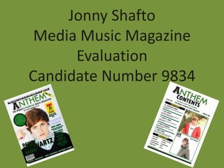
- 1. Jonny Shafto Media Music Magazine Evaluation Candidate Number 9834
- 2. Question 1) In what ways does your media product use, develop or challenge forms and conventions of real media products? INTRODUCTION TO ANTHEM • My style model was Mojo magazine • I also looked at Q magazine as it features heavily with the same music genre as Anthem • Anthem is a new, original alternative music magazine which features both mainstream and alternative artists • The main features of my magazine are the conventional artist interviews, festival guides, chart news, album reviews etc. Anthem magazine is predominantly based on a mixture of Mojo’s simplistic layout and Q’s content. I aimed to create a simplistic music magazine focusing on alternative and mainstream pop music with a particular colour scheme of green, black and white. A colour scheme of 2-3 colours often looks effective as the editors of Q chose to adapt a red, black and white to their magazine.
- 3. Question 1 continued) In what ways does your media product use, develop or challenge forms and conventions of real media products? FRONT COVER Q Front Cover Anthem Final Cut Mojo Front Cover Similarities: Differences: Similarities: Differences: • Central image • Different layout • Central title • Colour scheme • Circular notice (Anthem only • Central image (green, black, inclusion has cover stories (only one) white) • Cover stories down one side) • Consistent • Light background placed on right • Anthem title is colour scheme • Banner inclusion • Consistent colour central • Barcodes same • Mid/Close up scheme • Anthem features position • Festival • Artist has certain a banner • Bigger font for advertisements attitude • Q’s artist main title • Subtitle (focused/angry) overlaps title
- 4. Question 1 continued) In what ways does your media product use, develop or challenge forms and conventions of real media products? CONTENTS PAGE Similarities: Differences: Similarities: Differences: • Titling of page • Anthem includes 2 • Features function • Anthem includes 2 • 3 Areas listed images rather than aligned down the images rather than beneath title 1 big image left 1 main image • Simplistic features • The regulars • Regulars / Every • Anthem a lot more function section on Anthem month simplistic • Issue number and • Blocky lines • Consistent colour • Camera angle of date separating each scheme remains images • Continuity of story from front cover • Anthem refers to colour from front • Website name • Name of magazine “The Worlds cover listed featured Essential Music Magazine
- 5. Question 1 continued) In what ways does your media product use, develop or challenge forms and conventions of real media products? DOUBLE PAGE SPREAD Similarities: Differences: • Main image on seperate page • Anthems main image alters the flow of the text on next • Drop capital page • Quote pre-interview • Anthem features a quote on the image occupied page • Anthem Exclusive + “The Mojo Interview” • Anthem has the conventional amount of 3 columns • Main bodies of text laid out in columns • Anthem image not greyscale • Colour scheme of 3 colours • Positioning of artists • Artist facial expressions (focused/calm) • Anthem adapts a blocky look • Simplistic approach (not busy looking) • Anthem features caption on the image • A midshot is used for both images included • Anthem image features a prop (guitar)
- 6. Question 1 Summary How I used, developed and challenged forms and conventions of real magazines Front Cover Contents Page Double Page Spread I used features such as one main I used the convention from I used conventions from my style image, consistant colour scheme Mojo of including the title of model such as the application of and the “blocky” look. the magazine along with the my image dominating one full listing of three cities beneath page. I aslo applied the I developed these features by the title. I also continued the convention of including a quote applying my own unique and colour scheme from the front or in Mojo’s case, an personal twists. For example, I cover onto the contents page. introduction before the main used one particular font rather text was written. than use various fonts as I I developed conventions by thought this would benifit me in including three different cities I developed conventions of my developing my own simplistic to the ones listed on Mojo’s style model by making my model and unique look that I aimed to contents. Another feature I have a different bodily stance. achieve. developed is by including green My model is pictured to be blocky lines to seperate my glancing over towards the main I challenged the consistant feature stories, where Q use red body of text (the interview). colour scheme convention by lines to apply the separation. applying my own colour scheme I challenged conventions of my of green, black and white and I challenged conventions of my style model by adding a quote the introduction of fonts I have style models by including two onto the main image, never seen in my previous equally sized images on the surrounded by two green blocks. research were used in order to contents page which is contrary This is a feature my other style developed a uniqueness to my to what Mojo magazine tend to model, Q, normally include and I magazine. do. think it looks very effective.
- 7. Question 2) How does your media product represent particular social groups? My magazine’s images are all of males and not females. The style models I have looked at very rarely feature images of females on the front cover or double page spread in particular. Sometimes females are pictured on the contents page of magazines but very infrequently have I noticed this in my research so I decided to stick with an entirely male inclusion. AGE ETHNICITY CLASS AND STATUS GENDER Originally, I aimed to My product does not Although the language Although all the images target the teenage feature or include any within my magazine is featured within my audience. But after particular ethnic groups relatively sophisticated, magazine are of male referring to my style or ethnicities. Like most there is reference to artists, my magazine will models such as Mojo professional magazine drugs and gang-life within still appeal to the female and Q I began to think editors, I did not intend my double page spread. sex. There is still reference that I would like to aim to focus or to Like my style models, to females within my at a more mature specifically include stories depend on the interview, albeit in a audience, probably ceratin religions. The personalities of the artist slightly disrespectful way, between 18 and 30 music genre’s included being interviewed and in but this is a feature of my due to the swearing in my magazine variate Anthem’s case, the artist artists personality. The included within my within many different comes from a rough rough cut feedback I double page spread. cultures, religions and background but is a very received did not reveal a However, the artists races. I never intended sophisticated young man. lack of females included in featured are relatively any cultural bias or This gives me reason to my magazine, and this is young, so this factor inclusion of one think that I have not presumably due to their may attract a younger particular race or excluded or avoided knowledge that females audience of teenagers. religion. certain people’s “class”. rarely feature in my style models.
- 8. Question 3) What Kind of media institution might distribute your media product and why? For this question I searched all the big distributing companies such as Bauer Media, IPC Media, eMap and WWMD. WWMD (the distributors of Q magazine) stood out as the best choice for distributing my magazine. There are various reasons as to why I chose this company to distribute. My Reasons for choosing WWMD: • WWMD is a recognised, popular and established distributor who distribute Q magazine (one of my two Areas where my product could be style models). advertised: • They have specialist retailers not only in the UK, but all •Social Networking sites (Twitter/Facebook/MySpace) over the world. •Television (advertisements in intervals) • WWMD distribute the same genre of magazine to •Mobile advertisements (SMS advertising, Anthem with Q magazine. MMS advertising) • WWMD who have close links with HMV, a major music retailer who sell music industry products could be Areas where my product could be approached to distribute Anthem magazine. distributed: • Popular magazine distributors such as: • HMV • Tesco • WHSmith • Various newsagents/garages
- 9. Question 4) Who would be the audience for your media product? Predominantly teenagers. People who are fans of alternative and pop music genres. Both males and females. Between 16 and 30. PREDOMINANTLY MALE AND FEMALES LATE TEENS – EARLY TWENTIES TARGET AUDIENCE ALTERNATIVE/POP AGES 16-30 MUSIC FANS
- 10. MY READERS INTERESTS SEXUALITY GENDER AGE Due to the in depth The music industry Both males and As previously stated, interviews within features artists of females would be the my target audience Anthem magazine, various sexualities. My audience for my ranges from ages 18- music may not be the magazine includes an magazine. My 30. This is due to the only interest behind interview with a magazine features explicit language and buying Anthem heterosexual male. mentions of females, often serious nature of magazine. The quiz This is not bias of this but predominantly the article included and puzzles feature sexuality however, as males. I believe that within my magazine. within my magazine people of various other listeners of my Despite this, readers of and the informative sexualities may like my particular music genre younger ages (possibly festival guides are artist despite his laid like music because of 16+) would be seperate interests back and cocky the songs that are interested in my which can be read approach towards the produced rather than magazine due to the within my magazine. opposite sex. Anthem the gender of the wide range of genres Despite these extra magazine was artist. My style models presented within features, the main designed to be an of “Mojo” and “Q” are Anthem. The interests of my entertaining read for not aimed towards a sophisticated language readers would be the people from all types particular target combined with the alternative and of sexuality and I think audience and I’d like to minorly explicit mainstream music that if my magazine think I replicated this language may be more genres as my became popular, idea in the production appropriate for the magazine is heavily sexuality would not be of Anthem magazine. ages of at least 16 occupied by these an issue. years + up to 30 years genres. old.
- 11. By questionnaire From this questionnaire I found out: • The main image is the focal point behind what makes my target audience most attracted – So I included a close up image of a photogenic model • My target audience like to see a calm/focused facial expression on the artist on the front cover – I therefore made my model perform a focused facial expression on the front cover image • A colour scheme consistency of 2-3 colours is my target audiences’ preference - I kept a colour consistency of 3 colours (green,black and white) • My target audience predominantly read magazines weekly – I included aspects of my magazine which imply my magazine is a weekly occurance • Free gifts DO tempt my target audience to buy a magazine – I included a “Free CD” function to my magazine
- 12. Question 5) How did you attract/address your audience? TARGET AUDIENCE FEEDBACK FOR MY FINAL CUT FRONT COVER
- 13. TARGET AUDIENCE FEEDBACK FOR MY CONTENTS PAGE FINAL CUT
- 14. TARGET AUDIENCE FEEDBACK FOR FINAL CUT DOUBLE PAGE SPREAD
- 15. Question 6) What have you learnt about technologies from the process of constructing this product? CAMERA FUNCTIONS SHUTTER SPEED APERTURE Whilst using the cameras in the The aperture feature was key for Media studios I learnt how to alter me in order in deciding the and change the shutter speed in lightness of my photographs. I order to take a suitable photograph. learnt that the aperture is a variable I learnt that the shutter speed is a hole in front of the lens that adjusts cover over the sensor that controls to let more or less light through. the length of time that the light reaches it. DEPTH OF FIELD I was introduced to the depth of field function in order to improve the quality of my photographs. I learnt that the depth of field determines how much of an image is in focus.
- 16. NATURAL LIGHT ARTIFICIAL LIGHT This is a picture I took with the use of This is a picture I took with the use of natural light, pre and post edited. artificial light, pre and post edited. I learnt how to take photographs in different light types; natural and artificial. By applying my knowledge of the functions included on the previous slide I was able to take quality photographs before editing them to make them that extra bit more professional. The adjusting of various camera functions was needed in order to take a quality photograph. I then edited the photos on Photoshop so that the images looked more professional and magazine-suitable.
- 17. PHOTOSHOP MANIPULATION This slide shows the methods of manipulation I used to edit my photographs on Adobe Photoshop. STEP 1 STEP 2 STEP 3 Firstly, I clicked on image After the previous stage, I I then lowered the before scrolling down and was given a pop up box brightness and raised clicking adjustments. Once which let me alter and the contrast slightly so the adjustments section change the brightness and that the quality of my was open I then clicked on contrast. image was ready to contrast/brightness. place on my contents page.
- 18. Question 6) What have you learnt about technologies from the process of constructing this product? USE OF BLOGGER I used www.blogspot.com in order to create a blog which recorded my progress throughout my AS level Media course. I was able to record diary entry’s where I revealed each week the progress I had been making whilst making my project was evolving. I also uploaded JPEG’s of my magazine pages in order to show how much I have improved in terms of my production and creative qualities whilst my project evolved. I learnt how to blog appropriately due to this aspect of my project.
- 19. Question 7) Looking back at your preliminary task, what do you feel you have learnt in the progression from it to the full product? WHAT I HAVE LEARNT AND IMPROVED OVER THE COURSE OF MY PROJECT • Camera taking skills improved dramatically • Editing skills via the use of Photoshop and In Design • More appropriate use of fonts • Hugely better layout • More text featured across the page • Larger image which stands out more
- 20. WHAT I HAVE LEARNT AND IMPROVED OVER THE COURSE OF MY PROJECT • Colour scheme is more maintained and effective • More effective image types • Better quality images used • Professionalism and layout skills developed • Additional features aid the professional look of Anthem • Coloured frames around the images
- 21. FINAL PRODUCTS THANKS FOR WATCHING!