
Empfohlen
Weitere ähnliche Inhalte
Mehr von johnamp123
Mehr von johnamp123 (20)
Power point
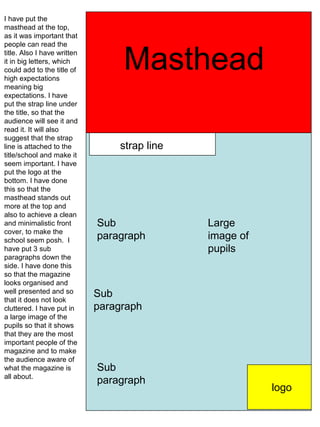
- 1. I have put the masthead at the top, as it was important that people can read the title. Also I have written it in big letters, which could add to the title of high expectations Masthead meaning big expectations. I have put the strap line under the title, so that the audience will see it and read it. It will also suggest that the strap line is attached to the strap line title/school and make it seem important. I have put the logo at the bottom. I have done this so that the masthead stands out more at the top and also to achieve a clean and minimalistic front Sub Large cover, to make the school seem posh. I paragraph image of have put 3 sub pupils paragraphs down the side. I have done this so that the magazine looks organised and well presented and so Sub that it does not look cluttered. I have put in paragraph a large image of the pupils so that it shows that they are the most important people of the magazine and to make the audience aware of what the magazine is Sub all about. paragraph logo
- 2. I have put the logo at the top as I think it would be important for logo the audience to know if it is their school magazine or not. I have put the mast head just above the middle. This could suggest that it is Large not ok to be mediocre, image of which also relates to the title, high pupils expectations. Also I have put one Mast Head subparagraph on the right and two on the left. This could suggest that the magazine has a large content and that the magazine is very informative. I have put strap line two large images of the pupils so that the magazine looks more professional and so that the audience has Large more to look at. I have image of also done this so that Sub the audience can see pupils paragraph what the pupils get up to. Sub paragraph Sub paragraph