
Empfohlen
Weitere ähnliche Inhalte
Andere mochten auch
Ähnlich wie Analysing my prelimanary task
Ähnlich wie Analysing my prelimanary task (20)
Mehr von johanna-asmedia
Mehr von johanna-asmedia (20)
Kürzlich hochgeladen
Kürzlich hochgeladen (20)
Analysing my prelimanary task
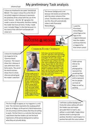
- 1. Johanna Fryer My preliminary Task analysis I chose my masthead to be called ‘SUCCESS @ The banner background is red NEGUS’. The reason I chose this as the title of because red stands out and also fits my school magazine is because it represents with the colour scheme of the the positivity of the school with the use of the school. Therefore when the readers word ‘Success’. Also the ‘@’ sign gives the see this, they will automatically reader a sense of informality, therefore making relate it with Plumstead the reader feel more at home. Finally, I made Manor/Negus. I used the sure I included ‘Negus’ in the title because it is Plumstead the name of the sixth form and people will manor/Negus relate to it. school logo as the logo on the magazine because then the readers will know that this a magazine for that certain school. I chose the heading for my magazine to be ‘Common Room Craziness’. The reason I I took a group chose this is because it shot as my uses alliteration and is second fairly catchy. The use of photograph to the word craziness represent the shows that it is fairly socialising that informal and will grab goes on in Negus the reader’s attention. and to represent the fun people can have at Negus as well as working. I will have a yellow background. The first image to appear on my magazine is a mid- Firstly the colour yellow will catch shot. The mid-shot represents the studying which the readers eye and maybe goes on at Negus, as the person’s facial expressions persuade them to read it, also are very serious and this shows that they are willing yellow is a very bright, happy colour to work. The fact that it is a mid-shot that has been and the article is aiming to be used means that the readers can see the facial positive, therefore I want to give it a expressions of the person doing work as well as positive feel with the colour yellow. what they are actually doing.