
Empfohlen
Weitere ähnliche Inhalte
Was ist angesagt?
Was ist angesagt? (20)
Andere mochten auch
Andere mochten auch (18)
Ähnlich wie 1st contents page
Ähnlich wie 1st contents page (20)
Mehr von johanna-asmedia
Mehr von johanna-asmedia (20)
Kürzlich hochgeladen
Kürzlich hochgeladen (20)
1st contents page
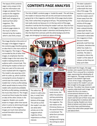
- 1. The layout of this contents The date is placed in page is very unique in the CONTENTS PAGE ANALYSIS very small, italic font way the information and underneath the main images are placed. This is title of this page. The unique to the magazine The title of NME’s contents page is ‘Inside this week’. This will draw reason it is so small is so world and personal to the readers in because they will see this and want to know what’s that the readers aren’t NME itself, bringing it to going to be in the magazine and the title of this page clearly states drawn away from the stand out from other that, that is what they are going to tell you. The positioning of the main information and magazines. The text really stands out because it is in the top centre of the page, articles of this page. uniqueness of the therefore it will be the first thing the reader’s will see. Also the font However because the contents page relates to style is big, black, bold capitals. It is the biggest, boldest font on the date is placed directly the music in which is page, thus catching the reader’s attention and drawing them in. underneath the title, listened to by the readers, Also the black font contrasts with the white background of the shows that reader’s are which is also fairly unique. page, also bringing it to stand out above all things. interested in what date this magazine is from, The image directly in the centre of because readers the page is the biggest image on generally read from top the contents page therefore giving to bottom, therefore the an idea that it is the main article of editor has made it is the magazine. The image is easy to see if you look surrounded by lots of other little carefully. The date is images, to emphasize that the included to inform the middle image is the main story. The reader’s of the date of model is looking directly at the release so that they can audience with a sincere look. This keep up to date. will bring the readers to feel as if they are a part of his story and Underneath the images, the page more involved with the magazine. number and a quote from the artist is placed. This is unusual for a contents The model is also wearing a shirt page, expressing the individuality of with his collar up, which could be the magazine. The page numbers are conveying his sense of power or placed in the bottom right hand control over the readers, Also the corner of the image, making them models hair is fairly scruffy looking easy to read so the reader’s can just which would relate to many of the flick straight to the page and don’t readers who would also probably feel lost. The editor has chosen to add In the bottom, right a quote underneath each image. The be fairly scruffy looking, considering The editor has reason for this is to create a the music they listen to. The images chosen to add a plus hand corner, the conversational element to the around are there to give the reader box, in small, faint editor has placed a contents page, so the reader’s will an idea of the other articles in the font towards the red box promoting read it and feel part of their story and magazine. Readers are usually bottom of the page. the subscription of also bringing them to believe what drawn to images rather than words This will be so that the magazine. The they are saying. Readers are more when it comes to skimming through red relates to the likely to believe and relate to what the reader’s can also Christmas theme, as the artists have said themselves to see what’s in the magazine. see what other rather than what other people have Images are much more attractive articles are in the the word Christmas said about them. and will therefore attract the magazine which is mentioned. The reader more. might be of less white font contrasts importance or of less with the red interest. background bringing the writing to stand out.