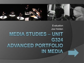
3. Introduction
Our project for our A2 Advanced Portfolio in Media (Unit G324) has been
to create a promotion package for the release of an album; consisting
of a promotional music video, a CD cover for the CD/Digipak’s
release, and a magazine advertisement for the CD/Digipak’s release.
For this project, I have worked with Natalie Ainsworth, and my particular
contributions to the project were; research, sourcing the
soundtrack, filming, starring in the video, editing the video, providing
photos for the ancillary tasks and assisting in creating the ancillary
tasks.
Our target audience is the teen to mid-twenties audience, aged 15-26;
Teenagers living at home with no independent income, Students, and
adults in their early twenties; with lower status jobs without children
and within this a niche audience; those who obviously have a taste
for this genre of music. Contents Main
For more discussion on audience, please click here Menu Task
6. The question of genre...
1. What genre of music is your video based around?
Our video based on the Rock and Punk genre of music
2. What conventions have you used? Why was it vital to use typical elements?
In our music video we have used typical conventions of the rock music genre, such as
fast paced editing, close-ups and focus on the members of the band and their
instruments. It was vital to use typical conventions such as these to establish the
video’s genre, and to keep the video in a recognisable format for it’s audience in order
to avoid alienating the viewer.
3. Did you do anything different? Why is it vital to do something new to the genre?
In our video, we differed from the typical music video by deciding not to include footage of
an additional storyline alongside our performance footage. It is often vital to do
something new to the genre to avoid the repetition of ideas; to keep the viewer
entertained.
4. Why did you think your innovations were likely to prove successful?
By removing storyline footage and focusing on performance, this innovation could stress
the rawer nature of the band and their genre; as performers.
5. Did your choices here work effectively for your audiences?
Our choices worked effectively for our audience to an extent, but members our audience
in feedback said that ‘another location’ might have improved the mix – a location shot
with a parallel storyline.
7. Branding and Brand Image
Our Brand Image is of a teenage Rock/Punk band; young and energetic, but dark
and heavy at the same time; a non-mainstream act.
For Discussion on our logos, please click here
What kind of media institution might distribute your media product and why is
brand image important to this industry?
A media institution likely to fund and/or distribute a media product like ours would
be a record label; namely labels that specialise in the Punk and Rock genres, such
as Victory Records, Decaydance Records and Roadrunner Records.
The publisher might see potential in the product because of it’s slightly different
approach to the setting of a video – going from studio rehearsal to all out
performance. Also, the video adheres to the genres these record companies
specialise in.
8. In what ways has my product adhered to or
subverted to generic media conventions, in
comparison with existing commercial music
videos?
The music video we have created as the
main task for our coursework seems
to have adhered to many of the
typical conventions of music
video, whilst also straying from some
:
Our video focuses on the performance
element of music video, fitting in with
the generic conventions of most
mainstream music videos. Where our
video differs from most commercial
music videos is in the absence of a
storyline happening parallel to the
music and video.
9. Comparison continued...
For our music video, instead of filming two
different locations for Music video and
storyline, we filmed two different locations for
different parts of the performance; in the
studio, and in performance; from the rough
edged rehearsals to the sleek, lit performance.
10. Comparison continued...
In keeping with the typical genre of
rock music videos, shots focused
mainly upon performance, and
featured close-ups of equipment and
instruments, in addition to the three
members of the band; the three
protagonists/main characters in the
video.
11. Comparison continued...
A video we took inspiration from
was Billy Talent’s ‘A Devil In A
Midnight Mass’ – a mainly
performance based video though
with some elements of a
storyline.
Our video had similarities to this
in it’s:
• Fast Paced editing
• Emphasis on performance
footage
• The look and style (mise en
scene of the video – appropriate
to the genre)
However, our video differs in it’s
lack of non-performance
footage, and it’s use of two
performance locations instead of
just one.
http://www.youtube.com/watch?v=ULSODQOMza8 Audience Contents
Feedback Menu
12. Audience Feedback
How effectively have our brand and products
appealed to the target audience?
Audience Testing Footage can be found
HERE
13. Audience Feedback (continued)
Our audience feedback seems to
suggest that our product and brand
did generally appeal to our target
audience; 13 out of 15 people who
we tested our video with agreed
that our video was edited
appropriately to match the fast
tempo of the song.
Most of our audience agreed that our
changes of location – and the
locations we used broke away a
little from the stereotype of a typical
music video, but that this element
worked.
Contents Ancillary
Menu Tasks
15. CD Cover / Digipak [page 1]
This was the front
cover for ancillary task
#1 – the CD cover/
digipak.
Upon drafting designs
for this task, we
decided to keep the
cover simplistic (to a
degree) to mirror the
style of modern
albums – especially
the Pop-Punk/Post-
Punk genre.
Research we carried
out into album covers
can be found HERE.
The explosion/blood splatter in Our simplistic design, using fonts
greyscale, used as symbolism for the (copyright free from
explosive nature of the music and it’s more dafont.com), and Adobe Photoshop
aggressive themes brushes from brusheezy.com
16. CD Cover/Digipak (page 2) Here is page one of the
inside cover for our
CD/Digipak – here we
tried to reflect similar
themes, but give minimal
information about the
band away – a
breakaway from
conventional CD covers;
the emphasis being on
the band’s music.
We feel that this page
gives a little more away
about the band, but that
in hindsight, we could
have made this page to
give more of an insight
into the band and their
personality.
17. Here we attempted to
continue the theme, this
time with shots we used
in the promotional
video, and with quotes of
lyrics from songs
(although fictional), to
carry through the Post-
punk theme – using fonts
and imagery (brushes)
that have been used on
the other pages to
maintain a theme.
18. CD Cover / Digipak [4]
This is our sleeve design
for the back cover of the
CD digipak.
Here we repeated a little
of the colour schemes
used in the video – black
and red, but focused on
revealing more of the
album’s content on the
back cover.
Here we tried to stress a
modern, almost urban
style to match the
popular genre.
Colour schemes
reflected
The silhouetted city -
giving a sense of
impending doom
Ancillary task #2
19. Magazine Advertisement for CD/ Digipak
This is our design for a
magazine advertisement for
the CD/Digipak.
Once again we have repeated
the our black and white colour
scheme, but this time with the
absence of red. We have also
maintained the use of similar
(and some the same) fonts, as
links to our other products.
Contents
Evaluation...
Menu
20. How effectively have the main and subsidiary
products worked in combination? Was the
house style maintained throughout? Do
these subsidiary tasks fit your brand image?
Upon reflection upon our products, it seems that our main and
subsidiary products worked together and maintained a house style
to a certain extent:
We attempted to introduce a similar, dark, yet not gothic theme into
our products; using colour schemes consisting of mainly
black, white and red, combined with our black and white footage.
These links were slightly coherent, but the ancillary products only
seem to cohere with the main product in it’s colour schemes, and
the imagery matching with themes associated with the genre and
style of the music.
Whilst some of these were slightly incoherent with each other, our
brand image does seem to fit – utilising dark colours; black and red
in a connotation of darkness, whilst the combination of white and
red, and the urban theme remind us of a modern young age.
21. Audience
Continuing from the introduction....
Why is this a good audience to target?
Whilst this audience is not a massive one, it appears to be neither mass or
niche; the scene for rock music is still continuing to grow, and it’s
audience is sufficient enough to make producing a product easily viable.
Examples of highly successful rock bands can be seen in bands such
as Green Day, Billy Talent, and more extremely so; Slipknot – all highly
successful acts.
Are you likely to have any secondary target audiences?
The space for secondary target audiences for this genre seems to be
smaller; but the Punk Rock genre of music has been seen to appeal to
fans of other similar genres of music; from indie-rock to heavy metal.
Describe how you have used audience feedback throughout your project.
Throughout our project, we have used audience feedback to assess the
successes of our products, and where they could ultimately be
improved. During the creation process, we showed our progress to
individuals, to pitch our ideas against to see whether they would work
from the audience’s perspective. Contents
Technology
Menu
22. How has digital media technology been
used in the research, pre-
production, production and evaluation
stages?
In our research, we have used digital media technology such as iMacs, and
YouTube and other internet sites such as IMBD to research music videos and
their typical connotations.
In Production we used a Canon DC320 Camcorder to record our
footage, and used Final Cut Express 4, on iMac to cut and edit our footage.
To create our DVD for audience testing, we have used iDVD, again on iMac.
For our ancillary tasks we used Adobe Photoshop, with downloaded brushes
(from brusheezy.com) and downloaded fonts (from dafont.com), in addition to
using Google images to source official logos of Music Distribution sites, such
as iTunes.
We used a Canon Camcorder to shoot our footage and to record our
audience response in the evaluation phase. We used Microsoft Office Word
to produce our questionnaire, and final cut again to cut up our audience
feedback footage.
To track our progress, we used Blogger to upload a database of ideas and
research to refer to – available at college or home.
23. Use of Technology...
What technologies have you used and why do you think this is an effective
way to do this?
In creating our products, we have used internet sites, such as YouTube to
research styles of videos, and to inspire our own ideas – access to all
types of music videos at the click of a mouse meant that researching
styles of music genres was made easier- in addition to finding
inspiration for our own products.
In the production stages we have used basic Camcorders to record our
footage – which proved lightweight and easy to operate. For
editing, we had access to Final Cut Express – giving us industry
standard editing tools at our disposal. We also had access to Adobe
Packages such as Photoshop – again giving us industry standard tools
to shape our ancillary tasks
Did it influence the planning and Construction of your final products?
The availability of such technology definitely influenced the planning and
construction of our final products; allowing us to research styles of
video and have good access to research, and allowing us to plan for
how shots would be shot and then edited.
24. Technology continued...
Did these technologies prove to be challenging – did they mess
up anything? Why? Did they limit your plans or creativity in
any way? – OR did they do the opposite?
I found sites such as YouTube and Blogger very useful for
research and planning, but found Software such as Final Cut
Express harder to get to grips with; because of my limited
knowledge of the software and limited time to experiment, I
feel my creativity was indeed limited. I also feel that the low
picture quality of the Canon Camcorder we used to shoot our
video compromised our ability to achieve a professional look
to our video; in conjunction with my trouble with Final Cut.
Because of the length of footage imported and the layout of
Final Cut, editing was a lengthy process.
However, using Final Cut as opposed to more basic software
packages such as iMovie, made it easier to produce a more
professional looking final product due to the wider range of
tools at our disposal. Contents Conclusion/
Menu Self Evaluation
25. Conclusion
What improvements can be made to the 3 products? What
evidence is there of audience feedback? How has it been
used to inform discussions and improvements to the
products?
Main Product Although these criticisms do apply;
Our audience feedback suggests there were some positive
that a few improvements could comments on our product:
be made to our final product: • Some members of the audience
• The use of more locations for thought that the lighting and stage
our footage. setting were particularly effective
• Perhaps a storyline parallel to • Close-ups of instruments made
the performance footage the video more authentic
• Better syncing of the drums • Editing was sufficiently fast
• More focus on the vocalist paced.
instead of mainly the • The timing worked
instruments. • The genre of music did fit in with the
style of video.
• Less of seemingly random
switches from and to each
location.
26. Conclusion
Improvements continued...
Ancillary Products
Our audience feedback suggested to us that improvements
could be made such as:
More visible links between the products and the video
More visible links between each product (cosmetically)
These would maintain a set (or house) theme.
Perhaps more detail to the front CD/digipak cover –
matching with the back cover
Higher quality photos
Self
Evaluation
27. Self evaluation
I personally believe that our product was successful
to an extent, but that given more time and some
better resources could have turned out better
overall.
Our products eventually came out well, though upon
reflection could have been better if I as a member
of the team had employed better organisation
skills
Contents
Menu