
Empfohlen
Weitere ähnliche Inhalte
Mehr von jesusisafriendofmine
Mehr von jesusisafriendofmine (20)
Kürzlich hochgeladen
Kürzlich hochgeladen (20)
Green day – magazine advert analysis
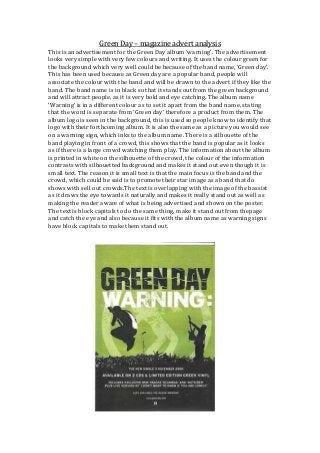
- 1. Green Day – magazine advert analysis This is an advertisement for the Green Day album ‘warning’. The advertisement looks very simple with very few colours and writing. It uses the colour green for the background which very well could be because of the band name, ‘Green day’. This has been used because as Green day are a popular band, people will associate the colour with the band and will be drawn to the advert if they like the band. The band name is in black so that it stands out from the green background and will attract people, as it is very bold and eye catching. The album name ‘Warning’ is in a different colour as to set it apart from the band name, stating that the word is separate from ‘Green day’ therefore a product from them. The album logo is seen in the background, this is used so people know to identify that logo with their forthcoming album. It is also the same as a picture you would see on a warning sign, which inks to the album name. There is a silhouette of the band playing in front of a crowd, this shows that the band is popular as it looks as if there is a large crowd watching them play. The information about the album is printed in white on the silhouette of the crowd, the colour of the information contrasts with silhouetted background and makes it stand out even though it is small text. The reason it is small text is that the main focus is the band and the crowd, which could be said is to promote their star image as a band that do shows with sell out crowds.The text is overlapping with the image of the bassist as it draws the eye towards it naturally and makes it really stand out as well as making the reader aware of what is being advertised and shown on the poster. The text is block capitals to do the same thing, make it stand out from thepage and catch the eye and also because it fits with the album name as warning signs have block capitals to make them stand out.