
Recommended
More Related Content
What's hot
What's hot (20)
Similar to Design color theory
Similar to Design color theory (20)
More from jesskrichels
Recently uploaded
Recently uploaded (20)
Design color theory
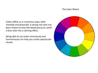
- 1. The Color Wheel Colors affect us in numerous ways, both mentally and physically. A strong red color has been shown to raise the blood pressure, while a blue color has a calming effect. Being able to use colors consciously and harmoniously can help you create spectacular results.
- 2. Warm and cool colors The color circle can be divided into warm and cool colors. Warm colors are vivid and energetic, and tend to advance in space. Cool colors give an impression of calm, and create a soothing impression. White, black and gray are considered to be neutral
- 3. Complementary color scheme Colors that are opposite each other on the color wheel are considered to be complementary colors (example: red and green). The high contrast of complementary colors creates a vibrant look especially when used at full saturation. This color scheme must be managed well so it is not jarring. Complementary color schemes are tricky to use in large doses, but work well when you want something to stand out.
- 4. The edges of contrasting colors may seem to vibrate or move: FRE AKY!
- 5. Analogous color scheme Analogous color schemes use colors that are next to each other on the color wheel. They usually match well and create serene and comfortable designs. Analogous color schemes are often found in nature and are harmonious and pleasing to the eye.
- 6. Monochromatic color scheme Shades and tints of one color
- 7. Triadic 3 colors equally spaced on the color wheel.
- 9. Split complementary Two colors next to each other and one opposite (Complimentary)
- 10. Example of split complementary
- 11. Double Complimentary (or tetradic) 2 sets of opposite colors
- 12. Example of double complementary