
Empfohlen
Weitere ähnliche Inhalte
Was ist angesagt?
Was ist angesagt? (20)
Andere mochten auch
Ähnlich wie Magazine cover evaluation
Ähnlich wie Magazine cover evaluation (20)
Magazine cover evaluation
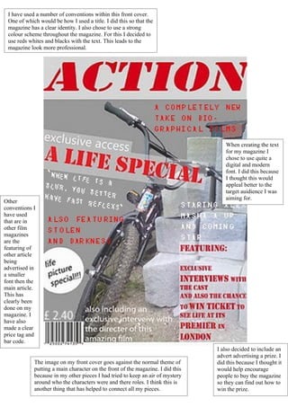
- 1. I have used a number of conventions within this front cover. One of which would be how I used a title. I did this so that the magazine has a clear identity. I also chose to use a strong colour scheme throughout the magazine. For this I decided to use reds whites and blacks with the text. This leads to the magazine look more professional. When creating the text for my magazine I chose to use quite a digital and modern font. I did this because I thought this would appleal better to the target auidience I was aiming for. Other conventions I have used that are in other film magazines are the featuring of other article being advertised in a smaller font then the main article. This has clearly been done on my magazine. I have also made a clear price tag and bar code. I also decided to include an advert advertising a prize. I The image on my front cover goes against the normal theme of did this because I thought it putting a main character on the front of the magazine. I did this would help encourage because in my other pieces I had tried to keep an air of mystery people to buy the magazine around who the characters were and there roles. I think this is so they can find out how to another thing that has helped to connect all my pieces. win the prize.