

Empfohlen
Weitere ähnliche Inhalte
Was ist angesagt?
Andere mochten auch
Ähnlich wie Analyse powerpoint
Ähnlich wie Analyse powerpoint (20)
Mehr von Bethany Stephenson
Mehr von Bethany Stephenson (20)
Kürzlich hochgeladen
Kürzlich hochgeladen (20)
Analyse powerpoint
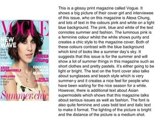
- 1. This is a glossy print magazine called Vogue. It shows a big picture of their cover girl and interviewee of this issue, who on this magazine is Alexa Chung, and lots of text in the colours pink and white on a light blue background. The pink, blue and white of the text connotes summer and fashion. The luminous pink is a feminine colour whilst the white shows purity and creates a chic style to the magazine cover. Both of these colours contrast with the blue background which kind of looks like a summer day’s sky. It suggests that this issue is for the summer and will show a lot of summer things in this magazine such as short clothes and pretty pastels. It’s either going to be light or bright. The text on the front cover also talks about sunglasses and beach style which is very summer-y and it creates a nice feel for people who have been waiting for the nice season for a while. However, there is additional text about Asian supermodels which shows that this magazine talks about serious issues as well as fashion. The font is also quite feminine and uses bold text and italic text to make it formal. The lighting of the picture is bright and the distance of the picture is a medium shot.
- 2. This is a glossy print magazine called Elle. Just like the other magazines it shows a picture of the cover girl and interviewee, who on this magazine is Taylor Swift and a lot of text. The text talks a lot about fashion and beauty which shows that this magazine is defiantly for women and avid style lovers. Furthermore, Taylor is wearing a sparkly silver dress and the masthead of the magazine is gold. This connotes that the magazine could have come out in December or just before Christmas as two of the four Christmas colours are being used (red and green are the other two) and the sparkly dress would never be used on a magazine unless sparkly dresses were in style or if it was nearly Christmas. The magazine doesn’t really talk much about serious issues which suggests that older teenagers will read this magazine as well as young women. The font is quite formal and very basic which shows that they didn’t want something powerful as they already had the amazingly powerful, sparkly dress. The lighting is a little bright but not too much and the distance of the camera shot is a medium shot just like the other magazines.
- 3. This is a glossy print magazine cover called Glamour. It also shows a big picture of the cover girl and interviewee, who on this magazine is Katy Perry. In addition, this magazine is a little bit like the Vogue magazine as it uses the bright and airy colours for a summer theme; blue, luminous pink and white, but also uses black to create depth. The pink represents that this magazine is for women, so the magazine will talk about summer things , whilst the light blue represents summer and the lightness of the day time. However the text is about serious topics such as healthy slimming diets or things you need to know about guys. The text is bold although the text of the interviewee’s name is italic and feminine which suggests that they want that to be the main thing. The light of this picture is also quite bright however the distance of the shot of this magazine’s front cover is a longer medium shot than the other two magazine covers as it shows the whole dress and a little bit of the dress as well.