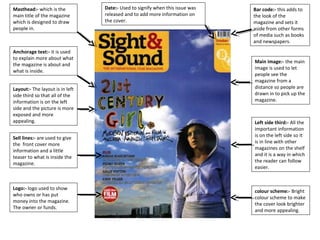
1. Masthead:- which is the
main title of the magazine
which is designed to draw
people in.
Anchorage text:- it is used
to explain more about what
the magazine is about and
what is inside.
Layout:- The layout is in left
side third so that all of the
information is on the left
side and the picture is more
exposed and more
appealing.
Sell lines:- are used to give
the front cover more
information and a little
teaser to what is inside the
magazine.
Logo:- logo used to show
who owns or has put
money into the magazine.
The owner or funds.
Date:- Used to signify when this issue was
released and to add more information on
the cover.
Bar code:- this adds to
the look of the
magazine and sets it
aside from other forms
of media such as books
and newspapers.
Main image:- the main
image is used to let
people see the
magazine from a
distance so people are
drawn in to pick up the
magazine.
Left side third:- All the
important information
is on the left side so it
is in line with other
magazines on the shelf
and it is a way in which
the reader can follow
easier.
colour scheme:- Bright
colour scheme to make
the cover look brighter
and more appealing.