A Guide To Google Charts For WordPress - Jack Karter
•
0 gefällt mir•387 views

This tutorial will show you how to use Google charts for wordPress effectively. I use Google charts on a lot of my WordPress sites because charts and graphs are a great way to give a visual representation of data, because most people find it easier to understand and analyse data and figures when plotted into charts and graphs such as pie graphs, line charts, bar graphs, among others. When presenting data on a WordPress page, you need to get your point across to your readers in an easy and understandable way. It’s very difficult to do this when you present your readers with hundreds of lines of data.

Empfohlen
Empfohlen
Weitere ähnliche Inhalte
Kürzlich hochgeladen
Kürzlich hochgeladen (17)
Empfohlen
Empfohlen (20)
A Guide To Google Charts For WordPress - Jack Karter
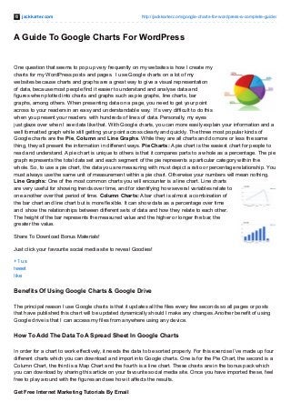
- 1. jackkarter.com http://jackkarter.com/google-charts-for-wordpress-a-complete-guide/ A Guide To Google Charts For WordPress One question that seems to pop up very frequently on my websites is how I create my charts for my WordPress posts and pages. I use Google charts on a lot of my websites because charts and graphs are a great way to give a visual representation of data, because most people find it easier to understand and analyse data and figures when plotted into charts and graphs such as pie graphs, line charts, bar graphs, among others. When presenting data on a page, you need to get your point across to your readers in an easy and understandable way. It’s very difficult to do this when you present your readers with hundreds of lines of data. Personally, my eyes just glaze over when I see data like that. With Google charts, you can more easily explain your information and a well formatted graph while still getting your point across clearly and quickly. The three most popular kinds of Google charts are the Pie, Column and Line Graphs. While they are all charts and do more or less the same thing, they all present the information in different ways. Pie Charts: A pie chart is the easiest chart for people to read and understand. A pie chart is unique to others is that it compares parts to a whole as a percentage. The pie graph represents the total data set and each segment of the pie represents a particular category within the whole. So, to use a pie chart, the data you are measuring with must depict a ratio or percentage relationship. You must always use the same unit of measurement within a pie chart. Otherwise your numbers will mean nothing. Line Graphs: One of the most common charts you will encounter is a line chart. Line charts are very useful for showing trends over time, and for identifying how several variables relate to one another over that period of time. Column Charts: A bar chart is almost a combination of the bar chart and line chart but is more flexible. It can show data as a percentage over time and show the relationships between different sets of data and how they relate to each other. The height of the bar represents the measured value and the higher or longer the bar, the greater the value. Share To Download Bonus Materials! Just click your favourite social media site to reveal Goodies! +1 us tweet like Benefits Of Using Google Charts & Google Drive The principal reason I use Google charts is that it updates all the files every few seconds so all pages or posts that have published this chart will be updated dynamically should I make any changes. Another benefit of using Google drive is that I can access my files from anywhere using any device. How To Add The Data To A Spread Sheet In Google Charts In order for a chart to work effectively, it needs the data to be sorted properly. For this exercise I’ve made up four different charts which you can download and import into Google charts. One is for the Pie Chart, the second is a Column Chart, the third is a Map Chart and the fourth is a line chart. These charts are in the bonus pack which you can download by sharing this article on your favourite social media site. Once you have imported these, feel free to play around with the figures and see how it affects the results. Get Free Internet Marketing Tutorials By Email
- 2. 1. Log into Google and once you have done that, head over to Google Docs. At this stage, I recommend you download and install Google Drive. It’s very useful and allows you to access all your documents from anywhere. 2. Once you have done that and logged into Google Docs, select “Create” and then “Spread Sheet“. 3. Once you have created the new spread sheet, open the file “Pie.csv” which you downloaded in your bonus pack and paste the contents into your newly created spreadsheet. 4. What you should see is an image like the one below. 5. Now using your mouse, select all the data and click “Insert“, followed by “Graph“. Then from the recommended charts, select the “Pie Chart” and you should see the following Image. You can hit the “ X” if you like and play around with the figures, reselect the data again to re-generate the chart and see the changes.
- 3. 6. Once you are happy with the graph, you can customise it. By clicking the “Customise” tab you can change virtually every aspect of the graph. All the changes you make at this stage are dynamic so you can see the effects immediately without re-generating the graph. After you have finished customising it, simply click “Insert” and it will appear, floating on top of your spread sheet. 7. Once you have finished making your graph, you will want to publish it to your page or post. Click the top of the chart and a drop down arrow will appear. Select “Publish Chart“. The next window will show you the script you will use to generate your chart. Make sure you select “Interactive Chart”, copy the code into your clipboard and select “Done“
- 4. 8. In your page or post, select the “Text” tab as opposed to the “Visual” tab and paste the code where you would like your image to appear. Once you have done that, click “Save Draft“. 9. Now you will need to get WordPress to recognise the Javascript and pull the image from Google and generate the interactive image. Copy the contents of the “javascript.txt” file and insert it just before the closing </head> in your header.php file. If you are not sure where to find your header.php file, go to your WordPress sidebar, click “Appearance“, then “Editor“. Look for the title Header, with (header.php) below it and click it. Look for </head> towards the end of the page and insert the code just before it. Now your interactive Google chart should appear like the one below. How I Spend 24 Hours In A Day Work Eat Commute Watch TV Sleep 45.8% 29.2% 8.3% 8.3% 8.3% 10. When you create a document in Google Docs, by default it is set to private. If you want to share this document
- 5. so anybody can view it on your webpage, you need to change this to public. Simply go to your Google Docs dashboard, tick the box beside your file and click the share icon. Once that window has opened, select “Public” Once your new pie chart is rendering on your page, repeat the exercise with the “Map-Chart.csv“, “Line- Chart.csv“ and “Column-Chart.csv” files. Again,play around with the figures and settings to familiarise yourself with how it works. Get Free Internet Marketing Tutorials By Email If you have any questions about this tutorial, I have created a Google Charts topic in the forums specifically to answer them, so please feel free to head over and I will be happy to try and help you out. Share This On Google+!