
Empfohlen
Weitere ähnliche Inhalte
Andere mochten auch
Mehr von jackhorne
Kürzlich hochgeladen
Kürzlich hochgeladen (20)
Analysis of 3
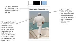
- 1. This magazine’s cover is very plain, basic and simple. The magazine uses the photo to get across what is going to be included in the magazine. The photo is very clean and has no editing to it, it has bright colours. The overall front cover is very clean and basic there is no overwriting text on top of the picture it is just the photo the title and issue number. The title is very basic all it has to it is a font the colour is kept black and dull.
- 2. The contents page for this magazine is very structured and organised it is segmented and clearly defined into what is what. The line the divides the contact information to the editors divides it well and you can tell that this is different to what is on the other side. The contents for the magazine are very simple and plain. The colours used as well as being boring they work well together to stand out and make it easy reading for the reader.
- 3. On this side of the double page we have a picture, the picture is clear and easy to look at, it stands out in the background colour. The picture is placed in the middle of the page and takes up most of the page which means it is the first thing that the reader looks at first. The text on this page is fairly small, it doesn’t take up much of the page unlike the picture. The text is in very clear font which makes it easier for the reader to read, but the background colour makes it a little bit harder to read than normal. The title for the text is in bold and a different font to the actual text, this means it stands out and it is the first thing you read before the text
- 4. The title for the cover is in a bright yellow colour, this makes the title stand out and it is the first thing that draws your attention, it is also in larger sized font than everything else. The text at the bottom is in the same colour as the title but it is in a different font style. This style is harder to read than the title and it is not as clear. The image on the front cover of this magazine takes up the whole front cover, you can only see half of the women face therefore this gives the impression that she is shy and afraid and isn’t comfortable. The photo also being in black and white gives the negative impression. The photo is the thing that you look at first as it is the largest thing on the cover and the most obvious to look at. This front cover follows the F rule in that the text on the front cover would be an F if you put an F over it. With the text down the side and the tezt on the top
- 5. This contents page is quite jam packed with information and pictures. The border for this colour page are these bright and vibrant twirls. But they are totally different to the actual contents as the contents are dark and dull. The pictures on the contents page are quite small but they give a preview of what is on the page and what you can expect to read about. The contents page is quite clearly split up into two sections and in those sections there are subheadings and areas of interest. The text and font for these headings and subheadings are in black and white which makes it easy to read but it is boring to look at. The images vary in size and some of them being small and some of them being bigger. The bigger ones will represent the more interesting or the most read articles so then you will know what page to go to.
- 6. The header for this spread is rather big and stands out from the other text. It is easy to read and it is the type of font to all the other text it is just in a different size. The article text itself is quite small writing but the font is easy to read and with the background the text is easy to read.