Start small, think big - Responsive Web Design
•
2 gefällt mir•2,403 views

Slides from my talk at World Usability Day 2012 in Graz, Austria

Empfohlen
Empfohlen
Weitere ähnliche Inhalte
Was ist angesagt?
Was ist angesagt? (19)
Andere mochten auch
Andere mochten auch (20)
Ähnlich wie Start small, think big - Responsive Web Design
Ähnlich wie Start small, think big - Responsive Web Design (20)
Start small, think big - Responsive Web Design
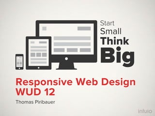
- 1. Start Small Think Big Responsive Web Design WUD 12 Thomas Piribauer
- 2. CEO / UXD intuio User Experience Consulting GmbH Twitter @tpiribauer Web http://intuio.at
- 3. Stmk
- 4. Rockstar
- 5. Erfinder
- 6. not me
- 8. usable
- 9. experience
- 12. Ex Us pe er rie nc e !
- 14. - 80%
- 15. Spaß
- 16. ” You can't just ask customers what they want and then try to give that to them. By the time you get it built, they'll want something new.
- 20. jederzeit
- 21. überall
- 22. jede(r)
- 23. 2000 2013 1500 1000 500 0 2007 2008 2009 2010 2011 2012 2013 2014 2015 Mobile Internetnutzer Desktop Internetnutzer http://www.mequoda.com/articles/new-media-trends/web-usage-prediction-when-mobile-and-desktop-collide/
- 24. 2015 There will be one mobile phone for every person on earth. http://bdconf.com/docs/convince_your_boss.pdf
- 25. 1. Nichts
- 26. 1. Nichts a1.net oebb.at omv.com orf.at
- 27. 81% aller österreichischen Unternehmen halten die mobile Nutzbarkeit ihrer Website für wichtig Fonda 2010
- 28. 8% aller österreichischen Unternehmen haben eine mobile Website Fonda 2010
- 29. Eine App fü iPad 1,2,3, 2. Apps rs Eine App fü r alle Mini Android Tab lets r Eine App fü Symbian Eine s Smartphone Blackberry App ü r pp f Ei ne A ws W indo Eine iPhone s Ph one App Eine Android App
- 30. 26% 150x täglich schaut eine Person im 48% Wie häufig werden Apps genutzt? Durchschnitt auf ihr Handy. Was sieht sie sich an? 26% Selten eine App. App wird nur 1 mal genutzt 68% aller Smartphone-Besitzer App wird 11 mal oder mehr genutzt nutzen nur 5 oder weniger Apps App wird nur 2-10 mal genutzt regelmäßig. http://www.lukew.com/ff/entry.asp?1501
- 31. Mobile Webseite App für iPhone 12% App für Android App für Blackberry 14% 60% 18,9% 14% 37,9% 21,6% Mobile Webseite SMS Service App für iPhone 21,6% App für Blackberry http://www.lukew.com/ff/entry.asp?1413
- 32. @jamespearce #qconsf 07.11.2012 https://twitter.com/firt/status/266278622376099841
- 33. Von allen Smartphone Nutzern haben empfehlen nehmen 95% 50% 79% auf ihrem Unternehmen mit Werbung auf Telefon nach einem schlechten mobilen einem Produkt mobilen Webseiten wahr, oder einer Webauftritt nicht jedoch nur 38% Dienstleistung an Freunde in einer App. gesucht. weiter. Google Studie zusammen mit Ipsos OTX MediaCT, Mai 2012 Compuware "What Users Want from Mobile" 2011
- 34. 3. Sites mobil.derstandard.at mobil.zeit.de mobil.post.at m.sparkasse.at
- 35. 3. Sites stattde ssen jedoch nicht wird d ie optimiert für herköm mliche optimiert für Tablets Webse ite S martphones angez eigt Zwei versch iedene Webse iten mobil.post.at mobil.post.at ≠ post.at
- 36. 3. Sites zeit.de spiegel.de
- 37. 3. Sites zeit.de m.spiegel.de
- 38. ...und eigen tlich Für für alle ande Des ren kto Geräte auch ps . abe r a uch Tab für lets und für Smartphones
- 42. Eine Webseite,
- 43. die sich jeder Größe anpasst http://www.bostonglobe.com
- 44. und dabei auf jedem Display gut aussieht. Nur ei ne Webse ite! bostonglobe = bostonglobe = bostonglobe .com .com .com
- 45. So wie diese clearairchallenge.com dribbble.com
- 47. Only the true Messiah denies His divinity
- 49. 1. Users First
- 52. 2. Content First
- 53. ” Content precedes design. Design in the absence of content is not design, it‘s decoration. — Jeffrey Zeldman
- 56. 3. Mobile First
- 57. Client, sei flexibel CSS Mediaqueries / Flexibles Layout Größere Anpassungen werden an definierten Breiten vorgenommen Fluid Images Bilder füllen den maximal verfügbaren Platz Responsive Typography Schriften werden relativ in em oder rem definiert und für alle Displaygrößen optimal angepasst
- 58. ” Wireframes do not work anymore. — Mark Boulton @ Fronteers 12
- 59. Design Workflow Alles auf Papier Die Content- und Layout-Struktur mit möglichen Breakpoints wird grob gezeichnet, am besten mit Papier und Bleistift oder auf Whiteboards Mobile-First im Browser Semantische HTML-Struktur, Echtdaten und keine Lorem Ipsums, CSS Stile und Animationen, Interaktivität mit JavaScript / jQuery Style-Tiling im Grafikprogramm Der visuelle Stil für die verwendeten Elemente wird in einem Grafikprogramm gestaltet und schrittweise via CSS in den HTML- Prototyp integriert
- 61. 60% < 3 sec. Compuware "What Users Want from Mobile" 2011
- 62. Server, sei wachsam Feature Detection / Cookies Der Server identifiziert die Features von Gerät und Browser z.B. via DeviceAtlas Scaled Media Bilder werden entsprechend der erwarteten Bildschirmgröße skaliert und dann erst verschickt Custom HTML, CSS & JavaScript Der Server liefert die notwendige HTML Struktur und nur tatsächlich benötigte CSS und JavaScript Dateien
- 64. Stay future friendly http://futurefriend.ly
- 65. Stay future friendly http://futurefriend.ly
- 66. Say hi. @intuio rib auer @tpi @xon1c
- 67. Danke. Pr es en ta tio n Sl id es Sleeping Audience Members © Jessica Hagy