unwanted pregnancy Kit [+918133066128] Abortion Pills IN Dubai UAE Abudhabi
Double page spread analysis 1
1. Imebvore Aigbochie AS Media
Double Page Spread Analysis 1
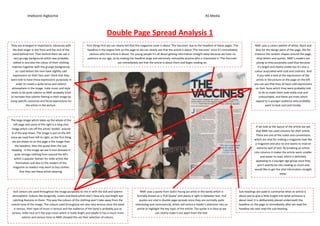
They are arranged in importance, obviously with First things first we can clearly tell that this magazine cover is about ‘The Vaccines’ due to the headline of these pages. The NME uses a colour palette of white, black and
the lead singer in the front and the rest of the headline is the largest font on the page so we can clearly see that the article is about ‘The Vaccines’ since it’s immediately blue for the design parts of the page, like for
band behind him. Then behind them we see a obvious who the article is about. For young people it’s all about getting information straight away because we have no instance the random shapes around the page,
very grungy background which was probably patience at our age, so by making the headline large and extremely noticeable anyone who is interested in ‘The Vaccines’ drop letters and quotes. NME’s readers are
edited in and also the colour of their clothing can immediately see that the article is about them and begin reading on. young so they purposely used blue because
matches together with the grunge background, it’s bright and clearly visible but it’s also a
as I said before the men have slightly cold colour associated with cold and coolness. And
expressions on their face and I think that they if you take a look at the expressions of the
were told to have these expressions purposely in artists in the picture on the page on the left
order to create a quite tense and solemn you can see that they all have cold expressions
atmosphere in the image. Indie music and style on their faces which they were probably told
tends to be quite solemn so NME probably tried to do to make them look really cool and
to recreate that solemn feeling in their image by untouchable, and these are traits which
using specific costumes and facial expressions for appeal to a younger audience who probably
the artists in the picture. want to look cool and trendy.
The large image which takes up the whole of the
left page and some of the right is a long shot
If we look at the layout of the article we see
image which cuts off the artists’ bodies’ around
that NME has used columns for their article.
¾ of the way down. The image is put on the left
These are one of the codes and conventions
since we read from left to right, so the first thing
which are vital for making a magazine look like
we are drawn to on the page is the image then
a magazine and also no one wants to read an
the headline, then the quote then the sub-
extreme wall of text. By breaking an article
heading. In the image we see 4 men dressed in
into columns it makes the article seem smaller
quite vintage clothing from around the 60’s
and easier to read, which is definitely
which is popular fashion for indie artists like
appealing to a younger age group since they
themselves and also to the readers of the
won’t exactly be into reading so much and
magazine so readers may want to buy clothes
would like to get the vital information straight
that they see these artists wearing.
away.
Dull colours are used throughout the image purposely to mix in with the dull and solemn NME uses a quote from Justin Young (an artist in the band) which is Sub-headings are used to summarise what an article is
atmosphere. Colours like burgundy, cream and black which don’t have any real bright eye formally known as a ‘Pull Quote’ and places it right in-between text. Pull about and to give a little insight into what someone is
catching features to them. This way the colours of the clothing won’t take away from the quotes are vital in double page spreads since they are normally quite about read. It is deliberately placed underneath the
overall tone of the image. The colours used throughout are also very serious since the band interesting and controversial, which will entice a reader’s attention into an headline on the page so immediately after we read the
is serious, their type of music is serious and the audience of the band is probably just as article or highlight the key topic of the article. The quote is in blue so we headline we next read the sub-heading.
serious, indie rock isn’t like pop music which is really bright and playful it has a much more can clearly make it out apart from the text.
solemn and serious tone so NME showed this via their selection of colours.