21 Illustrations That Prove Patent Drawing Is A Dying Art

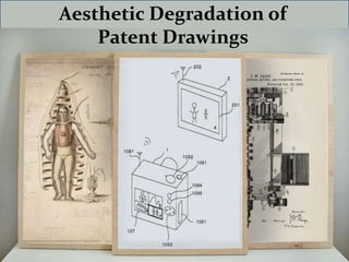
Patent drawings were once considered a work of art. If we create a gallery of patent drawings arranged chronologically since 1790 when the USPTO was started, it throws the light on present day drawings as nothing more than simple lines and computer-generated numbers. In the past 222 years, patent drawings have degraded from detailed works of art to simplistic line drawings that can barely be called illustrations. And this aesthetic degradation is all because of a fire that broke out in 1836. The raging flames destroyed many patents, and up went about 9,000 beautiful drawings in the smoke. Rules related to application filing and patent illustrations witnessed a radical change the following year. Details began to fade away; application rules demanded inventors to submit two illustrations —one for safekeeping in the patent office; the other attached to the patent grant transmitted to the applicant. Making duplicates of elaborate illustrations was not only cumbersome and costly, but also time consuming. The patent office no longer required patent applicants to hire an official draftsman to draw an invention. In 2000, the USPTO made another amendment that pushed the need of aesthetic patent drawings even lower on priority. It reduced the number of revisions required to correct drawings. Eventually, the USPTO enforced a rule that patent drawings must be in black ink to make them easier to reproduce. Even today, applicants can only submit a colour drawing if they file a petition and pay an extra fee. Specifically, the patent office stated that a drawing should just be informative enough to communicate the invention to the examiner and readable enough so as to usefully fit in published applications and patents. So, while a modern drawing does have to explain an invention, it holds no obligation to explain it in an aesthetic manner. This aesthetic degradation of patent illustrations might not be a surprising fact though. A closer analysis reveals that this is just a reflection of the cultural shift industries have gone through. With an increasing focus on cost-cutting, the pride in representing one’s invention artistically and making a mark has somehow disappeared over time. Isn’t it also sad that the patent draftsman, who once not just contributed livid drawings, but also added intricate, cursive labelling to the drawings, is no longer acknowledged in the patent? The labels used these days are also in rather plain fonts. Keeping in mind that too much detail can possibly limit a patent’s scope, today’s requirements call for fewer details with a deliberate shift towards a relatively vague technical drawing. Another motivation behind reducing drawing details is to make it easier incorporate requested revisions and modifications without much difficulty. As a result of this, artists whose work compelled patent officials to delve into the dense particulars, remain unheralded. Unfortunately, patent illustrations have no place for an artist

Empfohlen
Weitere ähnliche Inhalte
Ähnlich wie 21 Illustrations That Prove Patent Drawing Is A Dying Art
Ähnlich wie 21 Illustrations That Prove Patent Drawing Is A Dying Art (20)
Kürzlich hochgeladen
Kürzlich hochgeladen (20)
21 Illustrations That Prove Patent Drawing Is A Dying Art
- 1. Aesthetic Degradation of Patent Drawings
- 2. Still Design Patent, 1808 – US 912 Norman Chan The drawing looks straight out of a da Vinci paintbrush with a complete 3-D view. The intrinsic detailing helps one guess the material of every component that will be used when the invention comes to life.
- 3. Diving Dress, 1810 – US 1405 Chauncy Hall From designing the invention on a wearer to illustrating how and where the invention can be used, the illustrator went to great lengths to add depth and detail.
- 4. Raft Design, 1818 – US 2912 David Gordon The finer details of sailing the raft in swift waters and rocky terrain powers up the invention.
- 5. Mechanical Fan, 1830 – US 6263 James Barron The resting man in a couch is all the detail that one needs to believe in the invention and the comfort that it promises to offer.
- 6. Harp Guitar, 1831 US 6788 E.N. Sherr The drawing clearly shows that the strings can be individually plucked, true to its name of a Harp Guitar.
- 7. Fire Ladder, 1831 US 6490 James Johnson From a raging fire to fire fighters spewing water and rescue personnel, the drawing is replete with details of how the Fire Ladder can be put to use.
- 8. Artificial Arm, 1865 – US 51238 A John Condell A complete 3-D view of the invention, along with details of cross sections, this drawing must have done absolute justice to the model of the invention.
- 9. Typewriter, 1869 US 79265 Sholes, Glidden & Soule From the platen knob to the key top, the ribbon spool to the type wheel, the invention is all clear in this one illustration.
- 10. Life-Preserving Coffin, 1843 – US 3335 Christian Henry Eisenbrandt Worried about being buried alive, the inventor created this life- preserving coffin that would throw open the lid with the slightest movement of the body. The springs and levers are all here in intricate details, just in case you are wondering how!
- 11. Washing Machine, 1844 – US 1844 O. B. Wright A cross-section of the rotating blades and its movement perspective speaks more than the patent might have.
- 12. Flying Machine, 1869 – US 95513 W. F. Quinby From hand positions to flexed muscles, tapering moustaches to arched eyebrows, the illustrator has delved into detailing to bring the invention to life on paper. It also defines the use of metal, strings and wood in various parts of the invention.
- 13. Road Vehicle, 1895 – US 540648 C. E. Duryea From a cushioned seat to sturdy metallic spokes, the vehicle’s design complements the mechanical details of its functioning with pure aesthetic sense.
- 14. Horse Blanket, 1905 US 806925 A. H. Meyers After the 1880s, the USPTO did not insist on models of the invention accompanying the patent. This lowered the priority of drawings and saw the downward spiral of their aesthetic presence in patents. This illustration created in the early stages of this change sticks to detailing, albeit lower than its predecessors. There’s emphasis on the blanket design, with the horse pushed to the background.
- 15. Bird Cage, 1930 US 80524 F. E. Greene Unlike earlier patents that detailed even the material used through illustrations, black and white drawings of the 1900s could resort to as much detailing as this illustration. Silhouettes of persons and the drawing of a yacht in the sea is the prime aesthetic aspect of this image, while the projections on the sides describe the bird perches.
- 16. Safety Helmet with Face Guard, 1960 - US 2944263 D. H. Rayburn Marking a radical shift towards showcasing just the technical aspects of an invention, this drawing details all parts of the safety helmet, with a reference image of its usage. The illustrator, however, has worked brilliantly within the limits of using just black ink. The stippling practically brings the invention and the wearer to life. Even the labelling of the figure has an artistic intent, though it is more conformed to the style of the 1960s.
- 17. Buoyant Bullet-Proof Combat Uniform, 1968 – US 3398406 N. J. Waterbury This illustration tolls us back to the heydays with its intricate detailing. The invention is shown in its practical usage, including its role in case of an attack. The fire from a gun, crash landing of an aircraft, its ensuing smoke and a parachute-lander, coupled with the text marking figures – all support its aesthetic quality.
- 18. Apple Logo Telephone, 1985 – US 3398406 N. J. Waterbury Illustrations begin to show excessive focus on specific details of the patent. However, the artist has added a couple of nuances, such as the stippling, that add more depth to the drawing.
- 19. Wearable Computing Device, 1996 US 5798907 A Craig M. Janik Marking a nearly-complete shift towards describing just the invention, this illustration in black ink shows a perspective view of how the invention can be strapped on the wearer. It also details the input/ output device. The style of marking figures also witnesses a change from the 1960s and 1970s, getting more plain and matter-of-fact.
- 20. PC Peripheral Interactive Doll, 1998 US 6319010 B1 Dan Kikinis Going… going… nearly gone. That’s pretty much the story with this patent diagram. Filled with technical details of bi-directional communication with a doll, the illustration is purely for patent purposes.
- 21. Wearable Electric Field Detector, 2000 US 6329924 B1 William J. McNulty A single invention described in parts through four images, the 2000s herald the era of purely subjective patent illustrations. This is reinforced with the practical font of pointing to figures, the artistic curves of the past forgotten altogether.
- 22. Head-Mounted Display Locks During Unnatural Movement, 2011 US 8223024 B1 David Petrou With a basic diagram of the face, ears and eyes – parts of the body that the invention encompasses, patent diagrams have traversed a long and tedious path to become nothing more than simple lines and shapes with subjective emphasis on the invention and nothing beyond that.