SlideShare ist ein Scribd-Unternehmen logo
1 von 27
MY MUSIC MAGAZINE EVALUATION
In what way does your product use, develop or challenge forms  and conventions of real media products? I have accomplished this by using key  conventions of real magazines such as… Continued on next slide…
MASTHEAD- Located at the top of the magazine; the mast head is used to identify the magazine. For this typography is used. Like other magazines I have made it quite bold and simple allowing it to be easily identifiable. I have made the magazine a glossy gold, this is because gold is a colour associated with hip hop as it represents wealth and power  therefore I wanted my audience to feel like they would be buying in to this. This would cause them to want to buy the magazine. The Masthead is an important convention as it makes the magazine distinct  and allows the audience to familiarise themselves with the magazine , therefore  the audience would be able to buy my magazine again  if they wanted to. CENTRAL  I MAGE -The magazines central image is used to allow the audience to distinguish the genre of the magazine. It also reflects the mis en scene of the magazine. I have accomplished developing and forming products of a real magazine by firstly researching clothing, body language and posing of my model (hip hop). As I wanted to break the typical sexualised stereotype of women in hip hop I decided to have my model covered up (through the use of clothing) however I still tried to reflect the hip hop genre by dressing her with clothes that are quite “cool”, also I have managed to cause her body language and facial expressions to reflect the hip hop genre. I feel the black leather jacket I have chosen resembles the darker side of hip hop, representing the origins of street life and linking in with the roots of the hip hop genre. I  feel I have managed to portray the basic stereotype of a hip hop star through the posture and facial expressions. The central image is linked to the main article.
COVER LINES-  Cover lines are short phrases on the cover of a magazine that describe major articles within the magazine. They are used to entice the reader to see what is within the magazine. Therefore the content has to be interesting and something that will appeal to the audience. I have tried to make the cover lines short, snappy and interesting to further attract the audience. Also for  the bottom cover line I added the word exclusive to make the audience feel that this article was unique, one of a kind and  found only in this magazine  therefore would appeal to them. The cover lines are also located on the left third as this is the part that is visible while the magazine is on the rack therefore they play a vital role in attracting the audience.   Bar code- Barcodes cause the magazine to look more genuine, they are a vital part of the magazine as they are a verification for distributors for sales of the magazine. I have used a barcode as it causes my magazine to look more professional. Date and Price-These are conventions that keep the audience informed. The date allows the audience to be aware of the time period the information has come from; the issue number and price are small conventions that are important as they cause the magazine to look  more real, making it look more professional.
BOTTOM/ TOP S T RIP -These strips usually contain information about prizes, freebies or even basically what is inside the magazine. My top strip gives an Insight to what is inside my magazine, also the bottom strip advertises a competition. These strips allow the audience to see what is within the magazine. The bottom strip advertising the competition shows how people are able to win prizes therefore attracts the audience as young people are usually quite competitive. On the bottom I strip varied the colour of the text by using both black and white, I had the words limited edition in black, I did this because I felt it emphasised how rare, unique and special the prize was causing people to be want to buy my magazine due to this. Also I added that the prize was signed by a star, this would cause the audience to want even more. Freebies- These are an effective way of attracting the audience, a freebie is basically like a bribe which lures the audience in to buying your magazine.
CONTENTS PAGE Looking at other magazines I found contents pages were usually quite simple therefore I wanted my magazine to reflect this. As a result of this I have used conventions of a real magazine contents page to do this. I have tried to copy the layout of the magazine opposite mine, a unconventional contents page (for hip hop) from the hip hop magazine Vibe. Contents page continued on next slide..
Contents page Title- I have kept my title, simple and eye-catching using the Gills Sans Ultra Bold font. I feel white is a colour associated with hip hop as it reflects the “cool” “calm” aspects of it therefore I coloured the word Contents in white. For both the contents page title and the Mast Head I used the same font. This was to keep a constant continuity of the magazine allowing it to look like the same magazine, a vital convention of magazines. I continued with the Gills Sans Ultra Bold text as I felt it looked simple but effective. Also it made it easier to stick to my house style as I used this text for the mast head. It also seems to be a font which has the cool aspect and feel due to the way it looks. Although the font for the contents text remained the same I changed the colours to cause my magazine to look more diverse. I felt adding the red outer glow to the word contents caused it to look more professional and improved the basic appearance. Finally I have placed the title contents in the middle of the page, this causes it to draw the audience in and makes it easier for the audience to navigate themselves. Like my title this title  is very simple, also again it is placed at the top in the centre making it easier for the audience to navigate themselves, again the title for this masthead is very bold and simple. Issue Number and Date- This is basic information about the magazine which keeps the audience informed, it also allows them to be up to date with the magazine. On other magazines I found that the Issue number and date was usually near the contents title, I kept with this convention by placing my issue number and date just above the contents title where it is clear and easy to identify. As you can see here the issue number and date is near the title that is referring to the contents page.
Featured articles and comments- For these I used red and white for the headings and a red outer glow for  the comments. I felt this would attract the audience due to the sheer diversity and appearance. For each feature I put the actual feature in bold with a comment about the feature, this  comment is a basic convention of magazines which gives the audience an insight in to the articles. On other magazine contents pages like mine the title of the feature is usually in bold with smaller text for the actual comment. Another very small but important convention of magazine contents pages is the actual number for the articles, which I have placed next to my features, without this the audience will be unable to navigate the pages. Also I tried my utmost to make the comments sound interesting (like they do on real magazine contents pages) as these are what would cause readers to look within my magazine. Also if these are interesting the audience will be persuaded to read the articles and maybe even purchase my magazine again.  As you can see the layout for my features is very y much like this, I have varied  the appearance of the text for the feature headings and the comments, also like this magazine I have placed the page number next to the feature headings. Features Title- For the features title I used a Gold outer Glow. I felt this was simple but effective. On other magazines the title for the features was usually again like the  title simple. I felt giving the features title a gold outer glow a gave out the message that the features were like gold causing aspirers to want to read them further attracting the audience. As you can see here the title referring to the features is bold but very simple allowing the audience to be easily aware of what it is about.
Page number/ website- The page number is a very basic convention which makes it easier for the audience to locate pages. I Added a website to extend my target audience or give my basic target audience something extra. Also I feel this could cause my magazine to become more widespread as people on sites like “Face book” could create like pages or even tell a friend to visit the website who may later buy my  magazine. Main Image. As you can see the main image utilizes most of the right third of my magazine, I did this because this is how images were placed and laid out when the lay out of a magazine was like this. For the main image I have my model smiling, although this is unusual to the hip hop genre I feel it shows a different side to my model as on both the double page spread and front cover she looks quite serious (following the persona of a hip hop star) therefore I wanted to have something different. This could in turn be used as an incentive to attract the female audience who probably prefer the more fun loving side to my magazine.
Text- For the text I chose the basic Tahoma font, this was because font within a magazine is usually quite bold, simple and easy to read and Tahoma is a font with these properties. Heading and Introductory comment-On other double page spreads I found there were introductory comments which gave readers a basic over view of what the article was about. The purpose of these comments is to cause the reader to want to read what the article is about, to make this convention useful to my magazine I tried to make my introductory comment sound interesting enticing the audience in to reading my article. These comments were conventionally placed underneath the heading.  I put this introductory comment at a slant as I felt it gave my magazine an edge reflecting the cool aspects of the hip hop genre selling the lifestyle I wanted to portray.
On the double page spreads of genuine music magazines I found that the image was always related to the article, my article is basically about two artists, the  female artist has decided she wants to go solo.  Therefore I have tried to relate my images to the actual article through the positioning of my models, I have positioned them so they are not standing next to each other, in fact they are on opposite pages which reflects the article about how one of them “wants to go solo” causing them to split up.. This image is part of an article about being the best MCR, it is related to the article because it is about how this musical group are trying to be the best they can be, therefore the musical aspects are shown by the microphone and the male who seems to be performing. Here is an image of the male on my double page spread, this image follows the codes and conventions of a real music magazine due to the clothing of my star. As every magazine sells a specific lifestyle conventions such as clothing have to be suitable, therefore I have dressed my model in designer clothes which are a huge aspect of hip hop. This will  act as a form of advertising for the brand my male model is wearing, it will attract aspirers who wish to be like my star.
House style- It is vital to keep a constant continuity throughout the magazine, I have accomplished this by using red, white, black and gold throughout. This prevents the magazine from looking like different magazines.
My media product represents typical teenagers within the urban area. An urban area is usually a very multi-cultural area, although the culture is very diverse teenagers usually follow the trend or what they believe is “cool” or “in”. I chose the hip hop genre because I believe it is represented as a very cool genre which is usually targeted towards the younger target market. I have accomplished representing the market my magazine is aimed by reflecting the hip hop genre through the use of posing, facial expressions and clothing.  As hip hop stars usually wear designer labels to emphasise their power and wealth I  have dressed my male model in designer labels as I believe this will attract aspirers. The clothing my star wears is like a form of advertising for the product as it would cause aspirers to buy the product.  Although I have tried to attract the audience through the use of posing and other aspects for my female star I have rebelled against the typical stereotype of a woman. This is because women are represented in a very sexualised way, I wanted to break this stereotype by having my model more covered up however as I have said before I have tried to keep with the hip hop culture through the use of facial expressions and clothing (although the clothing is not the clothing of a typical hip hop star I believe it has a cool aspect which does reflect the hip hop genre), the clothing for my female model was inspired by the Vibe hip hop magazine featuring Chris Brown as I felt it was simple but effective. Another way I have represented a particular social group is by having my models quite young.  This means my target audience will be able to relate to these models. Also I have chosen colours for my magazine that target my young audience. The colours I have used are a continuity of black, red, white and gold. This is because these colours are commonly associated with the hip hop genre therefore will represent my audience. Gold is a colour which represents wealth a significant aspect of the hip hop genre. Red is a colour which can be co notated in many different ways, for the hip hop genre I believe red represents The rebellious side of my genre, white represents the cool aspects of the genre and finally black represents the darker side of hip hop. I have used fonts which I believe have the cool aspect and could be associated or used to portray the hip hop genre, I have coloured the masthead gold as people in to hip hop are very much in to wealth and glamour aspects of the hip hop genre. Also both the font and colours are bold and bright and can be seen as young fresh colours, this reflects the audience of my magazine. On the front cover I have tried to make the cover lines short, snappy and interesting, as the front cover reflects the content within the magazine I have tried to make the content relevant to my target audience, something I felt people within this age range would like to read therefore this will cause the audience to look within my magazine further attracting them. Finally although my target audience is very much within urban areas I feel it could also be targeted at people in the upper class society, people within the age range of my target audience could aspire to be like people within the urban area who are in to hip hop and therefore may buy my magazine. HOW DOES YOUR MEDIA PRODUCT REPRESENT PARTICULAR SOCIAL GROUPS? Typical Hip Hop aspirer
As you can see here I have chosen a model which is young representing my target audience due to her age, also although I have rebelled against the typical sexualised stereotype of women by covering my female model up more, I have represented the hip hop genre and therefore that particular social group through my use of posing and facial expressions, also because the clothing is quite cool it reflects the hip hop genre and therefore my particular social group, the clothing for my magazine was inspired by the hip hop magazine opposite as I feel it is cool and still very effective.  Also there is a continuity of red, black, gold and white; colours that are commonly associated with the hip hop genre therefore representing my particular social group. These colours represent both genders of my target audience as they are colours that can be adapted to both male and females, unlike a colour such as pink which would be stereotypically aimed at the female market.  Here is the male model within my magazine which I have dressed in designer clothing, this is because hip hop stars usually wear designer clothing, this is to symbolise their wealth. This represents my social group because aspirers usually copy their stars therefore the audience for my magazine  may wear clothing like this. Within my article I have used vocabulary commonly associated with street life and hip hop (known as slang within hip hop)  . As a result of this my media product has represented my particular social group.
What kind of media institution might distribute your media product and why?   -Having researched in to the institution Bauer media  I found it catered  for a number of different audiences, from women’s weeklies like  closer to magazines for men (FHM), currently Bauer media publishes  music magazines Kerrang and Mojo both aimed at the male  market. The lifestyle Mojo portrays is quite unique  therefore  my magazine would be a excellent  business venture due to its unique  nature.  - Adding a hip hop magazine to Bauer's huge collection of magazines would  increase their audience as Bauer does not currently produce a hip hop magazine. -Bauer media has a large audience due to the wide range of audience it caters for, my magazine is of the hip hop genre, a genre not yet part of the Bauer magazine institution therefore my magazine could increase their market. - Bauer media have two main divisions ;magazine and  radio, this synergy could be used to advertise my magazine  through  the radio station by playing songs related to my genre or maybe even having its own personal radio station like Kerrang which  is a magazine as well as a well known radio station radio. This would in return attract my audience and increase the popularity of my magazine and maybe even the radio station meaning an increase in popularity for both.
-IPC media have over 80 iconic media brands  with their print brands alone reaching almost two thirds of UK women and 44% of UK men, this adds up to about 27 million UK adults. These figures suggest a large majority of men and women read magazine produced by IPC, my magazine is aimed at both men and women and being able to reach these figures of men and women would be brilliant. The international fame of IPC media means choosing it as my institution would mean it would be given the chance to attract a large audience.  Currently IPC media produces music magazines NME and Uncut, therefore adding my magazine (which is of the hip hop genre) to their collection could increase their target audience without affecting these other two music magazines. IPC media is able to use its own products as a form of advertising . This synergy would mean that IPC media would be able to advertise my magazine through products of their own increasing its popularity without having to pay for advertising. IPC media is owned by Time Warner Inc. a global leader in media and entertainment with businesses in television networks, filmed entertainment and publishing. As a result of this artist for my magazine would have the opportunity to be advertised through different mediums. This includes music videos, albums, T.V and DVD’s. Exclusive Interviews of  my artists will be able to be held by my magazine, increasing its popularity.
How did you attract/address your audience?  Before attracting and addressing my audience I had to take in to account their opinions and what they liked to see on magazines. Firstly I looked at my audience demographics, these demographics were based on the genre I had chosen for my magazine, the demographics allowed me to take in to account the type of audience my product would be aimed at. Having completed my audience demographics I created a questionnaire, handing it out to people I felt would fit within the category of my audience, after this I put together the results of my questionnaire in pie charts. Once I was aware of my audience, their likes and interests and what they wanted I began applying it to my magazine. On the next slide are the different ways in which I have tried to attract my audience…
HOUSE STYLE I have used colours commonly associated with the hip hop genre, the colours I have chosen are red black, white and gold. As I have previously mentioned these are colours associated with the hip hop genre and life style therefore are an effective way of attracting and addressing my audience as they give off the hip hop feel. This will cause people who are in to hip hop to be attracted to my magazine. Gold is a colour that represents wealth and power therefore by using this colour for the mast head I feel I have given my audience the impression they are buying in to this as wealth is an important aspect  of the hip hop genre it will attract them. White is a colour that represents the “cool” aspects of hip hop as teenagers usually like what is referred to as “cool” therefore will purchase my magazine. Red is a colour which represents danger and could portray rebellion therefore I feel the red gives  my magazine an edge. Finally as hip hop is usually associated with urban areas which are widely associated with life on the streets I used the black to reflect this, as  I felt this made the audience feel like this magazine was basically like them and reflected their life style, this allows the audience to connect with the magazine.  MAST HEAD For the Mast head I have used a glossy gold, gold is a significant colour of the hip hop genre,  I feel this will attract the audience into buying my magazine as gold is a colour that represents wealth and power therefore I want to make my audience feel they are buying in to this. This is the glossy gold I feel will attract my aspirers in to buying my magazine.  FREEBIE At the top of the front cover of my magazine I offered a freebie as they are an effective way of attracting the audience as people like to receive free things therefore it could persuade or bribe them in to buying my magazine, by having the freebie at the top of my and on the front cover of magazine in bold capitals I have increased the visibility of it so it is clear  to see which will increase the chances of it attracting the audience. I had the background for my freebie red as red is a colour that is eye catching and therefore catches the audiences attention.
BOTTOM BOX OUT-COMPETITION On the bottom of my magazine I had a box out representing a competition within my magazine, this is an effective way of attracting the audience as they are a form of “fun” and causes people to have the desire to win attracting them. Another way I have used the competition as a way to attract the audience is by referring the prize as “LIMITED EDITION” , this causes my audience to feel as though the prize is something that is rare and not many people have which could cause them to want to buy it to have a chance of winning this prize by entering the competition. Also it emphasises the importance of the prize, varying the colours of the word limited edition from the rest of the text helps catch the audiences attention. Finally by informing the audience that the IPod is signed by a star  would increase their desire for it. COVER LINES To attract my audience I tried to make the cover lines short and snappy, also I tried my utmost to try and make the cover lines sound interesting, if the cover lines are interesting it will attract the audience as they will want to look inside the magazine to read about these cover lines. Also I varied the colour of the cover lines to enhance the appearance of my magazine. Finally  for the last cover line I have described the feature as EXCLUSIVE, this gives out the message that this feature is something that is rare and will not be found else where, this emphasises the value of the article. On both of these pictures my star is portrayed in very different ways as on the contents page I avoided the typical stereotype of a hip hop star by having my model smiling, I feel this will attract the as it will show them a different side to my star, it also increases the variety of my magazine attracting the audience.
I feel portraying the hip hop star persona will attract my audience as it will make it clear to them the genre of the magazine and sets the scene. Also by having a young star I feel my audience will be able to relate to my magazine and I feel this will attract them as it will make my magazine more personal.  This image reflects a hip hop artist through the use of posing however I have rebelled against the clothing to break the sexualised stereotype of women within the hip hop genre,  however I have tried to reflect the hip hop star persona through the use of facial expressions and also  through the use of clothing by making it  cool and current, an aspect of the hip hop genre. The clothing for my female model was inspired by a hip hop magazine featuring Chris Brown. Using a male or female on the cover of my magazine did not really make a difference as in the hip hop genre each gender is used to attract their opposites and also the gender can be used to cause aspirers to be like their gender. Here is the Issue number, date and price for my magazine, this attracts the audience as it keeps them informed, also it basically just makes it easier for the audience to be aware of what they are buying
On the contents page, I feel I have used a good strong image that has dominated most of the page to attract the audience. This will attract my audience because people in to hip hop usually prefer more visual images rather then text. Also for the artist on my contents page I added a gold outer glow, the gold outer glow emphasises the wealth, bling and power aspects of the hip hop genre. I have kept the features very simple, I feel the Gills Sans Ultra Bold will attract the audience due to the bold, cool sort of look it has, I feel having my explanatory comments text in black with a red outer glow will attract the audience as it is eye catching. I made the mast head very bold, simple and clear, I felt keeping it like this would attract the audience as it would allow them to easily identify the page attracting my audience.  For the heading features I added a gold outer glow, I felt this described and represented my features as features of gold. I felt this was effective as it would attract the audience as they would feel what they are reading is very valuable.
For my Double Page spread I believe my layout will attract the audience. I feel the first image will prevent my audience from getting bored as it will allow  them to admire the image before reading the second part of my article . I  also feel the images will attract the audience through the use of eye contact, I feel having my models in this position causes them to look directly at the audience. The variation of red and white for the colour of my article attracts the audience as it prevents my magazine from looking like one big block of writing, I feel having these two colours which stand out well on the background of the magazine, attracting the audience. Here my male artist is wearing designer labels, this will cause people to be able to relate to my magazine as people in to hip hop are usually very much in to designer brands,  this will therefore attract and address my audience. Before creating my magazine I asked my target audience what type of articles they were interested in, as you can see from this pie chart gossip about stars and the past life of stars were the most popular. As a result of this I combined the two as I felt having both would attract and address a larger proportion of my target audience. The content of the article will attract the audience because if these people were real stars people would be interested in reading about them.  I have used “slang” when the artist is talking, this is vocabulary commonly associated with street life and hip hop, therefore will attract and address my audience as it represents them.
WHO WOULD BE THE AUDIENCE FOR YOUR PRODUCT? As my magazine is of the hip hop genre, a genre I feel is very much associated with street life, I feel my magazine will be targeted at the younger market aged between 16-24. This is because people in to hip hop are usually very young and current, as I have previously mentioned they tend to follow the trend. Typical hip hop aspirers would be in to my magazine, they would be very much in to designer clothes and having the latest gadgets. As my audience would be in to current gadgets and clothes I feel a suitable advert in my magazine (if I had one) would be of a pair of designer trainers, clothes or even the latest gadgets. Adverts are an important part of a magazine as they provide the money for the magazine to actually be made. Although hip hop is considered very much an urban genre and aimed more at people within these areas (due to its origins and lifestyle) I feel people from other social classes may be attracted to my magazine, these could be aspirers from the upper class market increasing my target audience.  Age 16-24 Gender- Male and Female Ethnicity- I believe my magazine will appeal to a number of ethnic groups.
Through research I became aware of the typical hip hop stereotype. This gave me a basis for the way I would portray my star through the use of clothing and body language which would allow me to target my audience, making my magazine successful. Here I have tried to portray the hip hop stereotype  (through the use of body language) which should appeal to my target audience. By using young people within the age range of my target audience has enabled me to target them, this is because due to their age it is basically representing them and therefore will attract them. As you can see here the person on the cover of my magazine is very young. In the case of targeting gender in hip hop, genders can attract each other or cause the gender they represent to aspire to be like them. I feel the male audience will be attracted through the good looks of my model and the females will basically be the aspirers. The price is another aspect that centres around the audience your magazine will be aimed at, although people within urban areas usually do have the latest gadgets, the majority do not have parents with disposable income, therefore I have made my magazine a reasonable price due to my target audience. Due to the convention of designer  clothing within the hip hop genre, this image will  attract my target audience. This is a quote within my magazine, as you can see within this quote I have used “street language”, I have shortened the words “because” to “cuz” and “there” to “der”, this would appeal to my target audience because  of the language within my magazine, language that they are aware of and will be able to relate to. Colour scheme-I have used colours commonly associated with the hip hop genre, the colours I have chosen are not stereotypically male or female colours therefore show my product is aimed at both genders By using both the male and female gender for my magazine I have clearly shown that my magazine is targeted at both men and women.
WHAT HAVE YOU LEARNT ABOUT TECHNOLOGIES FROM THE PROCESS OF CONSTRUCTING THIS PRODUCT?  -InDesign- Before this process I was unaware of this programme, due to the process of constructing my product I have now found a programme which basically can be used as a template . When I was first told I would be using InDesign I was extremely nervous as I did not know a single thing about the programme, firstly I did get quite frustrated with it. Throughout this process I have  come across a number of new terms such as “layers”. Before this process I did not understand the concept of layers, now I am aware of how important it is to create layers, layers are used to determine where a specific aspect of your product will be placed. I have also learnt how to add effects such as the outer glow or maybe even the satin effect. Although I thought InDesign would be a very complicated programme to use through this process I feel I have become an expert at using it.  -Photoshop- Photoshop is a programme I have used to manipulate images. Before this process although I was aware of this programme I did not know how to use it. I am now able to successfully manipulate my images by changing the colour and contrast and using different tools such as the magic wand tool. Throughout this process I have been able to use this programme to manipulate my images which has enabled me to create a product that sells a specific lifestyle , genre and way of thinking.  -Blogger- Another programme I was unaware of before the process  of constructing this product, throughout this process I have learnt how to use Blogger. Blogger has allowed me to successfully research, plan and organise my work in one place. It has allowed me to categorise my work making it easier for others to navigate pages. It has also allowed me to put all my work together, through the research planning and construction which I have been able to put on one programme has successfully allowed me to create a magazine that sells a certain lifestyle and genre. -Slide share- Slide share is a programme which has enabled me to upload power points which I have then been able to upload on to my blog. -Camera- Through this process I have learnt the different types of shots used within a magazine. I have been able to use the camera to take photos and I am now aware of how the lighting can effect the type of life style you are trying to portray.  -Uploading and embedding- Through this process I have learnt how to upload and  embed my power points on to Blogger. Also I have learnt how to upload images on to Blogger, - Windows movie maker- I have learnt how to make short movies using this technology, I am able to correctly time my movie , add effects and upload images to add to my movie. While using this technology I first had difficulty timing each slide however I later found doing this very simple. -Through this process I have learnt about a number of new technologies, which have all hugely contributed to me creating a successful magazine that will appeal to my audience. This has shown me how important the role of technology is in creating a successful product.
LOOKING BACK AT YOUR PRELIMENARY TASK, WHAT DO YOU FEEL YOU HAVE LEARNT IN THE PROGRESSION FROM IT TO THE FULL PRODUCT? The basic appearance of my school magazine is very formal, therefore I feel this will not appeal to my main target audience, the students.  As you can see here on my music magazine I have carefully selected fonts and colours I feel will appeal to my target audience. This is because I had realised in the preliminary task I had not appealed to my target audience therefore I did not make the same mistake with my music magazine. On my school magazine I feel the font is not very clear, to  prevent making the mistake on my music magazine I selected a font that would stand out better on my music magazine.  On normal magazines it would be very unusual to see more then one main image on the cover, therefore on my music magazine I used only one main image unlike my school magazine.  My school magazine does not adhere to the codes and conventions of a real magazine, for example on  the school magazine I did not include a barcode and price as I felt these conventions would be not be needed because school magazines do not need to be distributed by manufactures therefore do not need a code to identify the item.
[object Object],[object Object],[object Object],[object Object],[object Object],[object Object]

Weitere ähnliche Inhalte

Was ist angesagt?

Evaluation
EvaluationEvaluation
Evaluationdriss123
 
Evaluation
EvaluationEvaluation
Evaluationdriss123
 
Evaluation Question 1
Evaluation Question 1Evaluation Question 1
Evaluation Question 1alicebarrett
 
Creating a clear brand identity on my contents page and the flat plan on cont...
Creating a clear brand identity on my contents page and the flat plan on cont...Creating a clear brand identity on my contents page and the flat plan on cont...
Creating a clear brand identity on my contents page and the flat plan on cont...Alfieweston
 
rough cut comparison
rough cut comparison rough cut comparison
rough cut comparison Sally Reeves
 
Media studies evaluation
Media studies evaluationMedia studies evaluation
Media studies evaluationGreen1406
 
Evaluation 1
Evaluation 1Evaluation 1
Evaluation 1Qainaat
 
Contents Page Analysis
Contents Page AnalysisContents Page Analysis
Contents Page AnalysisAmyShields00
 
Evaluation question 1
Evaluation   question 1Evaluation   question 1
Evaluation question 1beccaweight16
 
Evaluation - Question 1
Evaluation  - Question 1Evaluation  - Question 1
Evaluation - Question 1beccaweight16
 
Q1. In what ways does your media product use, develop or challenge forms and ...
Q1. In what ways does your media product use, develop or challenge forms and ...Q1. In what ways does your media product use, develop or challenge forms and ...
Q1. In what ways does your media product use, develop or challenge forms and ...hollygruncell
 
R&b magazine evaluation
R&b magazine evaluationR&b magazine evaluation
R&b magazine evaluationMiz_A
 

Was ist angesagt? (18)

Question 1
Question 1Question 1
Question 1
 
Exam q 1
Exam q 1Exam q 1
Exam q 1
 
Question 1
Question 1Question 1
Question 1
 
Evaluation
EvaluationEvaluation
Evaluation
 
Evaluation
EvaluationEvaluation
Evaluation
 
Inspiration
InspirationInspiration
Inspiration
 
Evaluation Question 1
Evaluation Question 1Evaluation Question 1
Evaluation Question 1
 
Creating a clear brand identity on my contents page and the flat plan on cont...
Creating a clear brand identity on my contents page and the flat plan on cont...Creating a clear brand identity on my contents page and the flat plan on cont...
Creating a clear brand identity on my contents page and the flat plan on cont...
 
rough cut comparison
rough cut comparison rough cut comparison
rough cut comparison
 
Q1
Q1Q1
Q1
 
Media studies evaluation
Media studies evaluationMedia studies evaluation
Media studies evaluation
 
Evaluation 1
Evaluation 1Evaluation 1
Evaluation 1
 
Contents Page Analysis
Contents Page AnalysisContents Page Analysis
Contents Page Analysis
 
Evaluation question 1
Evaluation   question 1Evaluation   question 1
Evaluation question 1
 
Evaluation - Question 1
Evaluation  - Question 1Evaluation  - Question 1
Evaluation - Question 1
 
Q1. In what ways does your media product use, develop or challenge forms and ...
Q1. In what ways does your media product use, develop or challenge forms and ...Q1. In what ways does your media product use, develop or challenge forms and ...
Q1. In what ways does your media product use, develop or challenge forms and ...
 
Question 1
Question 1Question 1
Question 1
 
R&b magazine evaluation
R&b magazine evaluationR&b magazine evaluation
R&b magazine evaluation
 

Andere mochten auch

Evaluation
EvaluationEvaluation
EvaluationAdella1
 
Media magazine evaluation
Media magazine evaluationMedia magazine evaluation
Media magazine evaluationemilydavi
 
Media Studies Evaltuation
Media Studies EvaltuationMedia Studies Evaltuation
Media Studies Evaltuationftallett03
 
Media Evaluation 2
Media Evaluation 2Media Evaluation 2
Media Evaluation 2LaurenBC
 
Media Studies: Magazine Evaluation
Media Studies: Magazine EvaluationMedia Studies: Magazine Evaluation
Media Studies: Magazine EvaluationCalfraz
 
ANEESAH'S EVALUATION
ANEESAH'S EVALUATIONANEESAH'S EVALUATION
ANEESAH'S EVALUATIONAneesah09
 
As Media Evaluation 1.25
 As Media Evaluation 1.25 As Media Evaluation 1.25
As Media Evaluation 1.25BaneTMB
 
As media foundation portfolio
As media foundation portfolioAs media foundation portfolio
As media foundation portfolioLaura
 
My Magazine Evaluation
My  Magazine  EvaluationMy  Magazine  Evaluation
My Magazine Evaluationkerrymay
 
Regional Magazine Advert Drafts
Regional Magazine Advert DraftsRegional Magazine Advert Drafts
Regional Magazine Advert DraftsChristosPaph
 
Presentation3
Presentation3Presentation3
Presentation3Adella1
 

Andere mochten auch (11)

Evaluation
EvaluationEvaluation
Evaluation
 
Media magazine evaluation
Media magazine evaluationMedia magazine evaluation
Media magazine evaluation
 
Media Studies Evaltuation
Media Studies EvaltuationMedia Studies Evaltuation
Media Studies Evaltuation
 
Media Evaluation 2
Media Evaluation 2Media Evaluation 2
Media Evaluation 2
 
Media Studies: Magazine Evaluation
Media Studies: Magazine EvaluationMedia Studies: Magazine Evaluation
Media Studies: Magazine Evaluation
 
ANEESAH'S EVALUATION
ANEESAH'S EVALUATIONANEESAH'S EVALUATION
ANEESAH'S EVALUATION
 
As Media Evaluation 1.25
 As Media Evaluation 1.25 As Media Evaluation 1.25
As Media Evaluation 1.25
 
As media foundation portfolio
As media foundation portfolioAs media foundation portfolio
As media foundation portfolio
 
My Magazine Evaluation
My  Magazine  EvaluationMy  Magazine  Evaluation
My Magazine Evaluation
 
Regional Magazine Advert Drafts
Regional Magazine Advert DraftsRegional Magazine Advert Drafts
Regional Magazine Advert Drafts
 
Presentation3
Presentation3Presentation3
Presentation3
 

Ähnlich wie Evaluation

Evaulation For Coursework
Evaulation For CourseworkEvaulation For Coursework
Evaulation For Courseworkrachaelyoung
 
Evaulation To My Coursework
Evaulation To My CourseworkEvaulation To My Coursework
Evaulation To My Courseworkrachaelyoung
 
How do you attract the audience
How do you attract the audienceHow do you attract the audience
How do you attract the audienceasmediae15
 
Question one
Question oneQuestion one
Question oneEllieLott
 
Q1. In what ways does your media product use, develop or challenge forms and...
Q1.  In what ways does your media product use, develop or challenge forms and...Q1.  In what ways does your media product use, develop or challenge forms and...
Q1. In what ways does your media product use, develop or challenge forms and...tabithasmithchs
 
Evaluation question 1
Evaluation question 1Evaluation question 1
Evaluation question 1emily_hop
 
Evaluation 1.2
Evaluation 1.2Evaluation 1.2
Evaluation 1.2BaneTMB
 
Creating a clear brand identity on my contents page and the flat plan of my c...
Creating a clear brand identity on my contents page and the flat plan of my c...Creating a clear brand identity on my contents page and the flat plan of my c...
Creating a clear brand identity on my contents page and the flat plan of my c...Alfieweston
 
Evaluation
EvaluationEvaluation
EvaluationHazieee
 
Evaluation
EvaluationEvaluation
EvaluationHazieee
 
Evaluation
EvaluationEvaluation
EvaluationHazieee
 
EVALUATION // QUESTION 1
EVALUATION // QUESTION 1 EVALUATION // QUESTION 1
EVALUATION // QUESTION 1 msharrattmedia
 
Q1 Media Magazine Evaluation:In what ways does your media product use , devel...
Q1 Media Magazine Evaluation:In what ways does your media product use , devel...Q1 Media Magazine Evaluation:In what ways does your media product use , devel...
Q1 Media Magazine Evaluation:In what ways does your media product use , devel...klaudia666
 
Evaluation Question 1
Evaluation Question 1Evaluation Question 1
Evaluation Question 1amytowns1999
 

Ähnlich wie Evaluation (20)

Evaulation For Coursework
Evaulation For CourseworkEvaulation For Coursework
Evaulation For Coursework
 
Evaulation To My Coursework
Evaulation To My CourseworkEvaulation To My Coursework
Evaulation To My Coursework
 
How do you attract the audience
How do you attract the audienceHow do you attract the audience
How do you attract the audience
 
Question one
Question oneQuestion one
Question one
 
Q1. In what ways does your media product use, develop or challenge forms and...
Q1.  In what ways does your media product use, develop or challenge forms and...Q1.  In what ways does your media product use, develop or challenge forms and...
Q1. In what ways does your media product use, develop or challenge forms and...
 
Evaluation
EvaluationEvaluation
Evaluation
 
Evaluation question 1
Evaluation question 1Evaluation question 1
Evaluation question 1
 
Evaluation 1.2
Evaluation 1.2Evaluation 1.2
Evaluation 1.2
 
Evaluation 1
Evaluation 1Evaluation 1
Evaluation 1
 
Creating a clear brand identity on my contents page and the flat plan of my c...
Creating a clear brand identity on my contents page and the flat plan of my c...Creating a clear brand identity on my contents page and the flat plan of my c...
Creating a clear brand identity on my contents page and the flat plan of my c...
 
Evaluation
EvaluationEvaluation
Evaluation
 
Evaluation
EvaluationEvaluation
Evaluation
 
Evaluation
EvaluationEvaluation
Evaluation
 
Evaluation
EvaluationEvaluation
Evaluation
 
AS Media - Evaluation (Magazine)
AS Media - Evaluation (Magazine)AS Media - Evaluation (Magazine)
AS Media - Evaluation (Magazine)
 
EVALUATION // QUESTION 1
EVALUATION // QUESTION 1 EVALUATION // QUESTION 1
EVALUATION // QUESTION 1
 
Q1 Media Magazine Evaluation:In what ways does your media product use , devel...
Q1 Media Magazine Evaluation:In what ways does your media product use , devel...Q1 Media Magazine Evaluation:In what ways does your media product use , devel...
Q1 Media Magazine Evaluation:In what ways does your media product use , devel...
 
Evaluation Question 1
Evaluation Question 1Evaluation Question 1
Evaluation Question 1
 
Media evaluation
Media evaluationMedia evaluation
Media evaluation
 
AS Media Evaluation
AS Media EvaluationAS Media Evaluation
AS Media Evaluation
 

Kürzlich hochgeladen

Behind the Scenes The Life of Enzo Zelocchi, a Hollywood Film Producer.pdf
Behind the Scenes The Life of Enzo Zelocchi, a Hollywood Film Producer.pdfBehind the Scenes The Life of Enzo Zelocchi, a Hollywood Film Producer.pdf
Behind the Scenes The Life of Enzo Zelocchi, a Hollywood Film Producer.pdfEnzo Zelocchi Fan Page
 
Taken Pilot Episode Story pitch Document
Taken Pilot Episode Story pitch DocumentTaken Pilot Episode Story pitch Document
Taken Pilot Episode Story pitch Documentf4ssvxpz62
 
NO1 Certified Black magic specialist,Expert in Pakistan Amil Baba kala ilam E...
NO1 Certified Black magic specialist,Expert in Pakistan Amil Baba kala ilam E...NO1 Certified Black magic specialist,Expert in Pakistan Amil Baba kala ilam E...
NO1 Certified Black magic specialist,Expert in Pakistan Amil Baba kala ilam E...Amil Baba Dawood bangali
 
Uk-NO1 Amil In Karachi Best Amil In Karachi Bangali Baba In Karachi Aamil In ...
Uk-NO1 Amil In Karachi Best Amil In Karachi Bangali Baba In Karachi Aamil In ...Uk-NO1 Amil In Karachi Best Amil In Karachi Bangali Baba In Karachi Aamil In ...
Uk-NO1 Amil In Karachi Best Amil In Karachi Bangali Baba In Karachi Aamil In ...Amil baba
 
Biswanath Byam Samiti Open Quiz 2022 by Qui9 Grand Finale
Biswanath Byam Samiti Open Quiz 2022 by Qui9 Grand FinaleBiswanath Byam Samiti Open Quiz 2022 by Qui9 Grand Finale
Biswanath Byam Samiti Open Quiz 2022 by Qui9 Grand FinaleQui9 (Ultimate Quizzing)
 
THE MEDIC, A STORY for entertainment.docx
THE MEDIC, A STORY for entertainment.docxTHE MEDIC, A STORY for entertainment.docx
THE MEDIC, A STORY for entertainment.docxazuremorn
 
Fight Scene Storyboard (Action/Adventure Animation)
Fight Scene Storyboard (Action/Adventure Animation)Fight Scene Storyboard (Action/Adventure Animation)
Fight Scene Storyboard (Action/Adventure Animation)finlaygoodall2
 
What Life Would Be Like From A Different Perspective (saltyvixenstories.com)
What Life Would Be Like From A Different Perspective (saltyvixenstories.com)What Life Would Be Like From A Different Perspective (saltyvixenstories.com)
What Life Would Be Like From A Different Perspective (saltyvixenstories.com)Salty Vixen Stories & More
 
NO1 Certified kala ilam Expert In Peshwar Kala Jadu Specialist In Peshwar Kal...
NO1 Certified kala ilam Expert In Peshwar Kala Jadu Specialist In Peshwar Kal...NO1 Certified kala ilam Expert In Peshwar Kala Jadu Specialist In Peshwar Kal...
NO1 Certified kala ilam Expert In Peshwar Kala Jadu Specialist In Peshwar Kal...Amil Baba Dawood bangali
 
Statement Of Intent - - Copy.documentfile
Statement Of Intent - - Copy.documentfileStatement Of Intent - - Copy.documentfile
Statement Of Intent - - Copy.documentfilef4ssvxpz62
 
Bald Philosopher, a story for entertainment.docx
Bald Philosopher, a story for entertainment.docxBald Philosopher, a story for entertainment.docx
Bald Philosopher, a story for entertainment.docxazuremorn
 
Aesthetic Design Inspiration by Slidesgo.pptx
Aesthetic Design Inspiration by Slidesgo.pptxAesthetic Design Inspiration by Slidesgo.pptx
Aesthetic Design Inspiration by Slidesgo.pptxsayemalkadripial4
 
Flying Avocado Cat Cryptocurrency Created, Coded, Generated and Named by Grok...
Flying Avocado Cat Cryptocurrency Created, Coded, Generated and Named by Grok...Flying Avocado Cat Cryptocurrency Created, Coded, Generated and Named by Grok...
Flying Avocado Cat Cryptocurrency Created, Coded, Generated and Named by Grok...TeslaStakeHolder
 
ECOLUXE pre-ESPYS Ultimate Sports Lounge 2024
ECOLUXE pre-ESPYS Ultimate Sports Lounge 2024ECOLUXE pre-ESPYS Ultimate Sports Lounge 2024
ECOLUXE pre-ESPYS Ultimate Sports Lounge 2024Durkin Entertainment LLC
 
Princess Jahan's Tuition Classes, a story for entertainment
Princess Jahan's Tuition Classes, a story for entertainmentPrincess Jahan's Tuition Classes, a story for entertainment
Princess Jahan's Tuition Classes, a story for entertainmentazuremorn
 
A Spotlight on Darla Leigh Pittman Rodgers: Aaron Rodgers' Mother
A Spotlight on Darla Leigh Pittman Rodgers: Aaron Rodgers' MotherA Spotlight on Darla Leigh Pittman Rodgers: Aaron Rodgers' Mother
A Spotlight on Darla Leigh Pittman Rodgers: Aaron Rodgers' Motherget joys
 

Kürzlich hochgeladen (20)

Behind the Scenes The Life of Enzo Zelocchi, a Hollywood Film Producer.pdf
Behind the Scenes The Life of Enzo Zelocchi, a Hollywood Film Producer.pdfBehind the Scenes The Life of Enzo Zelocchi, a Hollywood Film Producer.pdf
Behind the Scenes The Life of Enzo Zelocchi, a Hollywood Film Producer.pdf
 
S10_E02_How to Pimp Social Media 101.pptx
S10_E02_How to Pimp Social Media 101.pptxS10_E02_How to Pimp Social Media 101.pptx
S10_E02_How to Pimp Social Media 101.pptx
 
Taken Pilot Episode Story pitch Document
Taken Pilot Episode Story pitch DocumentTaken Pilot Episode Story pitch Document
Taken Pilot Episode Story pitch Document
 
NO1 Certified Black magic specialist,Expert in Pakistan Amil Baba kala ilam E...
NO1 Certified Black magic specialist,Expert in Pakistan Amil Baba kala ilam E...NO1 Certified Black magic specialist,Expert in Pakistan Amil Baba kala ilam E...
NO1 Certified Black magic specialist,Expert in Pakistan Amil Baba kala ilam E...
 
Uk-NO1 Amil In Karachi Best Amil In Karachi Bangali Baba In Karachi Aamil In ...
Uk-NO1 Amil In Karachi Best Amil In Karachi Bangali Baba In Karachi Aamil In ...Uk-NO1 Amil In Karachi Best Amil In Karachi Bangali Baba In Karachi Aamil In ...
Uk-NO1 Amil In Karachi Best Amil In Karachi Bangali Baba In Karachi Aamil In ...
 
Biswanath Byam Samiti Open Quiz 2022 by Qui9 Grand Finale
Biswanath Byam Samiti Open Quiz 2022 by Qui9 Grand FinaleBiswanath Byam Samiti Open Quiz 2022 by Qui9 Grand Finale
Biswanath Byam Samiti Open Quiz 2022 by Qui9 Grand Finale
 
THE MEDIC, A STORY for entertainment.docx
THE MEDIC, A STORY for entertainment.docxTHE MEDIC, A STORY for entertainment.docx
THE MEDIC, A STORY for entertainment.docx
 
Fight Scene Storyboard (Action/Adventure Animation)
Fight Scene Storyboard (Action/Adventure Animation)Fight Scene Storyboard (Action/Adventure Animation)
Fight Scene Storyboard (Action/Adventure Animation)
 
What Life Would Be Like From A Different Perspective (saltyvixenstories.com)
What Life Would Be Like From A Different Perspective (saltyvixenstories.com)What Life Would Be Like From A Different Perspective (saltyvixenstories.com)
What Life Would Be Like From A Different Perspective (saltyvixenstories.com)
 
NO1 Certified kala ilam Expert In Peshwar Kala Jadu Specialist In Peshwar Kal...
NO1 Certified kala ilam Expert In Peshwar Kala Jadu Specialist In Peshwar Kal...NO1 Certified kala ilam Expert In Peshwar Kala Jadu Specialist In Peshwar Kal...
NO1 Certified kala ilam Expert In Peshwar Kala Jadu Specialist In Peshwar Kal...
 
Statement Of Intent - - Copy.documentfile
Statement Of Intent - - Copy.documentfileStatement Of Intent - - Copy.documentfile
Statement Of Intent - - Copy.documentfile
 
Sincerely, The Friday Club - Farewell Quiz-Finals.pptx
Sincerely, The Friday Club - Farewell Quiz-Finals.pptxSincerely, The Friday Club - Farewell Quiz-Finals.pptx
Sincerely, The Friday Club - Farewell Quiz-Finals.pptx
 
Bald Philosopher, a story for entertainment.docx
Bald Philosopher, a story for entertainment.docxBald Philosopher, a story for entertainment.docx
Bald Philosopher, a story for entertainment.docx
 
Aesthetic Design Inspiration by Slidesgo.pptx
Aesthetic Design Inspiration by Slidesgo.pptxAesthetic Design Inspiration by Slidesgo.pptx
Aesthetic Design Inspiration by Slidesgo.pptx
 
Flying Avocado Cat Cryptocurrency Created, Coded, Generated and Named by Grok...
Flying Avocado Cat Cryptocurrency Created, Coded, Generated and Named by Grok...Flying Avocado Cat Cryptocurrency Created, Coded, Generated and Named by Grok...
Flying Avocado Cat Cryptocurrency Created, Coded, Generated and Named by Grok...
 
S10_E06-Sincerely,The Friday Club- Prelims Farewell Quiz.pptx
S10_E06-Sincerely,The Friday Club- Prelims Farewell Quiz.pptxS10_E06-Sincerely,The Friday Club- Prelims Farewell Quiz.pptx
S10_E06-Sincerely,The Friday Club- Prelims Farewell Quiz.pptx
 
ECOLUXE pre-ESPYS Ultimate Sports Lounge 2024
ECOLUXE pre-ESPYS Ultimate Sports Lounge 2024ECOLUXE pre-ESPYS Ultimate Sports Lounge 2024
ECOLUXE pre-ESPYS Ultimate Sports Lounge 2024
 
Moveable Feast_Travel-Lifestyle-Culture Quiz.pptx
Moveable Feast_Travel-Lifestyle-Culture Quiz.pptxMoveable Feast_Travel-Lifestyle-Culture Quiz.pptx
Moveable Feast_Travel-Lifestyle-Culture Quiz.pptx
 
Princess Jahan's Tuition Classes, a story for entertainment
Princess Jahan's Tuition Classes, a story for entertainmentPrincess Jahan's Tuition Classes, a story for entertainment
Princess Jahan's Tuition Classes, a story for entertainment
 
A Spotlight on Darla Leigh Pittman Rodgers: Aaron Rodgers' Mother
A Spotlight on Darla Leigh Pittman Rodgers: Aaron Rodgers' MotherA Spotlight on Darla Leigh Pittman Rodgers: Aaron Rodgers' Mother
A Spotlight on Darla Leigh Pittman Rodgers: Aaron Rodgers' Mother
 

Evaluation

  • 1. MY MUSIC MAGAZINE EVALUATION
  • 2. In what way does your product use, develop or challenge forms and conventions of real media products? I have accomplished this by using key conventions of real magazines such as… Continued on next slide…
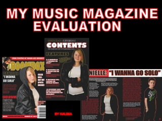
  • 3. MASTHEAD- Located at the top of the magazine; the mast head is used to identify the magazine. For this typography is used. Like other magazines I have made it quite bold and simple allowing it to be easily identifiable. I have made the magazine a glossy gold, this is because gold is a colour associated with hip hop as it represents wealth and power therefore I wanted my audience to feel like they would be buying in to this. This would cause them to want to buy the magazine. The Masthead is an important convention as it makes the magazine distinct and allows the audience to familiarise themselves with the magazine , therefore the audience would be able to buy my magazine again if they wanted to. CENTRAL I MAGE -The magazines central image is used to allow the audience to distinguish the genre of the magazine. It also reflects the mis en scene of the magazine. I have accomplished developing and forming products of a real magazine by firstly researching clothing, body language and posing of my model (hip hop). As I wanted to break the typical sexualised stereotype of women in hip hop I decided to have my model covered up (through the use of clothing) however I still tried to reflect the hip hop genre by dressing her with clothes that are quite “cool”, also I have managed to cause her body language and facial expressions to reflect the hip hop genre. I feel the black leather jacket I have chosen resembles the darker side of hip hop, representing the origins of street life and linking in with the roots of the hip hop genre. I feel I have managed to portray the basic stereotype of a hip hop star through the posture and facial expressions. The central image is linked to the main article.
  • 4. COVER LINES- Cover lines are short phrases on the cover of a magazine that describe major articles within the magazine. They are used to entice the reader to see what is within the magazine. Therefore the content has to be interesting and something that will appeal to the audience. I have tried to make the cover lines short, snappy and interesting to further attract the audience. Also for the bottom cover line I added the word exclusive to make the audience feel that this article was unique, one of a kind and found only in this magazine therefore would appeal to them. The cover lines are also located on the left third as this is the part that is visible while the magazine is on the rack therefore they play a vital role in attracting the audience. Bar code- Barcodes cause the magazine to look more genuine, they are a vital part of the magazine as they are a verification for distributors for sales of the magazine. I have used a barcode as it causes my magazine to look more professional. Date and Price-These are conventions that keep the audience informed. The date allows the audience to be aware of the time period the information has come from; the issue number and price are small conventions that are important as they cause the magazine to look more real, making it look more professional.
  • 5. BOTTOM/ TOP S T RIP -These strips usually contain information about prizes, freebies or even basically what is inside the magazine. My top strip gives an Insight to what is inside my magazine, also the bottom strip advertises a competition. These strips allow the audience to see what is within the magazine. The bottom strip advertising the competition shows how people are able to win prizes therefore attracts the audience as young people are usually quite competitive. On the bottom I strip varied the colour of the text by using both black and white, I had the words limited edition in black, I did this because I felt it emphasised how rare, unique and special the prize was causing people to be want to buy my magazine due to this. Also I added that the prize was signed by a star, this would cause the audience to want even more. Freebies- These are an effective way of attracting the audience, a freebie is basically like a bribe which lures the audience in to buying your magazine.
  • 6. CONTENTS PAGE Looking at other magazines I found contents pages were usually quite simple therefore I wanted my magazine to reflect this. As a result of this I have used conventions of a real magazine contents page to do this. I have tried to copy the layout of the magazine opposite mine, a unconventional contents page (for hip hop) from the hip hop magazine Vibe. Contents page continued on next slide..
  • 7. Contents page Title- I have kept my title, simple and eye-catching using the Gills Sans Ultra Bold font. I feel white is a colour associated with hip hop as it reflects the “cool” “calm” aspects of it therefore I coloured the word Contents in white. For both the contents page title and the Mast Head I used the same font. This was to keep a constant continuity of the magazine allowing it to look like the same magazine, a vital convention of magazines. I continued with the Gills Sans Ultra Bold text as I felt it looked simple but effective. Also it made it easier to stick to my house style as I used this text for the mast head. It also seems to be a font which has the cool aspect and feel due to the way it looks. Although the font for the contents text remained the same I changed the colours to cause my magazine to look more diverse. I felt adding the red outer glow to the word contents caused it to look more professional and improved the basic appearance. Finally I have placed the title contents in the middle of the page, this causes it to draw the audience in and makes it easier for the audience to navigate themselves. Like my title this title is very simple, also again it is placed at the top in the centre making it easier for the audience to navigate themselves, again the title for this masthead is very bold and simple. Issue Number and Date- This is basic information about the magazine which keeps the audience informed, it also allows them to be up to date with the magazine. On other magazines I found that the Issue number and date was usually near the contents title, I kept with this convention by placing my issue number and date just above the contents title where it is clear and easy to identify. As you can see here the issue number and date is near the title that is referring to the contents page.
  • 8. Featured articles and comments- For these I used red and white for the headings and a red outer glow for the comments. I felt this would attract the audience due to the sheer diversity and appearance. For each feature I put the actual feature in bold with a comment about the feature, this comment is a basic convention of magazines which gives the audience an insight in to the articles. On other magazine contents pages like mine the title of the feature is usually in bold with smaller text for the actual comment. Another very small but important convention of magazine contents pages is the actual number for the articles, which I have placed next to my features, without this the audience will be unable to navigate the pages. Also I tried my utmost to make the comments sound interesting (like they do on real magazine contents pages) as these are what would cause readers to look within my magazine. Also if these are interesting the audience will be persuaded to read the articles and maybe even purchase my magazine again. As you can see the layout for my features is very y much like this, I have varied the appearance of the text for the feature headings and the comments, also like this magazine I have placed the page number next to the feature headings. Features Title- For the features title I used a Gold outer Glow. I felt this was simple but effective. On other magazines the title for the features was usually again like the title simple. I felt giving the features title a gold outer glow a gave out the message that the features were like gold causing aspirers to want to read them further attracting the audience. As you can see here the title referring to the features is bold but very simple allowing the audience to be easily aware of what it is about.
  • 9. Page number/ website- The page number is a very basic convention which makes it easier for the audience to locate pages. I Added a website to extend my target audience or give my basic target audience something extra. Also I feel this could cause my magazine to become more widespread as people on sites like “Face book” could create like pages or even tell a friend to visit the website who may later buy my magazine. Main Image. As you can see the main image utilizes most of the right third of my magazine, I did this because this is how images were placed and laid out when the lay out of a magazine was like this. For the main image I have my model smiling, although this is unusual to the hip hop genre I feel it shows a different side to my model as on both the double page spread and front cover she looks quite serious (following the persona of a hip hop star) therefore I wanted to have something different. This could in turn be used as an incentive to attract the female audience who probably prefer the more fun loving side to my magazine.
  • 10. Text- For the text I chose the basic Tahoma font, this was because font within a magazine is usually quite bold, simple and easy to read and Tahoma is a font with these properties. Heading and Introductory comment-On other double page spreads I found there were introductory comments which gave readers a basic over view of what the article was about. The purpose of these comments is to cause the reader to want to read what the article is about, to make this convention useful to my magazine I tried to make my introductory comment sound interesting enticing the audience in to reading my article. These comments were conventionally placed underneath the heading. I put this introductory comment at a slant as I felt it gave my magazine an edge reflecting the cool aspects of the hip hop genre selling the lifestyle I wanted to portray.
  • 11. On the double page spreads of genuine music magazines I found that the image was always related to the article, my article is basically about two artists, the female artist has decided she wants to go solo. Therefore I have tried to relate my images to the actual article through the positioning of my models, I have positioned them so they are not standing next to each other, in fact they are on opposite pages which reflects the article about how one of them “wants to go solo” causing them to split up.. This image is part of an article about being the best MCR, it is related to the article because it is about how this musical group are trying to be the best they can be, therefore the musical aspects are shown by the microphone and the male who seems to be performing. Here is an image of the male on my double page spread, this image follows the codes and conventions of a real music magazine due to the clothing of my star. As every magazine sells a specific lifestyle conventions such as clothing have to be suitable, therefore I have dressed my model in designer clothes which are a huge aspect of hip hop. This will act as a form of advertising for the brand my male model is wearing, it will attract aspirers who wish to be like my star.
  • 12. House style- It is vital to keep a constant continuity throughout the magazine, I have accomplished this by using red, white, black and gold throughout. This prevents the magazine from looking like different magazines.
  • 13. My media product represents typical teenagers within the urban area. An urban area is usually a very multi-cultural area, although the culture is very diverse teenagers usually follow the trend or what they believe is “cool” or “in”. I chose the hip hop genre because I believe it is represented as a very cool genre which is usually targeted towards the younger target market. I have accomplished representing the market my magazine is aimed by reflecting the hip hop genre through the use of posing, facial expressions and clothing. As hip hop stars usually wear designer labels to emphasise their power and wealth I have dressed my male model in designer labels as I believe this will attract aspirers. The clothing my star wears is like a form of advertising for the product as it would cause aspirers to buy the product. Although I have tried to attract the audience through the use of posing and other aspects for my female star I have rebelled against the typical stereotype of a woman. This is because women are represented in a very sexualised way, I wanted to break this stereotype by having my model more covered up however as I have said before I have tried to keep with the hip hop culture through the use of facial expressions and clothing (although the clothing is not the clothing of a typical hip hop star I believe it has a cool aspect which does reflect the hip hop genre), the clothing for my female model was inspired by the Vibe hip hop magazine featuring Chris Brown as I felt it was simple but effective. Another way I have represented a particular social group is by having my models quite young. This means my target audience will be able to relate to these models. Also I have chosen colours for my magazine that target my young audience. The colours I have used are a continuity of black, red, white and gold. This is because these colours are commonly associated with the hip hop genre therefore will represent my audience. Gold is a colour which represents wealth a significant aspect of the hip hop genre. Red is a colour which can be co notated in many different ways, for the hip hop genre I believe red represents The rebellious side of my genre, white represents the cool aspects of the genre and finally black represents the darker side of hip hop. I have used fonts which I believe have the cool aspect and could be associated or used to portray the hip hop genre, I have coloured the masthead gold as people in to hip hop are very much in to wealth and glamour aspects of the hip hop genre. Also both the font and colours are bold and bright and can be seen as young fresh colours, this reflects the audience of my magazine. On the front cover I have tried to make the cover lines short, snappy and interesting, as the front cover reflects the content within the magazine I have tried to make the content relevant to my target audience, something I felt people within this age range would like to read therefore this will cause the audience to look within my magazine further attracting them. Finally although my target audience is very much within urban areas I feel it could also be targeted at people in the upper class society, people within the age range of my target audience could aspire to be like people within the urban area who are in to hip hop and therefore may buy my magazine. HOW DOES YOUR MEDIA PRODUCT REPRESENT PARTICULAR SOCIAL GROUPS? Typical Hip Hop aspirer
  • 14. As you can see here I have chosen a model which is young representing my target audience due to her age, also although I have rebelled against the typical sexualised stereotype of women by covering my female model up more, I have represented the hip hop genre and therefore that particular social group through my use of posing and facial expressions, also because the clothing is quite cool it reflects the hip hop genre and therefore my particular social group, the clothing for my magazine was inspired by the hip hop magazine opposite as I feel it is cool and still very effective. Also there is a continuity of red, black, gold and white; colours that are commonly associated with the hip hop genre therefore representing my particular social group. These colours represent both genders of my target audience as they are colours that can be adapted to both male and females, unlike a colour such as pink which would be stereotypically aimed at the female market. Here is the male model within my magazine which I have dressed in designer clothing, this is because hip hop stars usually wear designer clothing, this is to symbolise their wealth. This represents my social group because aspirers usually copy their stars therefore the audience for my magazine may wear clothing like this. Within my article I have used vocabulary commonly associated with street life and hip hop (known as slang within hip hop) . As a result of this my media product has represented my particular social group.
  • 15. What kind of media institution might distribute your media product and why? -Having researched in to the institution Bauer media I found it catered for a number of different audiences, from women’s weeklies like closer to magazines for men (FHM), currently Bauer media publishes music magazines Kerrang and Mojo both aimed at the male market. The lifestyle Mojo portrays is quite unique therefore my magazine would be a excellent business venture due to its unique nature. - Adding a hip hop magazine to Bauer's huge collection of magazines would increase their audience as Bauer does not currently produce a hip hop magazine. -Bauer media has a large audience due to the wide range of audience it caters for, my magazine is of the hip hop genre, a genre not yet part of the Bauer magazine institution therefore my magazine could increase their market. - Bauer media have two main divisions ;magazine and radio, this synergy could be used to advertise my magazine through the radio station by playing songs related to my genre or maybe even having its own personal radio station like Kerrang which is a magazine as well as a well known radio station radio. This would in return attract my audience and increase the popularity of my magazine and maybe even the radio station meaning an increase in popularity for both.
  • 16. -IPC media have over 80 iconic media brands with their print brands alone reaching almost two thirds of UK women and 44% of UK men, this adds up to about 27 million UK adults. These figures suggest a large majority of men and women read magazine produced by IPC, my magazine is aimed at both men and women and being able to reach these figures of men and women would be brilliant. The international fame of IPC media means choosing it as my institution would mean it would be given the chance to attract a large audience. Currently IPC media produces music magazines NME and Uncut, therefore adding my magazine (which is of the hip hop genre) to their collection could increase their target audience without affecting these other two music magazines. IPC media is able to use its own products as a form of advertising . This synergy would mean that IPC media would be able to advertise my magazine through products of their own increasing its popularity without having to pay for advertising. IPC media is owned by Time Warner Inc. a global leader in media and entertainment with businesses in television networks, filmed entertainment and publishing. As a result of this artist for my magazine would have the opportunity to be advertised through different mediums. This includes music videos, albums, T.V and DVD’s. Exclusive Interviews of my artists will be able to be held by my magazine, increasing its popularity.
  • 17. How did you attract/address your audience? Before attracting and addressing my audience I had to take in to account their opinions and what they liked to see on magazines. Firstly I looked at my audience demographics, these demographics were based on the genre I had chosen for my magazine, the demographics allowed me to take in to account the type of audience my product would be aimed at. Having completed my audience demographics I created a questionnaire, handing it out to people I felt would fit within the category of my audience, after this I put together the results of my questionnaire in pie charts. Once I was aware of my audience, their likes and interests and what they wanted I began applying it to my magazine. On the next slide are the different ways in which I have tried to attract my audience…
  • 18. HOUSE STYLE I have used colours commonly associated with the hip hop genre, the colours I have chosen are red black, white and gold. As I have previously mentioned these are colours associated with the hip hop genre and life style therefore are an effective way of attracting and addressing my audience as they give off the hip hop feel. This will cause people who are in to hip hop to be attracted to my magazine. Gold is a colour that represents wealth and power therefore by using this colour for the mast head I feel I have given my audience the impression they are buying in to this as wealth is an important aspect of the hip hop genre it will attract them. White is a colour that represents the “cool” aspects of hip hop as teenagers usually like what is referred to as “cool” therefore will purchase my magazine. Red is a colour which represents danger and could portray rebellion therefore I feel the red gives my magazine an edge. Finally as hip hop is usually associated with urban areas which are widely associated with life on the streets I used the black to reflect this, as I felt this made the audience feel like this magazine was basically like them and reflected their life style, this allows the audience to connect with the magazine. MAST HEAD For the Mast head I have used a glossy gold, gold is a significant colour of the hip hop genre, I feel this will attract the audience into buying my magazine as gold is a colour that represents wealth and power therefore I want to make my audience feel they are buying in to this. This is the glossy gold I feel will attract my aspirers in to buying my magazine. FREEBIE At the top of the front cover of my magazine I offered a freebie as they are an effective way of attracting the audience as people like to receive free things therefore it could persuade or bribe them in to buying my magazine, by having the freebie at the top of my and on the front cover of magazine in bold capitals I have increased the visibility of it so it is clear to see which will increase the chances of it attracting the audience. I had the background for my freebie red as red is a colour that is eye catching and therefore catches the audiences attention.
  • 19. BOTTOM BOX OUT-COMPETITION On the bottom of my magazine I had a box out representing a competition within my magazine, this is an effective way of attracting the audience as they are a form of “fun” and causes people to have the desire to win attracting them. Another way I have used the competition as a way to attract the audience is by referring the prize as “LIMITED EDITION” , this causes my audience to feel as though the prize is something that is rare and not many people have which could cause them to want to buy it to have a chance of winning this prize by entering the competition. Also it emphasises the importance of the prize, varying the colours of the word limited edition from the rest of the text helps catch the audiences attention. Finally by informing the audience that the IPod is signed by a star would increase their desire for it. COVER LINES To attract my audience I tried to make the cover lines short and snappy, also I tried my utmost to try and make the cover lines sound interesting, if the cover lines are interesting it will attract the audience as they will want to look inside the magazine to read about these cover lines. Also I varied the colour of the cover lines to enhance the appearance of my magazine. Finally for the last cover line I have described the feature as EXCLUSIVE, this gives out the message that this feature is something that is rare and will not be found else where, this emphasises the value of the article. On both of these pictures my star is portrayed in very different ways as on the contents page I avoided the typical stereotype of a hip hop star by having my model smiling, I feel this will attract the as it will show them a different side to my star, it also increases the variety of my magazine attracting the audience.
  • 20. I feel portraying the hip hop star persona will attract my audience as it will make it clear to them the genre of the magazine and sets the scene. Also by having a young star I feel my audience will be able to relate to my magazine and I feel this will attract them as it will make my magazine more personal. This image reflects a hip hop artist through the use of posing however I have rebelled against the clothing to break the sexualised stereotype of women within the hip hop genre, however I have tried to reflect the hip hop star persona through the use of facial expressions and also through the use of clothing by making it cool and current, an aspect of the hip hop genre. The clothing for my female model was inspired by a hip hop magazine featuring Chris Brown. Using a male or female on the cover of my magazine did not really make a difference as in the hip hop genre each gender is used to attract their opposites and also the gender can be used to cause aspirers to be like their gender. Here is the Issue number, date and price for my magazine, this attracts the audience as it keeps them informed, also it basically just makes it easier for the audience to be aware of what they are buying
  • 21. On the contents page, I feel I have used a good strong image that has dominated most of the page to attract the audience. This will attract my audience because people in to hip hop usually prefer more visual images rather then text. Also for the artist on my contents page I added a gold outer glow, the gold outer glow emphasises the wealth, bling and power aspects of the hip hop genre. I have kept the features very simple, I feel the Gills Sans Ultra Bold will attract the audience due to the bold, cool sort of look it has, I feel having my explanatory comments text in black with a red outer glow will attract the audience as it is eye catching. I made the mast head very bold, simple and clear, I felt keeping it like this would attract the audience as it would allow them to easily identify the page attracting my audience. For the heading features I added a gold outer glow, I felt this described and represented my features as features of gold. I felt this was effective as it would attract the audience as they would feel what they are reading is very valuable.
  • 22. For my Double Page spread I believe my layout will attract the audience. I feel the first image will prevent my audience from getting bored as it will allow them to admire the image before reading the second part of my article . I also feel the images will attract the audience through the use of eye contact, I feel having my models in this position causes them to look directly at the audience. The variation of red and white for the colour of my article attracts the audience as it prevents my magazine from looking like one big block of writing, I feel having these two colours which stand out well on the background of the magazine, attracting the audience. Here my male artist is wearing designer labels, this will cause people to be able to relate to my magazine as people in to hip hop are usually very much in to designer brands, this will therefore attract and address my audience. Before creating my magazine I asked my target audience what type of articles they were interested in, as you can see from this pie chart gossip about stars and the past life of stars were the most popular. As a result of this I combined the two as I felt having both would attract and address a larger proportion of my target audience. The content of the article will attract the audience because if these people were real stars people would be interested in reading about them. I have used “slang” when the artist is talking, this is vocabulary commonly associated with street life and hip hop, therefore will attract and address my audience as it represents them.
  • 23. WHO WOULD BE THE AUDIENCE FOR YOUR PRODUCT? As my magazine is of the hip hop genre, a genre I feel is very much associated with street life, I feel my magazine will be targeted at the younger market aged between 16-24. This is because people in to hip hop are usually very young and current, as I have previously mentioned they tend to follow the trend. Typical hip hop aspirers would be in to my magazine, they would be very much in to designer clothes and having the latest gadgets. As my audience would be in to current gadgets and clothes I feel a suitable advert in my magazine (if I had one) would be of a pair of designer trainers, clothes or even the latest gadgets. Adverts are an important part of a magazine as they provide the money for the magazine to actually be made. Although hip hop is considered very much an urban genre and aimed more at people within these areas (due to its origins and lifestyle) I feel people from other social classes may be attracted to my magazine, these could be aspirers from the upper class market increasing my target audience. Age 16-24 Gender- Male and Female Ethnicity- I believe my magazine will appeal to a number of ethnic groups.
  • 24. Through research I became aware of the typical hip hop stereotype. This gave me a basis for the way I would portray my star through the use of clothing and body language which would allow me to target my audience, making my magazine successful. Here I have tried to portray the hip hop stereotype (through the use of body language) which should appeal to my target audience. By using young people within the age range of my target audience has enabled me to target them, this is because due to their age it is basically representing them and therefore will attract them. As you can see here the person on the cover of my magazine is very young. In the case of targeting gender in hip hop, genders can attract each other or cause the gender they represent to aspire to be like them. I feel the male audience will be attracted through the good looks of my model and the females will basically be the aspirers. The price is another aspect that centres around the audience your magazine will be aimed at, although people within urban areas usually do have the latest gadgets, the majority do not have parents with disposable income, therefore I have made my magazine a reasonable price due to my target audience. Due to the convention of designer clothing within the hip hop genre, this image will attract my target audience. This is a quote within my magazine, as you can see within this quote I have used “street language”, I have shortened the words “because” to “cuz” and “there” to “der”, this would appeal to my target audience because of the language within my magazine, language that they are aware of and will be able to relate to. Colour scheme-I have used colours commonly associated with the hip hop genre, the colours I have chosen are not stereotypically male or female colours therefore show my product is aimed at both genders By using both the male and female gender for my magazine I have clearly shown that my magazine is targeted at both men and women.
  • 25. WHAT HAVE YOU LEARNT ABOUT TECHNOLOGIES FROM THE PROCESS OF CONSTRUCTING THIS PRODUCT? -InDesign- Before this process I was unaware of this programme, due to the process of constructing my product I have now found a programme which basically can be used as a template . When I was first told I would be using InDesign I was extremely nervous as I did not know a single thing about the programme, firstly I did get quite frustrated with it. Throughout this process I have come across a number of new terms such as “layers”. Before this process I did not understand the concept of layers, now I am aware of how important it is to create layers, layers are used to determine where a specific aspect of your product will be placed. I have also learnt how to add effects such as the outer glow or maybe even the satin effect. Although I thought InDesign would be a very complicated programme to use through this process I feel I have become an expert at using it. -Photoshop- Photoshop is a programme I have used to manipulate images. Before this process although I was aware of this programme I did not know how to use it. I am now able to successfully manipulate my images by changing the colour and contrast and using different tools such as the magic wand tool. Throughout this process I have been able to use this programme to manipulate my images which has enabled me to create a product that sells a specific lifestyle , genre and way of thinking. -Blogger- Another programme I was unaware of before the process of constructing this product, throughout this process I have learnt how to use Blogger. Blogger has allowed me to successfully research, plan and organise my work in one place. It has allowed me to categorise my work making it easier for others to navigate pages. It has also allowed me to put all my work together, through the research planning and construction which I have been able to put on one programme has successfully allowed me to create a magazine that sells a certain lifestyle and genre. -Slide share- Slide share is a programme which has enabled me to upload power points which I have then been able to upload on to my blog. -Camera- Through this process I have learnt the different types of shots used within a magazine. I have been able to use the camera to take photos and I am now aware of how the lighting can effect the type of life style you are trying to portray. -Uploading and embedding- Through this process I have learnt how to upload and embed my power points on to Blogger. Also I have learnt how to upload images on to Blogger, - Windows movie maker- I have learnt how to make short movies using this technology, I am able to correctly time my movie , add effects and upload images to add to my movie. While using this technology I first had difficulty timing each slide however I later found doing this very simple. -Through this process I have learnt about a number of new technologies, which have all hugely contributed to me creating a successful magazine that will appeal to my audience. This has shown me how important the role of technology is in creating a successful product.
  • 26. LOOKING BACK AT YOUR PRELIMENARY TASK, WHAT DO YOU FEEL YOU HAVE LEARNT IN THE PROGRESSION FROM IT TO THE FULL PRODUCT? The basic appearance of my school magazine is very formal, therefore I feel this will not appeal to my main target audience, the students. As you can see here on my music magazine I have carefully selected fonts and colours I feel will appeal to my target audience. This is because I had realised in the preliminary task I had not appealed to my target audience therefore I did not make the same mistake with my music magazine. On my school magazine I feel the font is not very clear, to prevent making the mistake on my music magazine I selected a font that would stand out better on my music magazine. On normal magazines it would be very unusual to see more then one main image on the cover, therefore on my music magazine I used only one main image unlike my school magazine. My school magazine does not adhere to the codes and conventions of a real magazine, for example on the school magazine I did not include a barcode and price as I felt these conventions would be not be needed because school magazines do not need to be distributed by manufactures therefore do not need a code to identify the item.
  • 27.