
Empfohlen
Weitere ähnliche Inhalte
Was ist angesagt?
Was ist angesagt? (17)
Andere mochten auch
Andere mochten auch (14)
Ähnlich wie Kerrang! Magazine Cover Breaks Convention
Ähnlich wie Kerrang! Magazine Cover Breaks Convention (20)
Mehr von guest1e5343
Mehr von guest1e5343 (8)
Kürzlich hochgeladen
Kürzlich hochgeladen (10)
Kerrang! Magazine Cover Breaks Convention
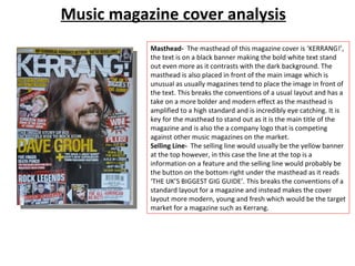
- 1. Music magazine cover analysis Masthead- The masthead of this magazine cover is ‘KERRANG!’, the text is on a black banner making the bold white text stand out even more as it contrasts with the dark background. The masthead is also placed in front of the main image which is unusual as usually magazines tend to place the image in front of the text. This breaks the conventions of a usual layout and has a take on a more bolder and modern effect as the masthead is amplified to a high standard and is incredibly eye catching. It is key for the masthead to stand out as it is the main title of the magazine and is also the a company logo that is competing against other music magazines on the market. Selling Line- The selling line would usually be the yellow banner at the top however, in this case the line at the top is a information on a feature and the selling line would probably be the button on the bottom right under the masthead as it reads ‘THE UK’S BIGGEST GIG GUIDE’. This breaks the conventions of a standard layout for a magazine and instead makes the cover layout more modern, young and fresh which would be the target market for a magazine such as Kerrang.
- 2. Music magazine cover analysis Main Image- The main image is of the lead singer of Foo Fighters. The shot is a semi-close up shot with the model facing slightly to the right. The angle of the photo gives a more casual feel to the main image as the model is not in any special or professional looking pose and looks casual which suits the general genre of the magazine and is also a more appealing approach to a younger generation of audience. The lighting of the photograph is mid tone giving the older aged model a soft lighting on the face and also adding to the casual theme of the front cover. The model is dressed in all black making the text stand out. Other Images- There are a lot of small images placed on the front cover. This is unusual as not many music magazines tend to place extra images on the front cover as there is a potential risk of drawing attention away from the main image. This layout breaks conventions again and spreads a wider message of being rule breaking, young, modern and bold. The images allow the readers to have more insight to what will be inside the content of the magazine and also draws in more visual attention as a young audience is more likely to be attracted by images rather than a lot of text. Having the extra images allows the cover to advertise and sell the magazine as it reveals the famous faces that will be included in the issue and will instantly catch the audience’s attention.
- 3. Music magazine cover analysis Colour Scheme- The colour scheme of the magazine is red, yellow, white and black. The white and black come from the main image and background as the model is dressed in all black and the background is a plain white. Any black and white used in the text will also compliment the masthead. There is no red or white apparent in the main image, however there are hints of these colours in the other images. The badges on the hat of the male artist on the left has red and yellow on it and the male singer on the right also has bright, yellow toned hair, accompanying the colour scheme of the magazine; or the text accompanying the images. Button- There are two buttons on the front cover; the first is the selling line in a button on the right under the masthead. The button almost looks like a stamp as it is stylised in this form, a stamp style almost gives an impression of being official or authorised which is appropriate for the text inside it as it shows the quality of the magazine is also a title being ‘THE UK’S BIGGEST GIG GUIDE’. The second button is for a prize as it says in bold letters ‘WIN!’ with brief details of the prizes. A star shaped button is usually used as sale marks or winning products and so this is familiar and readers will instantly know what it is all about. Having a button for this particular information also makes the text stand out.
- 4. Music magazine cover analysis Kicker- In this front cover, the kickers are mainly names of artists that are being featured and the extra images also work as a form of a kicker. The main kicker is the name of the main feature, ‘DAVE GROHL’ (lead singer of Foo Fighters). The font of the kicker is largest out of all kickers as it is important for this kicker to be the main feature as Dave Grohl is the front cover and main attribute to the magazine. Explanatory- The explanatory text consists of quotes from interviews and catchy phrases. Quotes will allow the reader to instantly know that there are interviews inside the magazine and also allows the reader to feel connected to the interviewee. There are also direct pieces of text such as ‘we make a great band’ this allows the readers to become engaged and draws more attention as the audience is made to feel exclusive and personal. Font- On this front cover, there are at least 7 types of font which is unusual for a front cover as usually, magazines tend to stick to 3 types; keeping a thematic, proffesional and neat look. This magazine cover breaks conventions in various ways to create a different, new and edgy twist to the cover.