
Empfohlen
Weitere ähnliche Inhalte
Was ist angesagt?
Was ist angesagt? (20)
Andere mochten auch
Andere mochten auch (14)
Ähnlich wie Magazine Cover
Ähnlich wie Magazine Cover (20)
Mehr von guest1abe576e
Mehr von guest1abe576e (20)
Kürzlich hochgeladen
Kürzlich hochgeladen (20)
Magazine Cover
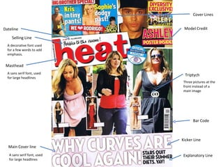
- 1. Masthead Selling Line Cover Lines Bar Code Dateline Main Cover line Model Credit Triptych Three pictures at the front instead of a main image Kicker Line Explanatory Line A sans serif font, used for large headlines A sans serif font, used for large headlines A decorative font used for a few words to add emphasis.
- 2. Anchorage—how does anchorage create/manipulate meaning? The photos are of glamorous girls, none of the photos are of the women posing, and instead they have been taken whilst the women are in their natural habitat, they are taken from a position that the women look worst in to create a more interesting image. The anchoring of the phrase ‘we’re skinny-get over it’ changes the meaning of the photos as it is what the celebrity think. The language used ‘get over it’ is rude which portrays an image of the celebrity’s altitude. For the main magazine cover, the photos become more important that the words used as they are larger. Audience-How does this magazine target a desired audience? It targets an audience of the age range 16-25 and is a women’s magazine. Its main focus is on celebrities rather than real life stories this may portray a different audience with people that have an interest in the lives of celebrities. Connotations—what connotations are brought by the signs are symbols on the cover? Why are they placed? The title is bright and stands out against the white background and is written in big, bold font. The main story in the magazine is also highlighted as important as it is bright yellow with a red background which makes it bold. The phrase ‘get over it’ is written in red which could signify anger; this associates with the rude and arrogant language used. Words underlined signify important and get the audiences attention, for example ‘I still haven’t had sex with my boyfriend’ this signifies the importance of time. Following on from this, use of bold words such as finally also gives the importance of time. Conventions—What are the conventions of this magazine cover? It will help to have two different issues of the same magazines? The magazine repeatedly has a white background on each issue of their magazine as well as this the title ‘heat’ magazine is always bold and written in red. Along with this on each issue, the title and the words ‘this week’s hottest celebrity news’ is always written in the same place. The magazine always has images of celebrities with bold subtitles using quotations lastly, each different story is written within a different section of the magazine for example, a main story is always written at the top of the magazine cover. Deconstruction—Can you deconstruct the magazine cover? What are its parts? You can deconstruct the magazine into many parts for example, photographs of celebrities, story headlines, quotations and main titles. Demographic—What demographic group does this magazine target? Age, race, gender, ethnicity, occupation, income and socioeconomic status. The magazine targets young females between the age of late teens and 25. it doesn’t particularly target a occupation group as it is based on celebrities and not real life issues. It is worth £1.65 as a lot of information and stories is packed into the magazine and it comes out weekly. The magazine targets the upper and middle class. Effects—How does the form and conventions of the magazine effect its audience? The form and conventions of the magazine catches the interest of readers, making the readers interested as to what might be inside for example the magazine uses dialogue, quotations, colours and photos, these features give the magazine a particular aesthetic that makes the magazine unique and stand out as ‘heat’ magazine. Form—Describe the form of the magazine. Comment on the choices make by the magazine’s editor. The form of the magazine follows the form of the magazine cover, such as big bold pictures are used, colours and large fonts. I think the editor of the magazine created it in this way to make it appealing and easy to enjoy looking and reading through. The conventions used make the magazine exciting and less formal to read which appeals will appeal to the target audience of young women. Interactive—How is the magazine interactive? It is interactive in many ways, for example it gives real life stories these may receive a certain reaction from the audience, it also gives advice on many issues such as love life, family and money. Lastly, it enables people to write in about any problems they have in life, and advice given back will influence people to maybe change to sort the problems. Mise en Scène—Comment on the Mise en Scène of the front cover. The ‘mise en scene’ has been set out in an appealing, simple way but is also quite attractive. For example, white background is used to emphasis the main content in the magazine, the main title ‘heat’ is written brightly in bold, there is a main story of the magazine in the top corner and below the title are photos of celebrities and just a small amount of headlines and quotes to keep the front cover simple but gives enough information for viewers to want to buy the magazine and read the content. Point of View Shot—From what point of view is the camera shooting? How does it impact the form and audience? The camera is shooting from the photographers/editors point of view as they have caught the celebrities when they aren‘t posing and have then made comments about ‘being skinny‘, however the quotes beside the photos are given by the celebrities point of view “we’re skinny- get over it”, which causes conflict which makes the reader more interested as to what is inside and what the story is about. Semiotics—What cultural myths are played upon on the front cover of the magazine? There are many theories regarding symbolism that is given from the front cover. Meanings are given from the words and pictures used however these meanings may be myths and different from what is being portrayed such as there are images of skinny women and then quotes such as ‘deluded stars insist they eat normally’ and ‘we’re skinny-get over it’ these portray a meaning to the audience that there is a battle between the magazine editors and the celebrities about the truth. Look for symbols/sign. What do they mean to you? How may they be interpreted by the target audience. Each image on the magazine cover evokes a sign and has a meaning for example, to me the image of Rachel the winner of big brother portrays anger, unhappiness and envy however the quote next to the photo gives me a different meaning ‘ I’m BB winner’ this to me shows excitement and happiness. Each image may give a different sign/meaning to different people of the audience which is why the cover is cleverly edited as it is the most important part of the magazine as it gets the audience involved. Symbolic—What are the symbols? On the cover there is use of iconic representations that carry particular conventional meanings, for example each micro element of the cover is a symbol and represents different meanings. The symbols include, text, photographs and quotations. Text—What is being said behind the text, through the text, by where the text is placed? People could have a different image as to what is being said by the text, I believe behind the text of this certain magazine cover there is conflict between the magazine editors and the celebrities. The text is placed according, this could show disagreement about the statement given as the quote given by the celebrities “we’re skinny-get over it” is placed big and bold on the left hand side of the page whereas the statement from the editor is written in smaller print at the bottom right of the page. This image is also created on another main story given on the front of the magazine cover. Therefore this may be a technique the magazine editors use to attract the audience’s attention.