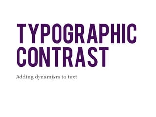
Typographic Contrast
•
6 gefällt mir•1,771 views

This document discusses different typographic techniques for adding dynamism and emphasis to text, including using size, style, typeface, color, and spacing. It recommends using bigger text to catch attention, smaller text for longer reading, font styles for emphasis, limiting to 2-3 typefaces, combining serif and sans-serif, using hue, saturation and brightness of color effectively, and using space to suggest borders and hierarchies. It also notes that all uppercase letters are strong but lose detail, so they should only be used for headings, titles and acronyms.

Empfohlen
Weitere ähnliche Inhalte
Mehr von Gerson Abesamis
Mehr von Gerson Abesamis (20)
Typographic Contrast
- 2. contrast • defines hierarchies • gives emphasis • adds semantics • heightens interest
- 3. SIZE • Big text catches attention • Small text is for longer reading
- 4. style • Use font styles for emphasis
- 5. typeface • Use moods to mix typefaces • Limit to 2-3 typefaces max • Serif & sans-serif combinations
- 14. cases • Upper-case letters are strong and commanding • Upper-case letters lose the ascenders and descenders’ advantage • Use only for acronyms, headings, and titles
- 15. The quicker-than-lightning brown furry fox jumped amazingly high over the fat stupid weird lazy dog. THE QUICKER-THAN-LIGHTNING BROWN FURRY FOX JUMPED AMAZINGLY HIGH OVER THE FAT STUPID WEIRD LAZY DOG.
- 16. space • Suggesting borders even when there aren’t any • Logical groups, hierarchies of elements • Organization and neatness