
Empfohlen
Weitere ähnliche Inhalte
Mehr von georgiamarie
Mehr von georgiamarie (20)
Kürzlich hochgeladen
Kürzlich hochgeladen (20)
Evaluation Question 1 - How have I followed, developed or challenged conventions with my media product?
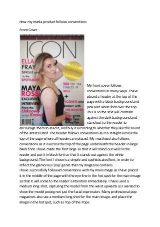
- 1. How my media product follows conventions Front Cover My front cover follows conventions in many ways. I have placed a header at the top of the page with a black background and pink and white font over the top. This is so the text will contrast against the dark background and stand out to the reader to encourage them to read it, and buy it according to whether they like the sound of the artists listed. The header follows conventions as it is straight across the top of the page where all headers are placed. My masthead also follows conventions as it is across the top of the page underneath the header in large black font. I have made the font large so that it will stand out well to the reader and put it in black font so that it stands out against the white background. The font I chose is a simple and sophisticated font, in order to reflect the glamorous ‘pop’ genre that my magazine contains. I have successfully followed conventions with my main image as I have placed it in the middle of the page with the eye-line in the hot spot for the main image so that it will come to the reader’s attention immediately. I have used a medium long shot, capturing the model from the waist upwards as I wanted to show the model posing not just the facial expression. Many professional pop magazines also use a medium long shot for the main image, and place the image in the hotspot, such as Top of the Pops:
- 2. This magazine has also used a mask on the masthead which makes the masthead appear behind the main image, which is what I have also done. This makes my magazine look more professional as many well-known magazines do this, meaning the magazine is popular enough for some of the letters to be hidden. I have put the barcode in the bottom left hand corner of the front cover, which is in dead space. This means that it isn’t taking up any valuable space that could be used by something essential. This is typical and consistent through all magazines as the barcode isn’t an important attraction or feature of the front cover. The price of the magazine has been rotated to run up the side of the barcode, again in the dead space so that the reader can still see it without it taking up valuable space. This follows conventions as the majority of magazines place barcodes in dead space, in the bottom corners, like the ‘Top of the Pops’ magazine. I have used various cover lines around the picture, following conventions, so that they don’t block the picture and can be seen clearly. The main cover line has been placed on the left hand side in larger and bolder font than the rest to make it clear that it is the main one. One of the cover lines saying, “Ella Fray single and in the spotlight” anchors the main image to make it clear to the reader that this cover line is about the model on the front. Throughout the whole of the front cover I have used a consistent colour scheme of black and pink. This links in with the glamorous, girly theme I have
- 3. tried to portray to reflect a pop genre, and this is stereotypical of a pop- themed magazine – to use feminine colours. The Top of the Pops magazine has a colour scheme of pink and purple, which are also typical feminine colours and will therefore attract a female audience. On my magazine, the black with the pink also makes the magazine appear more sophisticated and professional as it isn’t too bright and cheesy, making it more appealing to the eye. The only other colour I have used on this page is white text on top of the header. This was so it would stand out against the black background. With my cover lines, I have used various different font styles and sizes. This is so it looks more interesting and doesn’t look consistent and boring for the audience to look at. I have also placed a pug on the right hand side of the page just under the masthead. This is also where ‘Top of the Pops’ has placed theirs; however mine is slightly higher up than theirs is. Inside the pug I have placed text saying, “First ever edition” in dark gold writing, against a gold gradient background. I have done this so that it is obvious to the reader that it is the first edition of this magazine, and I used the colour gold to make it appear exclusive, glamorous and luxurious which would encourage the reader to want to buy the magazine. I have mostly followed conventions with my front cover; however I have also challenged some conventions. One of my cover lines is placed in the right hand corner which is usually classed as dead space and wouldn’t often catch the reader’s attention. However, I did this as it carries on from the cover line above, therefore when a reader reads the cover line above, they would automatically read this one after. ‘Top of the Pops’ have also challenge d conventions by placing one of their cover lines in dead space as well.
- 4. Contents Page On my contents page, I have followed conventions by placing the title at the top of the page, however slightly developing them as I have placed it further to the right than the left. I have also used the same font for the title on the contents page and for the masthead on the front cover. This is to keep my magazine consistent and brand it. On the ‘Top of the Pops’ contents page, they have followed conventions completely by placing it right across the top of the page in the centre. My contents list is on the right hand side, which follows the conventions for a contents page. On my contents list, I have used sub-headings which will help the reader find the page they want quicker and easier. I have placed white text on top of a black background to make them stand out, again making it easier for the reader to find which section they want to read about. The ‘Top of the Pops’ magazine have also divided their contents list up by using sub-headings to make it easier for the reader to find and have used a black, bold font to make the sub-headings stand out from the rest of the text. However, this magazine has developed conventions by splitting up the contents list all around the page. This is effective as it separates
- 5. all the sub-headings, showing more clearly where to find what is under the sub-heading. For my page numbers, I have made them larger and in a different colour to make them stand out making it clearer what page number the text is on. On my contents page, I have followed conventions by making my main image larger than the rest. However I have slightly developed conventions by the position of my images, which is lower down than in the hotspot. ‘Top of the Pops’ have followed conventions by placing their image in a hotspot at the top of the page, sending the reader’s attention straight to the main image. I have carried on my colour scheme through to the contents page by using pink and black as my two main colours. This gives my magazine a brand. I have also used the ‘Icon’ logo on my contents page as part of the background behind all the text. This also gives my magazine a brand as it consistently uses the magazine’s title, constantly reminding the reader. ‘Top of the Pops’ have also carried on their colour scheme of purple and pink, which makes their magazine consistent, therefore giving it a brand. My editorial has been placed in the top left, following conventions as this will draw my reader’s attention to it immediately. In my editorial, I have used colloquial language with pronouns such as ‘you’, which will invite them to read the magazine. As my target audience is from the ages of 15-18, they will relate to the language used in my editorial as they will also use words such as ‘pics’ and ‘stuffed with’. On the bottom right hand corner of my contents page, I have made a section for a weekly competition that my magazine holds. I have used a pink background behind white text to make it clear that it is separate from my contents list. Beside this section is a Twitter logo and a Facebook logo. In my text is says they can ‘find out more by visiting our twitter or facebook page’. This will encourage my readers to enter the competition as they are of the ages where they will be frequently using social networking sites, and this will help them relate to my magazine.
- 6. Double Page Spread On my double page spread, the main image follows conventions as it is on the right hand side page, and is a medium close up of the ‘celebrity’ looking directly into the readers eyes. This would encourage the reader as often, readers like to see pictures to go with articles as they are interested in the celebrity, but also because it involves the reader and makes them feel as if the model is directly looking at them. The double page on the ‘Top of the Pops’ magazine have placed their main image right in the centre of the page. This also follows conventions and is effective for their Question and Answer style article, as it places them in the centre of their answers, involving them more. The title also follows conventions as it is in large bold, black font across the top of the page. It states the celebrities name and therefore makes it obvious who the audience will be reading about. It will catch their eye immediately as it stands out against the white background and smaller text below it. Below the main title, there is a sub-title, which gives the reader a hint about what the article is about. It is in smaller font as it isn’t the main title, and is only placed there for effect to encourage the reader to want to read on. ‘Top of the Pops’ has followed conventions by placing their title on the left hand side. They have
- 7. used white text on a purple background, therefore catching the reader’s attention by standing out. They have also used a sub-heading in which they have briefly explained what the article is about. This has also been done for effect in order to encourage the reader to want to find out more! I have further followed conventions by placing a quote in the middle of my text, in larger font to break it up. This quote has been picked out from the text and placed there to catch the reader’s attention, and influence them to read the article to find out what this quote is about. ‘Top of the Pops’ has also done this, however they have slightly developed conventions by placing their quotes beneath the picture of whoever has said it. This is effective as makes the reader feel more involved as they can see which celebrity said which quote. I have slightly developed conventions on my double page spread as I have placed another image on the left hand side. It is a long shot of the model sitting across the bottom of the page. This would be following normal conventions; however I have increased its opacity and placed it under the text to make it appear as a background. I have done this to make the article more personal to her, and show that it is directly about her. ‘Top of the Pops’ have also used two extra images. One of them has been placed in the middle of the text to break it up, and the other has been placed in a separate section on the right hand side. ‘Top of the Pops’ has also carried on their colour scheme of pink and purple right through to their double page spread. I have included the colour black, however I haven’t included the colour pink on this page. I have carried on my branding, as I have placed the ‘Icon’ logo in the top right hand corner, consistently showing my audience the name of my magazine, therefore getting them used to the logo. This will help them to recognise my magazine in the future.