1. Magazine Content Analysis
House Style
The house style of thismagazine would
be white,red, andblack.The right is
significantthroughoutthe magazine
because oneveryQ magazine it’sred.
Thishouse style of thiscontentpage is
upbeatandcoloursfull because of the
colourstheyhave usedonthe page
numbersandthe coloursin the images.
The imagesaren’tdark theyare bright
and theyhave coloursto theminthe
background.Thisrepresentswhattype
of magazine thisisbecause itshowsthe
musicbandsinside are upbeatandpop
but if the bandswere dark androck
theywouldn’tbe muchcoloursonthe
bag it wouldbe mainlyblackandwhite
Target Audience
The target audience forthismagazine
wouldbe people whoare intorockor
indie pop,etc.Itwouldappeal tothose
typesof people because of the people
whoare featuringinthe magazine. The
target age wouldbe people between
18-30 because forthe advertsthatare
inside of the magazine andthismusic
wouldappeal tothose people more
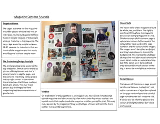
The GuttenbergDesignPrinciple
The primaryoptical area wouldbe the
top leftcorner.Inthat cornerthere isa
picture of RickyGervais and that’s
where itstarts to saythe pagesand
the content. The strong fallowareais
the top rightcorner,in that corner
there isreviews thatQhave made on
bandsand artists.Thismay make
people buythe magazine if the
magazine givesrecommendations of
goodartists
Imagery
On the bottomof the page there isan image of LillyAllenwhichreflectswhat
type of magazine thisisbecause LillyAllenmakes Indie Pop musicsothat’sthe
type of musicthat maybe inside the magazine orothergenreslike that.Thismay
make people bythe magazine if theysee thattype of musicwill be inthe there
so theymaywant to buyit more.
DesignBalance
The balance of thiscontentpage would
be informal because the textisn’tlaid
out ina certainway it’sjustbeenplaced
on the page randomlyandthe colorful
page numbersaren’tall the same size.
It wouldalsobe informal because the
coloursare brightand theydon’tlook
professional
2. Evaluation
These two magazines have a lot of similarities and differences. One of the similarities between them is that the main colours on both
of the content pages is red, this may have been used because they stand out on the page and it is very eye catching. Another
similarity is that they have a lot of images on the content page of who is featured in the magazine which shows which type of music
magazines they are and who the audience may like to see. Finally the both target the same people who are into the same type of
music which is rock/Indie rock.