21st century breakdown digipack analysis
•Als PPTX, PDF herunterladen•
0 gefällt mir•177 views

Digipack Anyalsis

Empfohlen
Weitere ähnliche Inhalte
Was ist angesagt?
Was ist angesagt? (18)
Ähnlich wie 21st century breakdown digipack analysis
Ähnlich wie 21st century breakdown digipack analysis (20)
Mehr von George Lawley
Mehr von George Lawley (18)
Kürzlich hochgeladen
Kürzlich hochgeladen (20)
21st century breakdown digipack analysis
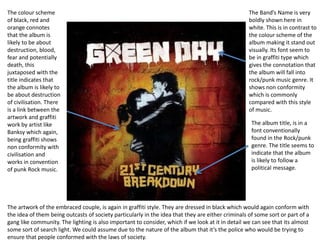
- 1. The Band’s Name is very boldly shown here in white. This is in contrast to the colour scheme of the album making it stand out visually. Its font seem to be in graffiti type which gives the connotation that the album will fall into rock/punk music genre. It shows non conformity which is commonly compared with this style of music. The album title, is in a font conventionally found in the Rock/punk genre. The title seems to indicate that the album is likely to follow a political message. The colour scheme of black, red and orange connotes that the album is likely to be about destruction, blood, fear and potentially death, this juxtaposed with the title indicates that the album is likely to be about destruction of civilisation. There is a link between the artwork and graffiti work by artist like Banksy which again, being graffiti shows non conformity with civilisation and works in convention of punk Rock music. The artwork of the embraced couple, is again in graffiti style. They are dressed in black which would again conform with the idea of them being outcasts of society particularly in the idea that they are either criminals of some sort or part of a gang like community. The lighting is also important to consider, which if we look at it in detail we can see that its almost some sort of search light. We could assume due to the nature of the album that it’s the police who would be trying to ensure that people conformed with the laws of society.