
Empfohlen
Weitere ähnliche Inhalte
Was ist angesagt?
Was ist angesagt? (20)
Ähnlich wie Adele's 'Skyfall' digipak cover features James Bond theme song
Ähnlich wie Adele's 'Skyfall' digipak cover features James Bond theme song (20)
Mehr von fatimasyeda95
Kürzlich hochgeladen
Kürzlich hochgeladen (20)
Adele's 'Skyfall' digipak cover features James Bond theme song
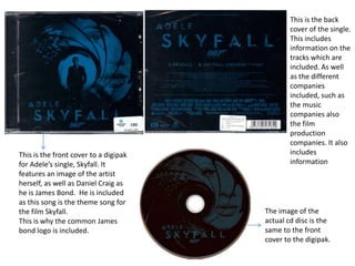
- 1. This is the front cover to a digipak for Adele’s single, Skyfall. It features an image of the artist herself, as well as Daniel Craig as he is James Bond. He is included as this song is the theme song for the film Skyfall. This is why the common James bond logo is included. This is the back cover of the single. This includes information on the tracks which are included. As well as the different companies included, such as the music companies also the film production companies. It also includes information The image of the actual cd disc is the same to the front cover to the digipak.
- 2. The front cover of Taylor Swift’s digipak shows and informs the audience of the album's name. Also there is a mid shot of the artist herself in order to raise awareness and emphasize that it is her album. Also the font in the front cover of the digipak is slightly different, as the name of the album 'Fearless' and name of the name of the artist 'Taylor Swift'. These two fonts are used throughout the digipak,, such as on the disc itself and the back cover of it. Unlike the Adele digipak this Taylor swift one includes 3 different images on the front cover, disc and back cover. It has the record company logo included in the disc. I like how the back cover is another mid shot of Taylor Swift, which is a shot taken from the video ‘Love story’. This shows that we can include images from our music videos and use on our digipak. Also on the back it includes a list of all the other songs included in the album. As some digipaks are for singles but there are also album digipak. The stem of the digipak also blends in with the back cover and states the artist and album name. However there is different font used on the stem, non the less the colours remain similar.
- 3. The front cover for this digipak is a close up of the artist. The low-key lighting and vintage effect of this shot allows the album to look more artistic to enable audience attraction. The image itself is quite dull however the colour of Taylor’s lips adds a sense of colour to the digipak. The titles are also different as the album name differs to the artist name in terms of colour and font. The title ‘RED’ also compliments the image as Taylor is wearing red lipstick. The back cover of this digipak uses a duplicate image as the front cover, however it had a red effect on top of the image which removes the vintage/artistic look. The colours of the album cover is continuous as red and white font is used in both back cover and the cd. The colour red can connate love or danger. However I think because its red and white it could show a sense of love and purity within the songs in the album. There is also a list of the songs in the album which is commonly used in digipaks. The cd disc is colour coordinated to the rest of the digipak, and includes the name and artist of the digipak.
- 4. The back cover uses another close up of Adele looking at the camera. The edit of the image still remains the same to the front cover as it is black and white, dull with shadows, she has also blended into the dark background. An advantage of this is it allows the list of songs to stand out, as it is in white font. This digipak also includes a barcode which is different to the previous ones I have researched. The front cover of this digipak uses a close shot of Adele posing. It uses lowkey lighting with a black and white effect. This may be showing the audience the pace and type of songs included, such as slow ballads. Also the title of the album states the artist’s and the album name ’21’. This is written in different colour to the name of the artist, however the font remains the same. This may be to add a sense of colour to the dull, lifeless black and white image. However the disc of this digipak is in colour co-ordination to the album cover
- 5. This is a digipak to Rihanna’s album ‘Loud’. This has a booklet included inside which is a high angle long shot of the artist posing. It is spread out into 3 different sections as the right and left side of the booklet have space for cd discs to be inserted. The image used in this booklet uses fluorescent colours such as red, in the roses and the colour of the artist’s hair. This is part of the mise-en-scene and these factors may connote love, and passion. The two discs in this digipak are the inside of a cream/peach coloured rose. This is yet again colour co-ordinated as it matches to the top and dress Rihanna is wearing in the long shot. The front and back cover of this digipak uses the exact same image and which as a close shot of the artist posing. The main colour used in this digipak is red and skin tone/ nude colours. Therefore the front cover colours are correlated throughout the album. The font used in the digipak is white font this is used to make the titles stand out from the image.
- 6. This digipak is from the artist Katy Perry. Similarly to Rihanna’s digipak, this one has a 3 sectioned folded booklet, but with no extra front and back cover. However this booklet included 2 different images rather than one long shot. This digipak has a close up of the artist posing in what looks to be pink clouds or candy floss on the right hand side. The other 2 section is one long shot of Katy in the same location but at different angle. Where she is looking quite provocative in order to gain the male audience attraction. This image seems to be the front cover for this digipak. These images used are from the music video ‘California girls’ which perhaps is included in the album itself. In the middle of this digipak there is a list of the songs in the cd. This is the back cover of the digipak. There no title used in this digipak cover as audience will already be aware of the album, as the images used are referenced/related to the California girls music video. However the name ‘teenage dreams is included in the inclusive booklet provided in this digipak However as there are 2 different cd’s there is also information on what is included in each cd. The colour theme are similar as shades of blue and pink are being used. This is important mise en scene. As the video from California girls itself references a lot of confectionary, the disc itself have been transformed to look like food, such as the hard boiled sweet and sprinkled donut. There also seems to be a booklet included inside of this digipak, this is mid/long shot of the artist next to other props, such as cakes.
- 7. This is a digipak to the single ‘Nobody’s Perfect’, by Jessie J. The front cover of the digipak is a long shot of the artist posing. The mise-en –scene in her costume allows the artist go gain a male demographic audience. Also the location used in this shot is referred to the Nobody’s Perfect music video. This shows that the artist already may have an audience who will purchase the single as the music video and song has already gained an audience. Similar to other digipaks researched the artist’s name tends to differentiate with the font of the song/album title. The back cover of the digipaks shows a list of the songs included in the cd. This is different to other album digipaks, as this is for a single alone. Therefore these digipak include other versions to the song, such as acoustic versions etc. Also the cd disc I no image, instead it has the name of the artist, in the same font used on the front cover. This digipak also looks to be a cardboard version, as other digipaks I have researched have been plastic.